Build Design Systems With Penpot Components
Jul 21, 2:15 AM
Penpot's new component system for building scalable design systems, emphasizing designer-developer collaboration.
smashingmagazine.com

UX Planet — Medium | Martin Jancik
I have always been fascinated by the way the human mind works. I am also convinced that being familiar with cognitive sciences is one of the key skills of any designer. To better myself professionally and perhaps to help other people learn something new, I decided to write about the cognitive topics I am interested in.
 Photo by Andrew Neel on Unsplash
Although the design is perceived by our senses (vision, touch, hearing), it is immediately processed by our brain. As designers, we have to understand how to create experiences that go hand in hand with how the human brain evaluates them. While being a designer, you have the power to control the human mind during and even beyond the interaction with the product.
In this article I am focusing on how our attention works and on the ways that affects interface design.
Everything we see, hear, touch or smell is processed by our brain and affects our memory system. This system is divided into:
Working memory contains information about the focus of our attention. As the capacity of our working memory is rather small (research shows the capacity can range between 5–7 unrelated concepts), our attention is considerably selective. Our brain is simply not able to process all that is happening around us at once. It is instead narrowing down its focus to the most relevant pieces of information. The relevancy is determined by our own objectives.
Our brains receive about 11 million bits of data per second, but we’re only able to process roughly 50 bits per second.
Information from the working memory can be lost very easily if the focus shifts. Many of us can relate to a situation like this one:
In the middle of counting someone suddenly interrupts you. Afterwards you have to start all over again, because you don’t remember exactly where you left off.
You walk into a room, suddenly realising you have forgotten the reason you went there in the first place.
Using modes in design has many advantages. It allows us to perform more actions with fewer gestures/controls by switching contexts. For example, in „Sketch“, a graphic design app, you find yourself in select mode by default. What this means is that while dragging, you can select objects on the screen. However, if you go into draw rectangle mode, it means that now while dragging, you can draw a rectangle.
The working memory is too volatile to assume that the users can remember in which mode they currently are without having any feedback. When using modes, it is important to emphasize the currently active mode. Sketch has mastered this by showing a different cursor for each mode.
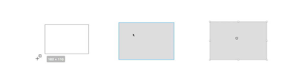 Rectangle mode, select mode, drag mode in Sketch.
While using the search function on a website, users enter the search terms and then review the results. The attention shifts from the input to the results. That means the users often forget what the initially typed search parameters were. Sites with a search function should have the input parameters displayed prominently even when already showing the search results.
If the user needs to go through more than 5 steps to achieve their goal, make sure they have clear instructions on how to do that. Users most certainly will not be able to remember all the incremental steps. It should also be possible for the user to easily review the instructions as they are executing them.
If the system you are designing requires a complex navigation hierarchy, it should give the user feedback on where they currently are and how they got there. It might be rather challenging to remember all the steps you took before ending up on this exact page. The designer should do their best to avoid overloading the user’s brain and letting them forget what their initial objective was. That is why breadcrumbs (usually arrows or slashes which show the hierarchy of a page)are getting very popular in many products nowadays.
 In Edookit teacher system you can clearly see where you currently are with the help of breadcrumbs as well as highlighted menu and submenu item.
Nowadays, our brain gets most of its information through the eye. Our eyes play an important role in how we perceive design. The structure of the human eye is complex, but the most important finding is that there is a part of the eye called an “eye fovea” in the central part of the eye. It is a small circle (1.5 cm wide) and it is the part through which our brain gets most of its information. There are 3 reasons for this:
All of this results in humans having a very narrow focus.

Our peripheral vision, on the other hand, is very poor. Really. Think about the way you are reading this article right now. You are focused only on these exact words, everything else is irrelevant. That is a tiny part of the overall design. The interesting part, though, is that our brain tries to help the eyes and fills out the missing data from our periphery based on our expectations and memory. This tricks us into thinking that we actually see everything at once, sharply.
Even though the peripheral vision is poor in quality, it does have a purpose in our lives. It guides the fovea towards focus points (where to look next) based on low resolution data. It is also very good at detecting motion — an ability we inherited from our ancestors who lived in the wilderness.The affect of the eye fovea on interface design
These findings are easily applicable to design. Users are not able to see the whole website at once. They can merely scan the page. That means their eyes jump very fast from one part to another. The most attractive usually is the part of the website that is in contrast or involves any kind of motion.
 The landing page of Semplice has a yellow CTA button in the right corner. It immidiatelly takes our attention.
Important, mutually related information has to be shown in a compact way, so that users can perceive these elements together. Use the gestalt principle of proximity that says:
Objects or shapes that are close to one another appear to form groups.
 Gestalt principle of proximity. Circles closer together appear to be grouped.
For example, an error message has to be shown near the password field. A user that is focused on typing the password might miss the error message if it is in a different part of the page. Another example (image below) is the marketing copy which should persuade the user to click the CTA buttons. The contrast of the heading and the CTA button implies that this part of the page is likely to be one of the first ones to be noticed by the user.
 Marketing microcopy, email field and CTA button or closely together so the user doesn’t have to scan other parts of the page
 The error message is shown directly underneath the input field. The user doesn’t have to move his eyes far away.
Human attention is goal-oriented. We tend to focus on things related to the achievement of our goals. Everything else is less relevant and unless it somehow triggers our attention, it will stay on the sidelines. This results in a psychology phenomenon called perceptual or inattentional blindness.
Watch this video and try to count the passes of the white team.
We should aim to design with interconnectedness in mind, for example by employing the gestalt principle of proximity. If it is not possible, we should attract the user to change with motion or contrast. Unless we adhere to these principles, there is data out there that says the user is highly likely to miss important details of the experience.
This is the end of me rambling about human attention and how recent findings in cognitive sciences affect the way we design. In writing this piece, I was heavily inspired by the book “Designing with the Mind in Mind” by Jeff Johnson. If you are curious how to design for the human mind and want to dig deeper, I strongly encourage you to read the book.
Thank you very much for reading this article. If you have found it interesting, please hit the heart button ❤ and share it with friends. Feel free to check more of what I do at mjancik.com or more of my personal life on my instagram.
Designing for Human Attention was originally published in UX Planet on Medium, where people are continuing the conversation by highlighting and responding to this story.
AI-driven updates, curated by humans and hand-edited for the Prototypr community


