Build Design Systems With Penpot Components
Jul 21, 2:15 AM
Penpot's new component system for building scalable design systems, emphasizing designer-developer collaboration.
smashingmagazine.com

medium bookmark / Raindrop.io |
Senior experience designer. I write about design tips and tricks, IT industry, and personal projects.
Various documents — reports, briefs, maps, guidelines, etc. — usually are the way designers communicate the results of their work. One doesn’t simply collect all the design data in one place and get the expected result because the how is as important as the what. Let’s dwell on some techniques how to make your documentation even more effective.
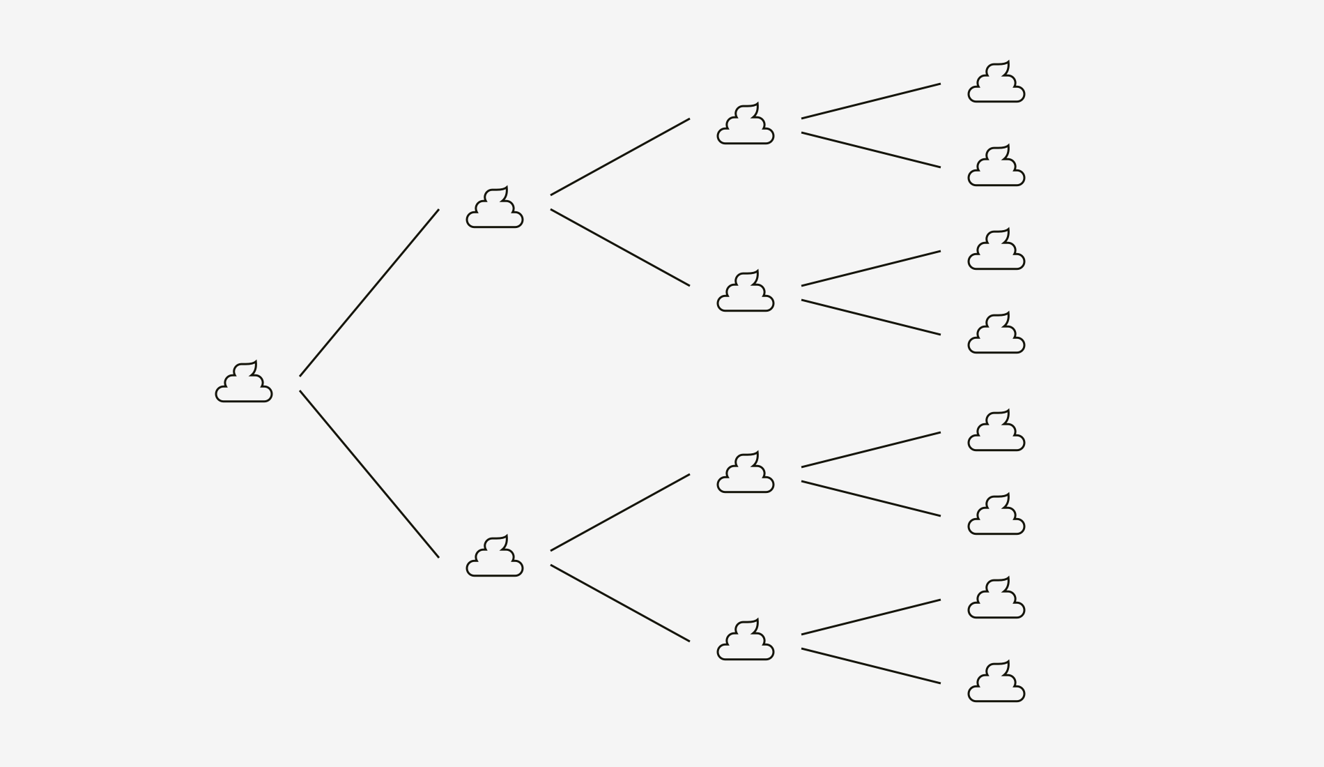
You might have heard about the theory that a small disorder attracts a bigger one — if a broken window is not fixed, soon it will be accompanied by a four-letter graffiti, dog’s poop, pile of garbage, and thieves’ ambush.
Although this theory originates from criminalistics, it is applicable to design too. The more ambiguity, inconsistency or inaccuracy you tolerate in design documentation, the more errors it may cause. Below are some typical extracts I saw in the documents of other designers.
Okay, but what exactly can happen? Your idea will be misconceived or even skipped. But the most dangerous consequence is improper implementation and wasting the effort of other people. Probably the worst thing is when developers code your design by eye. Then this code is tested and returned for redesign and redevelopment again and again. Eventually, the team and users hate this app, site or whatever the product is.
Even if you need to share a document in a draft or very early state, it can look clean and be labeled accordingly. Put meaningful placeholders so that no one passes the design to production until you finalize it. Or at least team members will understand that new features are on the go.
One more aspect of the “broken windows” effect is consistency. If you change, add or retire something in a document, be sure it’s updated everywhere and doesn’t contradict anything.
Just imagine your teammates look at different mockups or statements and don’t realize something is wrong with what they see! It may cause vain attempts of the team to piece everything together and figure out which of multiple variants is correct.
Inconsistency is mainly the bug of visual design outcomes (prototypes, style guides, guidelines, wireflows, etc.). But it may take place in research documentation, for instance, if information on the persona page is different from the data on the customer journey map for this persona.
Let’s say, you’ve made a profound heuristic evaluation of client’s application and pointed out a hundred of usability issues. As a result, you have a one-hundred-page report with screenshots and descriptions. Such a serious work might have taken you a week or two.
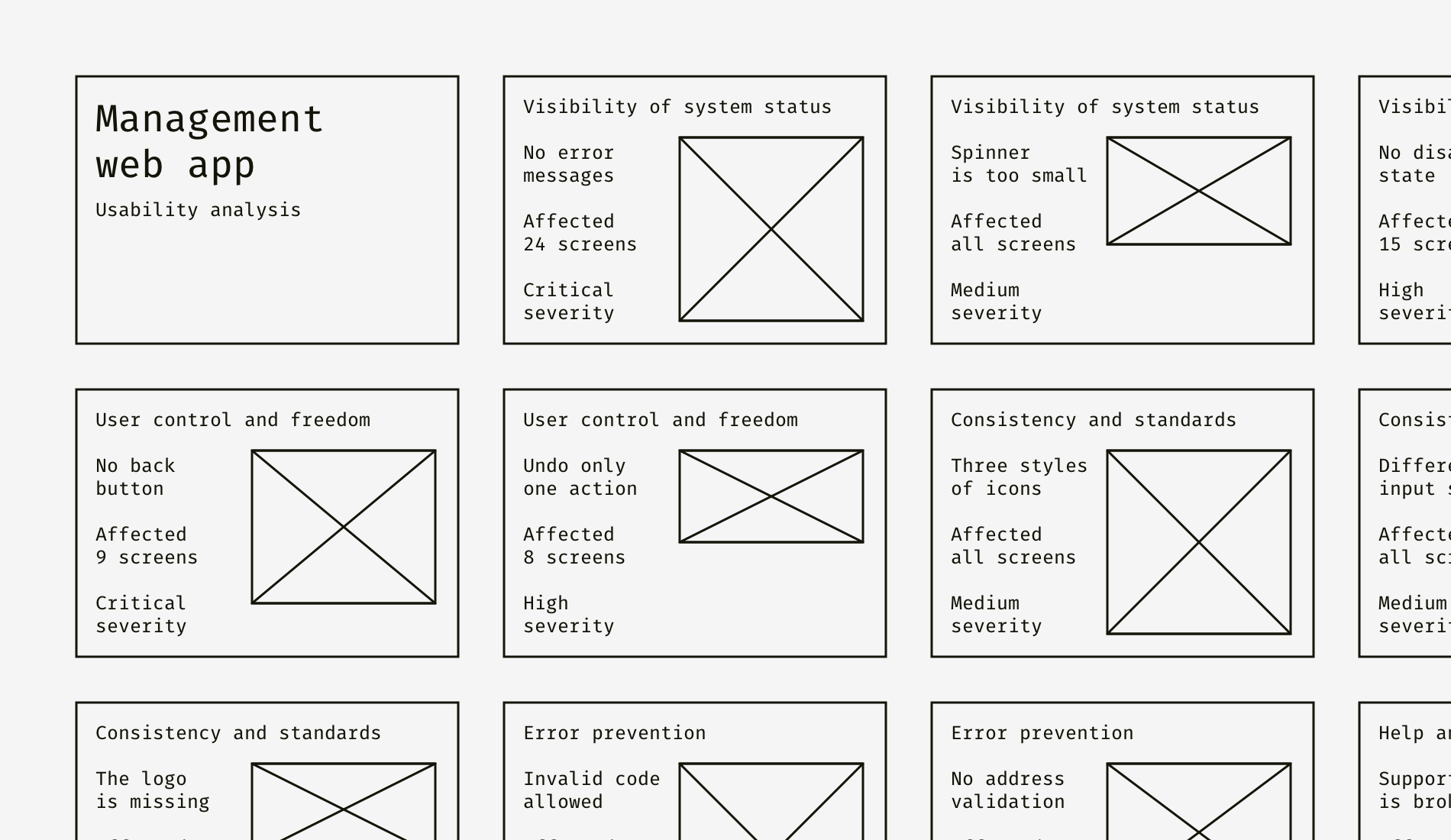
And now imagine a person who is looking through your report for the first time, especially if this is a non-designer. I’m pretty sure, this person will comprehend something like in the picture below.
Two weeks of documenting the issues in the client’s product — and your report rests in peace in “Read later” folder. Apparently, not what you expect, isn’t it? And now by adding two slides to this already enormous report, we’ll help the audience to read less but get more.
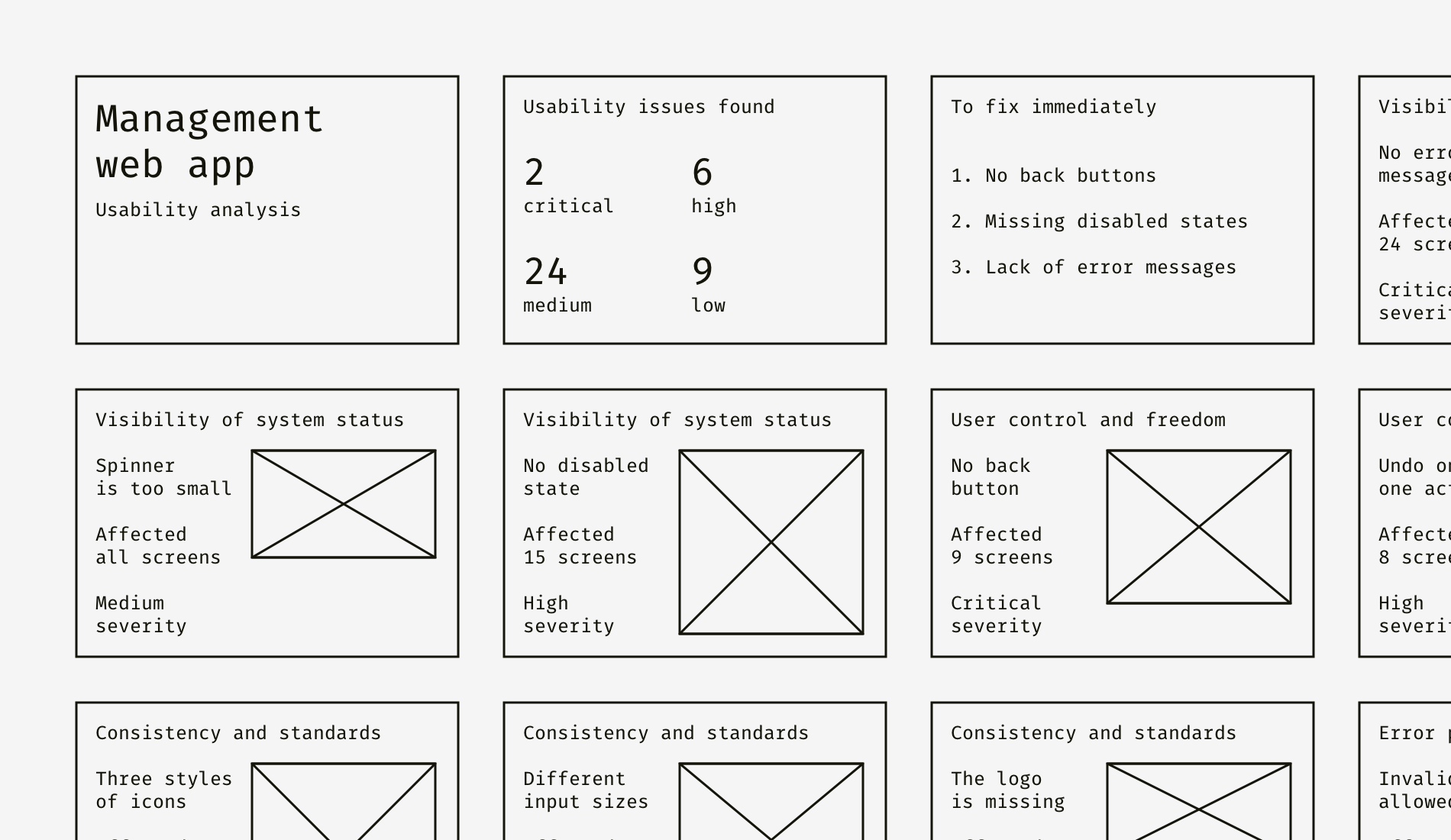
See that? The second and the third slides define key issues and to-dos. The rest of the slides are more of a proof than must-read information, thus aren’t usually interesting. Even if no one scrolls to the screenshots and comments, your goal will be reached because the essence of design is to cause changes, not to make people watch all the slides.
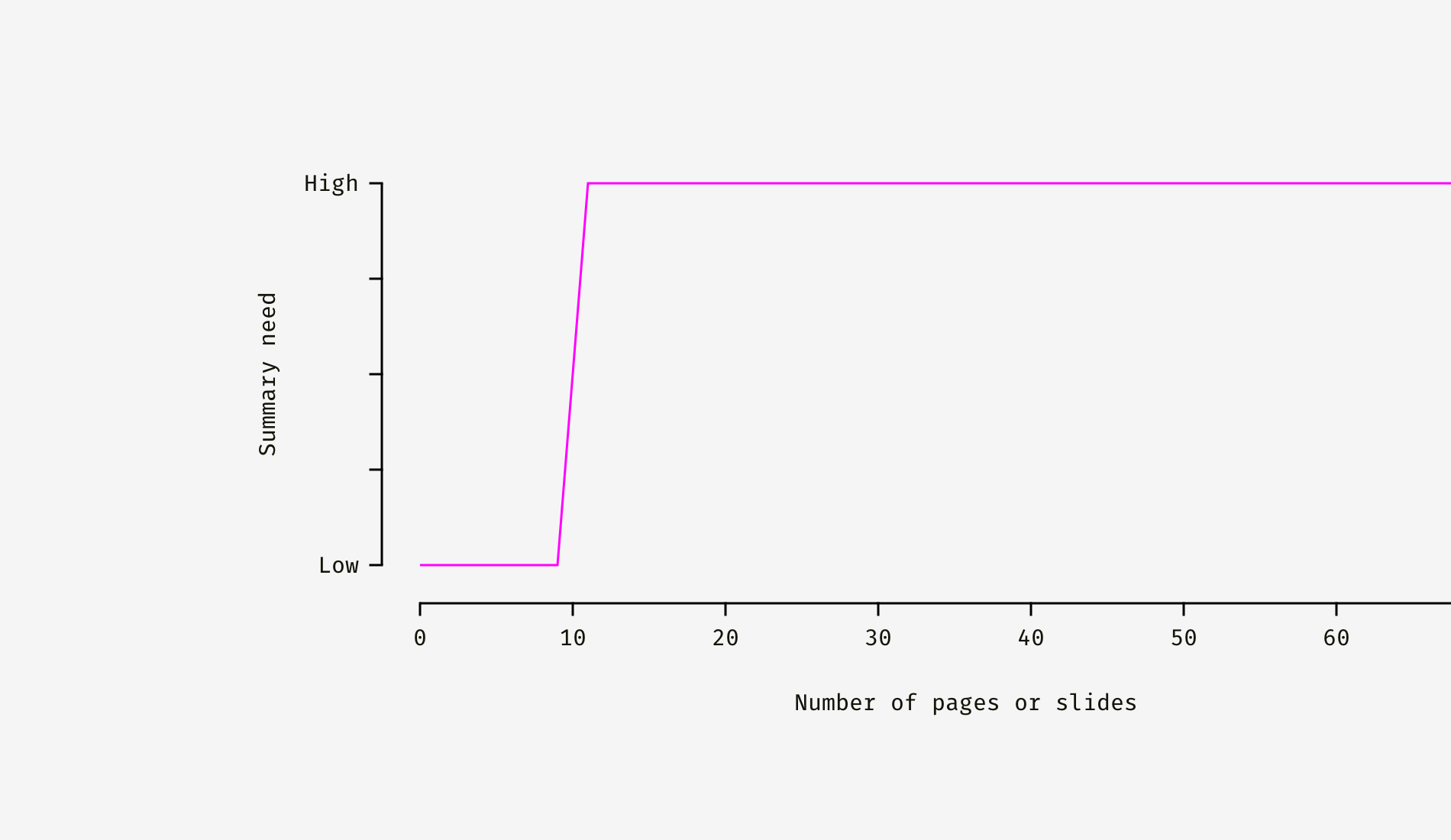
Even 10 pages are a sufficient cause for creating a summary. Just imagine your recipient is busy and has only five spare minutes. If he or she reads the summary only, it’ll be a win. No one is eager to cut through words and pictures to the document idea. Ideally, the summary should be placed right after the title page or title block.
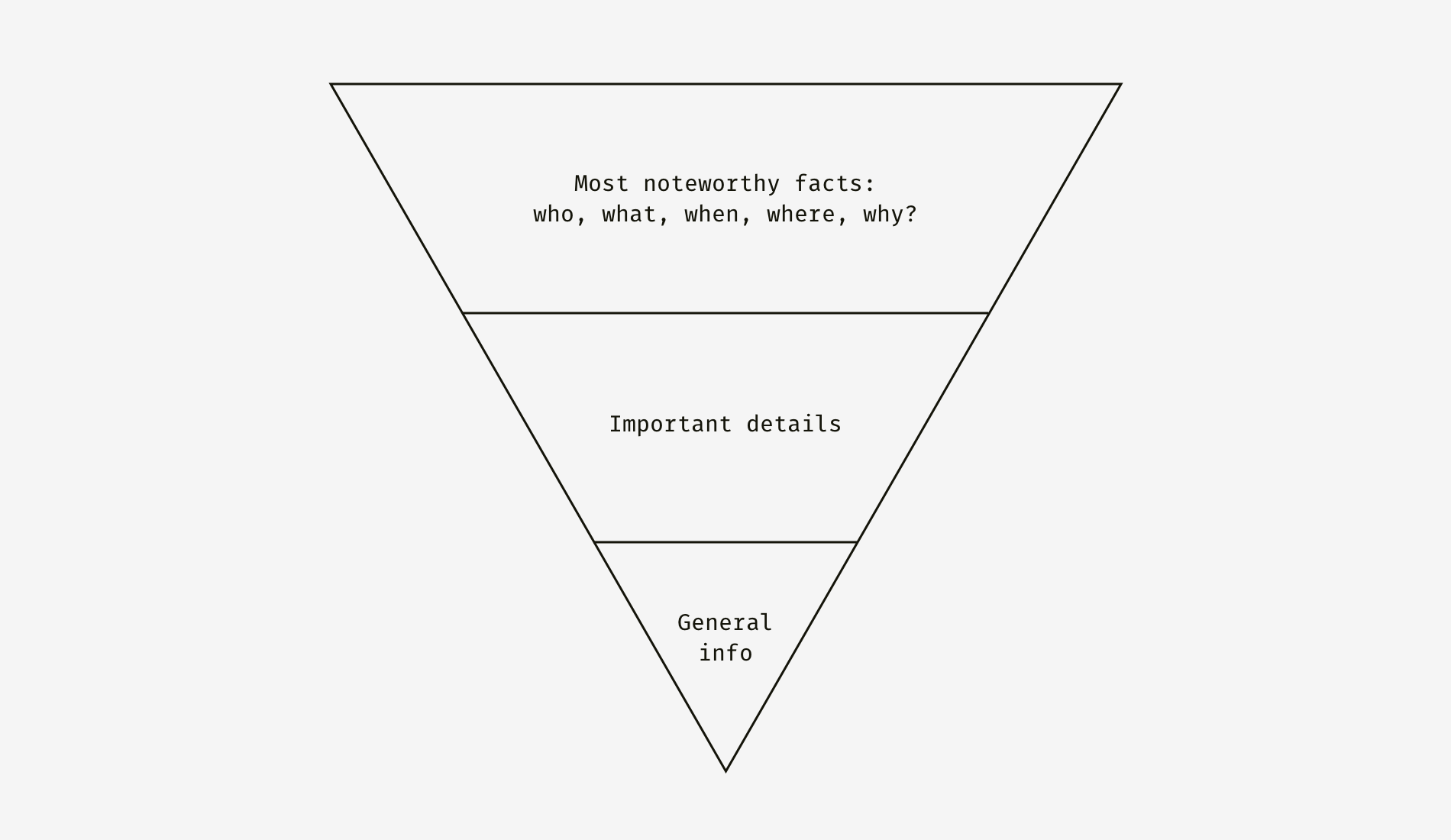
This principle originates from the journalistic “inverted pyramid rule”, which suggests putting facts descendingly in the order of their significance. Both journalism and design are utilitarian, result-oriented areas (unlike literature and fine art), that’s why the inverted pyramid is so useful for practically any design documentation.
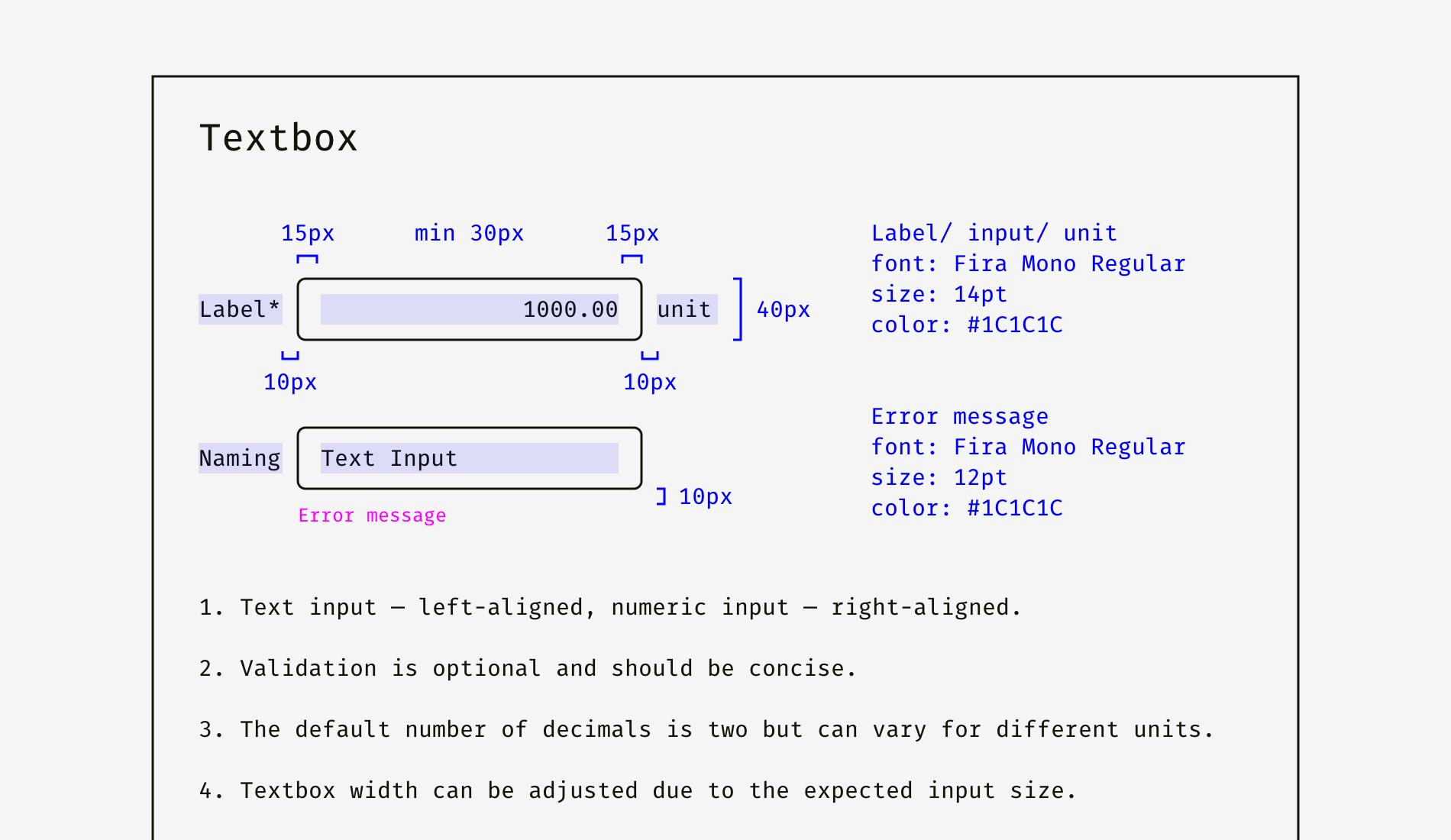
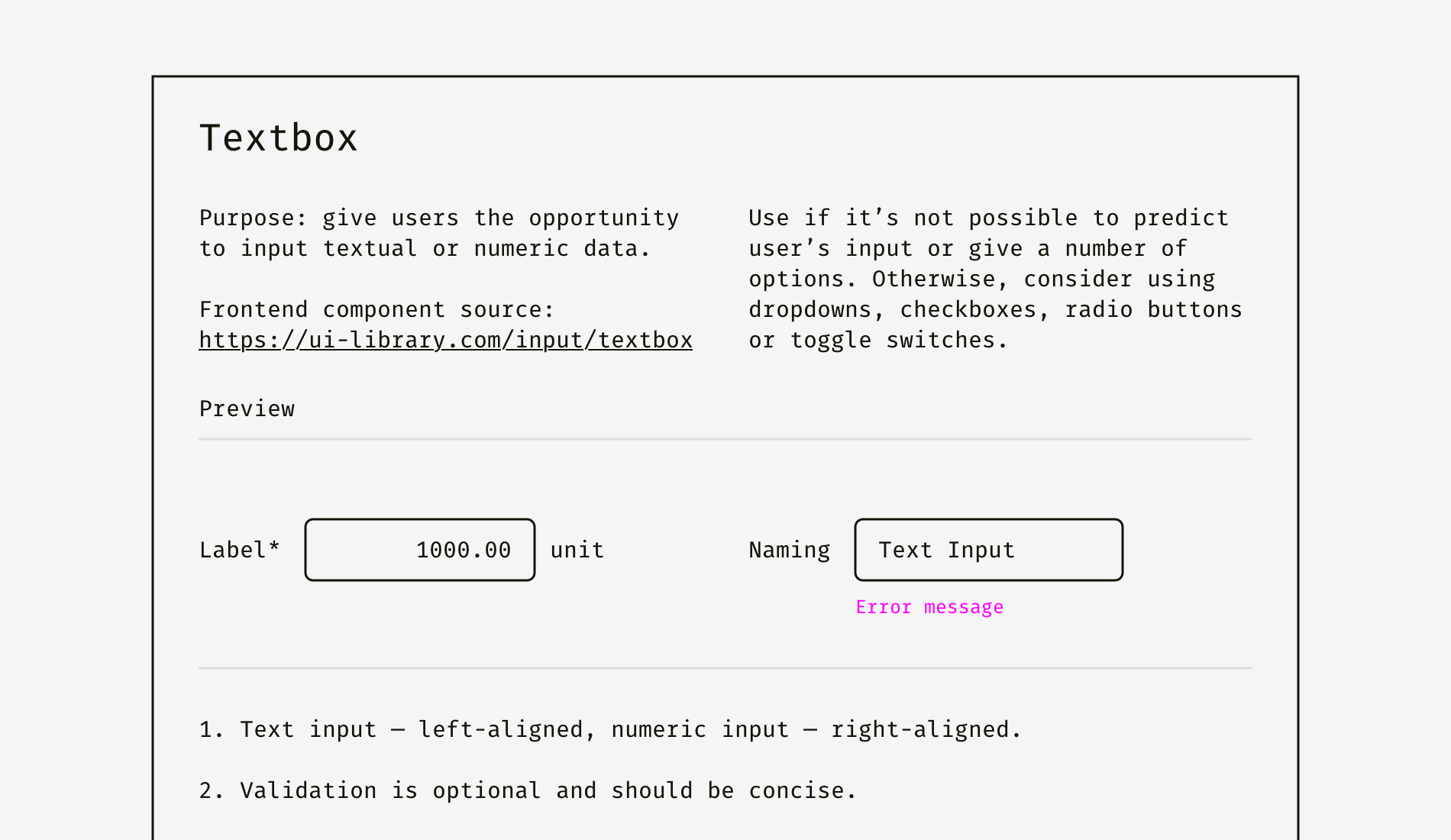
So, imagine this: you work on a design system that contains a lot of different components, and a textbox is one of them. The textbox guideline has a bunch of mockups, modifications, interaction rules, animation, specifications, and feature descriptions.
We, designers, tend to see the world through “design glasses” and expose pixel-perfect blah-blah-blah or fancy user experience canvases. Instead of bursting into pictures, animation, schemes, fonts, and colors, it’s good to clearly say what it is so that the entry level to a document becomes pretty low. Dip your recipient into the subject gradually by letting them catch the idea first and then learn as many details as they need.
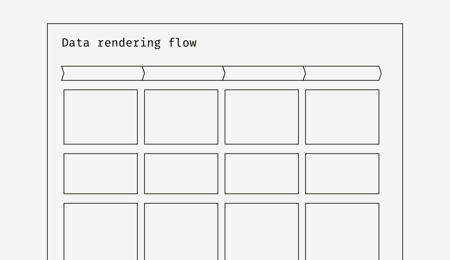
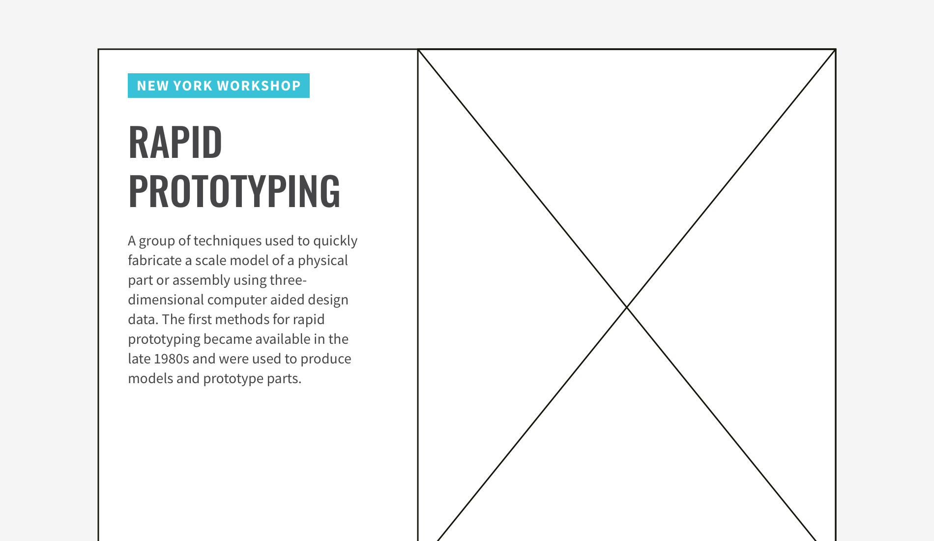
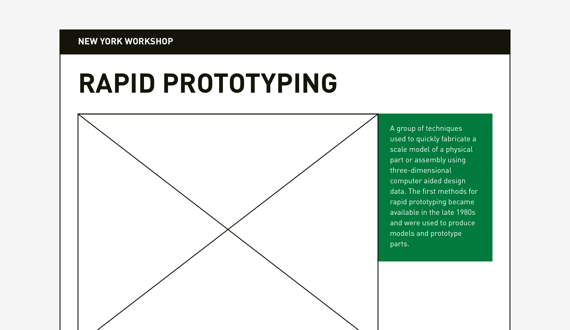
If your document is based on a previous teamwide activity, it’s good to remind of it in a couple of short sentences. For instance, after a workshop, you prepare a customer journey map — the description of user’s steps, actions, issues and opportunities organized in a grid. On the picture below you can see “Data rendering flow”, but it’s not clear what is this flow about, where it’s taken and why should one know about it.
Let’s add background information. It’ll help the audience to get what you want and not to start arguing about already agreed things. This technique works the best for design briefs and discovery workshop reports, which designers often send to the participants.

And one more thing. It’s better to start documents, which are to be sent out or viewed on a screen, with a summary. Materials that are presented face-to-face can finish with a wrap-up because an audience is usually more inclined to follow the story of a presenter. Of course, if the speaker is not so dull that listeners start yawning right after the intro slide.
This method helps to beat ambiguity if too many things are unknown or can’t be mathematically calculated. It’s especially important when you send your design solutions to a business person who operates facts, risks, budgets, and team capacity. So, what is your impression of this persona description?
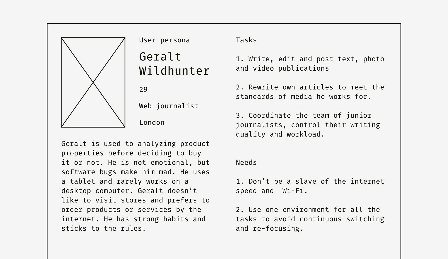
One needs to read the text first to get the difference. Is it possible to make understanding easier? Let’s see.
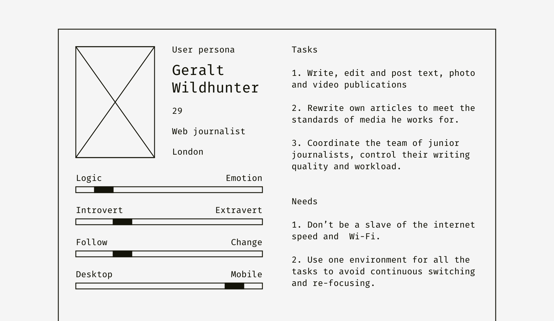
I added four charts that characterize the key parameters of this user type. You need a couple of seconds to get that Geralt the Web Journalist is a logical, introversive conformist who prefers mobile devices. Take a look at these two document formats compared.

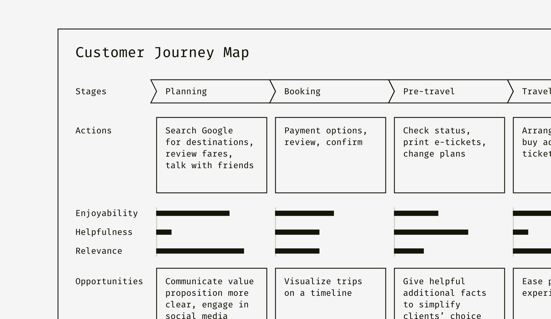
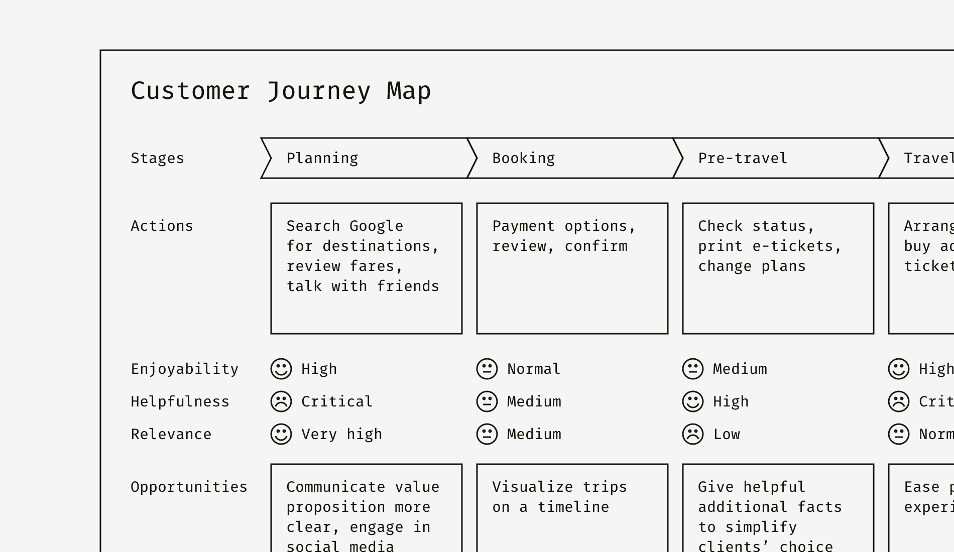
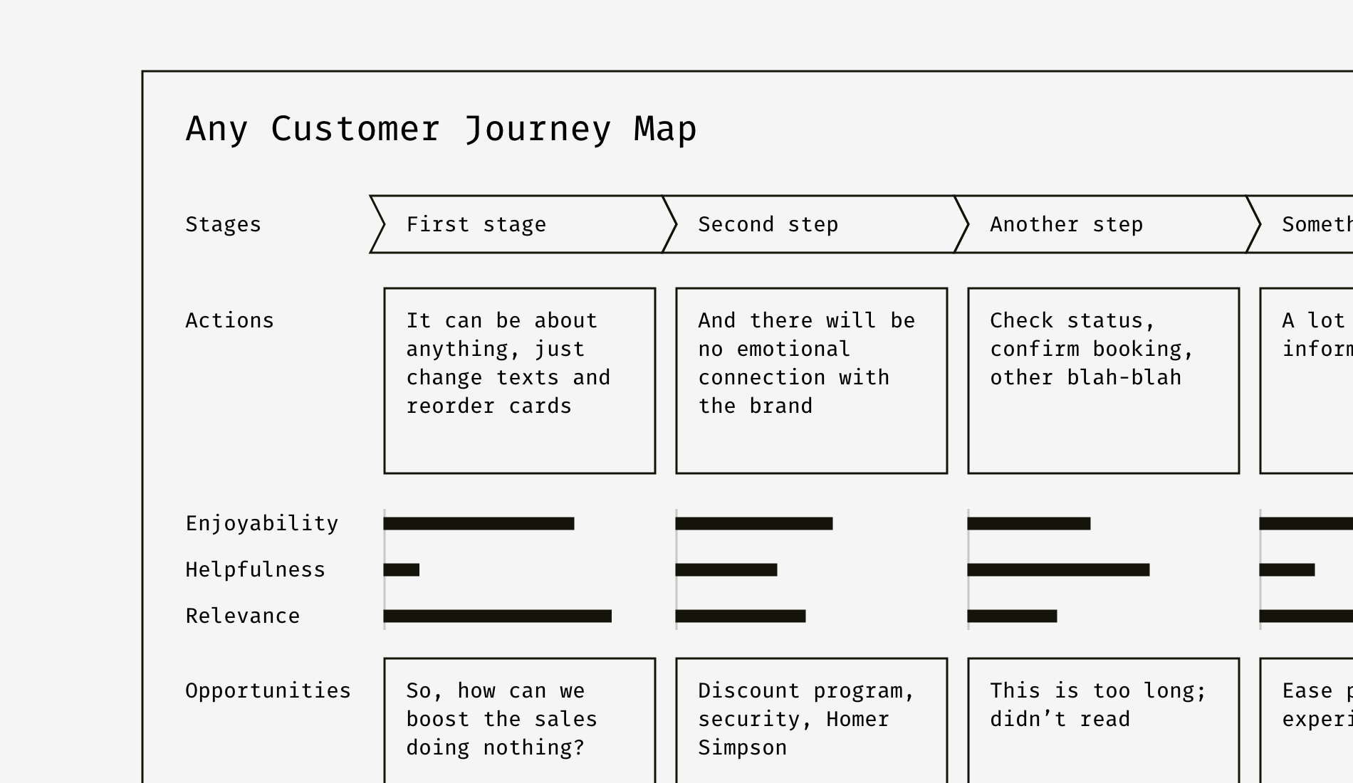
Personas documentation is not the only one where you can use charts or other data visualization elements. Here is a customer journey map canvas describing a hotel booking process. On each step, three parameters of user’s perception are defined. Can you quickly see where the worst situation is?

As for me, I need to spot all the “Low” and “Critical” labels first and then see where they are concentrated. It takes a minute or so. But the simplest bar charts can change the situation dramatically.
There are six levels of each parameter: critical, low, medium, normal, high, and very high. Each of them is represented by a stripe of the corresponding length. For example, “Critical” is six times shorter than “Very high”. It’s also good to keep text labels but add emoticons or color coding for better contrast between opposite characteristics.
As you can see, time estimates, complexity level, risk index, usability parameters are the things you can enrich a document with. It’s widely used in persona descriptions, user testing reports, and customer journey maps, but can be applied to lots of other design documents.
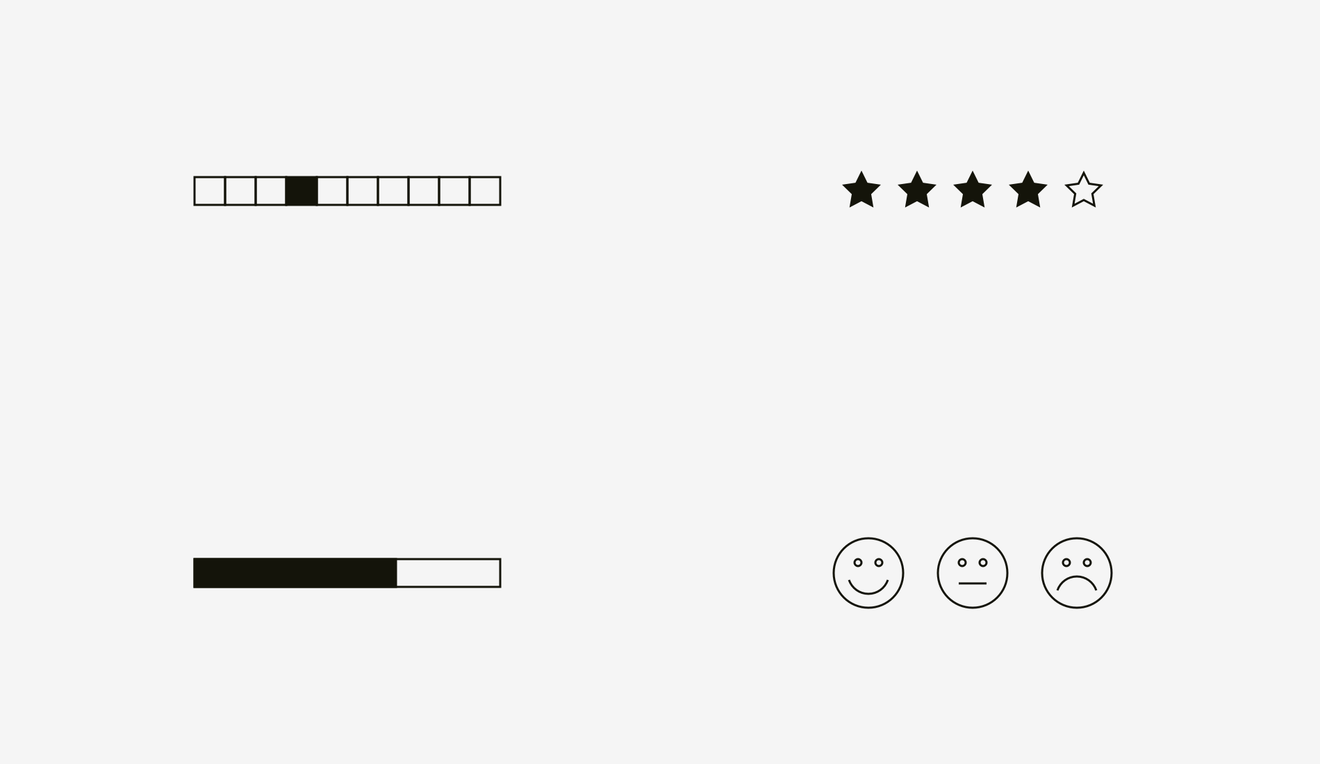
Bar charts, star ratings, 5- or 10-point scales, happy, neutral and angry smileys are the most effective, compact and well-recognizable ways to show relative, non-numeric information. As a result, readers of your documents will get additional information that can ease the choice, display human emotions and attitude, and prove ideas.
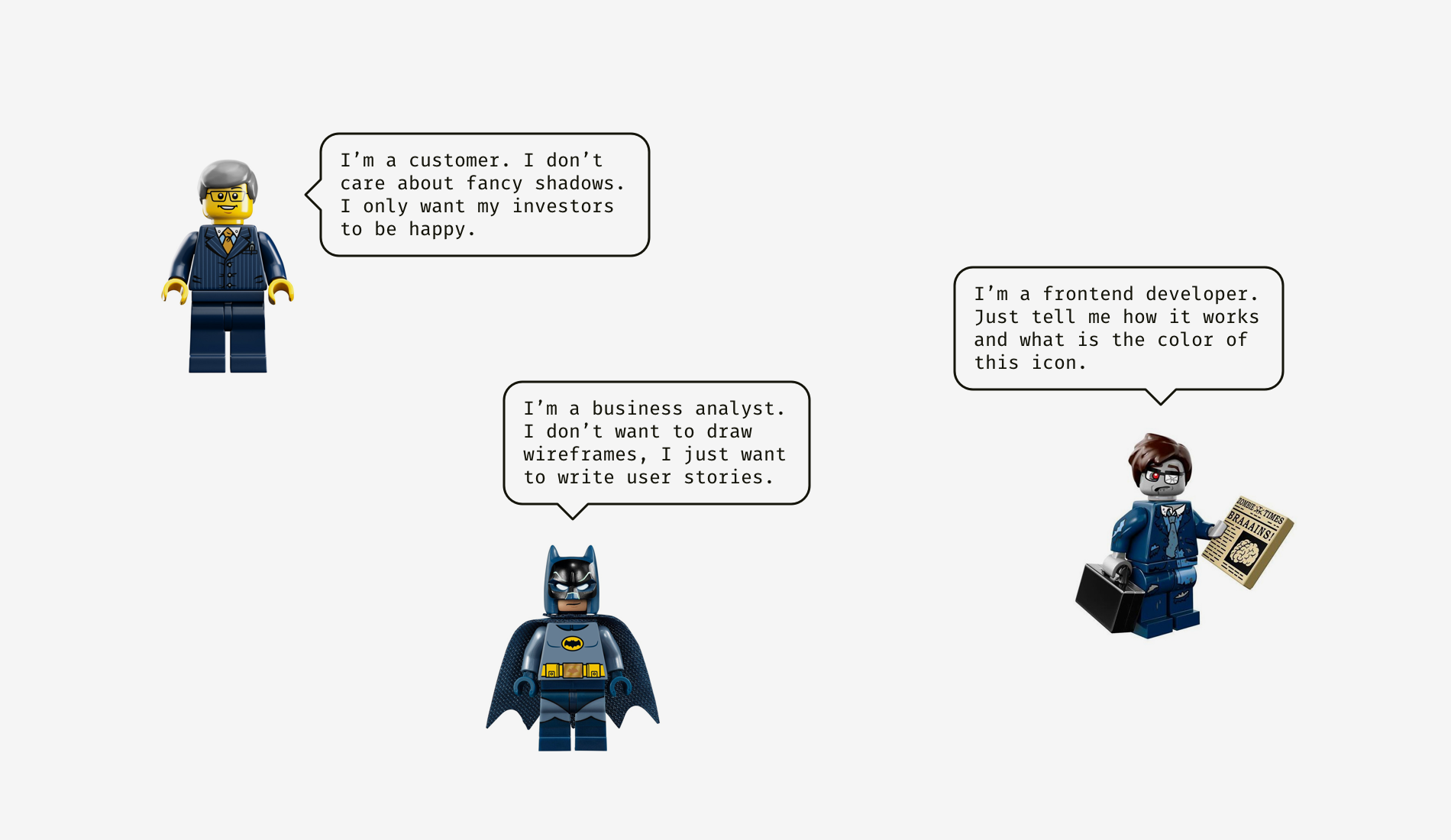
Why do developers hate the design guideline? Why aren’t clients viewing the presentations? Why do testing specialists never look in design files? Because not only do Alan Cooper’s personas work for end users but also they are an essential part of presenting designs to clients and passing knowledge to teammates. And the most crucial aspect is the focus of reader’s attention: either perfect pixels, or flows and tasks, or specification, or structure and logic, or business value and so on.

Depending on who a designer creates documentation for, he or she should use the same principles as in everyday design work — empathy, user-centrism, usefulness. As a result, it will affect the structure of a document, influence the language complexity and the level of detail. See how vocabulary and content vary for a designer and a frontend developer.
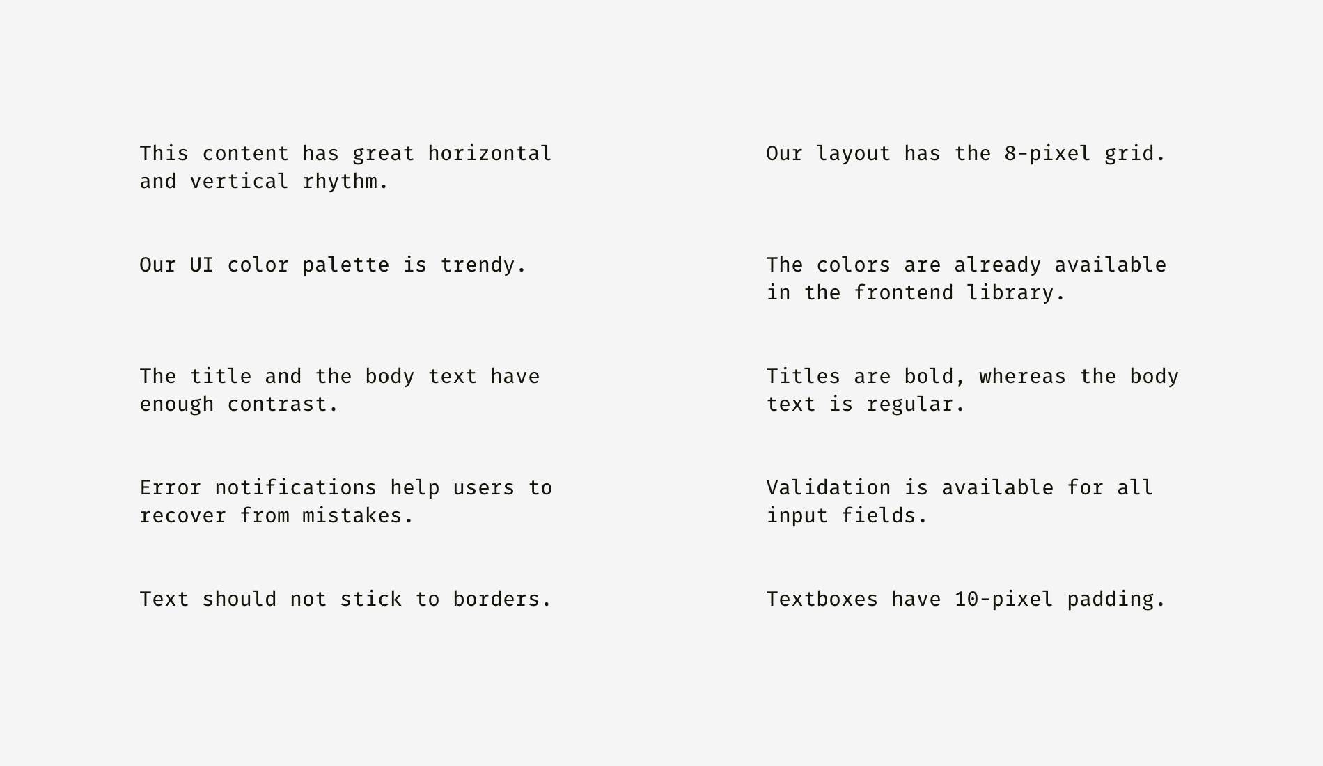
For example, if you develop a design system space, you are supposed to take into account multiple personas and satisfy all their needs. Usually, it means as simple language as possible, going from general to particular, and giving preference to flat navigation.
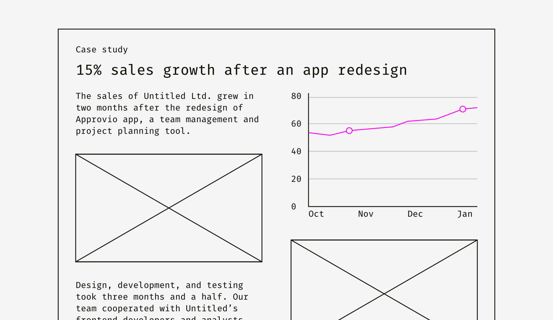
For instance, a case study page can look very different depending on the audience you are targeting. In your opinion, who can be satisfied by the following case study structure and content?
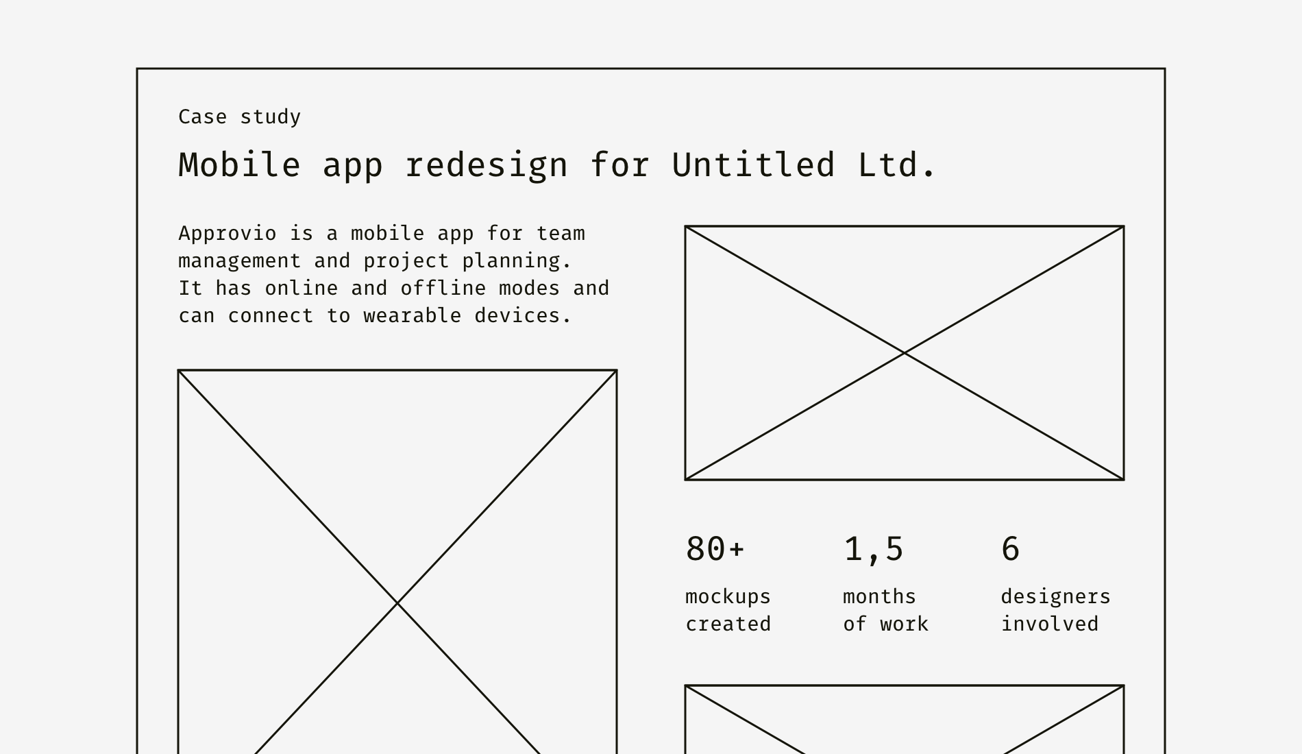
This is a typical way young design studios showcase their work. Trying to attract the business audience they focus on the number of design activities and deliverables: wireframes, mockups, prototypes. On the contrary, it’s better to tell about the business impact like sales growth, beating competitors, entering a new market, etc.
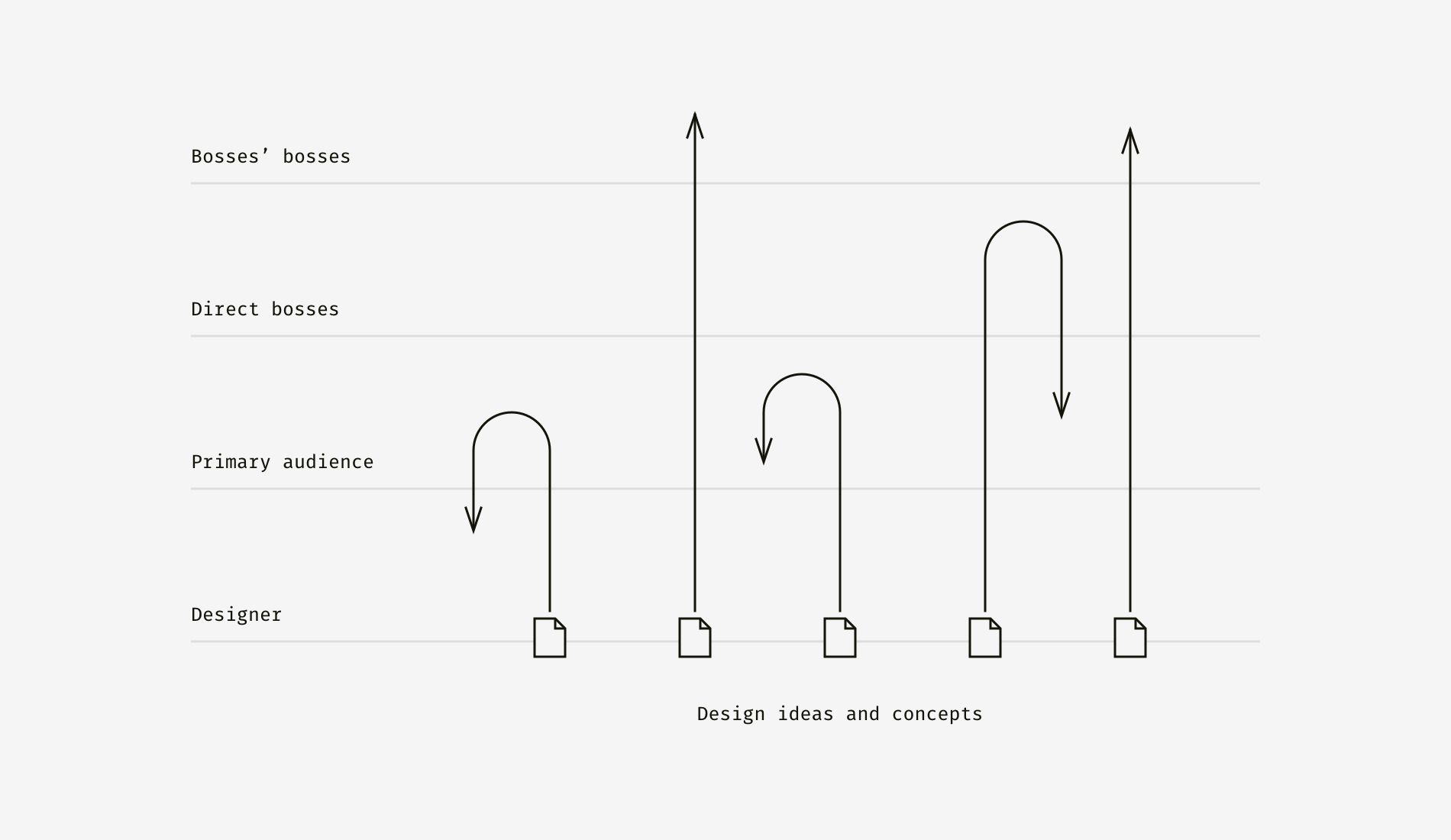
Another valuable benefit of the audience-centered approach is motivating your team to evangelize design and spread its principles. Remember that picture with poo at the very beginning of this article? Here it works the same way but with the opposite result. Design gains support, and it becomes easier to sell solutions not only to your direct manager but also to manager’s manager and even further.
Of course, I don’t advise to mask bullshit behind the words people are used to reading. This technique aims to improve understanding of a design if it’s not obvious or doesn’t seem attractive unless demonstrated.
Behind a cute font, sometimes we stop seeing the text. Designers often work with folks who prefer textual information or aren’t familiar with design. And the art of explanation can help a designer to avoid “stupid” questions. Here are four simple text-enhancing methods.
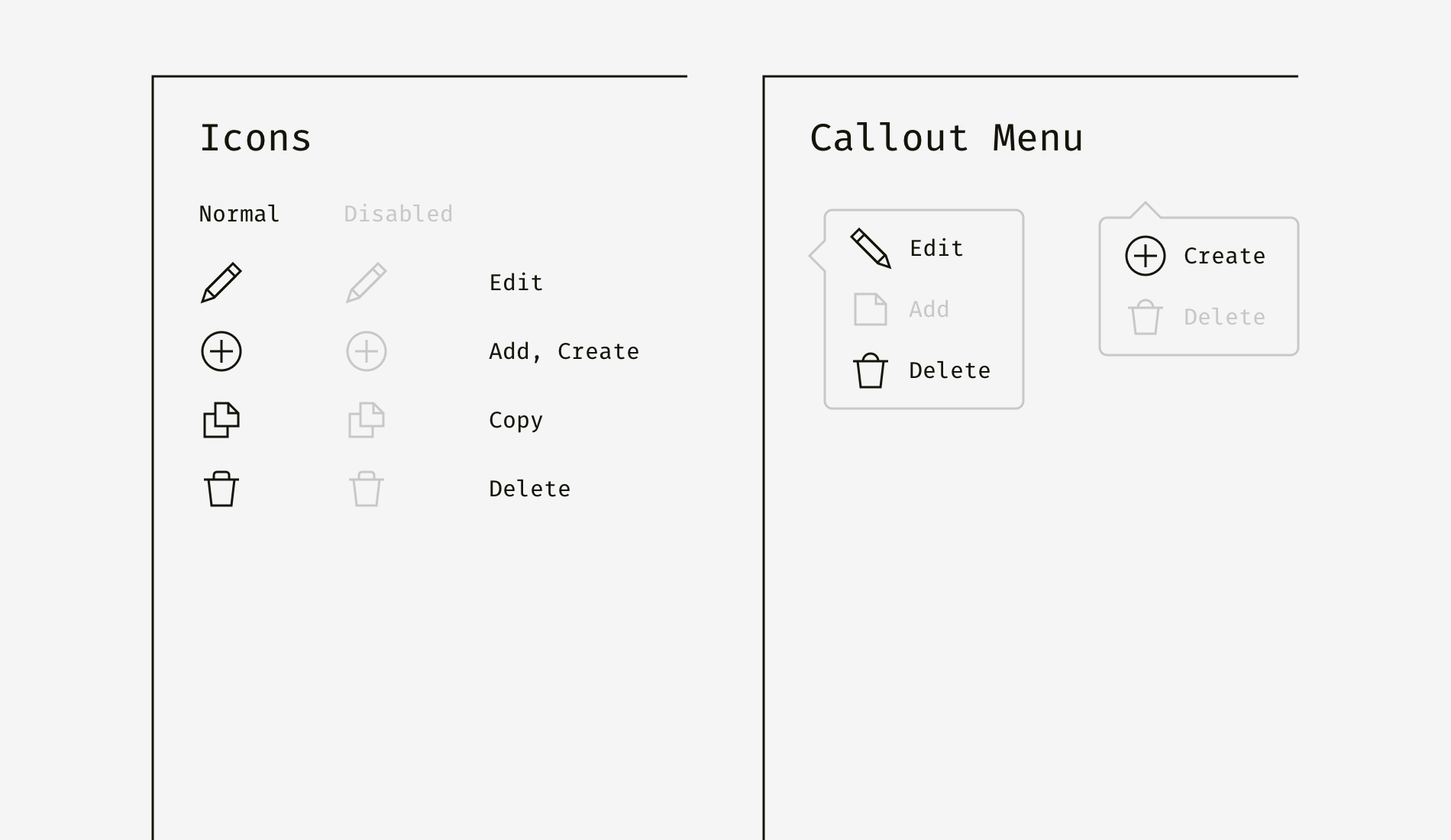
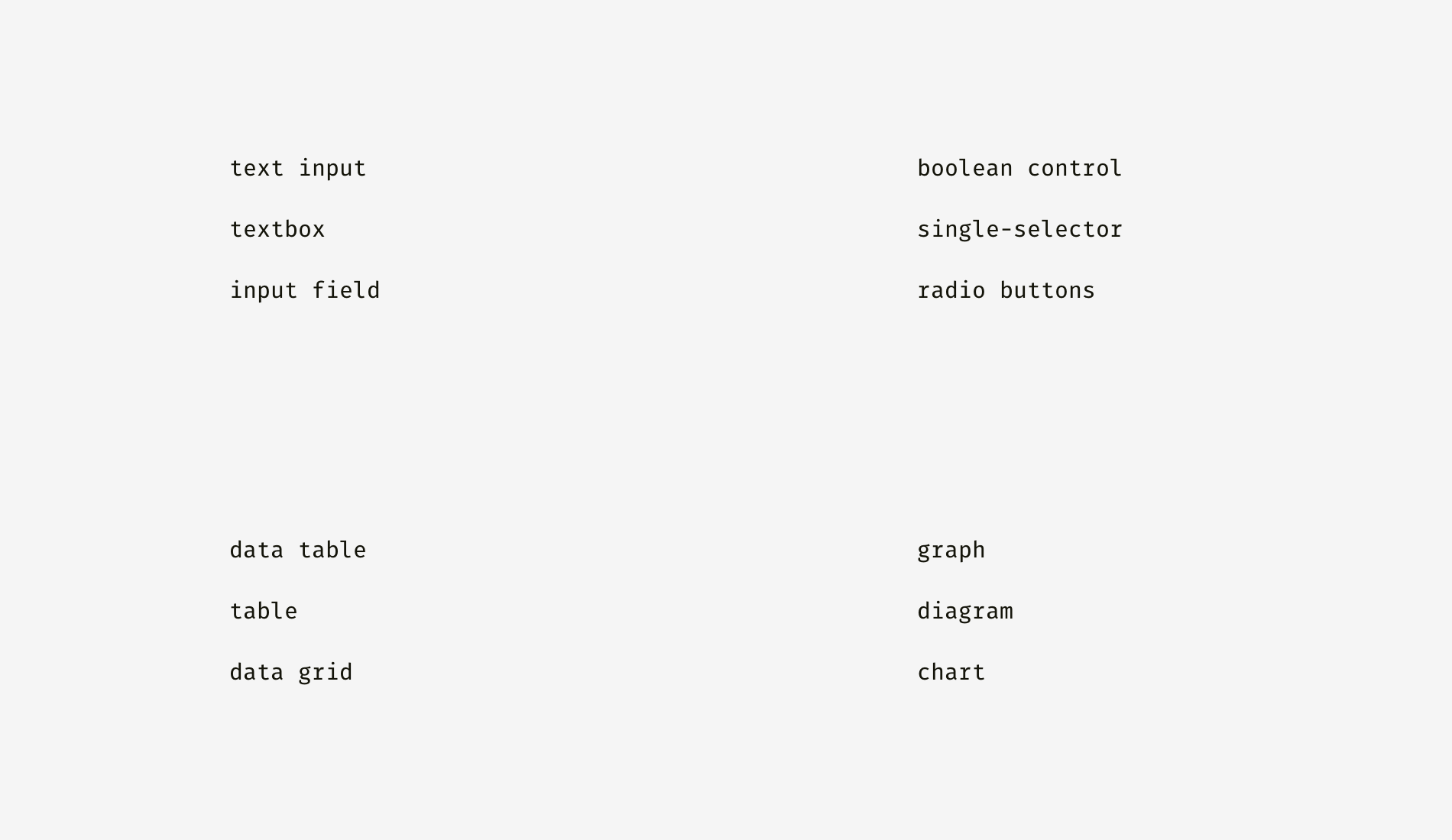
What are your teammates used to calling different user activities, design patterns, interface components? Are there typical names within your work platform or environment? “Chart” or “graph”, “textbox” or “text field”? Once you figure that out, you’ll be able to choose the most familiar and unambiguous words. If no naming convention has been created before, propose one and follow it everywhere.
Always start with what you want readers to know or do. Avoid such self-explanatory things as “you are on a web page where…”, “on this catalog page mockup, you can see the header, footer, and five product cards…”. If a word or phrase is repeated multiple times, try moving it to the higher level of the hierarchy and make a category of it.
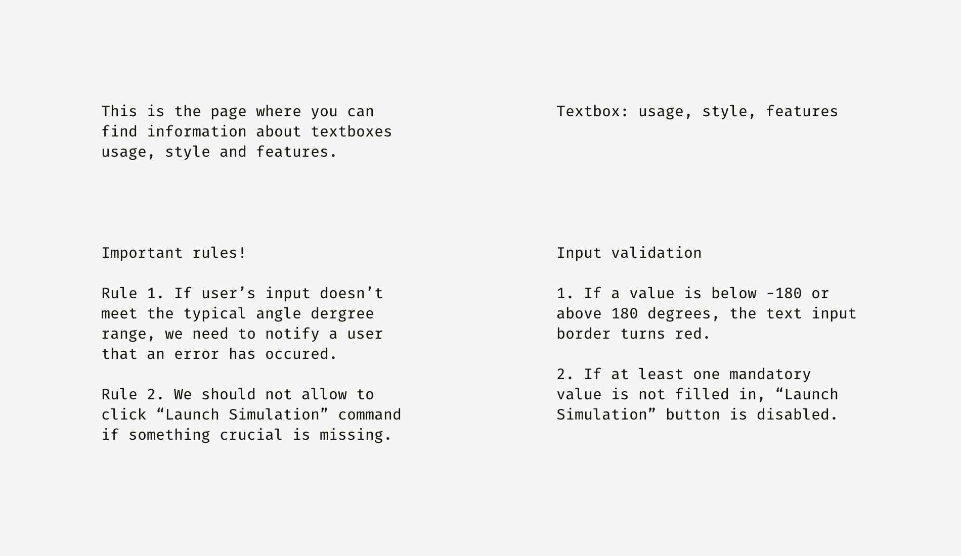
Below, I highlighted all the vague, repeating, and needless-to-say words in pink. By the way, the right column is not only cleansed from them but also upgraded by adding more useful information.

If you see a number of items are interconnected and describe a single element, flow or action, unite them in a list. Lists are easy to scan and find the needed information in just a second because the beginnings of all the items lie on the same vertical line one below another.
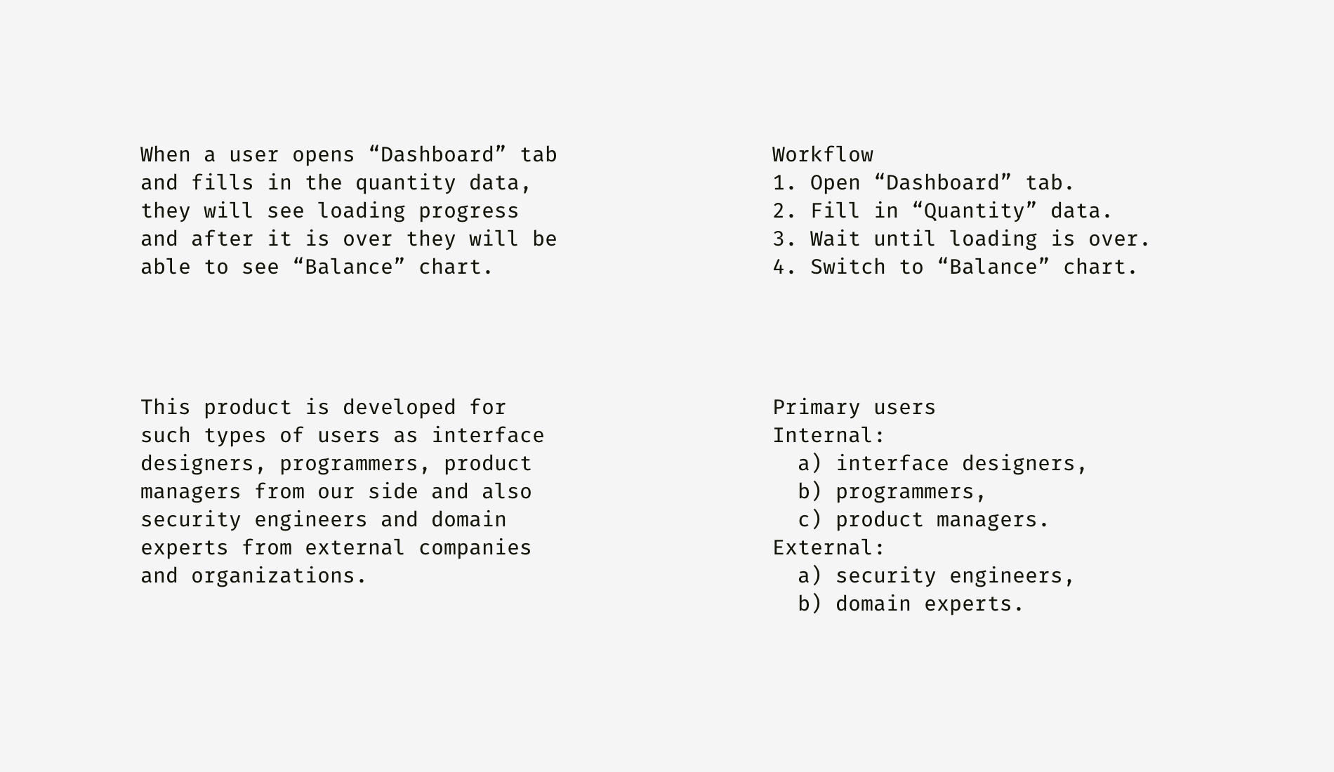
You can check that it’s really hard to see the sequence of actions or item relation in the plain text displayed on the left, while the right column exposes the logic. I highlighted the keywords in both variants.

If you have a bunch of interface rules starting with “if”, you are definitely considering some workflow. Of course, a designer can show this stuff by means of a prototype or mockups linked with arrows, but sometimes you don’t have time to do that. As you may notice from the example below, text description is not the best format, although it’s widely used by requirement writers — product owners, business analysts, project managers, etc.
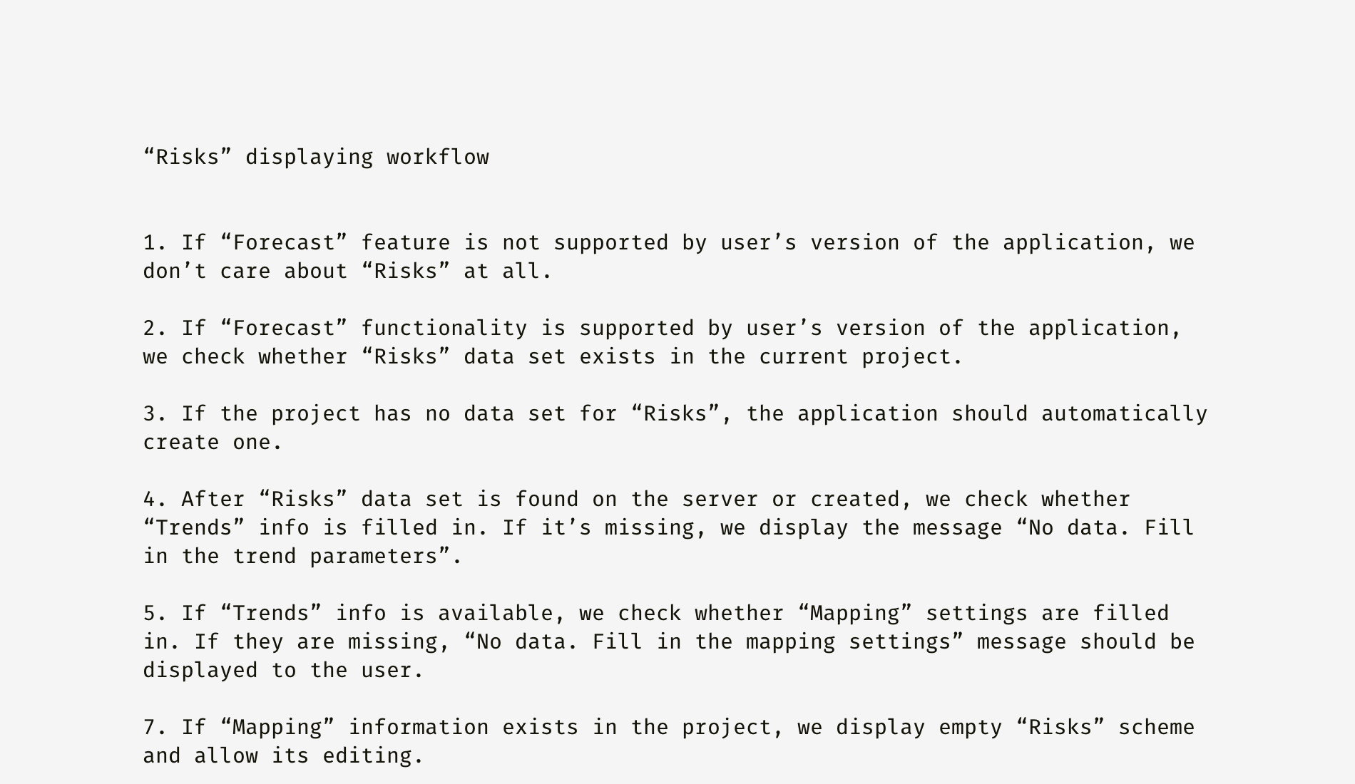
I suggest organizing it in the logical map of conditions and events. Take a look at how the workflow is shown below: one can easily follow the success scenario and see potential errors.
Every document is created to be seen, read, understood. Otherwise, there is no reason for creating one. You might be surprised by how many corporations still have prehistoric email clients that limit attachments to a megabyte; how many programs and fonts are missing on client’s computers; and how many teammates don’t have accounts in major collaboration tools.
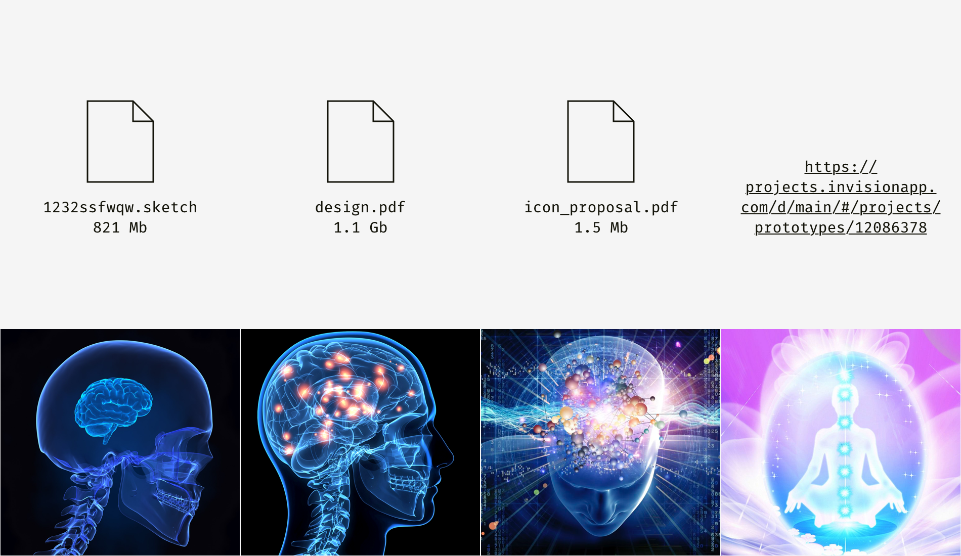
I guess designers can either utilize basic tools or — preferably — build as technically autonomous design environment as possible. Nowadays the most powerful tools are cloud storages (Dropbox, Google Drive) and web applications (Invision, Trello, Figma, Google Docs, Dropbox Paper, Confluence) since they are hardware-independent.
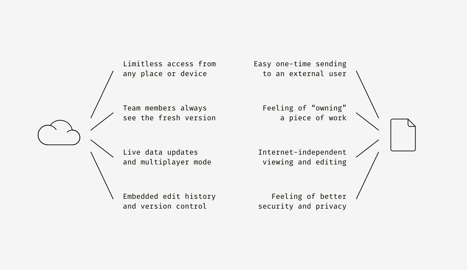
However, old good files still have some benefits, for instance, the offline mode and the psychological effect of having something firm and stable on a computer. Universal standalone formats like PDF are good for putting old designs in an archive, whereas links to online resources might expire or web services can be closed down.

If the only available option is to prepare a PDF or something similar, be sure it’s lightweight and compatible: has no dumb layers, overkill effects, lots of not cropped and not compressed bitmaps.
Designers promoting ideas often want to stand out. But this is not always a winning strategy. A bright presentation may scare corporate customers who operate billions of dollars and risk to lose a lot because of a mistake. They might think you propose revolutionary changes or you don’t get the essence of their business. For such stability-obsessed guys, there is a special presenting technique. Examine client’s brand guidelines and if you aren’t able to fully apply them, at least style your documents in a similar way. You’ll break the ice and broadcast the following messages.
Here is a slide based on the identity of EPAM, the company where I work.
What about something Adidas-looking?
And a bit of Mercedes-Benz character.

I used wireframes instead of pictures deliberately. You can put anything related to the topic there but typography and colors play the decisive role. Usually, it’s not allowed to use brand fonts (for instance, Adidas has its own one) or logos but no one can prohibit mimicking the general style.
Good documentation informs how to make something great but doesn’t inspire. And that’s a real catastrophe of many well-organized and perfectly formatted documents. There are many ways to make the audience feel a relation to something outstanding, and I’ll describe my favorite ones.
What makes you and your team roll on the floor laughing? Is there anything funny only the people involved in the project will get? Take it and make an easter egg somewhere in a document. Of course, a joke should be elegant and not hinder readers to find what they come for. The example below is from one of my design documents. So, there lived a dull “Line Graph” placeholder page, and people might have become sad about it.

Once I decided to add fun and usefulness, and it worked. Firstly, my colleagues smiled. Secondly, they were redirected to an alternative stuff, which could substitute what they were initially searching for.

Is there a symbol, mascot, or strong positive association connected with the subject of a project? Why not make it the leitmotif of a presentation, style guide or discovery report? I selected a quite neutral page that tells nothing about the peculiarity of a project or product.
And what about the slide below? Can you guess what the topic of a project is?
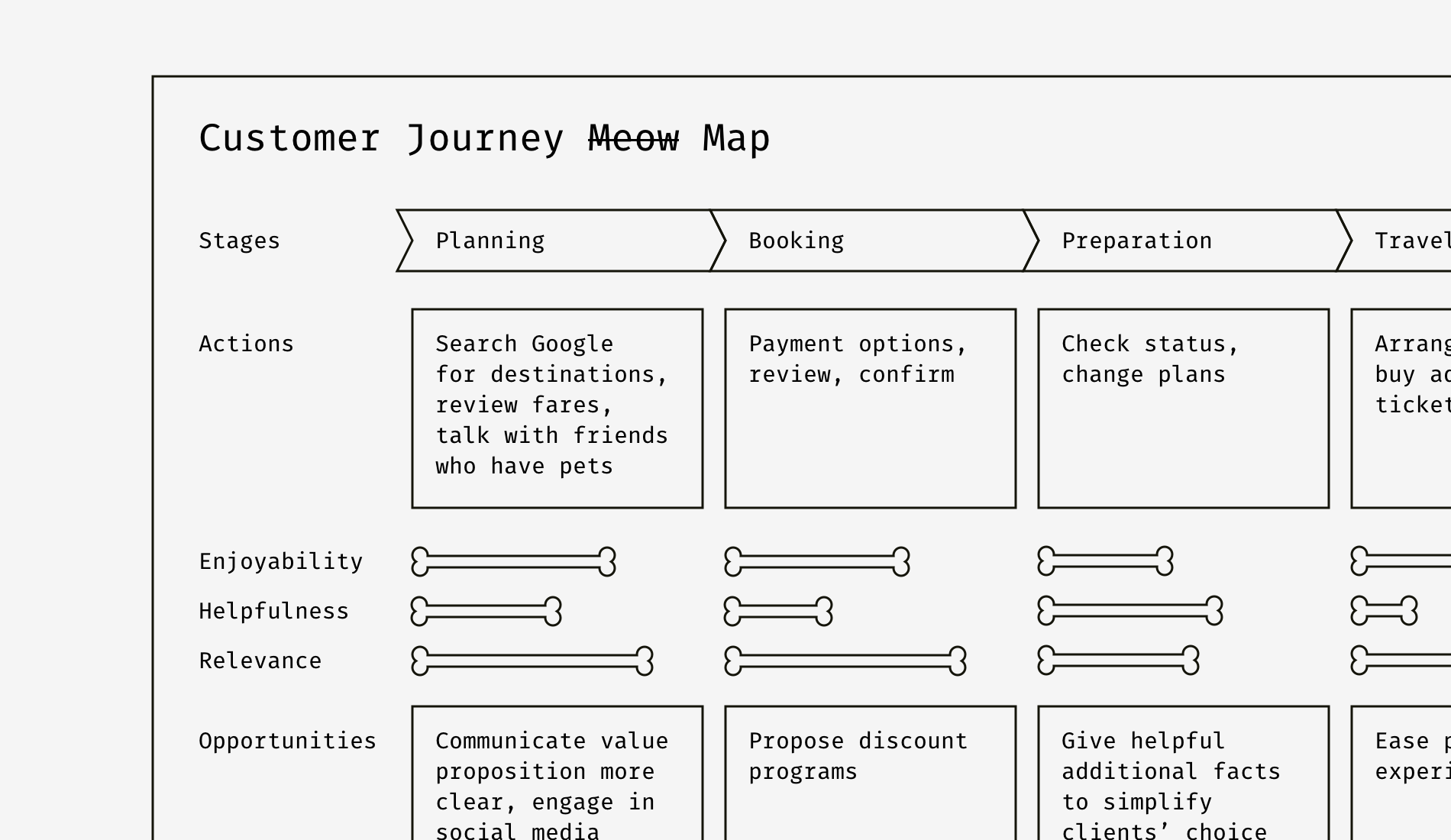
Something connected with pets, maybe a pet hotel, right? It’s a rough example of how details — in our case, bone-charts and “meow” — can demonstrate empathy and build the connection between a designer and the audience, especially from customer’s side.
Empathy is an essential designer’s skill, whereas other specialists who a designer works with aren’t supposed to be extremely empathetic. That’s why designers often need to help their teammates to feel empathy and care about users more. Compare the two user descriptions below.

For me, the left part is dull and hard to visualize. It’s focused on formal parameters, not a problem of a person. The right description is humane and more close to life. You can imagine this man and even speculate on what you would have felt if you had been in his shoes.
One more powerful trick is to use the photos of team activities — workshops, user testing, brainstorming sessions — in reports or presentations. It’ll show that everybody has contributed, and the solution is the result of analyzing a problem from multiple sides. Moreover, people often need a reminder where this design comes from.
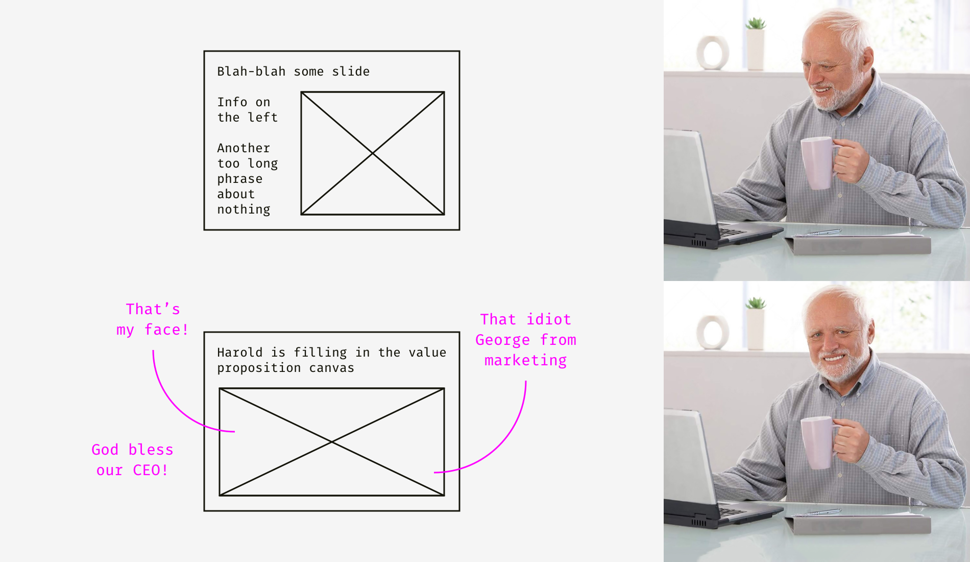
Photos aren’t a magic pill but a way to make documentation more appealing. I’m sure you know this pain when some guy says, “I reviewed the design yesterday, and… could you think on something more creative than this?” You are losing your religion and thinking, “Creative? F*ck this word! This design was tested with real end-users, approved by CEO, and now you want me to play with fonts and make the damn logo bigger?! Where is my chainsaw?”
Bad design documentation is useful because it leads to firing bad designers.
Feel free to get in touch elsewhere. I got cute pics on Dribbble, full-size projects on Behance and design presentations on SlideShare.
AI-driven updates, curated by humans and hand-edited for the Prototypr community


