Build Design Systems With Penpot Components
Jul 21, 2:15 AM
Penpot's new component system for building scalable design systems, emphasizing designer-developer collaboration.
smashingmagazine.com

medium bookmark / Raindrop.io |
As a digital designer I do a lot of research that directly (or indirectly) ties up with my profession. One part of this research includes scrolling through a lot of websites, looking and analysing stuff like typography, UI elements, content, animations, some UX solutions and so on. And all that with one simple goal — to become a better designer.

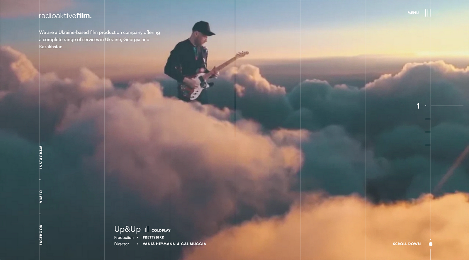
About 3 months ago I came across a pretty cool and innovative looking website (unfortunately I can’t remember which one anymore). It had great layout, good typography and some interesting UI solutions. But there was something that really caught my eye — gridlines.
Long story short, as the time passed by I began to notice that a bunch of new websites started to copy that style and and shortly after that, every third website that came up on Awwwards or other similar channels had those damn gridlines in it.

What bothers me most is that a lot of them had these gridlines without any special reason. They didn’t solve any problems, they didn’t align elements with them and in some cases they didn’t even represent the true grid of a website. They were just there because it’s a trend now.
Just to be clear, I’m not saying that gridlines are a bad thing or that digital designers shouldn’t use them in web design, but this trend became popular so fast, that I got really fed up with it. Now when I see a website that uses gridlines it brings out the same reaction like when I hear Despacito playing on radio — Please God, not this shit again.

I think that some designers nowadays do more copy/paste of some design elements without even thinking them through and asking themselves some important questions like:
And last, but not least:
My dear friend and mentor Mario Šestak has a saying, which I think really captures the essence of a problem that I’m trying to illustrate here:
“Don’t just blindly copy design elements, copy the principles.”
In addition, I’ll showcase some websites that use gridlines in their design here. Whether they’re good or bad, you decide and of course make sure you let me know what do you think about this trend in comments.
Cheers!


Write a response…
prototypr.io
AI-driven updates, curated by humans and hand-edited for the Prototypr community


