Build Design Systems With Penpot Components
Jul 21, 2:15 AM
Penpot's new component system for building scalable design systems, emphasizing designer-developer collaboration.
smashingmagazine.com

UX Planet — Medium | Matthew Talebi
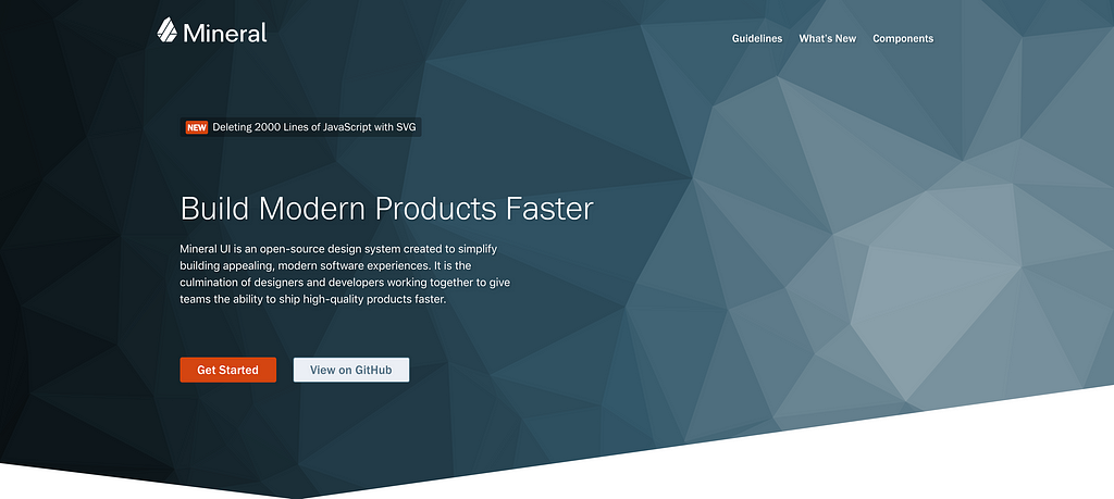
I am working with the CA Technologies Design Center team on Mineral UI, an open source design system aimed towards enterprise software. CA features multiple suites of software all at the enterprise level, some existing for many years. Our goal with the design system can be attributed to three simple design rules: Consistency, usability and accessibility.
Most of you are probably familiar with Sketch symbols. Symbols are reusable components that layer multiple design elements into a single object. These objects can have different variables to allow for state changes, content changes, or even responsiveness on a primitive level. Of course there are Sketch plugins such as launchpad that allows for advanced responsive design.
Plugins and dependencies other than the core software can get out of sync quickly especially with large teams. To make sure everyone is on the same version and everything syncs properly, we have to limit the number of plugins we use.
There are multiple design system paradigms out there, one of the most popular being atomic design. Atomic design goes by the principle of atoms which are basic HTML elements (such as input fields) that then come together to build molecules which can be input fields plus their labels and statuses, and later organisms which is a form field. It then grows from there into blocks, templates and so on.
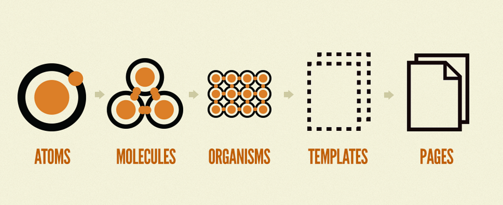 Atomic Design
With atomic design as your library grows larger it becomes a full-time job on it’s own to decide what level each element was at (if we were to be strict to the methodology of atomic design). We didn’t have the time and resources to spend on these decisions so we opted for a simpler solution.
Our symbol libraries goes with the simple model of:
You’re probably thinking what’s the difference, isn’t all of this just renamed? Not exactly. Atomic design takes a very scientific approach, for example, you cannot redefine an atom as a molecule. With our definitions, we can easily interchange these where it makes sense.
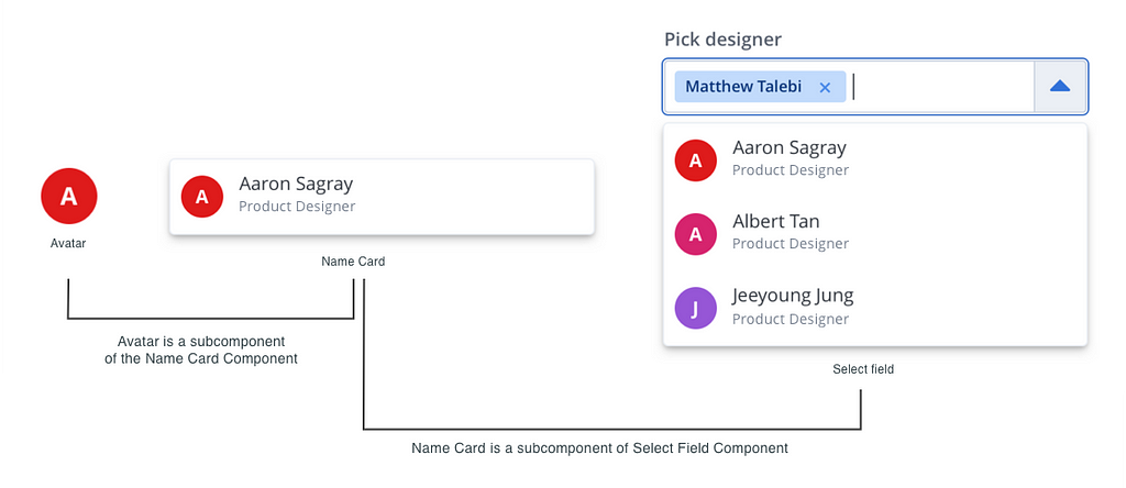
Using the example image given above, we would have to decide if “Avatar” is an atom, “name card” is a molecule, and does that make “Select field” an Organism? What about the full form interface, and the page interaction beyond that? Some companies that have used Atomic design add sub-atomic and other molecular levels to fix these issues. It all becomes convoluted very quickly and we found it much easier for our own sake and sanity to keep a loose definition.
Before we started templating we needed to create our theme colors and process. Thankfully our symbol libraries enabled us to do quick updates as our colors were changed with accessibility. Check out our color case study by Jeeyoung Jung.
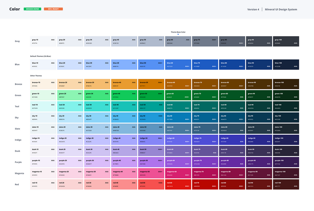 Mineral UI Color themes
We have eleven different theme colors to be used in Mineral UI products, excluding gray as that is our base colors that every theme uses for elements, text color etc. Each product uses one theme, so how do we build our symbol libraries to accommodate all these themes?
We have one central file that is purely for colors and typography setup. Here we have multiple canvases setup that enables users to set their theme colors:
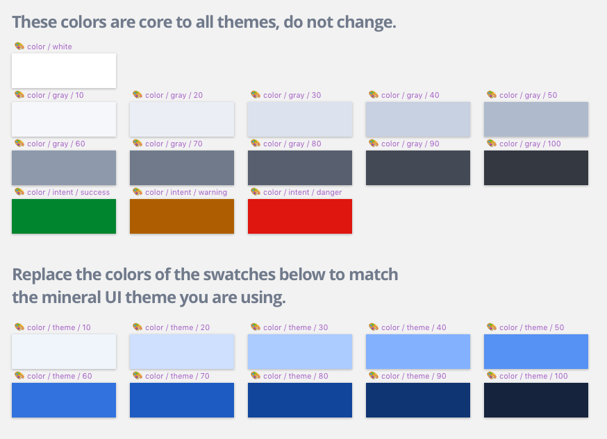
As mentioned above we have gray scale which is core to all themes, and there are actually three more colors which we consider as variant colors to show statuses and other alerts that may appear within the application. All of the layers within these canvases are locked to help remove error of accidentally editing them.
For each of the theme colors however, this is where some manual labor is required by the end user. There isn’t an option in Sketch for color theme management to quickly swap out a set of colors for another. Our users will need to color swap for the ten canvases required for their theme. Here we added for their convenience the color sheet to the right for quick reference.
We used the Sketch palette plugin which allows us to export each theme palette for our users to import. This is optional and helps save time for users that would like to import the palettes in our theme to be used across their documents.
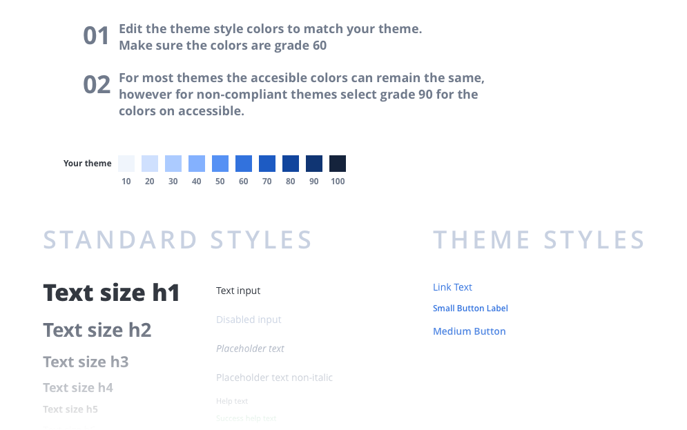
Our text styles are on a different page within the same document. Here the user also needs to replace the colors of the text styles that are under “Theme styles”
 Mineral UI text styles
Sketch doesn’t have a symbol library system for text layers, luckily we were able to find a plugin to export and import text styles. These are the only two plugins required for setup. I know I stated previously no plugins, however the two plugins we’ve used are purely for setup. We do not have any plugins required for actually using our library.
If you’re familiar with Sketch (or any design software) then you probably know about masks, framing some content inside another. Using masks we colored all of our icons and any other symbols that may need color to be used.
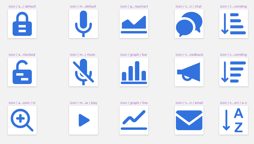 icons for Mineral UI by Sun Young Han
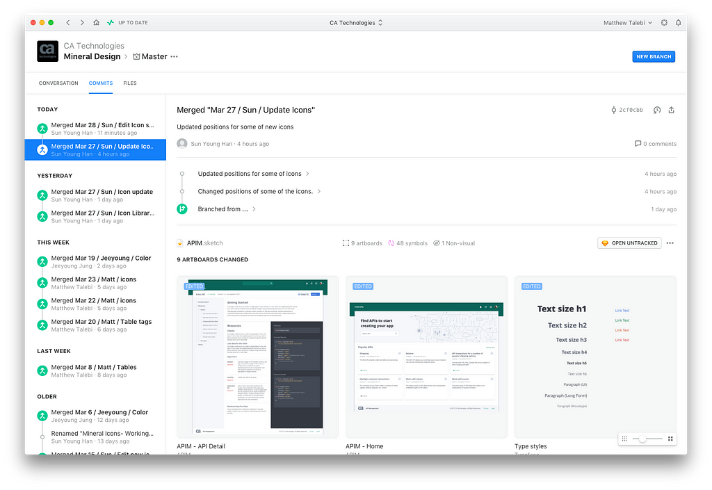
Our symbols are separated into multiple Sketch files all linked together by their symbols which has its pros and cons. The most obvious advantage is easy organization — other designers or team members that may be contributing may quickly know which files contain what symbols.
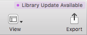
The downside? Anytime an update is made in one of these files, for example the core theme files, the end user needs to go through each and every file in the library and press this lovely “Library Updates Available” button.
At this time Sketch doesn’t have a method of asynchronously updating and saving each file as needed when you click update once. Depending on how symbol libraries are setup, there may be a logical file order the updates need to be applied in order to avoid repetition.
Some readers may be asking, why not just use a single file with multiple pages so there isn’t any of this hassle. The simple answer is, if you have hundreds of symbols and templates and as the library grows sketch itself cannot handle the load and may grow sluggish.
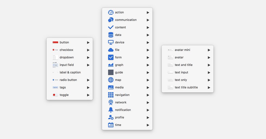
Organizing symbols in a large library can be tricky. The way Sketch works is this: If there are two symbols with the exact same canvas size, it will see them as related. If you have hundreds of symbols, some which should be the same size by normality, they need to actually be at minimum one pixel difference in size. Here’s an example:
The colors you may select for buttons and icons are different, perhaps you only have three colors for buttons and six colors for icons. Normally all that is needed is a 1×1 canvas that masks each item. If the color mask is 1×1 for both buttons and icons, then all colors from both are available to select from.
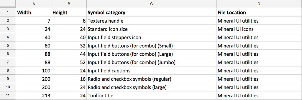
I needed a way to organize and find like symbols, so with the spreadsheet displayed below I created a simple list of every type of symbol, their sizes, and what file they may be found in. This allows me to quickly double check what symbols have the same size as I need and what file it may be found in.
This problem can also be somewhat alleviated by having different files for your symbols, if two do happen to be the same (and must be the same) then putting them in two different files can help with organization.
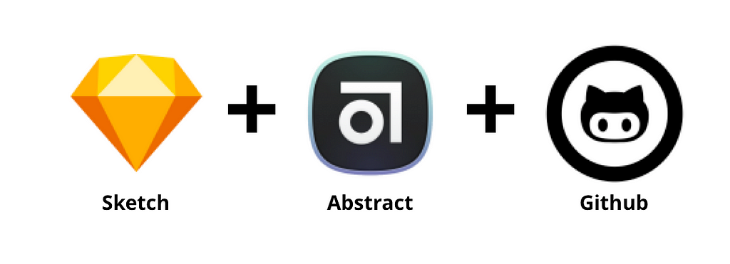
Now for the fun stuff, distribution of the libraries! Internally we use a software called Abstract which is very similar to github, but for Sketch files. This software is great for internal use, it is built for teams to collaborate and help reduce collisions in design changes and duplicate work. The problem is this software is built around the idea of a single team, not distribution. There isn’t a web interface or some other method to open-source and allow users to clone your project.
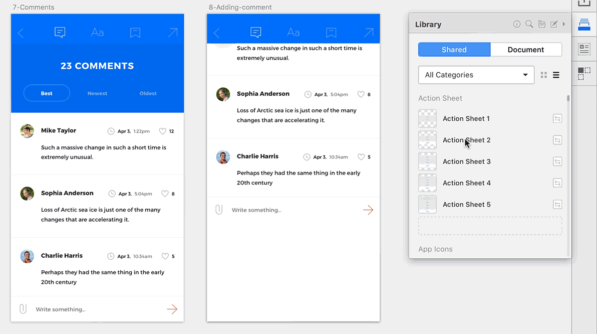 Credit: Invision Craft Library Sharing
We had tried out multiple plugins from InVision’s Craft Library to UXPin. Each one of them would have been perfect except for one universal issue: They all copy the symbol and all it’s elements into the users document. This meant that future updates to symbols would not sync with users integrating our library. Our only option left was to look into an option that shared synced Sketch files to link symbols directly from their source.
Cloud storage that can be shared publicly was definitely an option, however the possibility of syncing failures, or too many people connected to the same files causing slow downs was a problem. We also needed a versioning system for backup, albeit dropbox does have a simple versioning system, it wasn’t suitable to our needs.
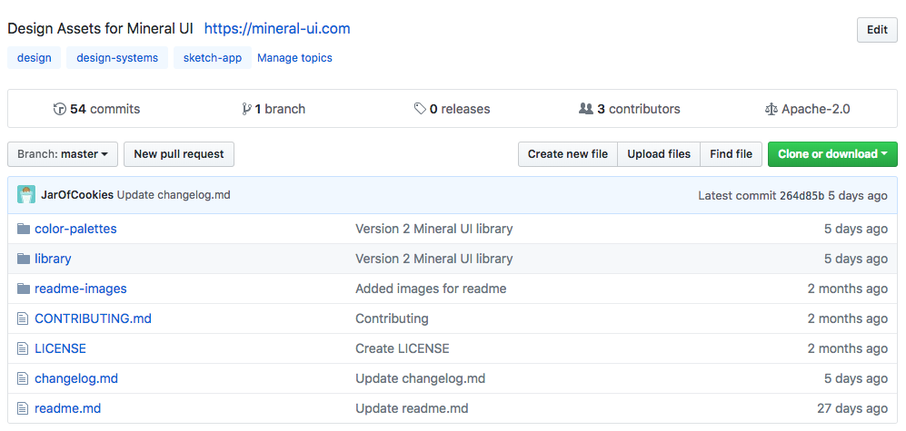
Naturally the only other option similar to what we have using Abstract is github. We wanted to explore other options to make it less technical for our users, but at this time it’s not possible. Github will also enable our users to file issues that may be present in the symbol library, or request new symbols. Although github is great to use with developers, there are definitely drawbacks for a design system libraries.
 Our newfound workflow
Now that we have our work flow, let’s recap quickly. Sketch and Abstract are great for using on teams internally. Github currently is the only liable option at the moment for releasing design systems, but what are the drawbacks?
Anytime we release, because there is no way to modularize the colors or text styles, our users will need to update every file with their theme settings again. Due to this factor we try to do a release only once a month to remove this hurdle as much as possible from our users.
As mentioned CA Technology has different suites of products. if one suite has three different software, each one may use a different color theme from Mineral UI. At this time there isn’t any way to select a theme for each product using the same library of symbols. We are still exploring ways to allow for a user to have two or more separate Mineral UI libraries in Sketch and to switch between them depending on which product they are working on.
Our only suggestion at this point is for users to make two clones of the Mineral UI repository and organize their Sketch libraries the way they see fit. One other option although not ideal, is simply swap out the colors each time a new product is being worked on.
The future of sharing open source Sketch libraries and being able to keep everyone up to date isn’t all too bleak. One of our colleagues Kyle Gach during their hackathon decided to look more into this issue, and found a solution that with further development could be plausible.
This seems like a great way to bring developers and designers to have closer collaboration with each other. Until we can have constraints, sub-symbols and other Sketch specific features translated from the code, this feature is not quite there for complex symbol systems we need. Sketch has recently started exporting to JSON, so perhaps this future is not so far off.
If you have insight into better managing and distributing design systems, let us know as we are always open to suggestions and collaborations!
Don’t forget to follow me on Twitter @oneuxdesigner and check out the slides for my presentation on this topic.
Distributing scalable Sketch libraries was originally published in UX Planet on Medium, where people are continuing the conversation by highlighting and responding to this story.
AI-driven updates, curated by humans and hand-edited for the Prototypr community


