
Build Design Systems With Penpot Components
Jul 21, 2:15 AM
Penpot's new component system for building scalable design systems, emphasizing designer-developer collaboration.
smashingmagazine.com

medium bookmark / Raindrop.io |
UX and Design Leader – King of Cardio – Curious — zackux.com — Madison, Wisconsin.
Aug 16
It’s no secret that designers have been painting user interfaces with light-colored, eye-straining palettes in attempt to look modern and fresh. But has anyone stopped and wondered: does this color palette support the people’s experience, match the personas, and support the environment people are using the app in?
Does your color palette support the user experience in environments where people commonly use your app?
If you’re not one to read introductions and stories, skip down to the tips section.
Last week, Atlassian released a vibrant new UI and brand style. Atlasssian and its product—Confluence—is now painted with a vibrant color palette and the text is displayed in the Spotify and Airbnb font — Circular.
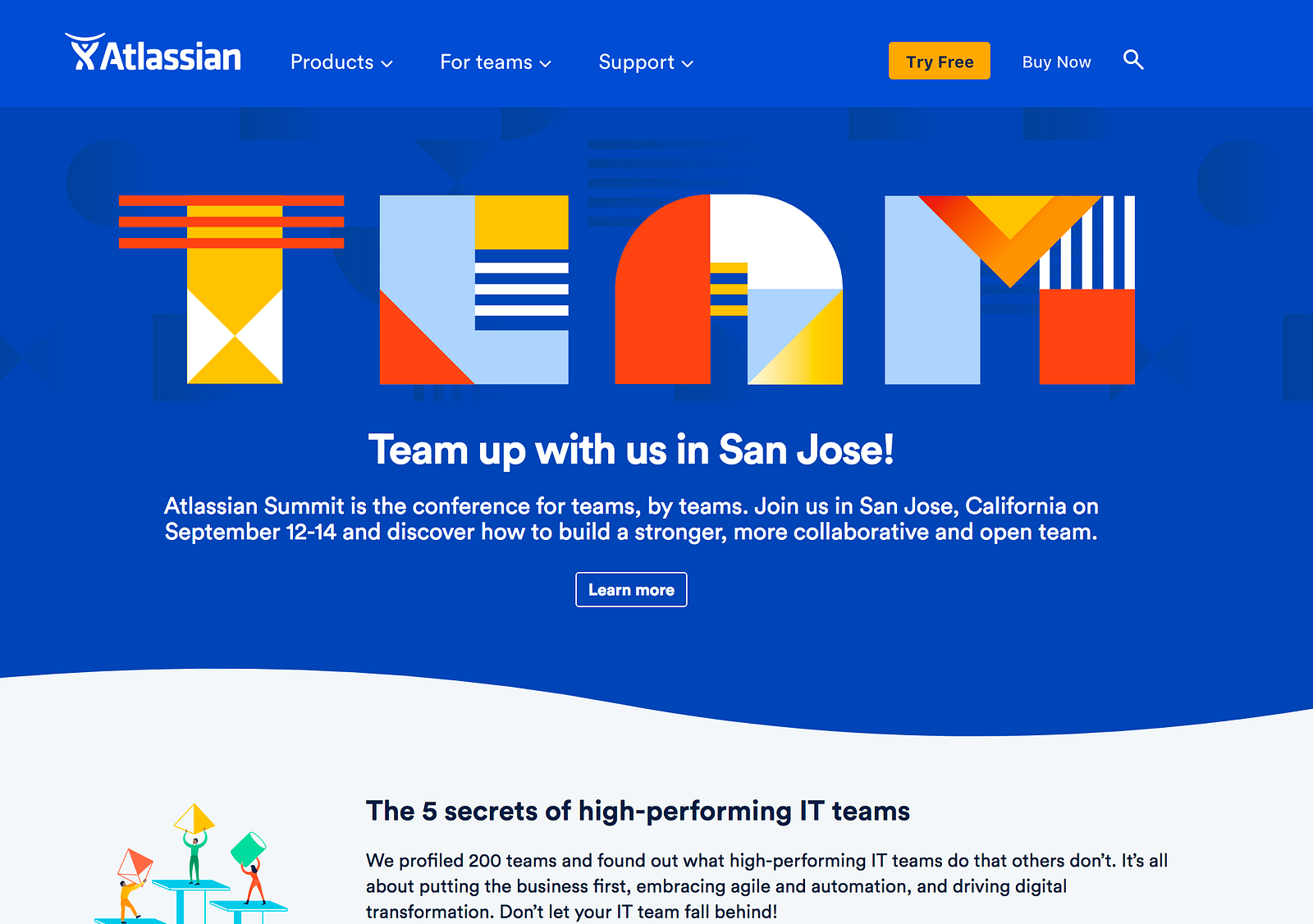
Bright and vibrant. Screams artsy, native, geometric. But is it a fit for developers?
It’s clear as day that the design team has followed the Spotify design system approach, which isn’t wrong to do, but also doesn’t mean it’s the right thing to do. In this case, it’s like a jock dressing up as a nerd and a nerd dressing up as a jock. I’m sorry for referencing stereotypes, but seriously. This isn’t halloween—right?
A developer from across the office unleashed his feedback on Slack…

From excited to…
The colors are too bright for my tired eyes.
Let’s not strain peoples eyes, let’s not contribute to daily stressors, let’s not make people feel uncomfortable.
Let’s start giving color the time it deserves. Let’s give the design process enough time in order to cultivate a natural, consistent palette—through trial and error—that helps bring people together, helps people utilize our apps, and helps make people feel great using our apps.
Last week, I had a conversation with a user experience leader. I told him the story of how I created a color palette derived from a primary blue base— astonishing I know— and what I found most important was stress testing the palette in environments the app was used in, in order to validate the color palette’s usability and emotional appeal.
Here’s what he had to say.
“Several years ago, we hired an agency to update our software design. The agency came back with an amazing dark theme similar to Spotify. Everyone on the team was excited: it felt very strong, fresh, and familiar, perfect for our users. The company celebrated the release of the user interface update and our customers were very happy—until the one phone call came in. On the line a client said…
“Hey, your new color theme is really slick… but… have you tried using it outside?”

Airballs are funny, disappointing, and never productive.
The construction software has a few user environments: office building, outside at a construction zone, and in a vehicle. The lack of testing the color palette outside of a building led to an poor experience. The product was completely unusable in the environment this user needed it the most. Major airball.
The team pivoted and pulled the release. Needless to say, this was an expensive mistake that could have been avoided with environment tests.
WCAG 2.0 is here to help us designers create the best experiences possible. Let’s stop ignoring these standards that the wise, empathetic leaders have invested their lives in creating. This contrast checker makes it quick and easy to validate your typography color choices. If they don’t pass, iterate for the sake of your people!
You now have a playground.

Trial and error — especially when finding colors that mean WCAG 2.0 specifications. This takes time and patience my friends.
Booyah! You have your first version of your color palette.
This will take you a lot of time. When I created a color palette for Widen Enterprises, I spent 40 hours creating, testing, and iterating. The end result matched our north star, targeted emotions, and accessibility standards. How valuable is that? How awesome is that? Our people may not notice at first, but they would if it was wrong.
No more color picker guess-a-thons, just straight up consistency.
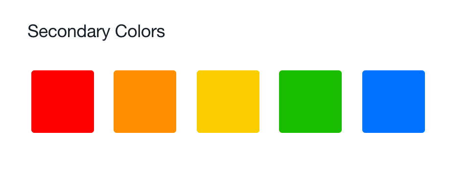
Seriously, it’s that easy. Here’s an example of a color palette I created for a family of applications by using Colllor.

All colors originate from the primary blue.
From here, I used the primary blue to create a family of complimentary-hybrid colors. To do this use tools like Adobe Color; and while this is not perfect—there is much trial and error—it will set you eons ahead.
Ta-da! Almost a rainbow—and almost perfectly unified.
This is one of the most important steps in the design process. Identify the environments your people are using your application in. Following the human environment design process will help you understand which environments are necessary.
The environment test is simple. Take your device(s) outside in daylight, in a dark room, or wherever your people use your app and test it for yourself!
If something isn’t working. Iterate!
Iterations—all of the possibilities. Look different.
While many of us are fortunate enough to work on the best technology, most of the world is not. It’s so easy for to grow accustomed to retina and or 5k displays. Let’s take a step back, pull out a windows laptop— cringeworthy I know—and low-quality monitor; you might be surprised by what you see.

These don’t exist anymore… Right?
A good way to identify machines and displays to test on is by pulling data from Google Analytics or the analytics tool you have access to.


Before and after.
Give color the time it desperately deserves. Give your people comfortable, fitting, and enjoyable apps to bring into their lives. What do you have to lose?
Have you created a color palette before? If so, I’d love to hear from you—perhaps you can help grow this article with a new tip. Leave your thoughts in the feedback section; or you can engage with me directly on Twitter and Linkedin.
If you enjoyed this piece please ❤️ or 👏🏽 to help others find this information. Thanks!
This article is brought to you by RUXERS. RUXERS is a community of real user experience leaders sharing and discussing the latest in design, user experience, usability, and research. We’re on Twitter — join us!
AI-driven updates, curated by humans and hand-edited for the Prototypr community


