Build Design Systems With Penpot Components
Jul 21, 2:15 AM
Penpot's new component system for building scalable design systems, emphasizing designer-developer collaboration.
smashingmagazine.com

medium bookmark / Raindrop.io |
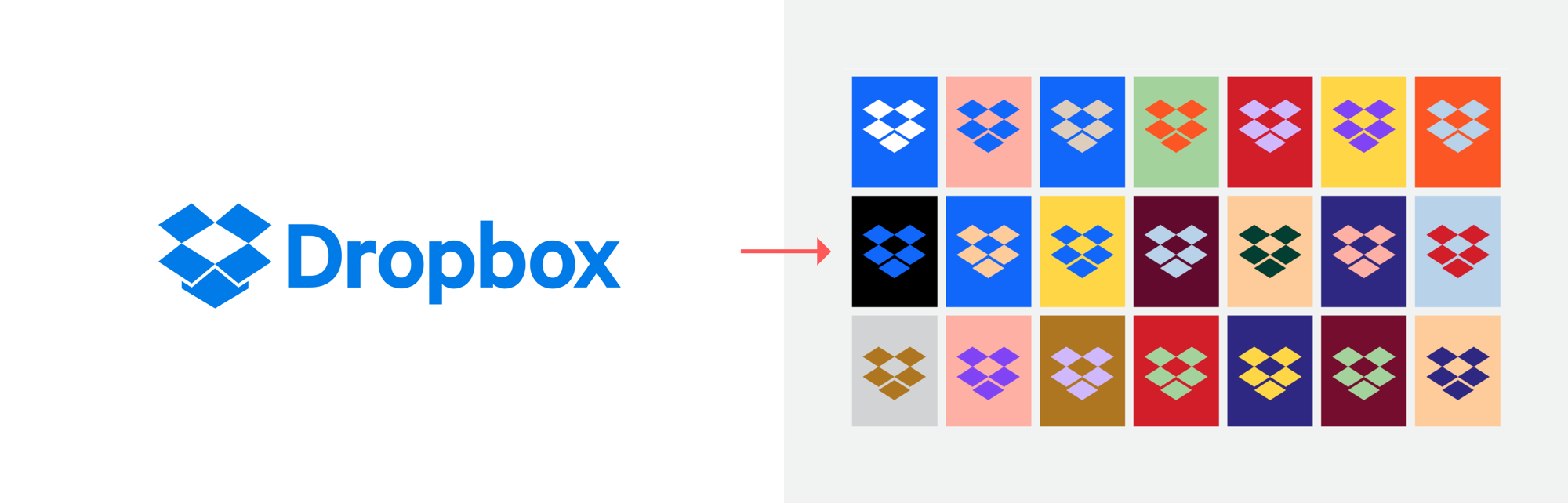
I’m no scientist, but I’d hypothesize that a vast majority of designers hated Dropbox’s rebrand in the first several weeks. (and maybe for several weeks after)
To be fair, I can understand the reaction. The colors and fonts are…well…ugly. Sure, they check off a lot of stereotypical rebrand boxes:
Bold? Yes.
Unique? Yes.
Memorable? Yes.
Visually competent? Debatable ;).
But a visceral reaction to product design is not that important when judging its effectiveness. (Just for fun, if you want to see what it’s like for designers’ heads to explode, read the reactions here). Instead, a digital product brand (like any brand) should be judged on how well it serves the stated business goals.
On the outside, it is a challenge to judge the effectiveness of a re-brand because it takes time to measure the results, but most of all, you can’t truly know what the brand’s goals are from the outside.
Since we cannot fast-forward in time, and most of us weren’t involved in the rebrand, how can we know whether it was successful? Luckily, the Dropbox design team was open about why they did it:
“Our new brand system shows that Dropbox isn’t just a place to store your files — it’s a living workspace that brings teams and ideas together.”
There you have it. The goal of Dropbox’s rebrand was to help them not only shed their file storage association, but to make an entrance into the world of digital creative workspaces.
Now, the cynic in you is probably thinking something like, “Oh, it’s so easy to apply rationale retroactively. This was just a creative team going wild and applying their own spin after the fact.” Sure, their creative team absolutely went wild, but Dropbox has been hinting at this for the past two years. In their post announcing that they had shut down Mailbox and Carousel in 2015, Drew Houston and Arash Ferdowski wrote:
“Over the past few months, we’ve worked on our team’s focus on collaboration and simplifying the way people work together. In light of that, we have made the difficult decision to shut down Carousel and Mailbox.”
Dropbox killed two products that were absolute darlings in the design community and they got raked through the coals for it. But this rebrand is a strong sign that they not only did not forget about the collaborative design community, they seek to lead it in a new direction. So how can we tell if Dropbox’s rebrand will be a success? Three factors indicate a strong path to success — and none of them have anything to do with visual design:
When rebranding digital products, it’s smart to minimize the impact on existing customers since their relationship is built within the product itself (and not exclusively with the product brand). In fact, taking a rebrand too far down into the product itself can cause a lot of confusion with users. Dropbox’s new brand manifests more so in the new products they are adding for existing users rather than the product website.
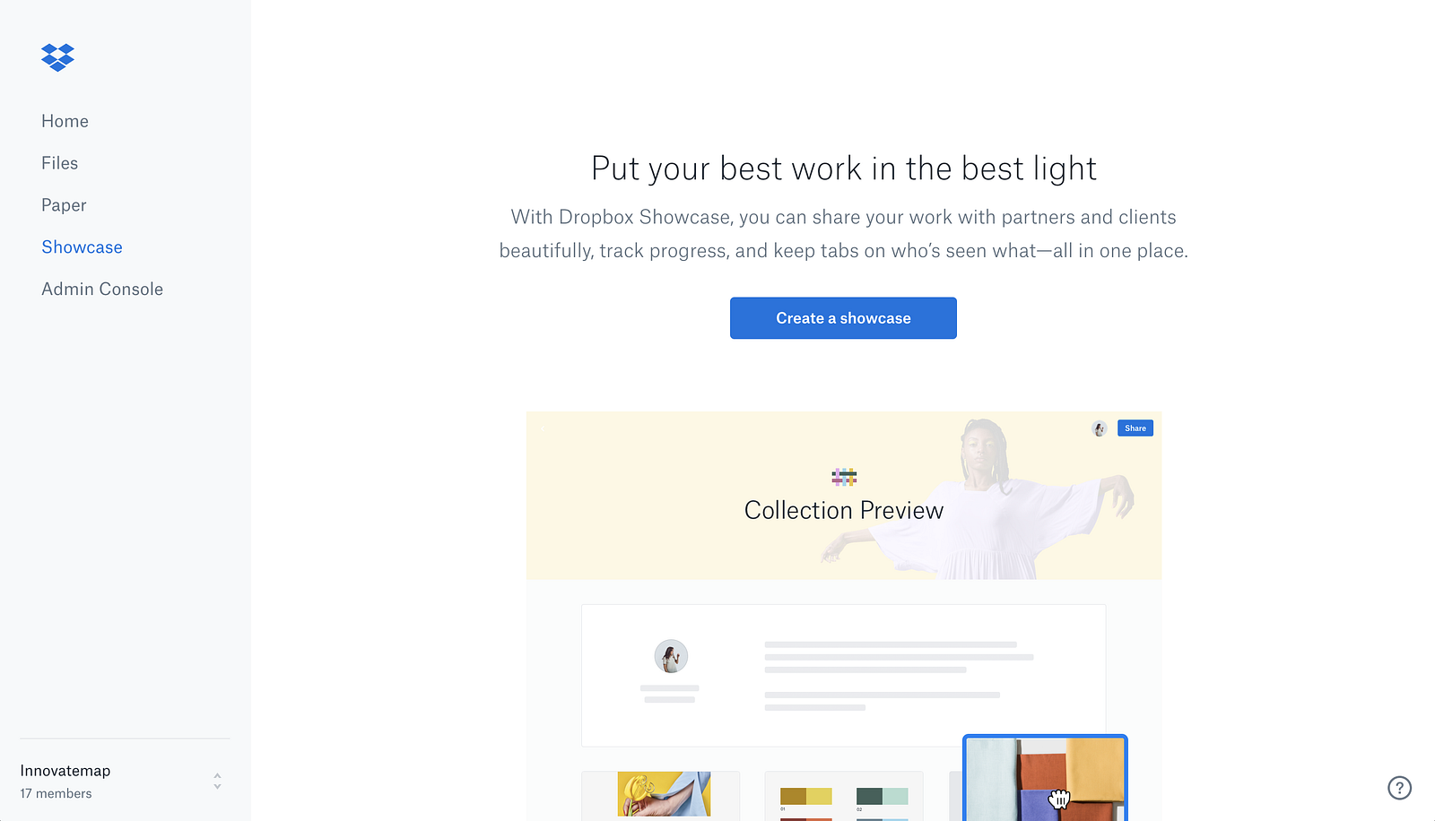
The only hint of the rebrand in the app itself comes through in the in-app product marketing while the UI itself stays true to form:
Dropbox announced their rebrand using a new URL:https://dropbox.design rather than on dropbox.com. This intentionally connects with the exact type of audience the rebrand is geared toward. Dropbox wants to be seen in a new way; one that shows they can fully handle the creative and collaborative needs of those who design or interact with designers. This is a smart move when you consider how design and design thinking have quickly become table stakes for all digital companies. Five years ago, the focus on design felt niche; today it is pervasive.
Back in 2009, Steve Jobs called Dropbox a feature and not a product. He was most certainly correct, but they’ve been on a mission to figure out how to prove him wrong ever since. Their product innovations through Paper and Showcase have started to reveal Dropbox’s inner product-ness. Look at the vanilla messaging before (left) compared to today’s strategic messaging (right):
Previously Dropbox spoke to security, IT, and file storage (snooze)— things that have since been commoditized. Today, it speaks to creative energy and reducing busywork — with a strong visual brand to support it.
Whether you are a fan of the redesign or not, there’s no doubt that it delivers on its goals and creates a new relationship between Dropbox and future customers. Most importantly, it gives Dropbox — the product — a platform upon which to grow, and leaves Dropbox — the feature — behind. The true test of whether it’s successful can only be judged with time. Based on how well it’s aligned with stated business objectives, and coordinated with strong product messaging, this brand is setup to succeed.
When I’m not judging rebrand efforts from my couch, I’m the Executive Design Partner for Innovatemap. Or I’m busy editing and writing about product management, marketing and design at https://current.innovatemap.com
AI-driven updates, curated by humans and hand-edited for the Prototypr community


