Build Design Systems With Penpot Components
Jul 21, 2:15 AM
Penpot's new component system for building scalable design systems, emphasizing designer-developer collaboration.
smashingmagazine.com

Design + Sketch App — Medium | Bunin
Last week we added a small but very interesting symbol to the component list we would like to share with you. Material — is a primary building block for design libraries in sketch app, that can store and share same universal rules across the design system components.
 Download freebie file — https://goo.gl/GxBZWr
Back when i started this run, the idea was to just add a shadow overrides into every Frames DS component, so i can quickly swap between different shadow states.
The only way to have a swappable shadow it’s to nest a shadow symbol instance within a symbol bottom. But, alongside with shadow there could be much more different instances already nested within the symbol (shape, state, icons, etc), this will lead to a messy = inconsistent symbol structure we probably don’t want to have and share.
 “When you can’t come up with emoji for each override line. “
So what if we have a single basement for every component through the design system, which can contain an auto-updatable background and elevation properties? So we no need to look up for the right drop-down, instead, we can have all visuals options always in one place.
To create this feels of depth within the interactions a shadow/box-shadow properties are commonly used, allowing to visually indicate the distance between UI objects and the surface. For a design system, such Frames is, it was advantageous to have a common set of shadow properties alongside with brand colors, for a consistent approach to building interface states.
Material Design has done a great job in this direction, so we can take the best out of it guides and apply it to the practice on working with nested symbols. Making it possible for a designer to do quickly swap different z-index levels, customize color fill and contour shape, just like this:
 A perfect basement for nested symbols (buttons, cards, forms etc.)
This symbol serves as a bottom layer for every UI element that will propagate same rules through the documents and projects. Materials are built using 3 main override properties: Border, Fill and Elevation, which are available for various manipulations and combinations.
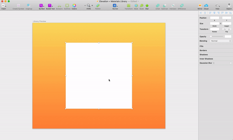
For each elevation option, we have a symbol with a shadow depth property from 0 to 6 DP (layer elevation is commonly measured in DP — Device-independent pixels) to indicate the pixel density of the shadow.
Note! Sketch have an issue on shadows & symbols, for some reason if you increase shadow distance up to 10–16 DP’s, the shadow visuals will get cut by an invisible mask. Which looks not that well — https://goo.gl/GupMEf. Hope we can get a fix for this in nearest time.🤞
The Elevation property can appear on any UI object, this means we need the shadow appear in different forms to match the shape of the object in which it is included.
 Note: that each layer type should be nested into its parent symbol.
Tip: All groups should have different artboard sizes to not overload the overrides menu.
Use 3 or more layer types, of same artboard size but different radius properties, such as, 00 pt, 04 pt, 100 pt to create various shape instances. We also put Border and Fill properties folders to stay nested above the elevation symbol, and form a background and a contour color.
Trick! 👀
To make this symbol really neat you can use a combined shape to form the Border (which will still have a Fill color override). And don’t forget to snap the inner container to pin to all edges on resizing.
This approach will not only grant a more consistent Color usage through the document but also will save your library from the unnecessary color symbol duplication. 👌
 Scale the number of Fill styles to meet an infinite number of border/background combinations.
Using Materials for building and scaling design systems can grant you the following perks:
 Touch 👆 to Download
Here you can find a .sketch file containing Material symbol library, use it to implement universal elevation rules through your components/sketch libraries or just experiment with shadows and style, the installation process is simple:
Have fun adding your own styles and using this tiny library to quickly come up with visual ideas for new design projects.
Beside the Material, we have added more contents in the latest version of Frames Design System. More components, icons, sketch 48 support, and 14 more prototyping layouts including Pricing Tables, Dashboards, and Team cards, as well as some changes and bug fixes.
You can see the full list of changes and get your license in case you need a trustworthy companion for your product design duties, here you can get one👇
Frames for Sketch – Web Design System
Thanks for an amazingly great year.
🎄
Elevation and shadow symbols in sketch was originally published in Design + Sketch on Medium, where people are continuing the conversation by highlighting and responding to this story.
AI-driven updates, curated by humans and hand-edited for the Prototypr community


