Build Design Systems With Penpot Components
Jul 21, 2:15 AM
Penpot's new component system for building scalable design systems, emphasizing designer-developer collaboration.
smashingmagazine.com

medium bookmark / Raindrop.io |
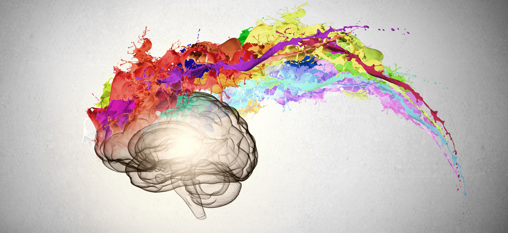
Image Source: Digital Health Age
In a previous article, I wrote about how our working memory has a storage capacity of ~4. For us designers, it means that we need to design our products so that our users’ ~4 spots are dedicated to accomplishing their goals instead of focusing on our designs.
Now, to add another wrench into the mix, those ~4 working memory spots can actually increase or decrease depending on our users’ emotional states, and our designs can have a direct impact on these emotions.
Have you ever gotten really nervous or anxious during an interview or a test that you didn’t do nearly as well as you could’ve? If so, then you’ve experienced how emotions can limit our working memory.
When we’re nervous or anxious, parts of our working memory are preoccupied by our awareness of our fears and worries, leaving us with less working memory to process the task at hand, such as an interview or a test. Also, when we’re nervous, our levels of dopamine and serotonin (the neurotransmitters controlling our happiness in our brains) decrease, shrinking the capacity of our working memory. Either way, negative emotions constrict our working memory.
The opposite is also true for when we’re happy: our working memory capacity increases because our brains aren’t preoccupied with negative thoughts and additionally serotonin and dopamine flow freely in our brains, further expanding our working memory.
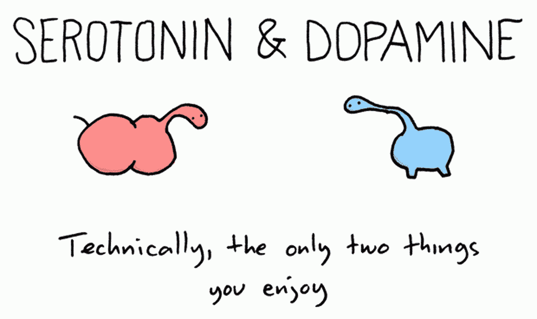
Image source: Nootriment
Users were given two interfaces to test:
Guess which interface performed better? Interface A! But why would a suboptimal interface perform better?
Physiologically speaking, when something is attractive, it puts us in a good mood, our brain is flooded with serotonin and dopamine, and that increases our working memory. With an increase of working memory, we’re able to process more information, be more creative with problem solving, see more associations, and can work through confusion more effectively.
A self fulfilling prophecy, this is called the aesthetic usability effect. Even when something isn’t easy to use but we perceive it as easy, then it’ll actually be easy because our brain is in a good state of mind (punny =P) and is more willing to muddle through the confusion.
Serotonin and dopamine are the key to increasing our working memory. Clean and attractive interfaces help with that. So does casual language that’s familiar and easily understood — less confusion helps put our minds at ease.
Some companies like MailChimp have taken it even further by showing their quirkier and funnier side. Their chimp ambassador cracks jokes and tells stories, always trying to make his user laugh. What better way to really stimulate those neurotransmitters than a good laugh?
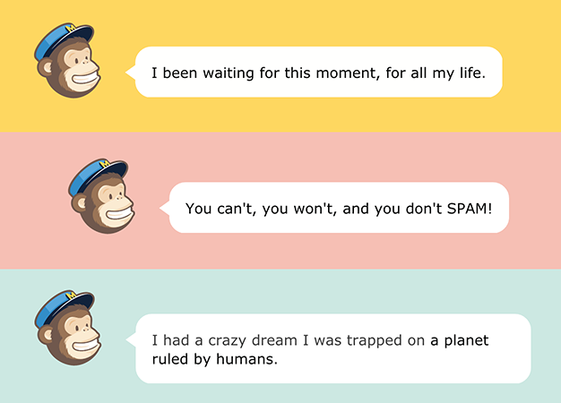
Image source: Adam Procter
1) Design to increase “happy” neurotransmitters. For most of us designers, we know this already: design products that are easy to understand, that are visually clean and attractive. Use copy that’s conversational because it’s easier to grasp and causes less confusion. This is all “common sense” but now you understand at the neurological level!
If you really want to overachieve, how can you incorporate emotional design into your product? The theory is, if your product is relatable, it builds a rapport and trust. Your users feel “safe” using your product, which would help move those “happy” neurotransmitters along and increase that working memory. I wrote more about that here.
2) Be aware of our users’ emotional states when they’re using our products. Our users aren’t using our products in a vacuum. External and internal factors are always influencing their emotions, and we should be mindful of when our users are stressed or in anxiety-inducing environments when their working memory capacity could be reduced.
In the previous article, I briefly wrote about working memory while using Google Maps. Though working memory has ~4 spots, those ~4 aren’t completely allotted for the screen. External environmental factors such as traffic, pedestrians, cyclers are all vying for those ~4 spots. Doing some fuzzy math, let’s say working memory now has only ~3 spots for the screen.
Now let’s say you’re driving in a new city with traffic patterns you’re not familiar with. You’re also running late. Internally, you’re stressed, and that stress is decreasing your dopamine and serotonin levels, further decreasing your working memory to ~2.
If you were designing Maps, you’d have to account for this severely limited working memory. Is the app visually appealing, helping with the flow of serotonin and dopamine to potentially increase working memory back to ~3? Or is the app difficult to understand, causing further frustration, and bringing that working memory down to ~1?
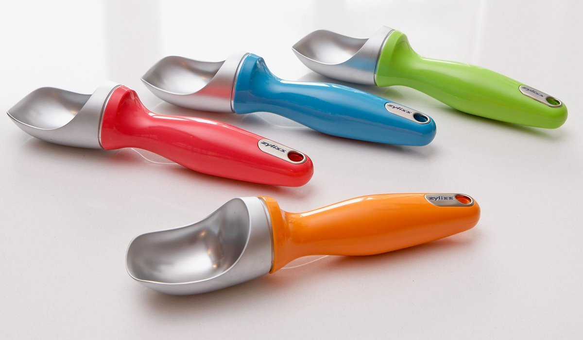
I once was visiting a friend at IDEO who was telling me that one of IDEO’s philosophies is to design for the extremes. If you’re designing an ice cream scooper, design for the kids as well as the 80 year olds since they’re the ones who traditionally have difficulties holding scoopers. Because if these extremes can handle your new product, then the middle of your target users will be able to as well.
At the time, I took this comment to mean designing for the extreme “physical” attributes — extreme ages, color blindness, people who are highly proficient or remedial at using technology. I’ve now come to also think we need to make sure we’re designing for the extreme emotional states. If a person under the most tenuous experiences can make sense of your product and easily accomplish their goals, then anyone else would be able to as well.
AI-driven updates, curated by humans and hand-edited for the Prototypr community


