Build Design Systems With Penpot Components
Jul 21, 2:15 AM
Penpot's new component system for building scalable design systems, emphasizing designer-developer collaboration.
smashingmagazine.com

medium bookmark / Raindrop.io |
Senior Designer at PaperTiger, USA
Feb 12

One of the main concern for designers during the making of an adaptive or responsive UI is text management. The vast majority of the components built on a system are made using text elements.
The same components should be designed, adapted, and tested to live in a diversified cluster of screens and scenarios, while offering their best in terms of usability, readability, and style.
If you’d like to get rid of all the headaches that are caused by the myriad of independent, and unrelated text styles that have to be maintained on a per-project basis, Text is the right place to start.
That’s all possible thanks to the power of Figma’s Components. Which provides designers a tool to reach a new level of abstraction by lowering the unnecessary complexity of your design system files.
Components and Overrides in Figma are so powerful that they require you to adopt a slimmer and better mindset on how you organize your work. If you follow the Atomic Design methodology, Components in Figma will let you drastically reduce the amount of symbols needed to fulfill the task.
If you don’t know much about Components, I strongly recommend to take a look at this series of free tutorials and this article.
In some aspects the technique is very similar to what CSS and fluid typography can achieve on the web nowadays.
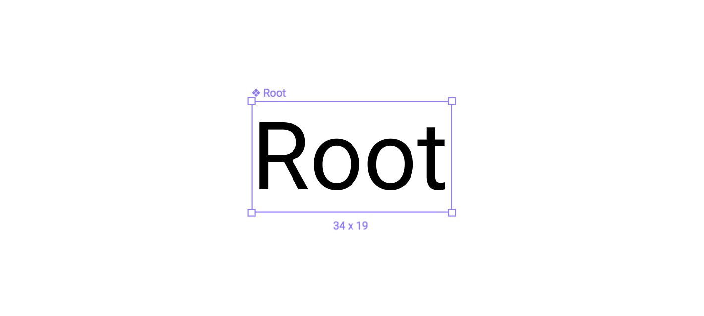
So let’s start by creating a new Text Layer Component which will act as our main Root Unit, where all other text layers are going to be linked. I picked a base of 16px / 120%.
Components generated from a Text Layer
Two small requirements:

Component’s Layer Naming
An effective typographical system is composed by interconnected elements which relates one to each other by following rules of visual proportions, contrast, and rhythm. It acts as a key element to improve consistency on our interfaces, and creates a hierarchy in which the content is laid-out.
By using a modular scale tool, like modularscale.com, we can quickly generate a series of value to fed Figma’s Layers with. In our case I chose 16px as Base Unit and 1.5 as ratio (So sorry Golden Ratio lovers…)
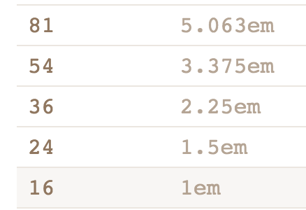
Some values from modularscale.com
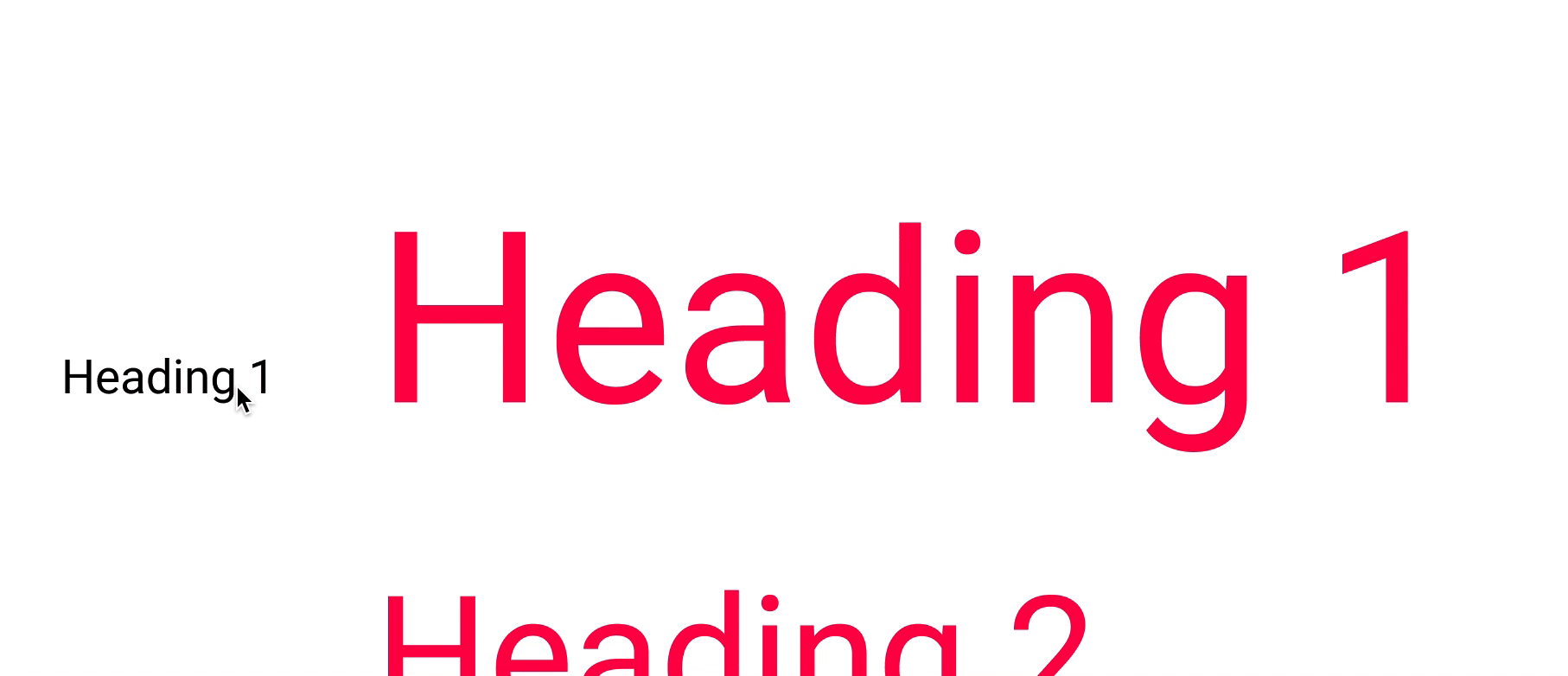
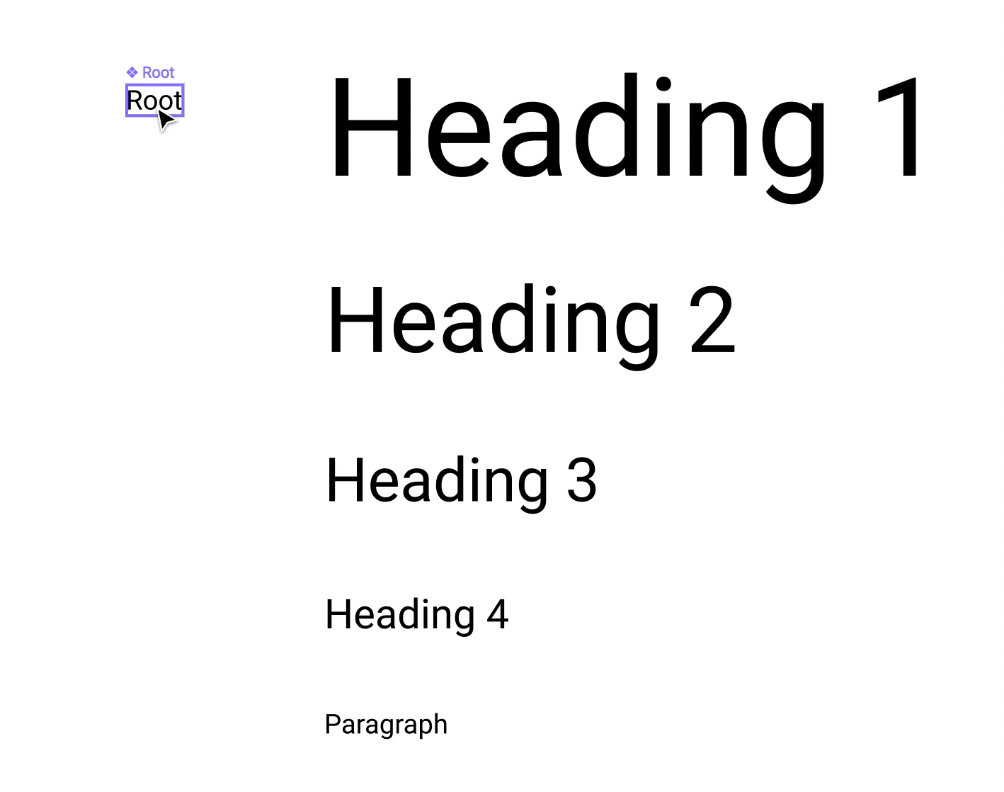
Now use those values to create some basic text layers and set the color to a bright red and finally group them. To keep things simple enough I’ve picked 4 sizes for the heading and one for the body text.
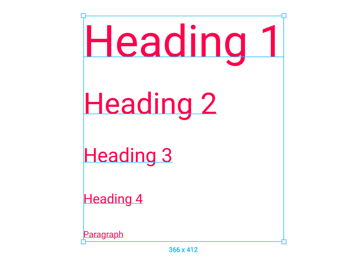
Set of standards text layers
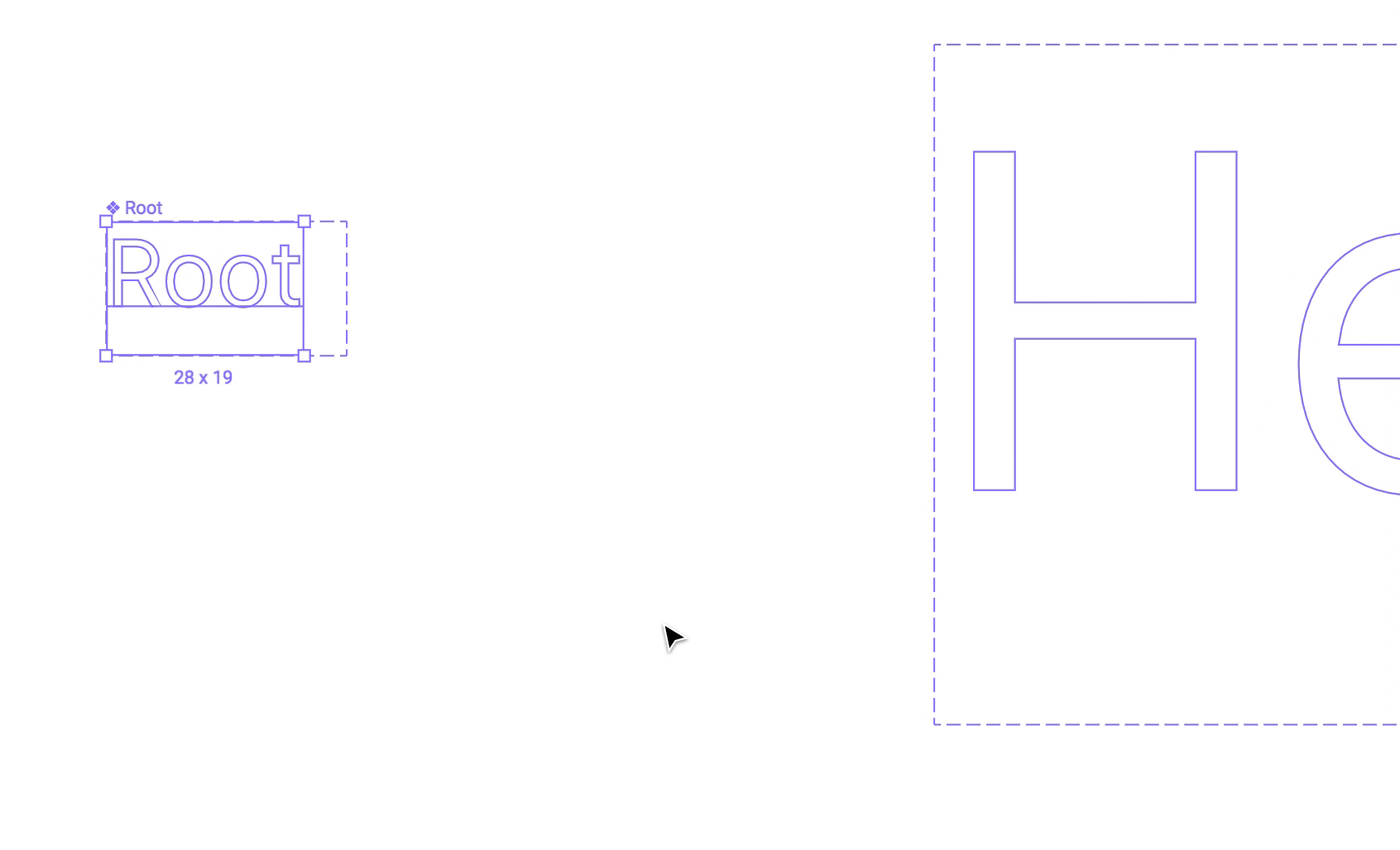
After that, we can generate the Instances starting from the Root Component. Just drag and drop while holding the option/alt key, then some Text and Frame adjustments as showed.

Generating instances from the Root Component
Here’s the tricky part… now we need to adapt and resize the instances to match the text layers made earlier…
BUT…we’re not going to set the font-size via the properties panel, instead we’ll use the Scale Tool (K).

Scale Tool…yeah…right!?
The best part about the Scale Tool in Figma is its ability to scale all the properties like strokes, constrains, and sizes proportionally, while keeping the instance/layer fully editable.
So…time for some scaling!
Note: If we had picked the size via the Properties panel, that would have triggered an Override and set a non-scalable behavior for the instance.
Note 2: The resulting font-size might contain some floating point values, don’t panic, it can be considered normal, especially when using this type of fluid approach. i.e. calc() generated css
Just repeat Step 3 for all of your instances and you’re done!
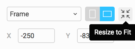
Now since everything is connected to the Root Component, any change you apply — size, style, color etc — will be reflected to its instances as well.
Important: each time you change the size of Root Component, make sure to click on Resize to Fit on the Properties Panel, as showed on Step 1 and on this snazzy gif showcasing the Outline Mode (⌘ + Y).
Thanks to Figma’s components flexibility, you can completely change the styles of those instances… edit things like the font-family, line-height, vertical alignment, color, spacing, and lots more while keeping the ability to scale them dynamically from the root. In fact, changes are stored as Instance Overrides.
⚠️ A rule of thumb…. if you change the Instance’s font-size manually via the Properties Panel, the dynamic resize through the Root Parent will stop working for that instance.You’re basically asking Figma to set a fixed size for that text object.
In some occasions this behavior may comes in handy — i.e. if you need to lock the size of the body text to a value for a specific screen sizes, and keep the fluidity on the Headings only. See the“Elon Musk” label below.
This technique can be considered as the tip of the Iceberg of what Components in Figma are truly capable of. A smoother, simpler, and more maintainable workflow for your design systems or project is just ahead.
Hard-to-maintain components or 10x duplicates of the same symbol just to change a color or alignment are thing of the past.
A sample project file is available for free here!
No download needed! 🙂
Mirko Santangelo is a Senior Designer at Paper Tiger, an award-winning, boutique digital design agency based outside of New York City.
One clap, two clap, three clap, forty?
By clapping more or less, you can signal to us which stories really stand out.
Write a response…
prototypr.io
AI-driven updates, curated by humans and hand-edited for the Prototypr community


