Build Design Systems With Penpot Components
Jul 21, 2:15 AM
Penpot's new component system for building scalable design systems, emphasizing designer-developer collaboration.
smashingmagazine.com

UX Planet — Medium | Geunbae “GB” Lee 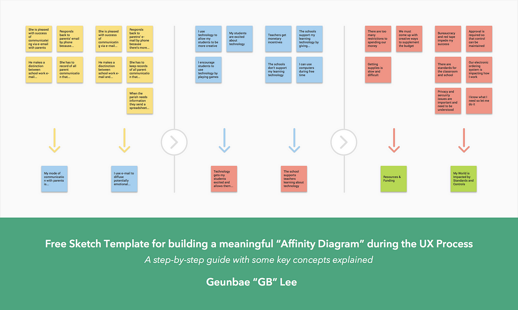
*I believe that doing an affinity diagram exercise is more efficient in a physical space with teammates scribbling notes, thinking out loud and engaging in discussions. Therefore, unless Sketch provides the ability to share/edit a file with multiple people at once, I would suggest to use the template to digitally store written Post-it notes or to showcase the process/result somewhere (i.e portfolio).
At the end of this article, there is a link to download a Free Sketch Template to create a digital version of an affinity diagram with explanations 😎

In short, the affinity diagram shows the common issues, themes, and scope of the customer problems and needs in one place. By hierarchically grouping the data, or affinity notes that reveal the problems and needs, it acts as the voice of the customer and the issues become the basis for user requirements. With just a few tools, you can create a visual representation of large amounts of data that will help to inform your future strategy.
Throughout the research process, the team have the opportunity to learn about user pain points, motivations, and preferences in a very personal way. However, it could be difficult to track all of that data and finding patterns, especially when trying to navigate a long text document or pages of handwritten notes. This is where creating an affinity diagram helps. It allows you and your team to develop innovative solutions, drive group consensus and to organize insights.
 Photo Credit: NNGROUP
“The affinity diagram is built from the bottom up, grouping individual notes that reveal key themes in your data. We let the data suggest the labels for these groups rather than starting with predefined categories. Groups are then labeled using the voice of the customer- saying what they do and how they think. This process exposes and makes concrete common issues, distinctions, work patterns, and needs without losing individual variation.”
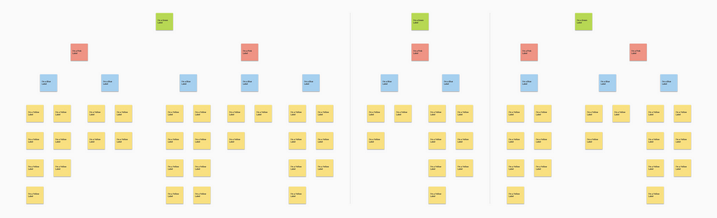
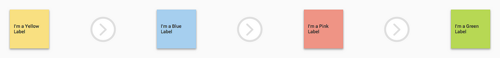 Process: Yellow > Blue > Pink > Green
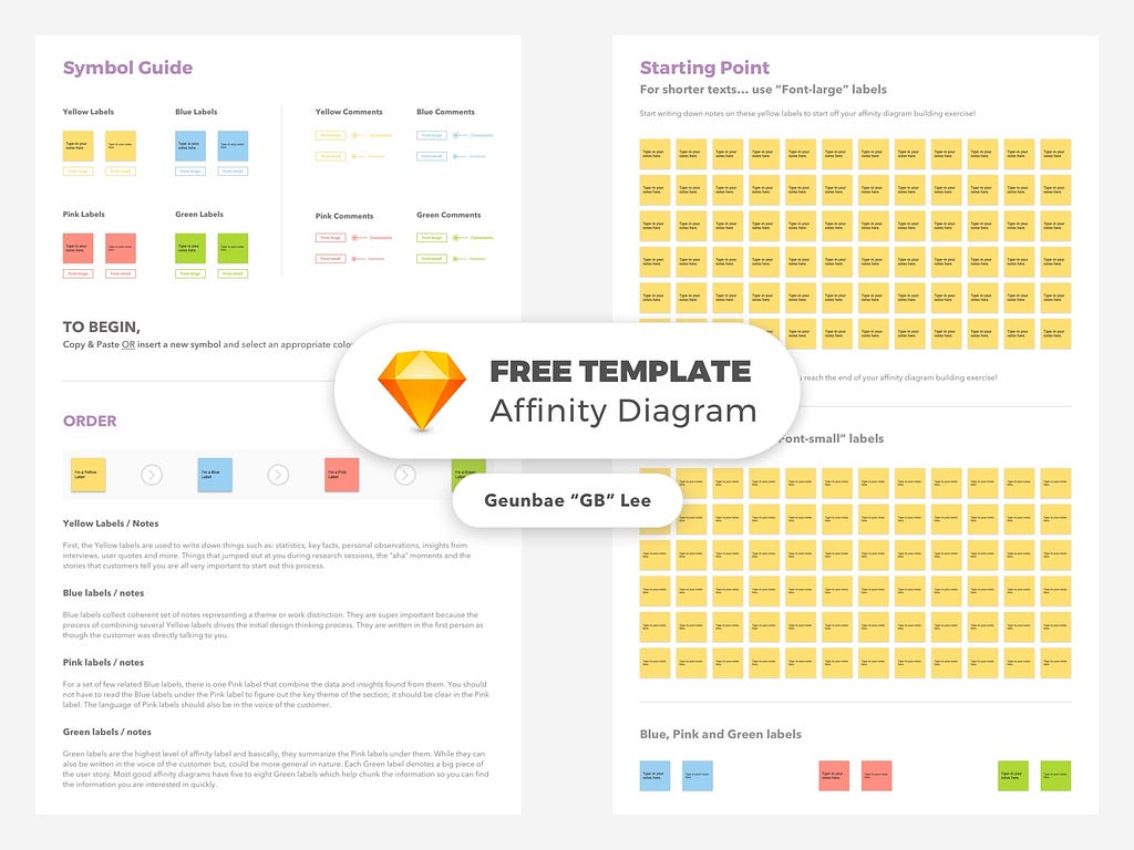
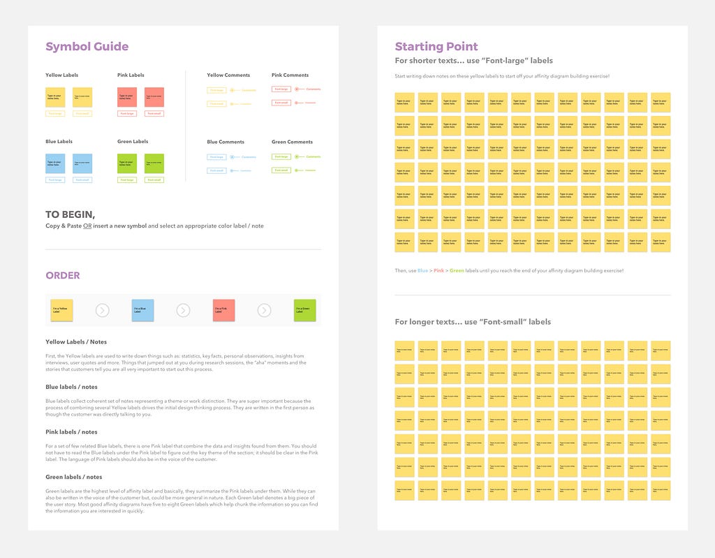
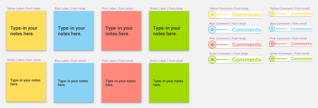
⚠️ Before we take a look at the Affinity Building Process and the Sketch Template for creating a digital version of the affinity diagram, let’s remember these key labels (or Post-it notes) by their colors and what they resemble.

First, the Yellow labels are used to write down things such as: statistics, key facts, personal observations, insights from interviews, user quotes and more. Things that jumped out at you during research sessions, the “aha” moments and the stories that customers tell you are all very important to start out this process.

Blue labels collect coherent set of notes representing a theme or work distinction. They are super important because the process of combining several Yellow labels drives the initial design thinking process. They are written in the first person as though the customer was directly talking to you.

For a set of few related Blue labels, there is one Pink label that combine the data and insights found from them. You should not have to read the Blue labels under the Pink label to figure out the key theme of the section; it should be clear in the Pink label. The language of Pink labels should also be in the voice of the customer.

Green labels are the highest level of affinity label and basically, they summarize the Pink labels under them. While they can also be written in the voice of the customer but, could be more general in nature. Each Green label denotes a big piece of the user story. Most good affinity diagrams have five to eight Green labels which help chunk the information so you can find the information you are interested in quickly.
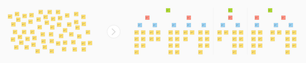 Beginning > End
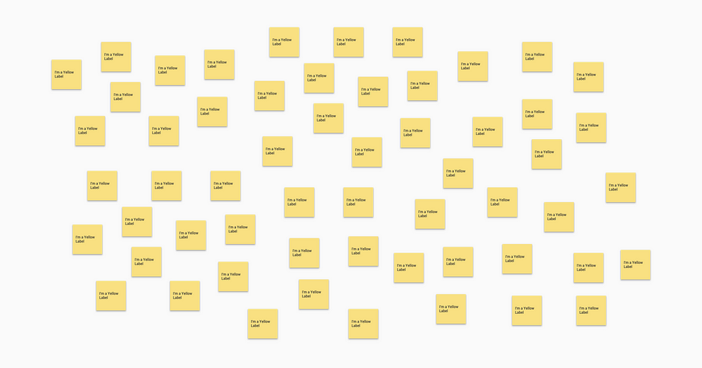 Write things on the yellow labels before grouping them
Your affinity building team can include your team members, stakeholders, and anyone who understands the project focus and is interested in the data. Also, you could invite people from Marketing, Management, Business Analysts, Developers, People on related projects and more. Once you assemble the team, start writing notes down on the yellow labels silently before putting them on the wall.
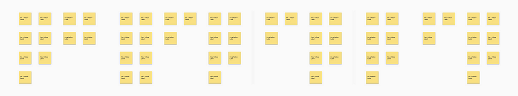
The first thing to do is to get all the yellow labels / notes up on the wall in loose groupings. Then, by going around the room, each team member reads them find any other notes that go with ones that are already up on the wall (this is only for the initial phase). If related notes are found, put each underneath or beside each other to create a category.
Remember to not let people to randomly put stuff without reading them aloud or without appropriate groupings in the beginning. If someone disagrees, let them express themselves and discuss rather than argue. No one should be moving notes without actually saying why they would like them to be moved to a different group.
Every affinity note is supposed to contain just one idea. If an affinity note needs to be broken up because it contains more than one idea, handwrite a new affinity note on a yellow Post-it for the second idea and cross out the duplicate information on the first one. If some are tough to categorize, make use of the “junk” category to later revisit if they help in anyway.
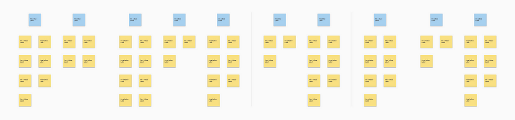
The goal is to create an affinity where you never have to read the individual affinity notes underneath to understand what the columns mean. A good Blue label will both characterize the work of the users and motivate to come up with ideas around the solutions for the problems. Therefore, the Blue label is the most important drive of design thinking.
These are some of the tips that you need to follow for a good Blue label and beyond (Pink and Green).
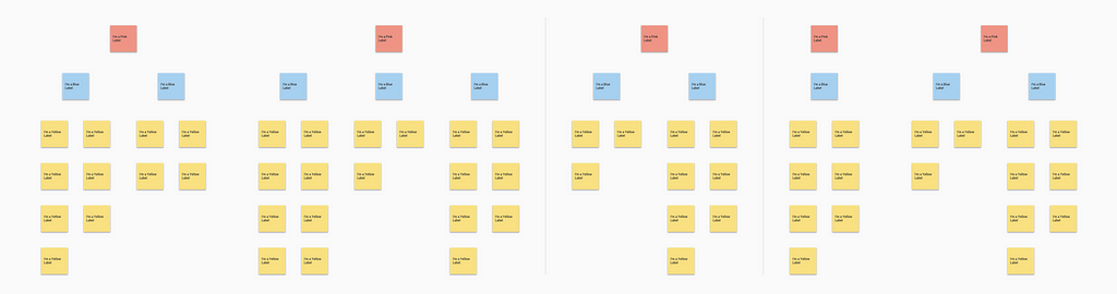
A good Pink label tells you what matters about the Blue labels underneath it. It reveals key issues in the data and should be able to tell a strong story at a glance. Therefore, Pink label should provide enough information to understand the issue.
Green label groups together Pink labels and all other notes underneath to form a coherent piece of story which is important to the project focus. While it can be more abstract and categorical (unlike Blue or Pink labels), the goal is to provide you with an overview of the key issues. Later, Green labels help chunk the information so that you can find the information you are interested in much more quickly.
Thank you so much for reading and if you have any questions or feedback, please comment below or reach out to me on LinkedIn. Also, follow me on Dribbble for my work.
Free Sketch Template for building a meaningful “Affinity Diagram” during the UX Process was originally published in UX Planet on Medium, where people are continuing the conversation by highlighting and responding to this story.
AI-driven updates, curated by humans and hand-edited for the Prototypr community


