Build Design Systems With Penpot Components
Jul 21, 2:15 AM
Penpot's new component system for building scalable design systems, emphasizing designer-developer collaboration.
smashingmagazine.com

uxdesign.cc – User Experience Design — Medium | Marvily Meirav Har-Paz
I’m often asked “Meirav, what does biophysics have to do with User Experience?” Well, being a multidisciplinary person provides me with an endless pool of ideas, perspectives, and metaphors which I greatly enjoy using. In fact, borrowing ‘friction’ from physics to describe a notion in digital products’ UX is a great example of connecting the two worlds.
 Friction as a function in UX
In mechanics, friction is a force that resists the relative motion of two touching objects sliding against each other. We can talk about friction in the digital world as well.
Friction in UX acts between the user and the interface: while our user tries to complete a task, moving forward on the task completion axis, the force of friction acts in the opposite direction, backward. As a result, our user’s progress is slower, he has to use greater effort to move forwards and complete the task. Friction makes us burn calories, but it also makes us sweat.
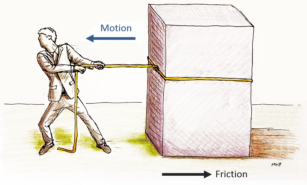 Friction is a force that resists the relative motion of two touching objects sliding against each other
Steve Krug’s book ‘Don’t Make Me Think’ about web usability and human-computer interaction (a MUST read for any UX designer), outlines the principles of good usability. Krug’s notion is that users should be able to accomplish their tasks as easily and directly as possible.
For users, ‘Don’t Make Me Think’ means we don’t need a manual to operate the UI. It also means making the least number of decisions, and in general using very little cognitive effort. We prefer to burn the calories in the gym.
For UX designers, ‘Don’t Make Me Think’ means incorporating known patterns in our designs, using common UX standards, applying consistency, and creating a solid intrinsic system logic to make users establish usage habits. It also means decreasing visual load, creating good information hierarchy, ect.
As a UX Lead & Researcher who has been working closely with users and customers for many years, I’ve realized that when it comes to complex systems in general and critical systems in particular — the fast, easy, and standard way of doing things is not always the best way for our users.
When there is limited friction, everything goes smoothly. Maybe too smoothly.
 When there is limited friction, everything goes smoothly. Maybe too smoothly.
Bear in mind: in most cases we’ll be using ‘Don’t Make Me Think’ usability principles to create an effective UX. It is up to us, as experts, to identify those rare features and cases that require a unique approach.
I’ll explain this by demonstrating three principles.
The conventional rule of thumb: decrease visual load.
However, there are cases in which we need to add text, visual elements, and functional elements to make functionality clearer, understood, and even simple.
For example, imagine a super sensitive feature in a critical application, rarely operated by Adam, the System Administrator, who is an expert user and has the relevant permissions. This feature contains numerous rules, each determines specific operational aspects of the system across the board.
My study showed that the administrators who rarely operate this feature (once a year on average) don’t remember what each rule means.
Following that, in this feature’s main view where all the rules are presented, we incorporated inline help texts describing each rule. Furthermore, when drilling down to each rule details view, a longer inline explanation appears followed by a link to the full online help documentation.
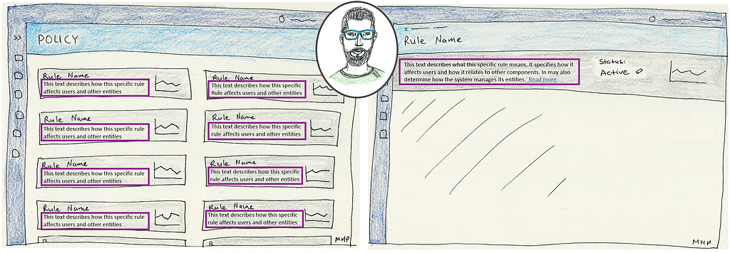 Make Me Comprehend: incorporating inline help text at the cost of increasing the visual load
When it comes to rarely used critical operations, we’ll incorporate some inline help text — even at the cost of increasing the visual load.
The conventional rule of thumb: don’t waste users’ time.
Let them complete their tasks in the least number of clicks or steps.
However, there are cases in which we better add numerous steps — especially when dealing with confirmation of sensitive operations. This is necessary to supply users with a sense of safety and control.
To demonstrate this principle let’s go back to the feature discussed in the previous section, editing sensitive rules’ settings. Remember, this rule determines how the application operates across the board, which makes this operation critical and super sensitive, and it also requires the highest permissions.
There are two typical users who are relevant for this discussion: Adam, who is the System Administrator and therefore he’s been granted with some elevated permissions, and Jane, who is Adam’s manager.
Editing rule settings is done in two steps: the first step includes determining rule’s activation state (active or inactive), while the second step includes editing other specifications.
During usability activities and conversations I’ve had with Adam, he asked me to enable editing the first step in the most direct fashion possible, i.e. by putting an inline toggle “so I can quickly switch between active and inactive states”. Not only did he request that, but he also wanted to incorporate this functionality in the main overview screen as well:
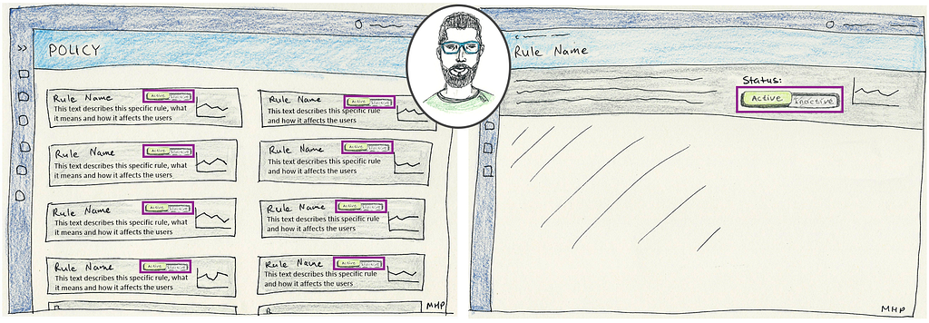 Adam: “I want to do it quickly in a single click”
However, when I continued to research this concept, things turned out to be more complicated. Apparently, different types of users have different perspectives, motivations, and agendas.
Jane and I discussed the suggested solution we designed following Adam’s feedback (actually it was not a single Adam but many users of his type).
“No way!” Jane said to my surprise. “I wouldn’t feel comfortable knowing that Adam can quickly and easily apply such a critical and sensitive operation across the board!”.
Interesting.
Jane continued: “let me tell you this: I want to approve such critical operations myself prior to them being applied across the board.”
Very interesting.
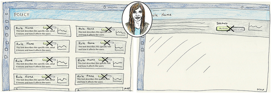 Jane: “No way! The quick and easy functionality might result in huge damage.”
So we increased the UX friction of this feature to make Jane feel more safe and in control. We designed a UI element that when clicked, it opens a bubble. In this bubble the user can consciously select the desired state, and proactively click the “Save” button. Following this, a confirmation message appears with a short description of the consequences of applying this action. We want the user to be aware of what his actions mean.
No to auto-save. Yes to conscious actions.
When it comes to the most critical operations that significantly affect objects, users, and environments, we’ll design numerous confirmation steps.
The conventional rule of thumb: keep it consistent.
When designing UX for any product or service, we’ll stick to some templates and patterns so users can form habits of use that allow them to more easily use the system.
However, when dealing with entities of varying sensitivity and applying the same function to all, in some cases we better apply some changes in the flow to prevent our users from operating in an automated fashion.
To demonstrate this principle let’s talk about three entities:
● Entity A — the least sensitive
● Entity B — of intermediate sensitivity
● Entity C — the most sensitive
Users can delete items of any type in the system. Naturally, the meaning and consequence of deleting items of different sensitivity levels varies contextually:
 The meaning and consequence of deleting items of different sensitivity levels varies contextually
So, we designed a ‘delete’ function in a different fashion for each entity:
● Entity A — ‘Delete’ buttons appear in the main view of the list that contains all the type ‘Entity A’ items. As deleting is the most common action for this entity, and no harm is caused by deleting an item of this type, it’s placed in the main view to be easily available.
● Entity B — Deleting an item of type ‘Entity B’ is a more critical action that might cause some damage, so we don’t want anybody deleting something he should not. The contextual action item is not as available as it is for ‘Entity A’. Alternatively, it appears as part of a sub-menu invoked by clicking a UI trigger in the main view.
● Entity C — We definitely don’t want anybody deleting an item of type ‘Entity C’ by mistake. Doing so might cause systems to crash, automated processes to stop, and other catastrophes. Therefore, the ‘delete’ function is not to be found anywhere in the main view. Alternatively, when drilling down to an item details view, it appears as part of a sub-menu invoked by clicking a UI trigger.
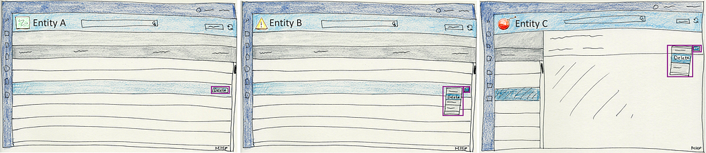 Functional elements of the same action appear inconsistently. Friction level increases according to the entity’s sensitivity, thus the criticality of this action.
In this example, not only did we place the same functions in different locations while adding more clicks on the way, but we also increased the physical distance as the criticality of the operation becomes more severe.
When applying the same function to multiple various entities — break consistency to slow users down and make them aware of the consequence of their actions.
As a rule of thumb, we design UX to achieve simplicity, so users can accomplish their tasks in the easiest way possible. We apply ‘Don’t Make Me Think’ principles to create as effective and delightful experiences as we possibly can.
However, there are unique cases that require a different approach. These would be the most sensitive, critical, influential, extreme operations or features. These cases may also be correlated to a different user mindset. Only then we’ll increase the friction by carefully and deliberately slowing our users’ progress while making them consciously consider their actions.
Increasing the UX friction aims to empower users’ sense of safety and control. Consider when, for whom, and how to do so. We’d better not slow users’ progress for nothing, it will only make them feel frustrated. It’s always important to test and validate our designs, but when UX friction is involved — it’s more essential than ever.
After all, when there is only a little friction, everything goes smoothly. Maybe too smoothly.
Increase friction to prevent glitches.
This article is based on my presentation at the ‘UX @ Cybersecurity’ meetup.
The video will be available soon!
Join my mailing list to be the first to hear about my activities, and get valuable insights and tutorials for professional people who create great products!
Friction as a Function in User Experience: Make Me Think was originally published in UX Collective on Medium, where people are continuing the conversation by highlighting and responding to this story.
AI-driven updates, curated by humans and hand-edited for the Prototypr community


