Build Design Systems With Penpot Components
Jul 21, 2:15 AM
Penpot's new component system for building scalable design systems, emphasizing designer-developer collaboration.
smashingmagazine.com

medium bookmark / Raindrop.io |
I recently finished working on Marvin Visions, a modern reinterpretation of the typeface Marvin that was originally designed in 1969 by Michael Chave and published by Face Photosetting.
Marvin Visions is a single weight, and uppercase only, but like many other typefaces it demanded more work than meets the eye. There were a lot of hurdles to get there as resources are scarce.

Above: Postcards designed by Matthew Young, Tom Etherington, Claudia Toia and Mathieu Triay
A lot of the books regarded as essential are often out of print and exceedingly expensive. If you’re lucky enough to have a type design workshop or university course near you, they’re not exactly affordable for the casual learner. So, where can one start to learn about type design?
Here are some of the things I’ve picked up along the way that I wish I’d known when I started.
Learning to see like a type designer only comes with time. You will need to look at a lot of existing designs, in detail. Find some typefaces you like and look at individual letters. Then focus your attention on how letters relate to one another and how they assemble to make words.
Letters can be beautiful on their own but they’re first and foremost used to build words and sentences. There’s an oft-cited quote from master type designer Matthew Carter which is good to keep in mind during this exercise:
Type is a beautiful group of letters, not a group of beautiful letters. – Matthew Carter
That’s why you continually have to alternate between looking at the typeface as a whole and focusing on individual letters.
So take your time and analyse the personality of these typefaces. What makes them friendly? Stern? Do they have subtly rounded corners? Look at the letters up close and look for details that you might not have noticed otherwise.
Maybe the feet of this serif n actually have a curve in them? Pay attention to the proportions of the letters and the relationship they have with each other as this is how you build rhythm into your typeface.
Use this time to pick up on things you may not have noticed if you were just reading the words. Good type can become invisible so you need to look at a text and dissociate the typeface from the meaning of the words (just as if you were trying to isolate the bass line from a song as you listen to it). Are all the capital crossbars aligned? Superimpose an R and a P, and look at what changes and what doesn’t.
Ultimately, you need to pay close attention to the shape of the counters (the white space). Train your eyes to shift back and forth between the positive space (the ink) and the negative space (the paper). Their relationship is what really forms the letters.
The goal here is to gain an appreciation of the construction of typefaces. By trying to reverse engineer the designs, you get an insight into the decisions the type designer has made. Is there something that feels odd in the design? Try to understand why it has been done this way. Chances are — if you are looking at a professional design — all decisions were completely intentional (but you might not like them all).
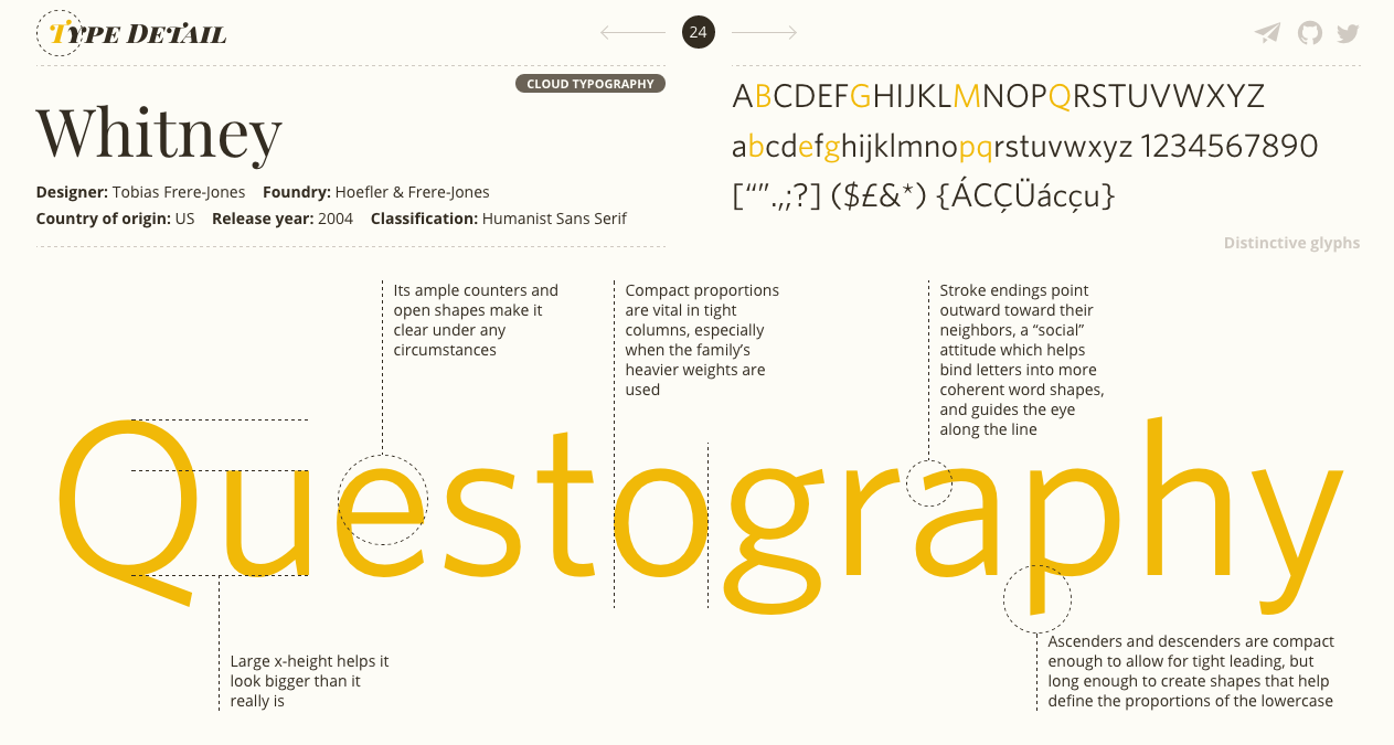 An analysis of Whitney’s letterforms from typedetail.com
This is an exercise you’ll keep doing, and it’s got an advantage, you can do it anywhere you see written text: a sign, a poster, a book. Is this combination of letters particularly pleasing? Is there something that annoys you? What could you do to fix it? What impact would it have on the rest of the design?
Try to pick up on these feelings, even if you can’t put them into words just yet, they’ll get more accurate and concrete as your perception improves. Keep a critical eye and try to understand why.
Links
Books
— The Elements of Typographic Style
—
2. Gathering Ideas
You may already have an idea of the sort of typeface you want to do. Maybe a pared down serif or a sans serif with contrast? It’s tempting to start with your very own design, but refrain from that just yet. The first step in the process hopefully showed you that there are a lot of interrelated decisions to make when it comes to designing a typeface.
When you start out, one of the most important things is to master the tools to be able to get your visions from your head to the screen. Using an existing design as a starting point frees you from making a lot of these invisible decisions and allows you to focus on understanding the tools and the details of the font making process.
Don’t worry, there are still a lot of opportunities to make things your own along the way. Keep your original ideas for when you have already tried your hand, you’ll be much more satisfied with the result.
It’s particularly tempting to go out and cram all the ideas you’ve had for letterforms into a single typeface, but you might end up creating a sort of Frankenstein’s monster. If you think of a typeface as a design system with internal rules, understanding an existing system and making it yours is going to be simpler than creating one from scratch with no experience.
 One of many specimens of the Type Specimens group on Flickr . Photograph: Nick Sherman
However, you should never copy the outlines of an existing font and incorporate them in yours. It’s fine to be inspired by an existing design, or even to do your own version of a favourite, but try to capture the image you have in your head rather than trying to be exact.
The outlines you draw should be your own even if some letter shapes end up resembling existing ones. Otherwise this doesn’t make for a good learning experience, and worse, you would be a common thief.
Start by taking a typeface you’re very familiar with (Futura, Plantin, Helvetica, etc.) or maybe one that doesn’t have a digital equivalent yet (there are plenty from the photosetting era). Study the specimens in detail, look at each letter and their construction to understand the decisions that have been made (see Learning to See, above).
Then draw the letters with your specimens next to you a few times. Once you’ve got the hang of it, draw the alphabet from memory. The intended effect here is to internalise the construction of the letterforms but let your personal style and vision seep into the design. Erik Spiekermann talks about a similar technique in an interview that’s well worth watching (below).
There’s a fine line between a copy, an inspiration, a revival and an interpretation. It can be hard to walk it sometimes. In short, don’t pass off someone else’s work as yours. Make the distinction between a learning project and one intended to be released. David Jonathan Ross makes the point clear:
As long as you are straightforward about what you are doing, and have made good-faith attempts to do it with respect, there’s nothing to frown about. You have cited your sources, documented your process, and are giving old type a new life. – David Jonathan Ross
Links
— Erik Spiekermann — Putting Back the Face into Typeface
— Call It What It Is (on copy vs revival vs interpretation)
Books
— A Letraset catalogue if you can find one!
—
3. Get Drawing
Drawing can be as simple as picking up a pencil and a piece of paper, but there are a few things that can help you get better results.
First, it’s tempting to draw outlines – the outside of the letter and then the inside. You might even get good results out of it. However, you might also find it frustrating because maybe your hand isn’t steady enough and you can’t get that curve to look right, etc. The problem with that method is it focuses on where the strokes meet rather than the actual shape and movement of the letter.
Instead, try to draw by shading — as if you had invisible outlines and were trying to colour inside. This way you can also vary the thickness of the letter in places. This method will help you get a better feel of the balance between the negative space and positive space — which is what you should be looking at, at this stage.

“Postpone drawing the actual outline until you have an idea where it is. Just drawing any line isn’t going to make it the right one. Better to ignore drawing the contour altogether and focus on proportion, contrast, weight, the white shapes as well as the black shape” – From Erik van Blokland’s video on Sketching
There are valuable lessons to learn by drawing letters by hand, notably when it comes to contrast (the thick and thins in the letter). The hand can convey things that curves drawn directly on the computer might lack.
A lot of the early type designers had a strong grounding in calligraphy which gave them the essential baggage to draw a fully unified alphabet.
Nowadays it might not be essential to excel in calligraphy to be a good type designer, but having an understanding of it is an asset. To try out the basics, get a broad nib pen (like the Pilot Parallel Pen) or put two pencils together with an elastic band so that you essentially have two tips (see the gif below).
The key here is to choose the angle of your pen and stick to it.
An easy way to achieve this as a beginner is to not move your fingers or your wrist as you’re probably used to. Grab your pencil, choose an angle, and draw the shapes by moving your arm, ensuring your wrist and fingers remain in the same position throughout. It’ll feel a little mechanical but you’ll get the idea.

“4 easy steps you can instantly follow to write calligraphy with just a normal pen” – From How to Write Calligraphy With a Normal Pen
With that technique, try to draw an O or an S. You should see how the thickness varies in places. Choose another angle and draw the same letters to observe how the thick and thins move differently along the path.
If you’re trying to achieve contrast in your typeface, keeping this technique in mind will help you understand the distribution of the weight along the stroke.
Links
— Glyphs’ tutorial on Sketching
— Sketching Out Of My Comfort Zone
— Calligraphy With A Pencil Video
Books
— Writing & Illuminating & Lettering
—
4. From Typeface to Font
Before you can transform your sketches into a font, you will need specialised software and learn how to draw nice and clean digital curves. If you have Adobe Illustrator you could get by to begin with, but I would really recommend type design software. It will prove itself very valuable soon enough.
There are a few different pieces of software available (Fontlab, Robofont, FontForge, etc.) but if you’re working on a Mac, I would heartily recommend Glyphs. It’s professional software used by a lot of foundries, and, for me, was by far the easiest to get started with. You can get a 30 day trial and buy the Mini version of it afterwards which will help you get going at an affordable price (about 50€).
Glyphs provides you with a whole suite of tools to make fonts and it’s incredibly powerful. So much so that you should really take a look at the different tutorials and handbook on the website. They’ll show you how to do most things, including how to import your sketches in the software for you to draw over. However, the first thing you have to learn is how to draw smooth curves.
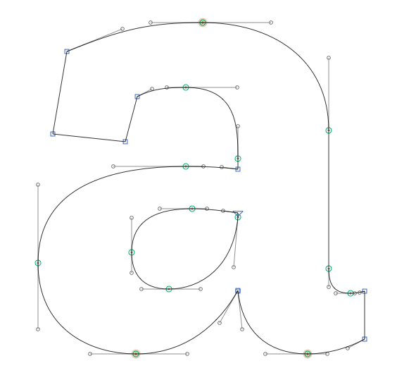
If you’ve used any vector drawing software in the past, you might be familiar with Bezier curves – strange curves that have points with handles coming out of them.
If you’re anything like me, you’ll have struggled to get them to do anything you want. The good news is you can learn how to master them, and if you abide a few rules, everything should be alright in the end.
Rule Nº1
You should have the minimum possible number of points on your path
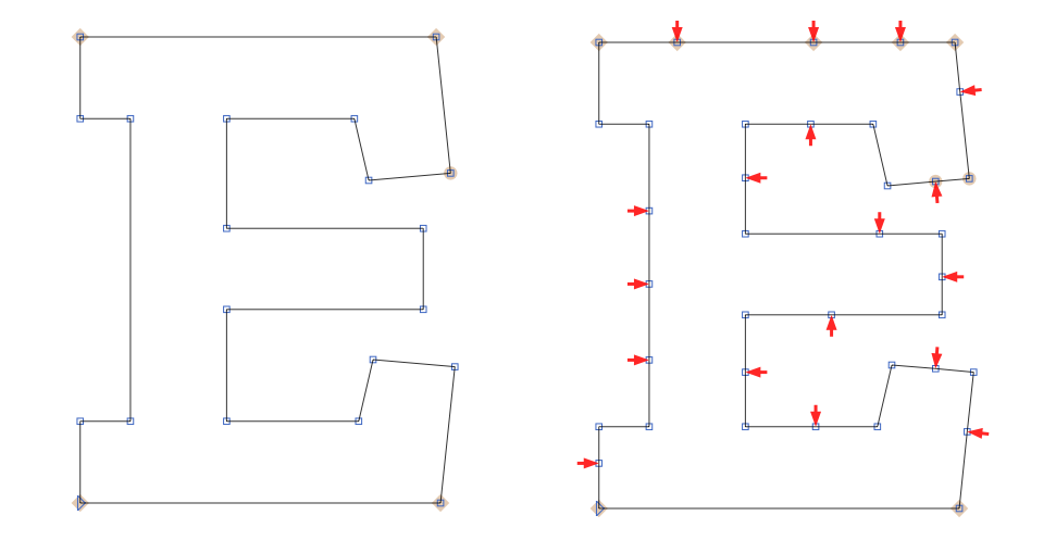 Example from Zilla Slab by Typotheque — All the red arrows show points that don’t need to be there (my addition)
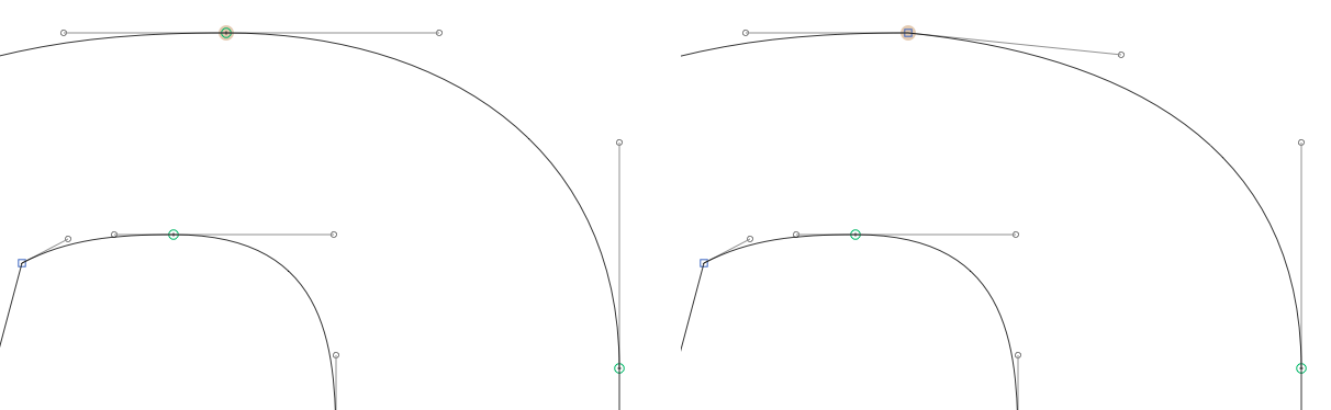
Rule Nº2
Handles should be either vertical or horizontal, never at an angle (the green circles in the example, below). However, you can make exceptions if the handle comes out of joint or a junction where two lines meet (the blue squares). In a series of curves, you should alternate horizontal and vertical handles.
 Green points should have straight handles while blue points are allowed to have handles at an angle — Example from Zilla Slab by Typotheque
Rule Nº3
The handles on either side of a point should always form a continuous line
 The example on the right will result in an ugly bump. Nobody wants that — Example from Zilla Slab by Typotheque
Rule Nº4
The points should be placed on the outmost parts of your path (called the extremum), wherever possible. If not, the handles are allowed to be at an angle.
 The diagonal handles in the middle of the S are necessary to control the progression of the curve, called an inflexion
Rule Nº5
Handles should never cross
 The red arrows show you what happens when handles cross. It creates a bump as the curve goes outwards then inwards. It’s not nice — Example from Zilla Slab by Typotheque
There are exceptions to these rules, but to get you started this should put you on the right track. If a curve is giving you grief, go and look at how other designers have solved the problem.
There are plenty of Open Source fonts by professional designers that you can analyse with Glyphs (Fira, Space Mono, Spectral are just some). Look at how they place their points, the length of their handles, etc. But again, never copy the outline.
If you’re starting on the Glyphs trial, you can also make use of plug-ins that provide some much needed information for beginners. One of these is called Red Arrow and, as the name indicates, will place red arrows wherever your path doesn’t follow some of the assumed rules above (you can see them in the screenshots).
Heatmap and Stem Thickness can also be very helpful by showing you how the thickness of your stroke is distributed across your glyph. Lastly, you can get the trial for Speedpunk which is a tool that visualises the mathematical smoothness of a curve. If there’s a curve that’s giving you a hard time, Speedpunk can help you understand what’s going wrong.
Links
— Two Methods for Smooth Curves
— More Technical Details on Curves
— So What’s the Big Deal with Horizontal & Vertical Bezier Handles Anyway?
— Mastering Bezier Curves in Sketch (applies to most vector drawing software)
Books
—
5. Which letters to draw first
To get started you could just pick a letter at random, one that strikes your fancy, or maybe — intuitively — the lowercase a. Any of these is a valid answer, but you can make your life easier by starting with H and O or n and o.
These pairs of letters are good starting points because they give you vertical strokes, horizontal strokes, shoulders and joints as well as circular shapes.
Excluding the diagonals for now, these are going to appear the most in the Latin alphabet. As a result, if you’re satisfied with your H and O, you can have a good starting point for the E (and therefore the F) and the N (which will give you the diagonals) but also the C and the G.
If you started with lowercase, the n will give you an idea of the h and u, with the o you’ll have an indication of the c and d.
Quickly you’ll notice how each letter has similarities to the ones you’ve already drawn. You can now use your newly acquired understanding of the letters’ structure to build up your missing glyphs.
A note on rotating
If you look at the Latin alphabet, you could make a lot of letters by just rotating a few key ones. If you have a p you could get a q, a b and therefore a d. If you have a V you could have an A, etc. The list goes on.
The point being that although rotating is a starting point and can give you acceptable results, it will probably need adjustments. For instance, your A might need to be a little bit wider than the V because of the crossbar limiting the space inside the letter.
Moreover, it’s down to the type designer to make sure the glyphs are recognisable enough and can’t get confused with another one. This is the first step on the path of trusting your eyes.
Links
— Letter Construction Basics Part 2
—
6. Trust your eye above the maths
You’d think that to make an H, you could just stick a horizontal bar in the middle of two vertical ones. Unfortunately it’s not that simple: our eyes don’t perceive things mathematically.

If you try, you’ll see that making the horizontal bar as thick as the vertical ones, will make them appear slightly thicker. Mathematically they’re equal, but visually they’re not. We’ll need to account for a lot of these optical illusions and make some tweaks accordingly. Here are some of the common ones to watch out for:
Horizontal bars need to be a little bit thinner (varies depending on the typeface but try 5% and adjust) than vertical ones. You can read about this in depth on Tobias Frere-Jones’ Type Mechanics article.
A circular shape with the same diameter as the side of a rectangular shape one will look smaller next to it. You can compensate for that by making the circle a little bigger (try 2% and adjust).
This is called an overshoot and also applies to triangular shapes. Again, Frere-Jones has a great visual explanation of this in another Type Mechanics article.
The bottom part of a letter will appear slightly smaller than the top part. If you have potentially symmetrical shapes (8, 3, B, etc.), you’ll need to take that into account and make the bottom part a bit bigger.
The visual vertical middle isn’t the mathematical one: it’s actually a little above (try 2% and adjust).
Curves need to get thinner as they approach a junction. If they don’t, the intersection will appear much thicker and darker than the rest of the letter.
Ultimately, this is all about your perception — hence why it’s important to train your eye early on.
You should aim to have an even colour throughout your alphabet, being careful that no letter looks darker or lighter than the others. For instance, letters with a lot of strokes might need to have marginally thinner stems to compensate for all the ink/black they bring to the paper.
If it helps, start out mathematically and then adjust. The maths is never far off but it’s rarely visually perfect (such is the life of a designer it seems). Ultimately, if it looks right then it is right no matter the measurements.
Links
— Frere-Jones’ Type Mechanics 01
— Frere-Jones’ Type Mechanics 02
— Optical Illusions and Eye Trickery
— Letter Construction Basics Part 1
Books
—
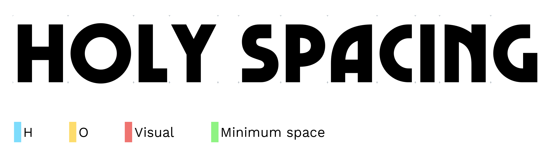
7. Spacing
Another area where you’ll have to trust your eyes more than numbers is spacing. Instinctively, you might think that spacing comes much later in the process, maybe once you have the whole alphabet. Whilst it’s not impossible to space a whole alphabet in one go, it can be a very painful process.
Instead, you should start spacing your typeface as you draw your glyphs. This will help you visualise letters next to each other immediately and make sure you get the right interplay. This is important because drawing and spacing are related.
If you design a T with a very long crossbar, you will create a lot of space under it when placed next to a letter like H, and it might just look awkward. Remember, letters are meant to work with one another, rarely on their own. You can’t design them in a vacuum.
Conveniently, the usual spacing process starts with n and o or H and O —the letters that are recommended to draw first. There aren’t any set rules for spacing, your eye is the decider of what looks right or wrong. However, there’s a popular method based on the work of Walter Tracy that will get you started and will give you something to refine.
The method consists in grouping letters by similar shapes to apply similar spacing to them. So, if you have the spacing for H and O, it’ll give you the spacing for a wide variety of letters that will allow you to build up words to check your design. Spacing works by adjusting the values of the side bearings, the additional space on either side of a glyph.
The first step is to choose a value for the left side of H. You can start with 50 or 60, then adjust for your design and desired spacing (loose or tight). Beginners tend to space their fonts too tight, so don’t be afraid to go a little looser at the start.
Because H is symmetrical it should have the same spacing on both sides. Same for the O. However, O can’t get the same values as H. Because of its circular nature it needs to be closer to the other letters to maintain the illusion of space. A rule of thumb to start with is 50% of the left side of H.
Then use the word HHOOHOHO to check your spacing. Adjust the spacing of H until you’re satisfied with the space between HH. You will then use that spacing as a benchmark for the rest of your font.
The perceived space between OO and HO should feel the same as the one between HH. Spend some time to find the right fit but don’t agonise over it just yet, chances are you’ll have to tweak it as your alphabet expands.
 An example of spacing grid for Marvin Visions, with kerning activated
As you draw new letters, assign them a spacing by testing them in a word like that (where A is your letter): HHAHOHOAOO
The same rule applies, the space on either side of that letter should be visually the same as the space between HH.
Walter Tracy tells us that every letter with a vertical stem (B, E, F, N, I, etc.) should receive the same spacing as H (on the straight side) to start with.
Every letter with a round stroke (Q, D, C, G, etc.) should receive the same spacing as O (on the round side). Take the time to adjust these values so it looks right — they don’t have to be exactly equal. depending on your design a lot of things can affect spacing (serifs, slabs, etc.).
The more a letter creates space around it, the closer its spacing will be to zero. Triangular letters (like A, V or Y) can often have zero as their spacing values (and in some cases even negative numbers).
 Wider spacing on an earlier version of Marvin Visions with no kerning
The “visual” spacing represents an effort to find a good value between H and O (and often close to either of these).
You might wonder, how do you define the space between words? There is a space character whose width you can specify. A rule of thumb is that it should be about the width of a lowercase i including its side bearings. If you don’t have one yet you can use 200 as a starting point.
Spacing would deserve an article of its own but hopefully this should be enough to give you an idea of how to think about spacing in the font. For a more in depth tour of the Tracy spacing technique, watch Thomas Phinney’s video (below) or read the relevant section in Type Tricks.
If the process scares you, and that’s understandable, there is a Glyphs plugin called HT Letterspacer which given the right parameters will do a very good job. You can use this plug-in to start your spacing if you have a lot of letters designed already, and then manually tweak what feels wrong to your eyes afterwards.
Links
— Pablo Impallari’s Testing Tools (Spacing Grid)
— Spacing techniques discussed
— Adventures in Spacing (all chapters)
Books
— Walter Tracy’s Letters of Credit (if you can find it)
—
8. Kerning
You should only get to kerning in the very last stages of the font making process. Focus on drawing and spacing, until you’re really satisfied with the design of your letters and how they look next to each other.
If you start kerning too soon and you change the design (or even if you just change the spacing) of one of your letters, you’ll have to start the kerning process for that letter all over again.
 Using Kern King during the kerning process. Every blue mark indicates where the space has been adjusted manually
When you do get there, there’s no silver bullet. You have to check every possible pair and make sure they look right. And you have to do that over and over again.
For that process, you’ll need to print a lot of samples, so get a cheap printer if you don’t have one available. There are lists of common (and less common) words available on the internet that will help you get started. One of them is called Kern King, but you will find various other ones on Pablo Impallari’s Testing Tools.
Your only relief here that, similarly to spacing, you can define groups of letterforms that would share the same sort of kerning behaviour. For instance, the left kerning of the O could very well apply to a Q. There are pre-made groups that you can set using a Glyphs script.
Links
— Pablo Impallari’s Kerning Lists (Kern King)
—
9. Next steps
Learning how to design typefaces will take time so don’t feel frustrated if everything doesn’t look right immediately. For a professional type designer, a well rounded single weight can take easily more than three months if they’re starting from scratch. A whole family can take years to polish and ship. Designing an alphabet is a long project albeit a very fun one. Keep practicing, noticing fonts in use, and questioning everything you see. You can only get better with practice.
There is a lot more to type design than the observations made in this article – and while I can’t hope to cover it all here, hopefully this should give you enough to get started. Take the time to read the articles linked, get familiar with the software and its possibilities by following the tutorials.
Finally, get hold of Type Tricks and How To Create Typefaces which are affordable and essential modern references. They touch on everything in this article in more details, with the added benefit of their professionalism.
—
10. A Note on Community
Type design doesn’t have to be lonely. Of course, you’ll do a lot of the work on your own and that’s even part of the fun. Yet, there are plenty of instances where you’ll feel like you need a second opinion and a fresh pair of eyes. When you’ve been staring at the same letters for hours on end, it certainly helps to have someone give you some feedback.
You can find such places on Reddit, Type Drawers, Typophile and even the Glyphs forum. These are all good places to show your progress and get some constructive comments.
Twitter is also a great way to stay in touch with the type design world, hear about new releases and an occasion to engage in short discussion. I’ve put together a certainly non-exhaustive list of type designers and type enthusiasts that you can use as a starting point.
Finally, being able to get feedback in person on a printed specimen that can be marked up is probably one of the best way to improve your practice. Short of having designer friends, you can join a ‘crit club’ like Type Thursday (now in London!) where you’ll be able to show off your specimens and get some of that red pen goodness.
It goes without saying but type design is demanding so be respectful and supportive of everyone showing their work. It can take a lot of courage and everyone has to gain from gentle and constructive feedback.
Mathieu Triay is a Creative Technologist with a background in computer science and a keen practice of design and user experience. He was the Technical Director of Night Zookeeper, helping children to be more creative online through reading and writing and was also part of the Creative Technology team at Penguin, working on new ways to engage with books online. He’s now joined BBC R&D to work on the future of online news. See @mathieuloutre and mathieutriay.com. Marvin Visions is available at readvisions.com/marvin
Reading List — Type, Typography & Type Design
Essentials
The Elements of Typographic Style
Type Tricks
How To Create Typefaces
Recommended
Stop Stealing Sheep
Detail in Typography
Reading Letters
The Geometry of Type
The Visual History of Type
Writing & Illuminating & Lettering
Type & Typography
Anatomy of a Typeface
An Essay on Typography
New Perspective in Typography
Ways of Seeing
Out of Print
Counterpunch
The Stroke
Letters of Credit
Additional Links
Designing Diacritics
Notes on Type Design
Typeface Design Blog
AI-driven updates, curated by humans and hand-edited for the Prototypr community


