Build Design Systems With Penpot Components
Jul 21, 2:15 AM
Penpot's new component system for building scalable design systems, emphasizing designer-developer collaboration.
smashingmagazine.com

medium bookmark / Raindrop.io |
Let’s see some examples of UI animations going from good to great. With a little bit of tweaking here and there, you can elevate your UI patterns with animation.
The interactions listed show continuity between states, denote a relationship between shared elements, and call the user’s attention to something they should notice and act upon.
To create these animations, I followed the guidelines from Material Motion, IBM’s Animation Principles, and The UX in Motion Manifesto.
All of the interactions were made using the early-access version of InVision Studio. You can download the source files here.
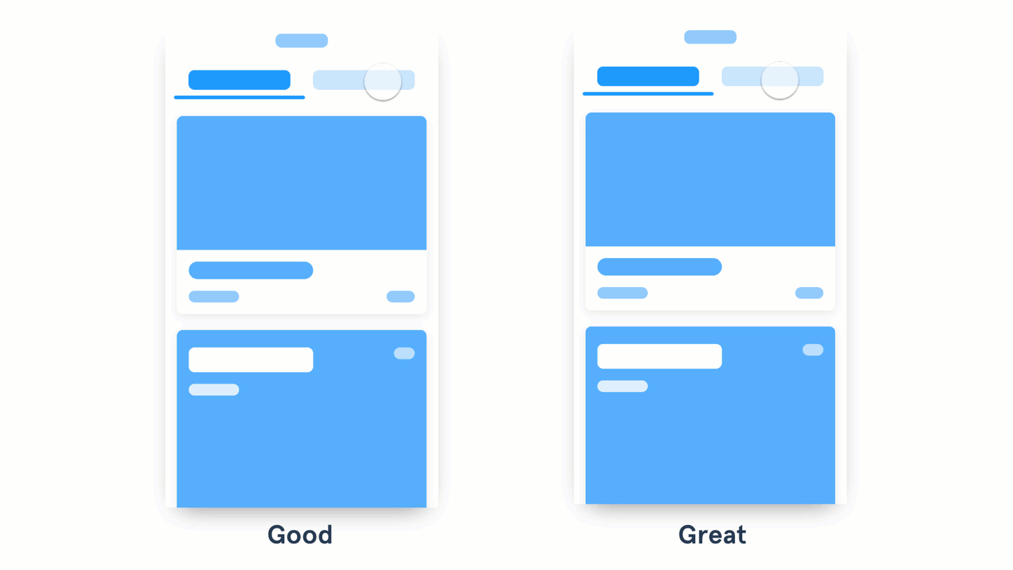
The content on the left fades in and out. The one on the right slides with the tabs.
When you design an interaction like a tab or a fly-out menu, try putting the position of the content relative to the action that opens it. This way you can animate not only the visibility of the content but the position too. Oh, and while you’re at it, add a swipe gesture that takes you from one piece of content to the other.
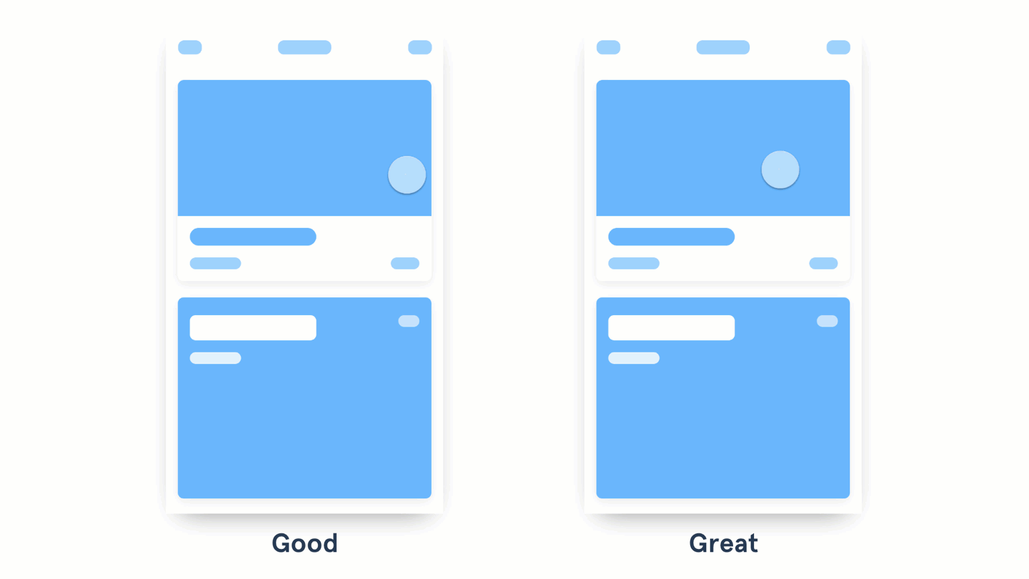
The content on the left opens a new screen that slides up. The card on the right expands and fills the screen.
When animating between different states, see if there are any shared elements between them and connect them. With InVision Studio, components that are repeated between two linked screens are automatically connected when you create a Motion transition. This makes prototyping animations a breeze.
Check out the Motion Manifesto to see the types of animations you can apply. The example above uses a combination of the Masking, Transformation, Parenting, and Easing principles.
The cards on the left appear by sliding and fading in. The ones on the right feature the same animation, but each card has a 0.1s delay.
To accomplish the waterfall effect, try applying delays to each piece or group of content. Keep the same easing and duration, so it feels consistent. Don’t cascade each little element, though—animate the groups of content. Keep the animation quick and snappy.

The animation on the left animates on top of the other content. The animation on the right pushes the content out as it grows.
Make the elements in your content aware of their surroundings. This means making the content attract or repel the elements around it. For more examples check out the Aware motion principle from Material Design.
The button on the left shows text indicating states. The button on the right uses the container to show different events.
Try using the container of a button to provide visual feedback of a status. For example, you could replace the CTA with a spinner or a loading animation; or you could add an animation to the background showing progress. The solution is up to you, the idea is to use the space the user is already interacting with. Bonus points if you use the button color and copy to confirm a success state.
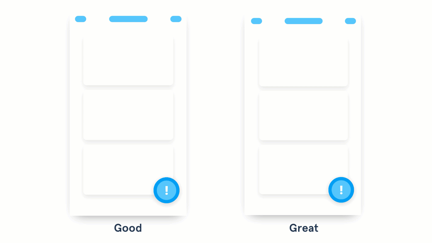
The example on the left uses color and position to make an element stand out. The one on the right uses a subtle animation to call the user’s attention.
When the user needs to act on something important, try animating the actions to attract their attention. Start with a subtle animation and increase the intensity (change of size, color, and speed) in relation to how important the action is. Use this only for critical actions—the more you use this effect, the less impactful it becomes… and the more annoyed your user gets 😱
I hope these examples help you make better decisions when adding animations to your interactions. With new animation and prototyping tools like InVision’s Studio, I predict we’ll soon start seeing a renaissance of creative interactions. We just need to remember to use this new superpower responsibly.
Let’s apply animation to explain changes in states, draw attention to necessary actions, determine relationships between elements, and add a bit of fun and character to our products. By following these principles, we’ll transform our animations from good to great.
Happy animating!
I write a comic series called The Design Team and I post design-related stuff on Twitter. You can also check out my YouTube channel, Sketch Together, where you’ll find tons of design tutorials.
Muchas gracias por leer.
AI-driven updates, curated by humans and hand-edited for the Prototypr community


