Build Design Systems With Penpot Components
Jul 21, 2:15 AM
Penpot's new component system for building scalable design systems, emphasizing designer-developer collaboration.
smashingmagazine.com

Design + Sketch App — Medium | Bunin
This is part of Frames for Sketch — Tutorial article that will help you to build smart and responsive tables, using single components from our toolkit which was recently added in the latest version of Frames Web Design System.

Hi, we are here to add some Tables to the list of things that give us pain in the lower back. It’s might get pretty messy when you try to build a table using lines or shape groups, making so you need to be super aware of where are you clicking to grab that exact layer, it might turn into that part of the day when you are constantly fighting your software using only sticks and stones.
But what you need to do, is to stay cool and see how some Sketch features can make this process more humane and also make tables more flexible for us to work with. 😉
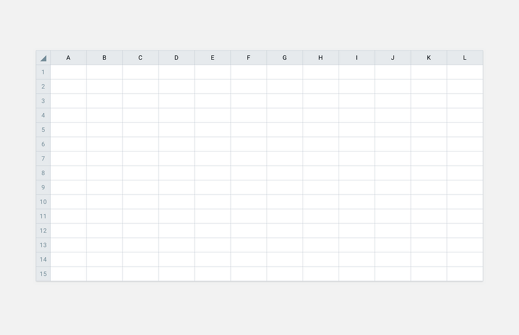
Here you can find Sketch file that contains a classic office spreadsheet, you can use it as a template next time you design a table, file contains additional symbols that may come in handy feel free to give this file a try.
👉 Download Table Template for Sketch
Tables mostly consist of multiple cells which form logical groups for your data and numbers. The Cell is a building block of any table, this blocks serves to store data, and data can be displayed as text or icon-based information. You can think of this blocks as atoms, and rows or columns as molecules in the atomic design methodology. 📚
Now let’s proceed and start designing.
Don’t forget to Download the Sketch file that will help you with the following tutorial steps:
1. Start by creating a symbol container and set it height and width properties. Define indents from the left and the right sides of the container by adding a text layer into it.
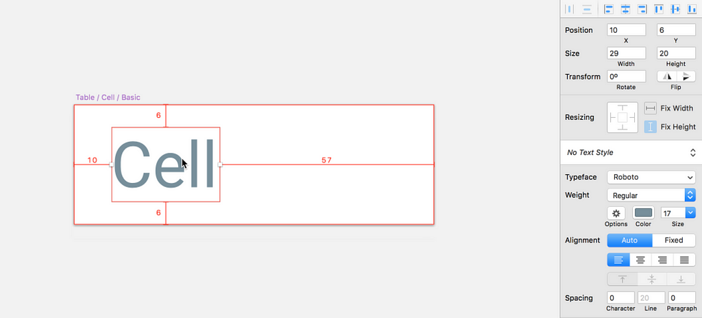 It’s recommended to use 8pt or 10pt as indent for your text input depending on what grid you prefer the most.
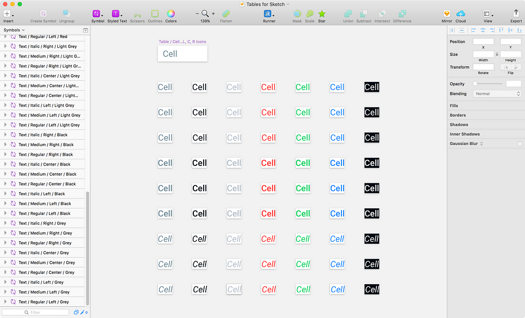
2. Convert the text layer into a symbol and duplicate it into multiple colors and text alignment options for your cell. Make sure all the text symbols have the exact same size, this will grant your ability to quickly change your text style from the override menu.
 Tip: When duplicating symbols, try to form a visual groups that can stay separate from other symbols.
When adding additional styles such as: Regular, Bold or Italic be sure to put the right suffix name to the symbol naming structure so you can form text style groups, like this one. 👇
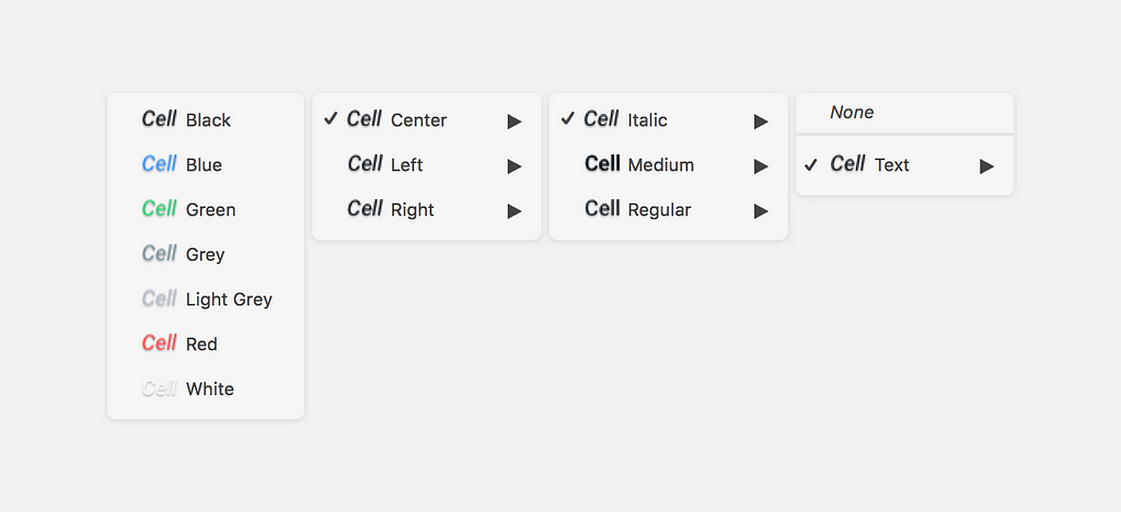 For example: Text / Italic / Center / Black
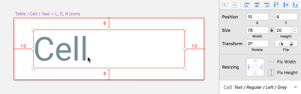
3. Fit the default text symbol inside a Cell container and set resizing properties to stretch, pin the text area to the Left and the Right edge.
4. Now add a background and a border to the container, use a Color symbol as Fill attribute for your cell background, and put it together with a border shape into an another symbol to form a State attribute.
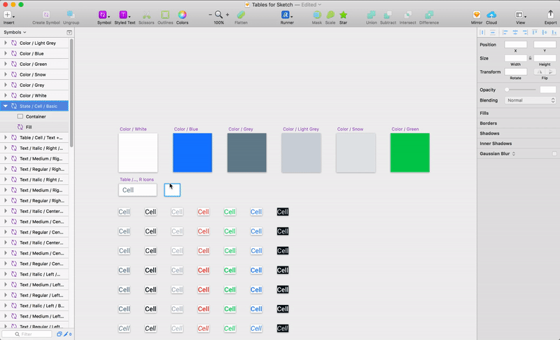 Container and Fill attribute merged to form a State.
State symbol will be used as parent container for Color symbol, and the border properties will be used to draw a rectangle and form a table grid, if you need to add another border/grid style simply duplicate the State symbol and adjust border layer properties to create a new cell look.
You can experiment a with border settings a lot (just as i did 🙃), and use different border positions and styles to control the visuals of your cell and the whole table as well. The border style that worked for me the best is —
0.5 Border, position: center.
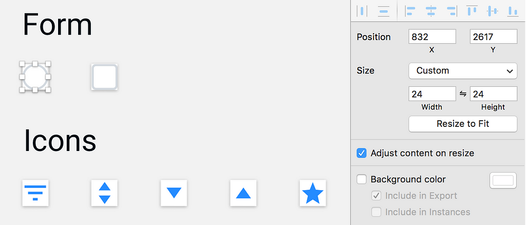
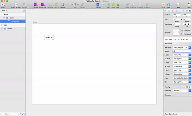
5. Now, grab some icons and put them inside the cell component, convert each icon to a symbol with a Color attribute in it, then place your default icon (★) into the Cell, set one icon to the Left, Right and Center.
Resizing: Fix width and height of each icon, leave the middle/center icon with no additional options, and set the left icon to pin to the left edge and the right icon to the right edge.
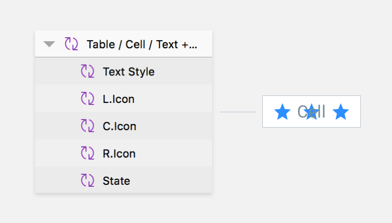 Tip: Put text symbol on the top of the folder so it stays the first item in the override menu.
6. Additionally, you can add checkboxes or radio buttons to the symbol page, with exact same size as icons symbols to quickly swap between icons and forms when using a cell.
 Tip: Checkboxes and radios can have different states as well — Normal, Hover, Selected etc.
7. Now you can play with Cell component and see how many visual combinations you can achieve by using these ingredients we have just put into a single container.
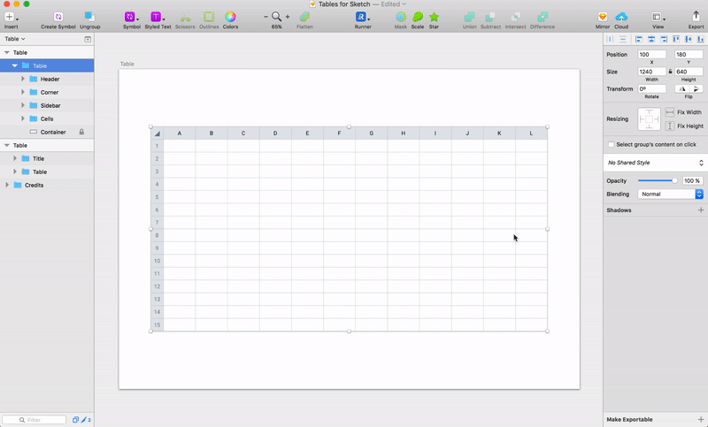
Since we have our master symbol ready, we will build a classic MS Office looking table using our Cell component. Using only one component at time will bless us with the ability to make super fast changes to different parts of the table (rows, columns) or to the whole table as well. 🏃
We will be using The Duplicator plugin on this stage so be sure to download and install it.
1. Start by making a table header and define the needed number of columns. Adjust Cell component to have a desired header look, go to Duplicator settings and set offset to: 0. Use shortcut ⌘⌃→ to quickly make a row of headers. (Feel free to use any direction you like.)
2. Duplicate the header row, and using override menu transform the row into a plain cells row — make a group and call it Row. Select the group and use Duplicator shortcut ⌘⌃↓ to quickly build the needed amount of rows.
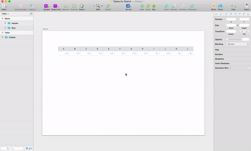
3. Make left sidebar from first cells of the rows and group it. Place a Cell to the left top of the table to make a separate corner group. Copy and paste this ◢ glyph into the corner text input to make a selector. This how you table should look by now. 👇
4. Now we only need to set the proper stretch/drag options to our table. Choose the table part and set resizing options to each of the group.
 Set resizing options only for the groups, all Cells symbols should have no additional resize options.
5. And… it’s done, now you can freely resize the table and put some data into it, feel free to make group changes by selecting an area of the table while holding the ⌘ key.
Using a single component can be very rewarding when it comes to constant changes for your data. But we still need a proper way to quickly populate override menu inputs with real data, if you know a way on how to do it feel free to DM me or leave a comment.
Frames toolkit contains much more components and techniques like this one, that will help you to master Sketch tools and produce better results at less time. Frames for Sketch is project driven by the will to design consciously using Sketch full potential, so be sure to visit the website and support the release of new articles and Sketch freebies. 🙌
Frames for Sketch – Web Design System
Hacking Tables in Sketch App was originally published in Design + Sketch on Medium, where people are continuing the conversation by highlighting and responding to this story.
AI-driven updates, curated by humans and hand-edited for the Prototypr community


