Build Design Systems With Penpot Components
Penpot's new component system for building scalable design systems, emphasizing designer-developer collaboration.
UX Power Tools – Medium | Jon Moore 
Quick Note: I learned all of this from amazing designers like you, fantastic mentors, and lots of trial and error. If you learn something from this article, share it with another designer. I’ll love you for it, and they will, too.
I always use this analogy:
No one cares what color the stitching is on the leather seats of your fancy concept car if it doesn’t even have wheels yet.
Prioritize your design efforts so that you’re satisfying all baseline requirements first. Then AND ONLY THEN can you move on to fancier things like custom illustrations and animation.
Which conveniently leads us to…
Sorry, everyone. It’s true. And I’m not saying this out of spite because I’m just not that good at it (which is also true).
World-class products have little to no animation at all:
These products are worth billions and billions and billions of dollars because they solve problems and deliver value, not because they have cute animations.
Yes, there is a time and place for animation, but start by spending your time delivering exceptional value through a best-in-class user experience. Then you can spend all the time you want making a cute little menu button that morphs into a McDonald’s Big Mac.
 This animation by Pete Sena couldn’t have been more perfect. (source)
A pattern is something that’s regularly found in comparable objects.
Design patterns are called patterns because they’re found all over the place. Users are accustomed to doing things a certain way and that usually comes with expectations for the user experience.
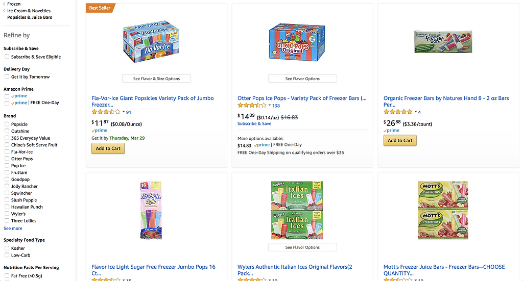
I could design you a hundred different ways to filter a data table, but nothing will ever be as efficient as a left-hand rail of check boxes like the ones found on every eCommerce website.
Don’t spend your time being fancy for things that don’t need to be reinvented.
In the spirit of not reinventing your entire being, for the love of all things holy, make yourself some design templates.
You’ll save yourself seven metric boatloads of time.
In a week and a half, I designed 52 screens for a client sprinting toward an important sales presentation and even wired them up into a clickable InVision prototype. It’s a fully custom design, too, and is completely customized to fit the tone of their brand. This would have been impossible without templates at the ready to help me jumpstart my work.
Here’s an example screen from my personal master UI boilerplate that I use on every single project as a way to get a head start:
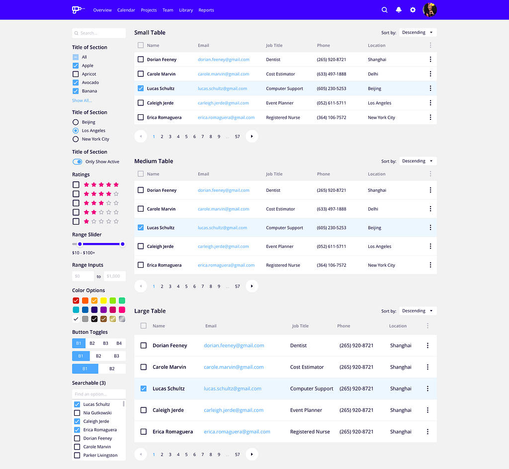 This was built using elements from UX Power Tools.
You can check out some of the design systems I’ve built over at UX Power Tools. I think they’ll really help you out.
The more consistently you design, the faster you’ll become.
How do I know?
Well for one thing, you’re dramatically reducing the number of design decisions you have to make along the way.
If you make yourself a button symbol in Sketch and use that throughout your design, no only will all of your buttons look consistent, but all of the sudden you’re working far more efficiently because you’re not making buttons from scratch every time you need one.
Earth-shattering, I know!
These are pretty symbiotic, so it also works in the reverse.
In order to work faster, you’ll have to create shortcuts for yourself. These shortcuts can be tangible things like design resources, or more intangible like establishing and following a set of design principles (like sticking to an 8px grid system).
As you become faster, consistency will naturally follow.
By last estimates, Craigslist was last valued at around $3 BILLION.
Have you ever seen that site? It’s hideous.
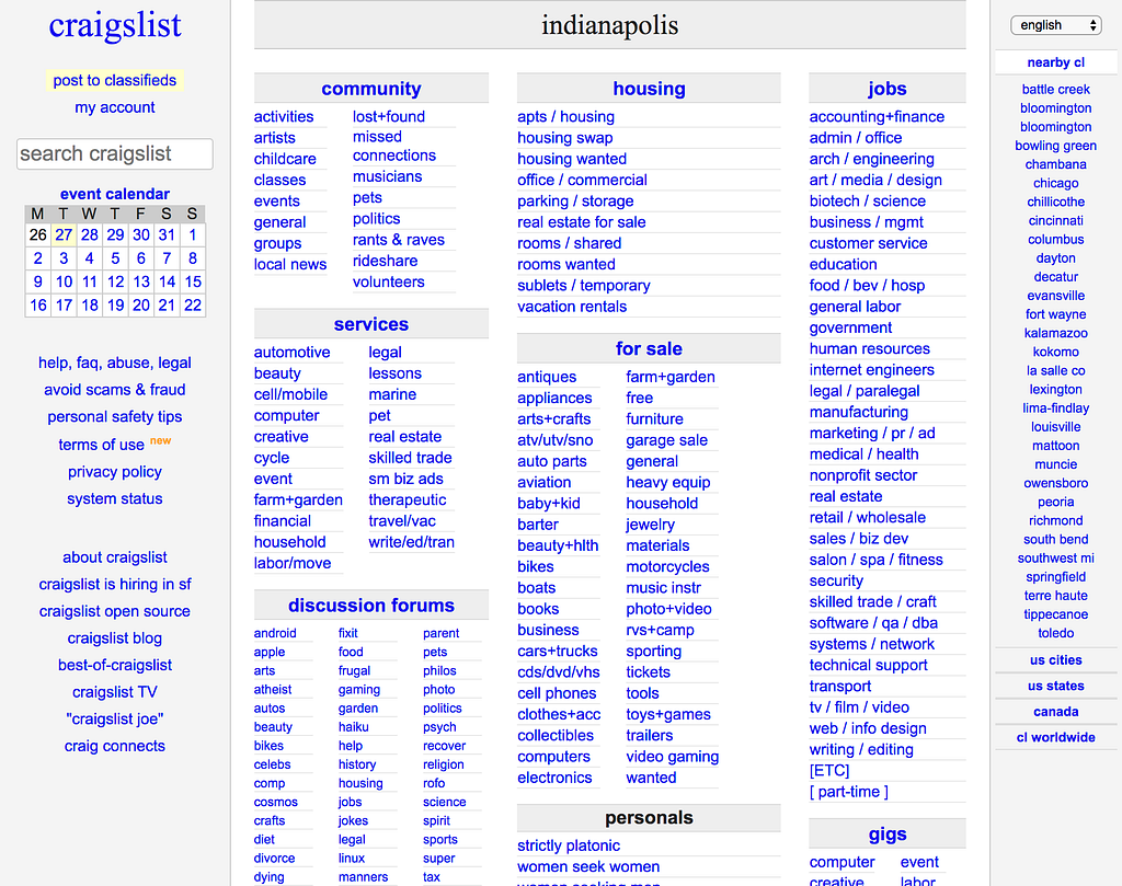
But it doesn’t matter. It solves a problem and delivers value to the user.
Plain and simple. Just like Craigslist!
Look, I’m not advocating design oversimplification. All I’m saying is that if you can deliver value to the user, you will create customers who will drive value to the business.
Solve the right problem for the right person and you’ll be golden.
There are LOTS of other people who matter in the product design process.
Just take a look:
Ever been on a date with someone that was SUPER HOT, but couldn’t really carry on a conversation to save their own life?
Visuals alone won’t carry a great design very far. I’d argue that visuals are really only about 20% of the entire presentation process.
The rest?
Well, that’s storytelling. If you don’t hook your audience with a compelling story, demonstrate business value, and speak on behalf of the user, then you will fail.
What does failure look like?
Lots of questions. Playing design defense instead of design offense. Design sacrifices. Lack of trust. Go-to-market anxiety.
You don’t want these things.
Tailoring Your Design Concept to the Right Audience
I saved this one for last because it’s SO SO SO SO SO SO important:
Literally nothing else matters.
Beautiful design? Awesome!
Didn’t launch? Failure.
Am I saying that in order to be considered a successful designer that you have to actually design something that gets built? Well to be honest, yeah, kinda. Talking about the plans you had for your spouse’s birthday that you didn’t follow through on aren’t going to do you any good.
Get. It. Built.
Even if it’s scrappy. Even if it’s imperfect. Even if no one ever uses it.
At least you followed through and learned something along the way.
When I’m not reflecting on my design career, I’m working on Sketch design tools at UX Power Tools to make you a better, more efficient designer.
Follow UX Power Tools on Twitter
Follow me on Twitter
Here’s everything I’ve learned from designing 10,000+ UI screens as a lead product designer. was originally published in UX Power Tools on Medium, where people are continuing the conversation by highlighting and responding to this story.
AI-driven updates, curated by humans and hand-edited for the Prototypr community