Build Design Systems With Penpot Components
Jul 21, 2:15 AM
Penpot's new component system for building scalable design systems, emphasizing designer-developer collaboration.
smashingmagazine.com

medium bookmark / Raindrop.io |
In October 2017, Dropbox’ rebranding became the designers’ community talk of the day, after it was presented to the world.
Dropbox is considered to have one of the most innovative and talented design teams in the world, and their previous brand and design language was an inspiration to many designers, including me. It was simple, consistent, responsive and playful. It felt like they kept finding new ways to simplify their products and brand, and every step they did seemed like a step in the right direction.
Their rebrand, however, was a big step away from what everyone knew and loved, which is why everyone cared so much. The new brand introduced many different color combinations, 259 fonts (!!!), and it can be described by many adjectives, but definitely not ‘simple’. To me it seemed as if Dropbox has changed and lost much of its magic. From a design system that helps their users handle their files with minimal distraction, to one with maximal distraction.

Dropbox Rebrand — Aaron Robbs
Inevitably, this redesign has received some harsh feedback from the design community. Here are some of the most voted comments in the Designer News post regarding that redesign:

But honestly, listening to too much feedback from designers is probably not the best way for a team to make design choices. Numbers are more important — measuring how the users behave in the redesigned pages, and see if the redesign performs better than the previous one. This will determine whether the redesign could help Dropbox evolve, or not.
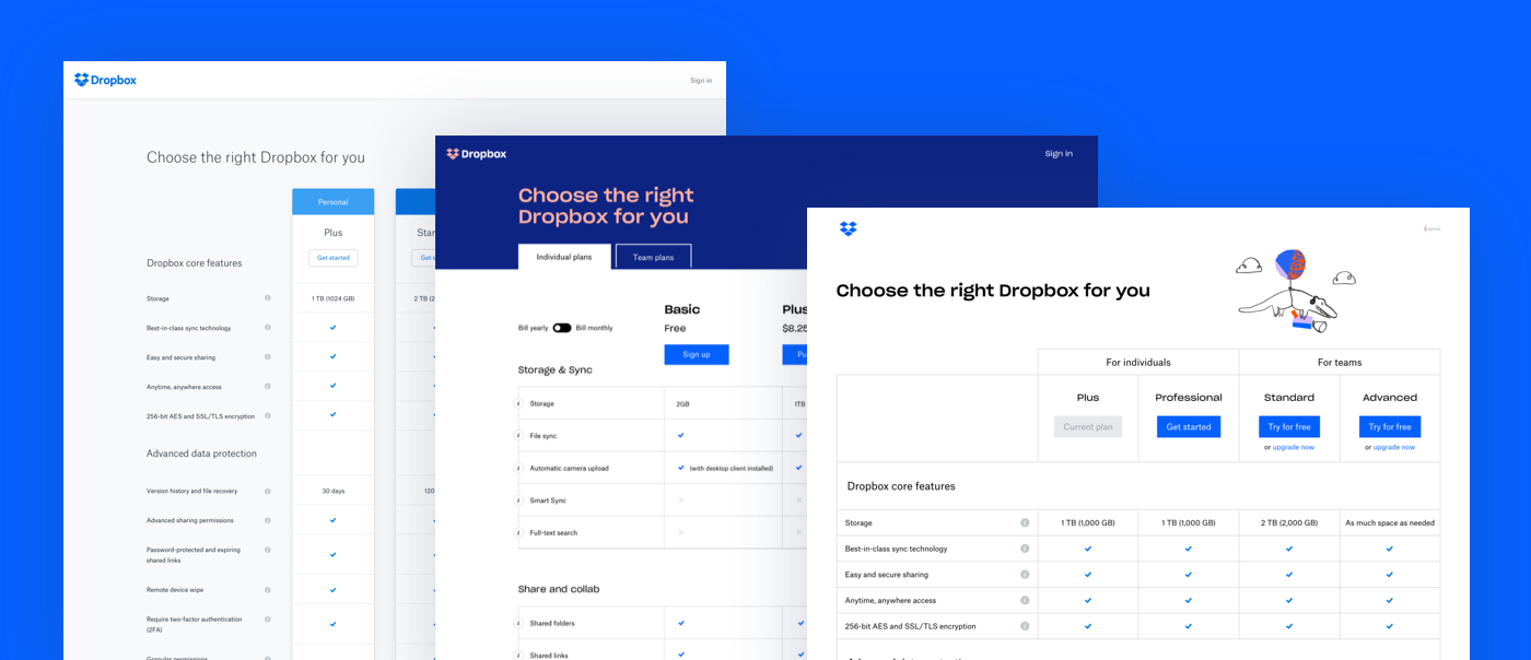
To get a glimpse into their process, we can observe the changes of the Dropbox.com pricing page. This page is usually a critical point in a company’s conversion funnel, it’s the stage where users decide if they want to pay for the services or not, and every small change in it could lead to impactful results.
This is how the pricing page looked like before the rebranding:
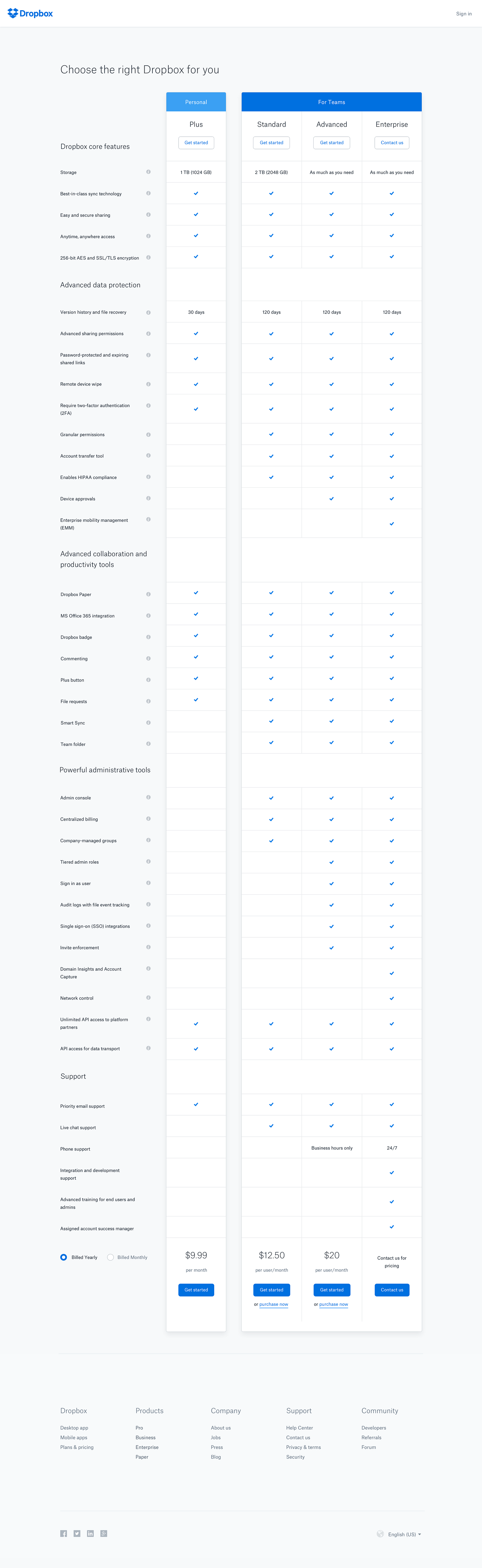
Plans — Arlen McCluskey
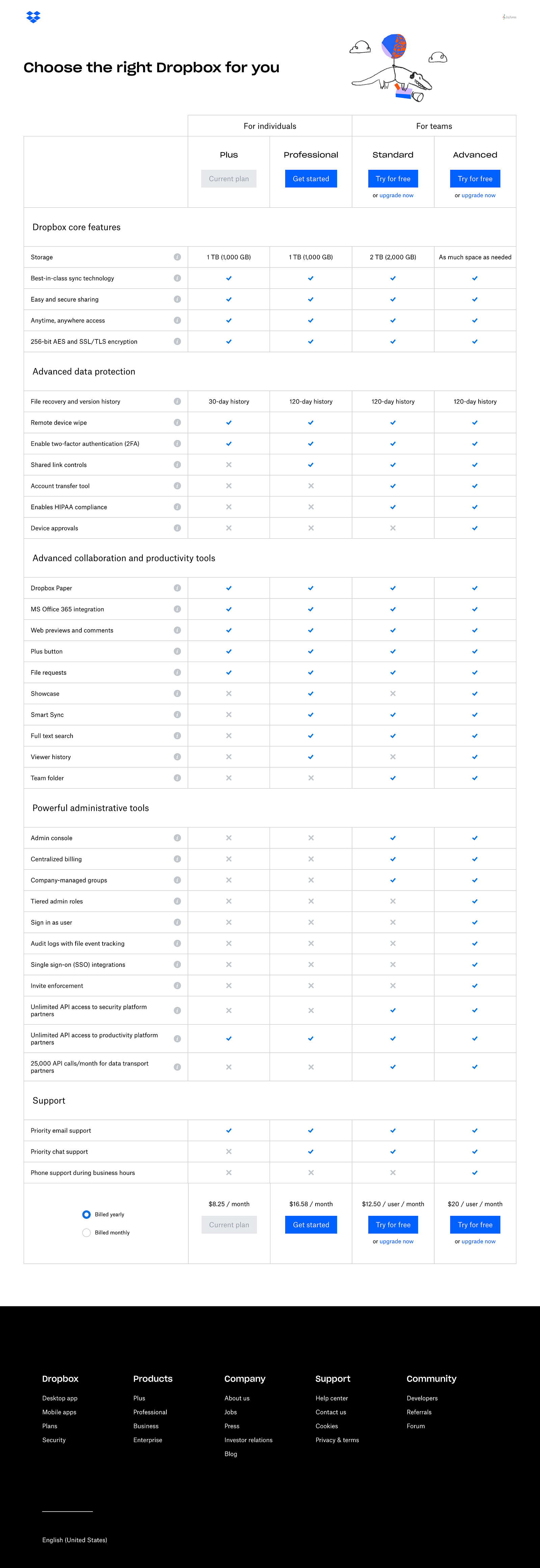
And this was the redesigned pricing page:
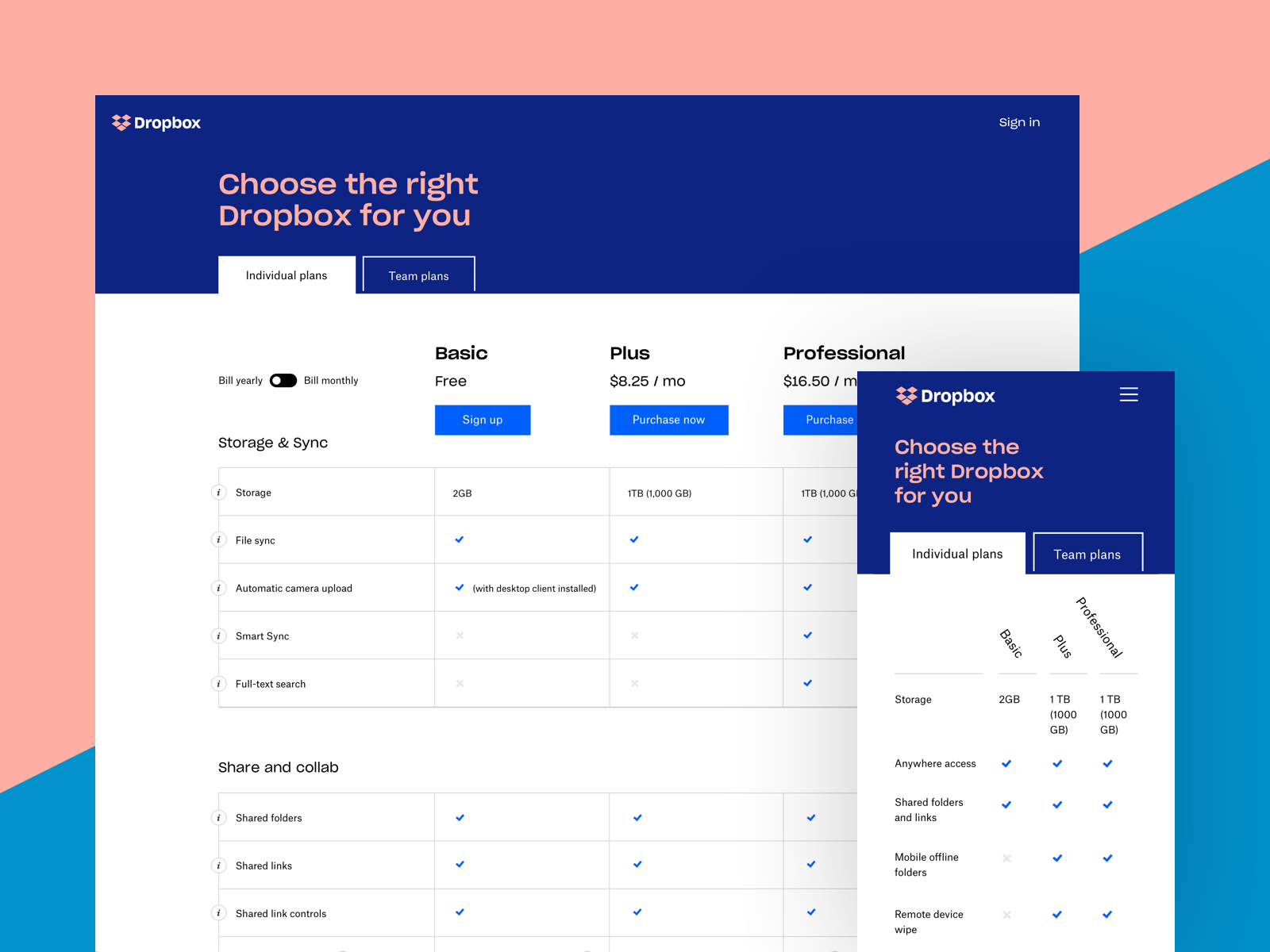
/Plans — Arlen McCluskey
When I first saw it, I was confused. I saw these changes, and I felt like they made a choice to step back from the simplicity for the sake of a more modern / experimental design. I was impressed by their courage, but pessimistic regarding their results. I was quick to make a comment about it and seems like a lot of people agreed with me.
This week, Arlen McCluskey from Dropbox shared a new pricing page, and wrote some interesting insights from the process which helps us understand what actually happened there:
When Dropbox rebranded late last year, our Plans page got a complete makeover. After launch, we soon noticed a drop in several key metrics. We reverted to the previous version of /plans, and swiftly got to work.
My team and I studied the numbers, and formed hypotheses to explain why the dip had happened, and how we could turn it around. For example, user research suggested that on this page, the bold rebrand color palette negatively affected trust and clarity. We also noted that the overall height of the page had grown substantially because of small increases in spacings on rows and titles. We combined a number of these ideas into one macro-experiment, and redesigned, rebuilt, and relaunched the page.
The results were in: the new page fully recovered across the board, now with a double-digit metrics lift. The new design out-performed both the pre-rebrand and rebrand Plans page in several other ways too. Here’s how it looks today. Not bad for a day’s work! 💪
Their redesign didn’t work at first, but they managed to identify the problems, iterate, and eventually come up with a version that’s out-performing all of the other versions so far.
In the redesigned page, Dropbox managed to keep important elements of their new brand, such as the title font and illustration style, and still come up with a simple version that‘s actually performing better and serves the company’s vision. This last version of this page is clean and friendly, the call to actions are bold. It’s simple and helps the users achieve their goal — compare the different plans Dropbox has to offer and pick the one that’s right for them. Which is why I assume it’s lifting their numbers.
Changes are scary. Especially if your company is successful, and your design is loved by many. Sometimes they’re not needed, but sometimes a company needs to make a move in order to evolve. When making a big change as a rebrand, it’s important to not be afraid of the immediate feedback and back down, but to keep track of how this rebrand affects your success as a company, and iterate where it’s most needed.
AI-driven updates, curated by humans and hand-edited for the Prototypr community


