 Design by
  Design by
  Design by
  Design by
 Build Design Systems With Penpot Components
Jul 21, 2:15 AM
Penpot's new component system for building scalable design systems, emphasizing designer-developer collaboration.
smashingmagazine.com

medium bookmark / Raindrop.io |
So, it’s official. You launched that brilliant startup idea you were dreaming about on lunch breaks. You bought the company domain, wrote a clever slogan and even built a solid business model. Now it’s time to focus on gaining traction with your target audience and creating your online presence. That means designing a website with brand consistency.

Your brand is the story that connects people to the products and services you offer. If the look of your website matches this narrative, your business will feel even more engaging and authentic. And that’s why fusing brand consistency into your web design is so important. You’ll gain recognition with your consumers.
Everything from colors and fonts to the words and layout represents your brand. But those design elements don’t need to be noisy, cluttered or overdone to still draw attention and make a lasting impact.
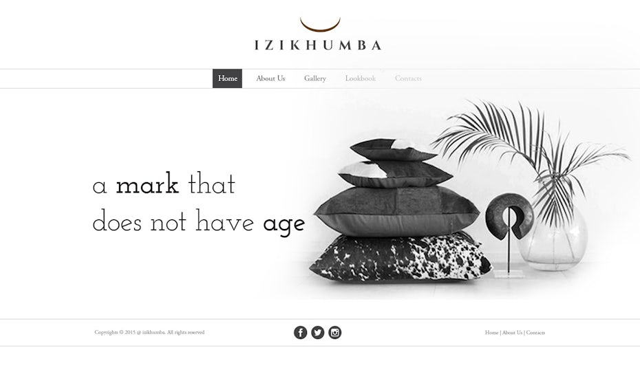
 How consistently the brand is translated onto your website determines how successfully the audience perceives, recognizes and connects with your business. Via Claudiu Fagadar.
Just follow these six steps to build brand consistency into your website. The finished product will communicate a bold, memorable statement that customers are sure to notice.
Every color you use on the website affects how people experience your company because each one evokes its own emotional response. This is known as color theory and picking the right combination gives your audience more insight on what the brand is all about. For instance, black and red feels edgy. Brown and green feels earthy.
Once you’ve determined the primary and secondary colors of your brand, integrate them into your website. Start with a dominant base color, like one used in your logo. Apply it to headlines, subheadings, background images and illustrations—any place that people will naturally gravitate toward on your site.
 The prominent turquoise base color offset with cool pastel accents reflect this startup company’s young, fresh and modern approach to business. Via Nikguk.
 The soft blue tones used on this website evoke a sense of calm which plays into the peaceful mood of this mindfulness-meditation space. Via Ink’d.
Use the subtler accent shades for the more functional aspects like navigation tabs, links, sidebar icons and menus. Color coding your website keeps it looking sharp and clean instead of distracting and unfocused.
Although it’s tempting to cram every square-inch of your website with content, the need for whitespace can’t be overlooked. Fusing this design technique into your site actually boosts attention spans and comprehension rates by 20%.
 The prominent degree of whitespace used on this website makes the black and gray features stand out almost three-dimensionally. Via PRANETOR.
Your eyes are prone to overstimulation, but whitespace is a blank canvas that allows them to breathe. Customers will be much more able to retain your brand identity than if you saturate the site with words and graphics. Instead of filling in all the available gaps and margins, surround images and text with whitespace to increase the legibility and communicate your ideas more effectively.
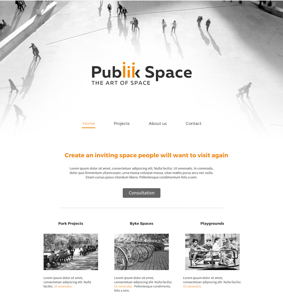 This website’s subtle but effective motif of a grayscale image fading into whitespace underscores the company slogan, “the art of space.” Via Piparus.
A website design that balances visual content with strategic whitespace is organized, polished and accessible—three attributes that you obviously want to be associated with your brand.
Just like your brand colors, the typefaces on your website should be uniform across-the-board. There are multiple styles of fonts, but too much variety will detract from your message. Instead of going into font overload, choose two that complement each other and support the tone of your brand. You’ll have design consistency without reining in brand personality.
Whether your preference is old-school serif, modern sans serif or freeform script, make sure the typeface is legible first. This might sound like a no-brainer, but regardless of how trendy the font looks, if you can’t read it, your audience can’t either. Some fonts are just too quirky to be practical.
You can also customize your own typeface, but when going this route, verify it’s compatible with all internet browsers—otherwise, the text won’t load correctly when people view your website. In order to sidestep this issue and still achieve that unique feel, choose a webfont that’s hosted through a server like Google, embedded into the browser and then coded directly onto the website. Although this sounds complicated, the actual process is straightforward, and it ensures that your custom font will be formatted on the website like you intended.
People want to know there’s a real name, face, and story behind your business, so infuse genuine human touches into your website.
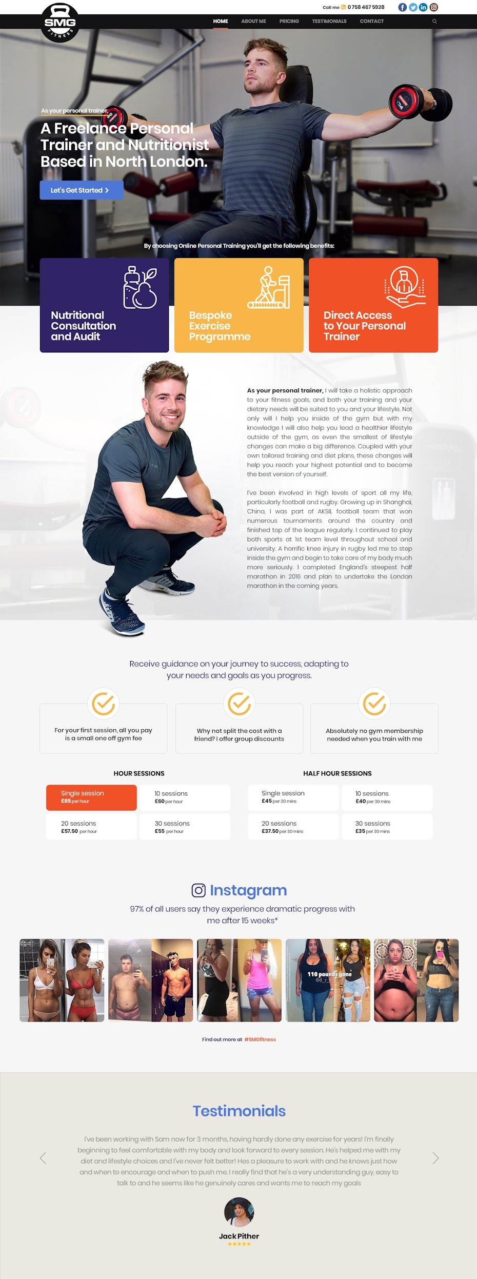 The about page establishes this personal trainer as competent, dedicated and authentic with the use of engaging text, progress photos and client testimonials. Via TheLionKing.
Think of your online presence casting a vision that tells to your audience, “We care about you and want to serve you.” When people are invested, they’re willing to support your endeavors. So rather than turning the website into a marketing hub, focus on personal details to craft a personalized experience that others can connect with.
A great starting point is a mission statement that tells customers what you’re about and how you can enrich their lives. Keep it concise, but specific. And make the core theme socially minded. An effective mission statement also has the freedom and fluidity to evolve as your brand changes based on customer needs.
For instance, we all know Chipotle as the undisputed authority on guacamole (who cares if it costs extra!). But their mission isn’t just about their product—it’s about the people:
“Over 23 years later, our devotion to seeking out the best ingredients we can—raised with respect for animals, farmers, and the environment—remains at the core of our commitment to ‘Food with Integrity.’ And as we’ve grown, our mission has expanded to ensuring that better food is accessible to everyone.”
Once you’ve defined your mission statement, find creative ways to incorporate those values into your web design. Here’s an idea: post candid, behind-the-scenes team photos that support your mission to give your brand an authentic, community-oriented vibe. This unfiltered glimpse into your company’s culture will energize the website with vibrancy and life. Plus, your audience will feel more closely connected to you.
Another element that adds credibility to your brand is the testimonial. Secure the clients’ permission, of course, then designate space on the homepage for real stories and quotes from people who have been impacted through your business. Peer endorsement tells a potential customer that you can be trusted to deliver on your mission.
The graphics on your website shouldn’t be flashier than the message your brand is communicating. But subtle image accents or underlays can add creative and aesthetic depth when used sparingly. Place high-quality photographs intentionally to show your audience what you represent even before they read any words.
Always make sure images are compatible with the content on your website. They should both clarify and amplify the brand’s voice, so people can visualize what it means to be part of your clientele.
For instance, think about the Nike customer—this brand has targeted a successful campaign around inspiring their audience to be fierce and gritty rule-breakers. And the sleek vibe of their graphics suggests owning Nike gear can develop this persona. In other words, strategically curated images send powerful non-verbal cues.
 The cityscape banner against a contrasting black and navy background gives this capital management website a smart cosmopolitan look. Via tale026.
 The three background images stacked on top of each other creates an ombre-like effect combining muted silhouettes and sharp, vivid details. Via slf1986.
You can also experiment with background or banner images on your website’s homepage to create even more dimension and refine the brand identity.
For example, if your business has an artistic feel—a gallery, fashion brand or design firm—add vivid and textured images to illustrate this concept. The graphic design studio Pentagram does that by interspersing a geometric collage of small photos with a rotating slideshow of large photos. The result is movement, colors, shapes and mixed-media to support the company’s emphasis on imagination and innovation.
A company’s logo is like its handshake. It’s the first impression that would-be customers receive when they come across your brand. The strongest logos are a fusion of both professionalism and personality, but just as crucial as your logo design itself is where it’s displayed on your website.
 This website’s logo is placed in the top left corner for maximum visibility, and its hexagon theme is woven throughout the homepage. Via martinthehorrible.
 This website’s logo is placed next to the navigation bar, making it accessible to visitors, and the embossed lettering adds an organic, homegrown feel. Via CreativeDove.
Be deliberate and purposeful about where the logo is placed. Visitors are more likely to remember a logo situated near the top left corner as opposed to the right because the majority of languages are read from left-to-right. Position the logo there and it’ll be the first image that readers subconsciously associate with your website.
Granted, it might seem cutting-edge to disregard the conventional top left model and choose a more unique layout—especially if the brand is known for challenging norms and setting new trends. Originality matters, but visibility is more important. It’s also a smart idea to group the logo and navigation tabs near each other for a convenient, effortless and optimized user experience.
From the major elements to minute details, every aspect of the website tells your target audience what to expect from your brand. If your web design is polished, cohesive and organized, people will trust your business to offer that same consistency in service and quality.
In other words, being consistent in how you present the brand online communicates how you operate your business offline. Do you want to be known as reliable and state-of-the-art? Or disjointed and unfocused? Yeah, exactly!
Mary-Elizabeth Schurrer is a freelance writer and blogger who is passionate about helping creative spirits like herself feel equipped to pursue their ambitions. She lives in Southwest Florida and believes that everything is better beachside. When she’s not writing, Mary-Elizabeth can usually be found running, listening to podcasts or updating her personal blog, Health Be A Hippie.
AI-driven updates, curated by humans and hand-edited for the Prototypr community


