Build Design Systems With Penpot Components
Jul 21, 2:15 AM
Penpot's new component system for building scalable design systems, emphasizing designer-developer collaboration.
smashingmagazine.com

Design + Sketch App — Medium | Marc Andrew 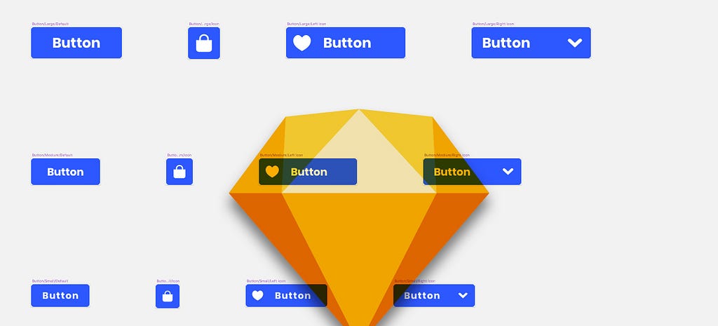
In the previous articles I showed you how to build the foundations of what will become your Design System in Sketch, including the creation of base elements such as Colour and Typography and then onto the base Symbols such Icons and Text which can then be implemented into countless other Symbols as you move forward.
In this final part I want to show you how to combine these smaller Symbols such as Color, Text, Icons, Button Shapes and States to start building out Components for your design system, with the added bonus of Sketch’s Resizing Constraints to make them adaptable to varying screen sizes.
Please note: Like I mentioned in the previous articles, I won’t be showing you how to build out hundreds of Symbols or Components. I’ll just be giving you a brief insight into some of the key elements here.
Let’s dive on in…
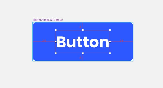
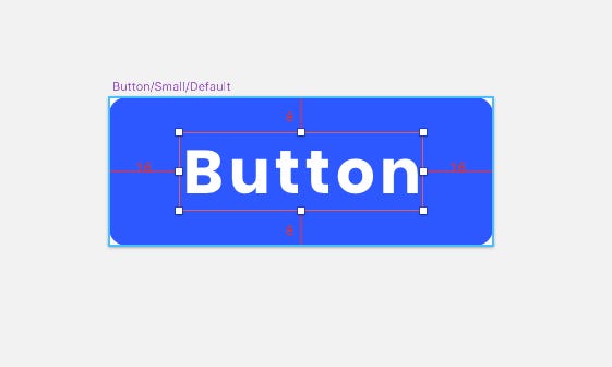
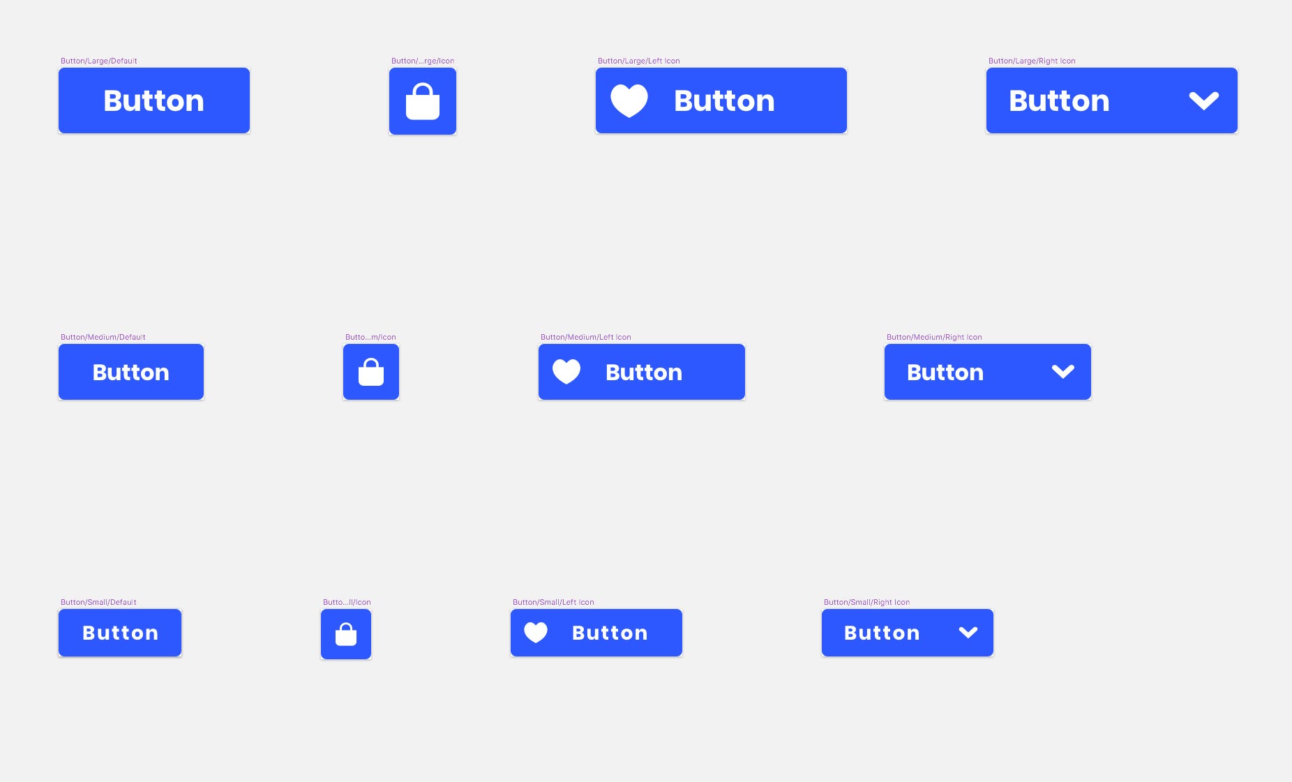
For the Button Components I opted for 3 sizes (Small, Medium and Large) to give myself some adaptability when creating artwork for various screen sizes.
I also brought the 8pt Grid System that I mentioned in Part One into play here once more, to keep an element of uniformity throughout.
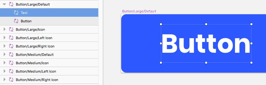
Starting with the Large Buttons, I chose to create 4 Component variants –
Enough in the way of design variety to slot into 99.9% of the projects you’ll create at a later stage.
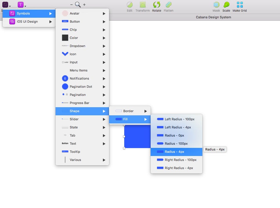
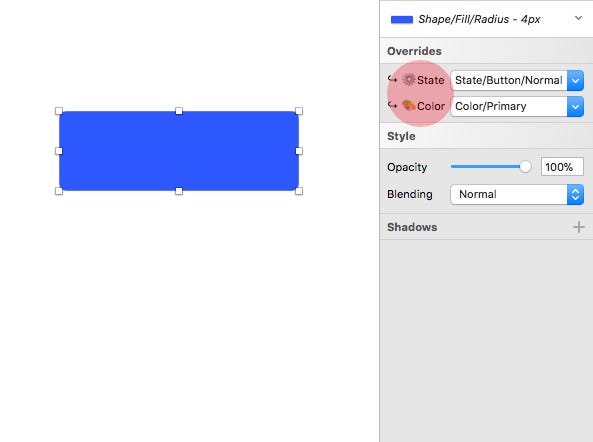
So starting with the Large/Default Button Component, I firstly dropped in the Shape/Fill/Radius — 4px that I had created previously. Now you can choose the Symbol with 0px or 100px Radius to be your default that’s entirely up to you.
I then renamed the Layer simply to Button, and noted that with just this Layer in place that I also had the Symbol Overrides (Button State & Color) at my disposal moving forward. Very handy indeed!
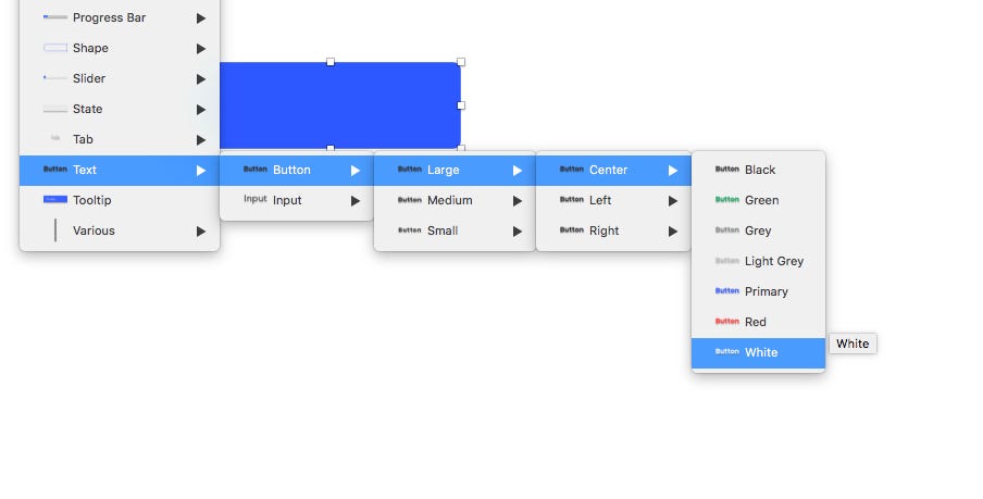
From the Text Symbols I had created previously I dropped in the Text/Button/Large/Center/White Symbol, and simply renamed the Layer to Text.
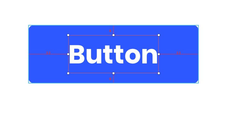
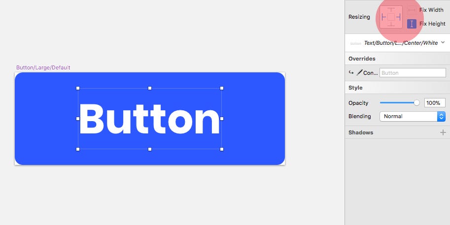
Now, wanting to adhere to the 8pt Grid System, and using a little bit of calculation I adjusted the width and height of the button Layer so the text Layer that I just added aligned 8pt from the top and bottom of the button, and 32pt from the left and right edges.
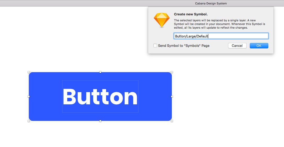
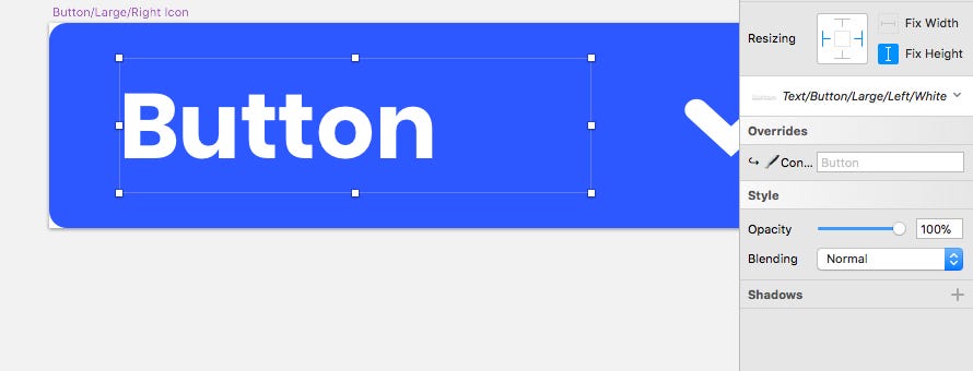
With the Button Layer resized accordingly, and the Text Layer aligned correctly, I selected both layers and converted to a Symbol naming it as such — Button/Large/Default.
Now working with the freshly created Button Symbol, I selected the Text Symbol inside of it…
…and from the Resizing Constraints in the Inspector Panel, Pinned it to the Left and Right edges, and fixed the Height. Now whenever I resize this Button Symbol inside of my projects, I know that the text inside of it is going to align perfectly.
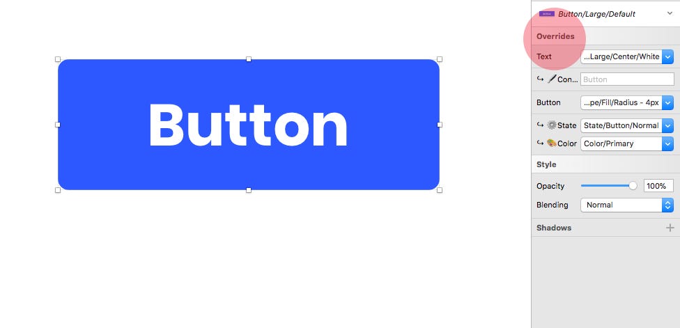
Now, inserting this Symbol into a project I have a multitude of options (Overrides) at my disposal, enabling me to tweak away at this Component with minimal effort. Huzzah with sprinkles on!!
Onto the Icon Button. I again, simply inserted the Shape/Fill/Radius — 4px Symbol I’d created previously, renamed it, and then adjusted it to more of a square shape.
Then from my Symbols, dropped in one of the Icons I’d created previously, renamed the Layer (Icon), changed its Color Override to White…
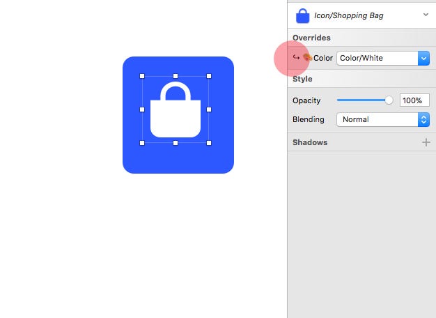
…and then, using the Scale tool, increased its size to 32 x 32px.
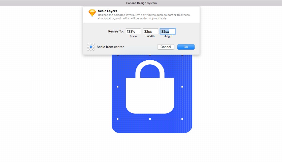
I then adjusted the dimensions of the shape layer, so the Icon Symbol aligned 8pt from all edges.

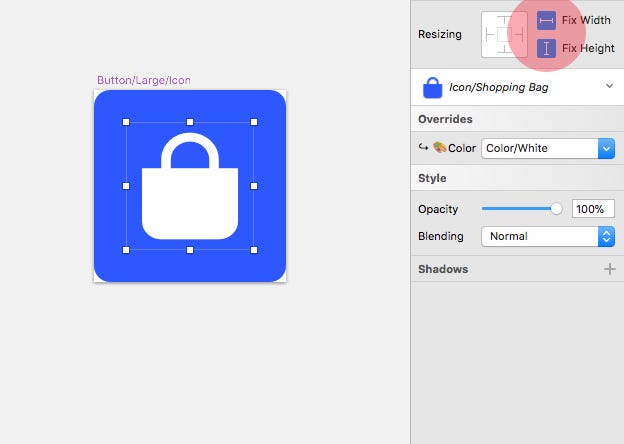
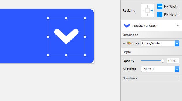
With the Button Layer and Text Layer aligned correctly, I selected both layers and converted to a Symbol naming it as such — Button/Large/Icon.
Now working with the newly created Button Symbol, I selected the Icon Symbol inside of it, and using Resizing Constraints fixed the Width and Height. This just avoids distortion of the icon when the Symbol is resized inside of your projects.
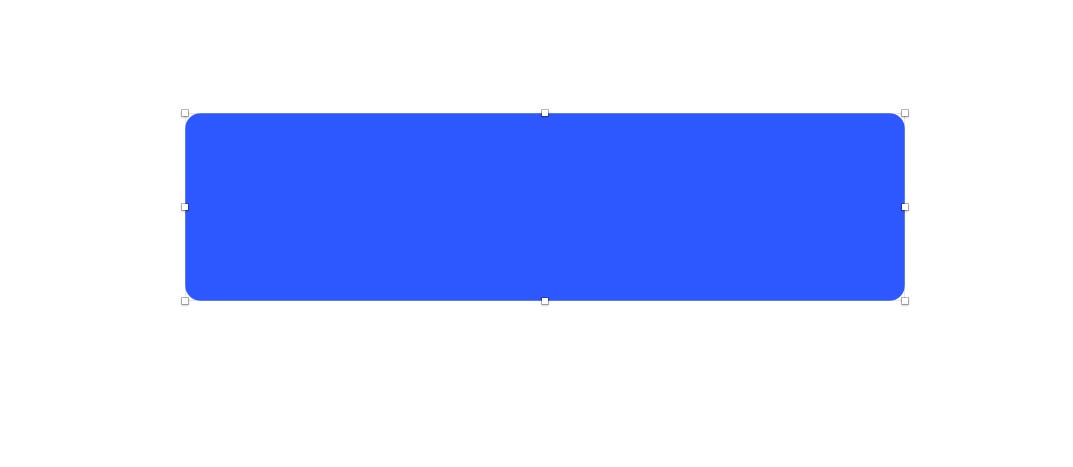
Moving onto the Button/Large/Left Icon Symbol, following similar steps to the previous buttons I’d created, I inserted a Shape/Fill/Radius — 4px Symbol and then adjusted its dimensions slightly (180px x 47px if you wanted to know the exact dimensions)…
I then inserted an Icon Symbol, renamed it, scaled it to 32 x 32px and changed the color Override to White.
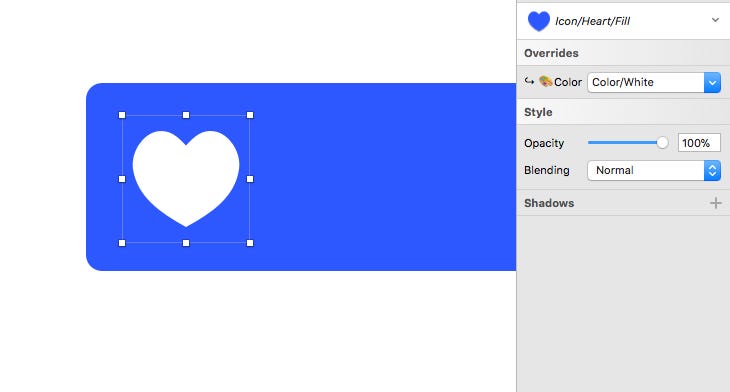
And from the Text Symbols I’d created previously, I dropped in the Text/Button/Large/Left/White Symbol, and renamed the Layer to Text.

And once more, adhering to the 8pt Grid System, I aligned the Icon Symbol, so it was 8pt from the top, bottom and left edge.
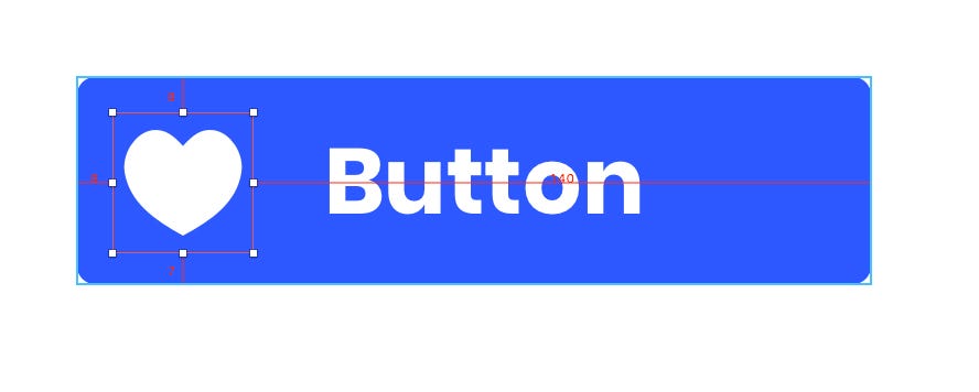
And for the Text Symbol, so it was 16pt to the right of the Icon, 8pt from the top and bottom of the Button Symbol, and using the resizing handles, adjust it so its bounding box was 16pt from the right edge of the Button Symbol.
Now, with all 3 Layers selected (Text, Icon and Button), I converted to a Symbol and named it Button/Large/Left Icon.
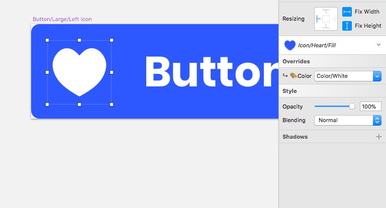
Working from the newly created Button Symbol, I first selected the Icon and pinned it to the left edge, and then fixed its Width and Height.
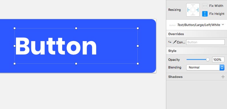
Then with the Text Symbol selected, I pinned it to the left and right edges, and fixed the Height.
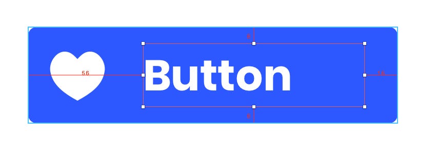
Finally, for the Button/Large/Right Icon Symbol, I followed a similar process to the previous buttons.
Then, aligning and resizing (bounding box) the Text Symbol so it was 16pt from the left edge, 8pt from the top and bottom edge of the button, and 16pt from the left edge of the Icon.
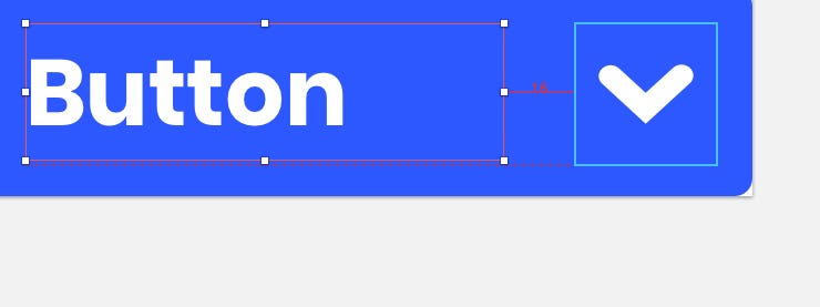
And for the Icon Symbol, so it was 8pt from the right, top and bottom edge of the Button.
Then I selected all 3 Layers (Text, Icon & Button), and once more converted to a Symbol Button/Large/Right Icon.
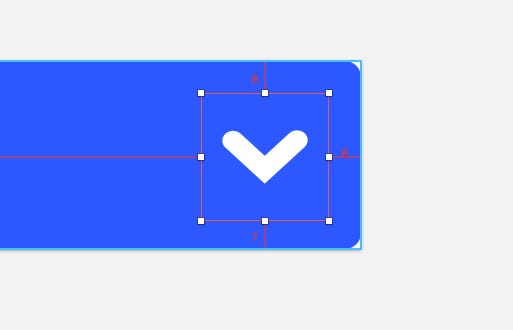
And finally, with the Resizing Constraints, pinned the Text Layer to the left and right edges, and fixed its Height.
And for the Icon, pinned it to the right edge, and fixed its Width & Height.
After getting the Large Button Symbols into play, I then went down through the Medium and Small variants following a very similar process to what I’ve shown you, but this time inserting, for example, the Text/Button/Medium/Center/White Symbol, and scaling the Icon Symbol accordingly, but still adhering to the 8pt Grid System throughout.
Until I had 12 rather fine Components now at my disposal. Oooh I do like that!
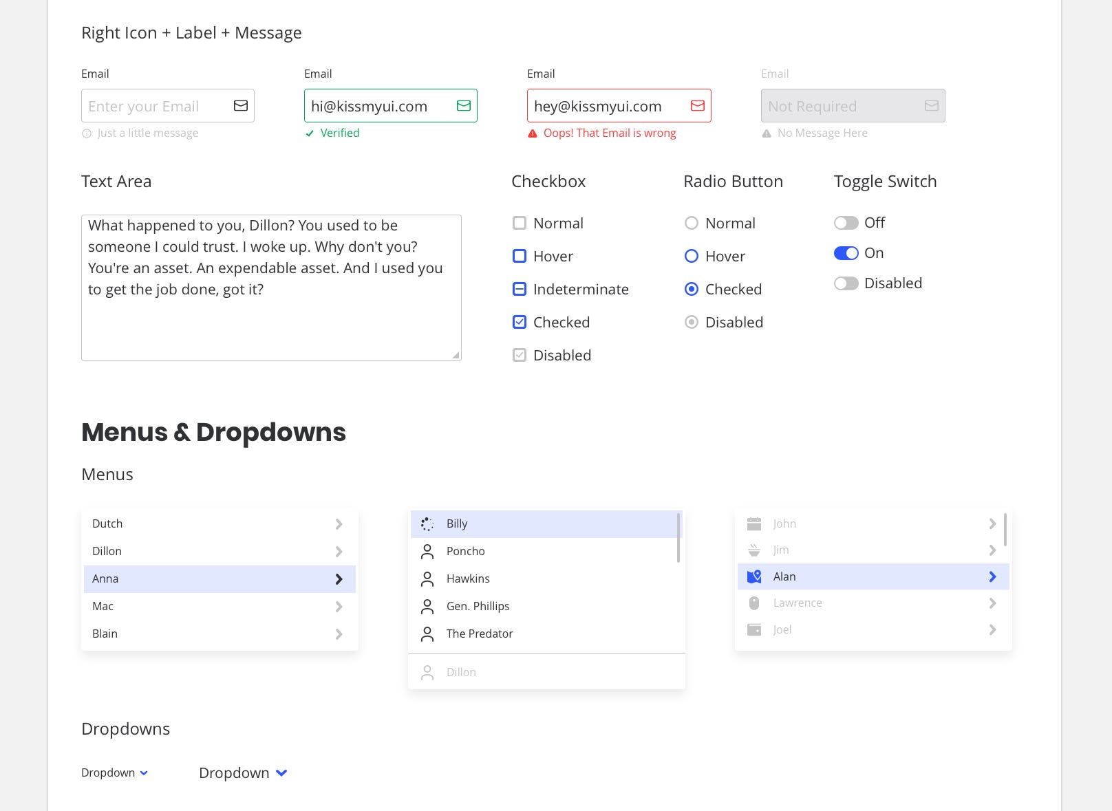
I then created Components such as Form elements, Menus & Dropdowns, Navigation, Pagination and more. Key elements for any project you’re working on, but it in a form that was now easily customisable and allowed me to stay on point when working through a project.
It opened my eyes to how just creating those smaller foundational elements such as Text, Color and Icon Symbols, then allows you to simply build out into much larger components with ease, and how those small building blocks are key to any kind of Design System that you’re hoping to build.
Use the offer code MEDIUM25 to receive 25% OFF.
Thanks for reading the article,
Marc
Designer, Author, Father and Lover of Crisps (or Chips, if you’re on the other side of the pond)
How to create a Design System in Sketch (Part Four) was originally published in Design + Sketch on Medium, where people are continuing the conversation by highlighting and responding to this story.
AI-driven updates, curated by humans and hand-edited for the Prototypr community


