Build Design Systems With Penpot Components
Jul 21, 2:15 AM
Penpot's new component system for building scalable design systems, emphasizing designer-developer collaboration.
smashingmagazine.com

Boagworld – Web & Digital Advice | Paul Boag
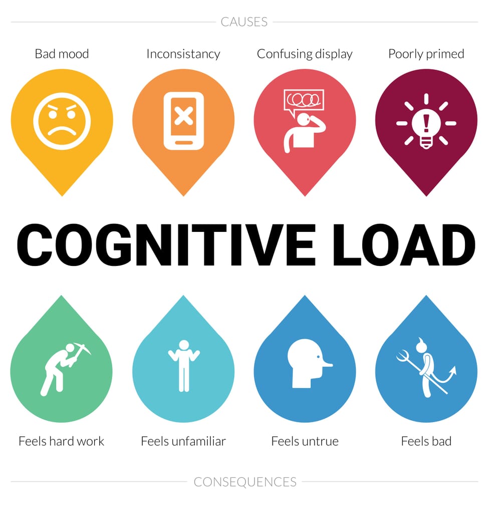
Is your website making users think too hard? Could it be increasing their cognitive load and causing them to abandon your site? If so, this is a problem you can, and should, fix.
The post How to Fix the Devastating Impact of Cognitive Load on Your Site appeared first on Boagworld – User Experience Advice.
Humour me for a moment. Watch the video below and count how many times the players who are wearing white pass the ball. Don’t worry; it only lasts about a minute, and watch it even if you think you have seen this video below.
You have just experienced the impact of cognitive load. Your working memory was overwhelmed with the exercise of counting ball passes. As a result, you were unable to process the additional input of the gorilla, departing player or curtain colour change.
The relevance of this to us as web designers is immediately apparent. If a gorilla becomes invisible when users are overwhelmed, then so can that critical call to action on your website. Suddenly our inherent desire as designers to keep things clean and simple makes sense. We are trying to reduce cognitive load.
Our inherent desire as designers to keep things clean and simple makes sense. We are trying to reduce cognitive load.
Every item we add to an interface increases cognitive load and reduces the chances users can see and process more essential elements. That can be devastating for conversion rate optimisation or site usability.
But this is not just about users missing essential screen elements. Cognitive load impacts how users feel about a website too.
Websites that require us to think, feel like hard work. We resent using them, and that makes us view the site negatively. But that also has another intriguing consequence — It makes us distrust the site.
Interestingly, according to research done by Katarzyna Samson and Patrycjusz Kostyszyn, if people are under increased cognitive load, we see a decrease in the amount of trust they are willing to place in associated activities. In other words, people stop trusting your site and, as we know, trust is essential if you want users to believe your messaging and ultimately complete your call to action.
 alt=”cognitive load illustration”>Cognitive Load has enormous consequences over the likelihood we will complete a call to action.
So what do we do about this? It is not as simple as removing screen elements. Yes, reducing visual clutter does make a big difference, but not every interface can be simple. Some tasks are by their nature complicated.
Also, an interface doesn’t come with a intrinsic level of cognitive load. There are other factors at play. Factors such as how familiar people already are with the interface you are creating.
If you can drive a car, do you remember what it was like to learn? It is a painful process with so much to concentrate on simultaneously. You have to watch the road, check your mirrors, steer, change gear (at least in Europe) and signal.
After a few years of driving, it is entirely possible to arrive at work with no memory of the trip. That is because it has become so familiar. The entire process has become automatic.
That is why people love using Amazon and Facebook. It is not that their interfaces are particularly well designed, it is that they are familiar. Using those services have become automatic.
 alt=”Amazon has managed cognitive load by changing gradually.”>Although Amazon has changed over the years it has done so gradually.
It also explains why Amazon has never substantially redesigned their site, but instead evolved it over time. They know that if they did, they would break the users mental model of how the site works and substantially increase their cognitive load.
Facebook hasn’t been as good at learning this lesson and paid the price. Every time they have made a change to their site it has inevitably caused a backlash, despite the differences often being an improvement to the interface. That is because it breaks the sense of familiarity and makes people think more.
When faced with an unfamiliar interface that increases cognitive load it is often easier to switch to another service.
However, inevitably, after a few weeks, the backlash dies down as people become familiar with the new approach and new autonomous pathways have formed. Of course, that only works if users are locked in enough to your site to encourage them to endure. Often it is easier to switch to another service.
There are six lessons we can learn from a user’s need for familiarity.
We should follow Amazon’s example and incrementally evolve a site giving users time to adapt to each change, rather than overwhelming them with many changes at once (like in the Gorilla video).
See also: How to adopt an iterative approach to UI design
Redesigns cannot and should not always be avoided and there are things that can be done to reduce cognitive load if you do redesign.
However, whatever you do, some users will complain, and you will see a decline in repeat traffic. If we do not explain this to stakeholders, they may lose their nerve or start blaming you for a poor design.
Whether evolving or redesigning your site, seek to ensure consistency across your site and conform to user expectations of what will happen.
If the user has come to expect your website to behave in a certain way, do not deviate from that. Consistency in your user interface and labelling is crucial and that is where a design system can help.
See also: How to create a pattern library and why you should bother.
I see a lot of articles complaining that all websites are looking the same. Although I sympathise with this position because it makes the industry stagnant, we need to understand there are times and places for design innovation. I am a fan of experimental design, but we need to recognise that this kind of design does increase cognitive load and so is not always appropriate.
If users have come to expect certain user interface patterns, because they have seen them across multiple sites, you should think carefully before deviating from that.
See also: Design convergence is not a dirty word.
Interestingly, one of the best ways to reduce cognitive load is to design with accessibility in mind. By making a site accessible, especially to those with cognitive disabilities, you reduce the cognitive load for all.
Take for example the copy on our websites. We need to keep the language as simple as possible or replace the text entirely with an infographic. Complicated ideas and language are unfamiliar, and so we need to think harder about them.
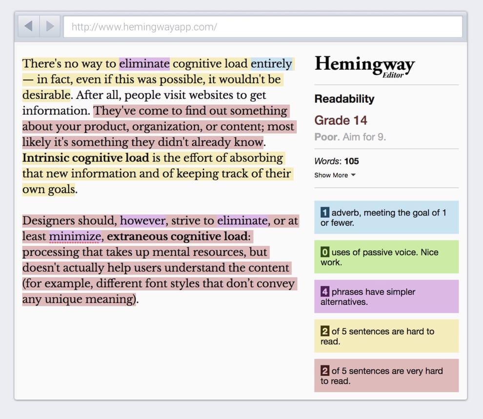 alt=”Hemingway App reduces cognitive load.”>Use a tool like Hemingway to improve readability and reduce cognitive load.
By using familiar, simple language we help those with dyslexia and other cognitive disabilities, but also make pages more accessible to scan for us all.
See also: Accessibility is not what you think.
But it is not just about familiarity. Mood can impact our level of the cognitive load too.
Our mood has a somewhat complicated impact on how we think, and by extension, use a website. Being in a lousy mood actually can be beneficial in some circumstances. For example, we will make fewer mistakes when filling in a form if we are in a bad mood.
A user being in a bad mood can actually reduce the number of mistakes they make on your website.
The reason for this is that a negative mindset causes us to be more analytical and therefore pay more attention. By extension being in a positive mood encourages us to be more intuitive, acting on a more subconscious and instinctual level.
That means that a positive mood can reduce cognitive load because we are behaving more autonomously.
So what does all of this mean to us as web designers?
First, it means that if your site is unfamiliar to your user and if the consequences of mistakes are relatively low, then it pays to put a user in a positive frame of mind.
The more a user delays a decision the more uncertain they will be about that decision.
Second, we know that people are inherently lazy when it comes to thinking. They tend to avoid it. That means if your call to action requires a big decision of any kind they will delay it. By putting them in a good mood, they will analyse the decision less, so reducing their cognitive load and increase the chance that they convert.
That is where design delighters become crucial. There is a trend at the moment towards design focused on usability. That is important. But, aesthetic design is as important.
Whether it is humorous microcopy, design easter eggs or satisfying interaction animation, design can lift our mood and so our cognitive load.
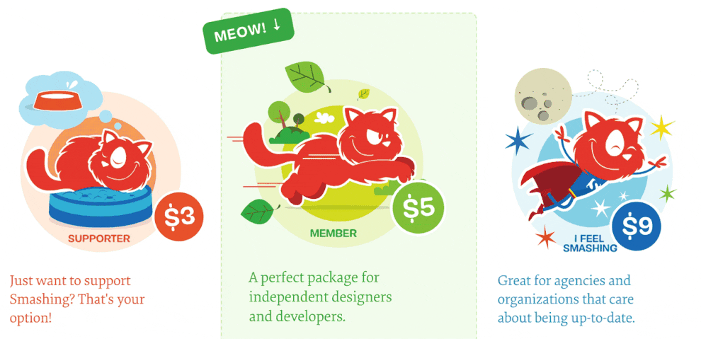 alt=”Delighting users reduces their cognitive load”>Smashing Magazine uses a combination of fun illustrations, lighthearted copy and subtle animation to influence user’s mood.
The impact of mood on cognitive load also helps make a case for adequate user research. If we don’t correctly understand a users mood, we cannot understand the level of their cognitive load. Also cognitive load is not just limited to what is going on within the user interface. External distractions play a part too, which is why we must understand their circumstances.
However, there is one more area that will impact the cognitive load of our users which is whether we have primed them correctly.
Our expectations impact our level of cognitive load. If our expectations don’t match our experience, then this causes a higher level of cognitive load.
For example, if we expect a transaction on a website to be fast and it is not, our level of cognitive load increases and we are more likely to abandon. However, if we go in expecting the process to take some time, then we experience less of a cognitive load and so are more likely to persevere.
We can manage users expectations by preparing them adequately. This preparation is known as priming.
We can use priming in all kinds of ways to influence behaviour making decisions feel more intuitive and natural. For example, in experiments, supermarkets have found that if they play French music in the store, they increase the sale of French wine and reduce the sale of wine from other countries.
The concept of priming is often associated with dark patterns. But it can be used in a positive way too.
The principle of priming has some interesting ramifications for us as web designers, not all of which are particularly ethical. But we can use priming for good too. We can use it to prepare people for their experience in our app or website.
Not only can priming be used to prepare a user for a more complicated interaction, but it can also be used to improve a persons understanding, by gently shifting their mental model.
If I said to you “Jim is going to the bank” what do you imagine? The chances are you will think Jim is going to the bank to complete a financial transaction. That is because most of us associate the word bank with money. But, if I had first talked about fishing with you, then you might have concluded Jim was going to the river bank. I had primed you to think about water.
Understanding this can be useful when labelling navigation. If we prime the user to think about a specific subject, that will influence how they interpret our labelling and that in turn can reduce cognitive load because we have put people on the right track.
In some ways, this post has taught you nothing new. You probably already knew that simplifying an interface was good or that putting people in a positive mood was desirable. It is hardly mind-blowing that creating a sense of familiarity improves usability.
But cognitive load explains why these things are good, and that is important when talking to stakeholders.
So the next time a client asks you to add too much information to a page, show them the gorilla video. Only then will they grasp the impact of cognitive load and how they need to work hard to reduce it.
The post How to Fix the Devastating Impact of Cognitive Load on Your Site appeared first on Boagworld – User Experience Advice.
AI-driven updates, curated by humans and hand-edited for the Prototypr community


