Build Design Systems With Penpot Components
Jul 21, 2:15 AM
Penpot's new component system for building scalable design systems, emphasizing designer-developer collaboration.
smashingmagazine.com

medium bookmark / Raindrop.io |
Trying to capture the essence of an object or an idea with only a few lines and at the same time maintaining its elegance is pretty much design in a nutshell. That’s what’s so great about icons, they’re tiny poems.
Kyle Tezak, The Four Icon Challenge
Content is a king and as any king he has own army. Written words, his main force, have so much energy and power with the ability to help, to heal, to hinder, to hurt, to harm, to humiliate and to humble. Written words have a great influence on our daily life, but sometimes they give up and fail to communicate any meaning.
Words with icons.
In these tight spots our little friends, icons, come to the rescue.
The word icon comes from the Greek εἰκών eikōn, which has two meanings: likeness and image. The term was coined by Dr. David Canfield Smith in his landmark 1975 PhD thesis “Pygmalion: A Creative Programming Environment”.
First computer icons were designed by Dr. Smith and Norm Cox for Xerox Star 8010 OS. Norm Cox, inventor of the hamburger menu icon, is also known for creating timeless office metaphors like the desktop, folder, file and trash can.
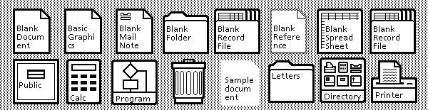
Xerox Star 8010 icons. Source: Tuts+
A picture is worth a thousand words.
Icons are more than just decoration or pretty images. They serve a wide range of purposes from portraying main features of the product to conveying mood and emotions.
There are lots of things that icons do better than words. Let’s take a look at some of them.
Icons help overcome language barriers, giving information when written words are not adequate. A standard set of pictograms provides valuable information about the location, services, rules and prohibitions to people all over the world.
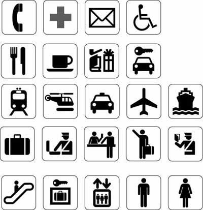
A standard set of pictograms was defined in the international standard ISO 7001: Public Information Symbols. Source: http://www.johngilltech.com/guidelines/pictograms.htm
Icons are fast to recognize at a glance. It’s particularly true for common icons, that people have seen and used before. Take the humburger icon for example. According to the Nielsen Norman Group, it is one of the most known icons around the world. Despite lots of different variations on the web, this icon became a standard to denote a hidden, off-canvas menu.
One of the major drawbacks of using the “hamburger” is that you create an additional step for users to reach valuable information on your site.
Some hamburger icons available for you in Gravit Designer’s library.
Icons are more memorable.
Using pictures with words in your communication increases the chance of creating long lasting impressions by 55% compared to words only.
This last phrase is not only hard to remember, but also hard to comprehend. Let’s look at the following picture
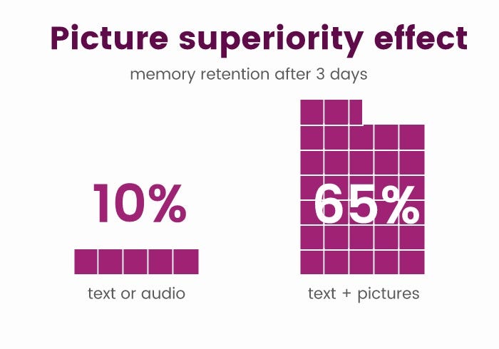
Picture superiority effect. Text with picture is six times more memorable than text alone. Source: https://vitorials.net/picture-superiority-effect-why-a-picture-is-worth-a-thousand-of-words/
This phenomenon is called “picture superiority effect.” It is based on the notion that “human memory is more sensitive to symbols.” The scientific explanation behind it is that an image has two domains of encoding in our brain: verbal and pictorial.
If our brain were a battleship, all words would be single-funnel ships, that vanish easily from our memory. In contrary, pictures would be two-funnel ships that can be hit once but still survive in our grey matter. 🙂
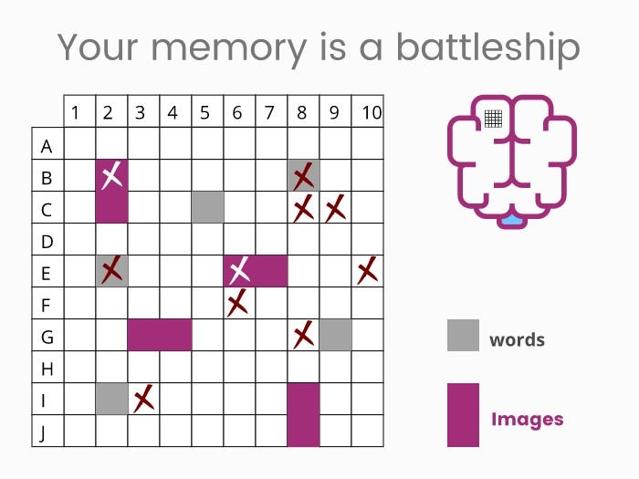
Battleship metaphor. Source https://vitorials.net/picture-superiority-effect-why-a-picture-is-worth-a-thousand-of-words/
Icons are better than words to convey emotions. Scientists have discovered that when we look at a smiley face online, the same parts of the brain are activated as when we look at a real human face. Our mood changes, and we might even alter our facial expressions to match the emotion of the emoji.
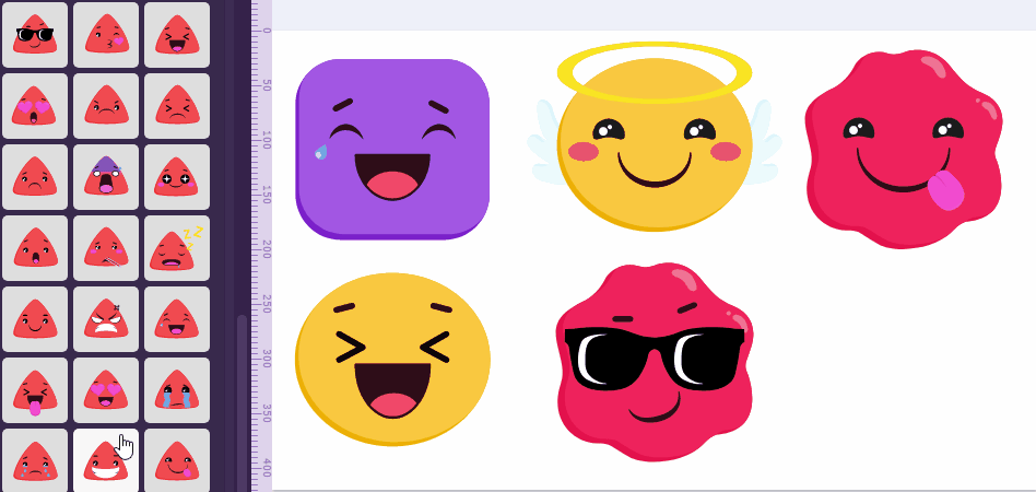
Gravit Designer has a special category with more than 40 smileys available out of the box, so you can use these emotional enhancers without spending too much time searching for them somewhere else.
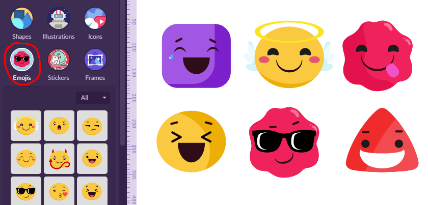
Emojis in Gravit Designer.
This emotional response for smileys has only developed in the last few years with the emergence of these icons. Essentially, social media culture has created a new brain pattern within us.
To use any icon from Gravit Designer’s icon library just drag-and-drop it onto the canvas.
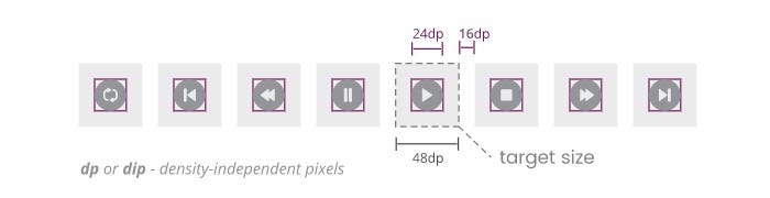
Icons could be a good target for fingers. The recommended target size for touchscreen objects is 7-10mm.
Touch targets include the area that responds to user input. That means, you can set an icon to 24 dp size, then create a 12 dp padding around. Don’t forget to include at least 3 mm margin between touch areas.
Following Google style guide for touch targets in Gravit Designer. Source: https://vitorials.net/
Microsoft’s Universal Windows platform UI Design and Interaction Guide has similar recommendations with touch target sizes equal 9 x 9 mm or greater. They also recommend to avoid using touch targets that are less than 7 mm.
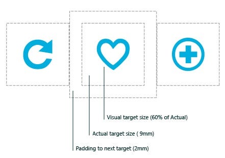
Microsoft’s UWP app developer guide. Source: Microsoft
Gamification can help people to reach their goals. It’s a practice of using game-like elements to leverage people’s natural desire for socializing, learning, mastery, competition and achievement.
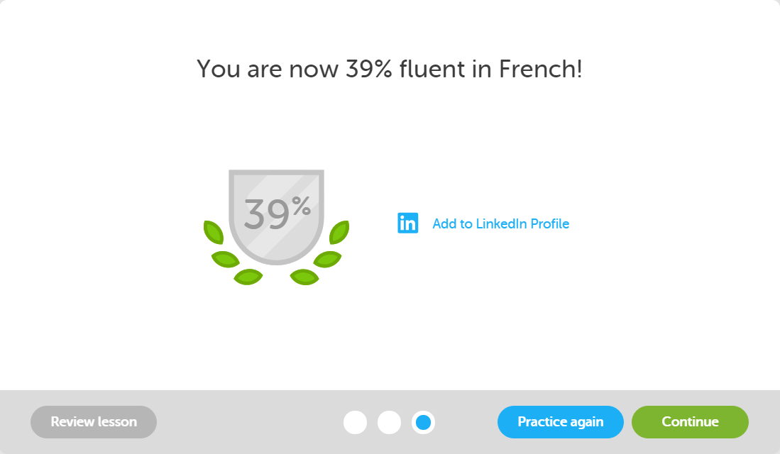
Fluency badges used by Dulingo.
In the Duolingo app, for example, you earn a reward for completing small, simple tasks. Reward is a core of gamification. It fosters a positive reinforcement in your brain and spurs you to repeat an action over and over again, as a mouse did in famous Skinner experiment.
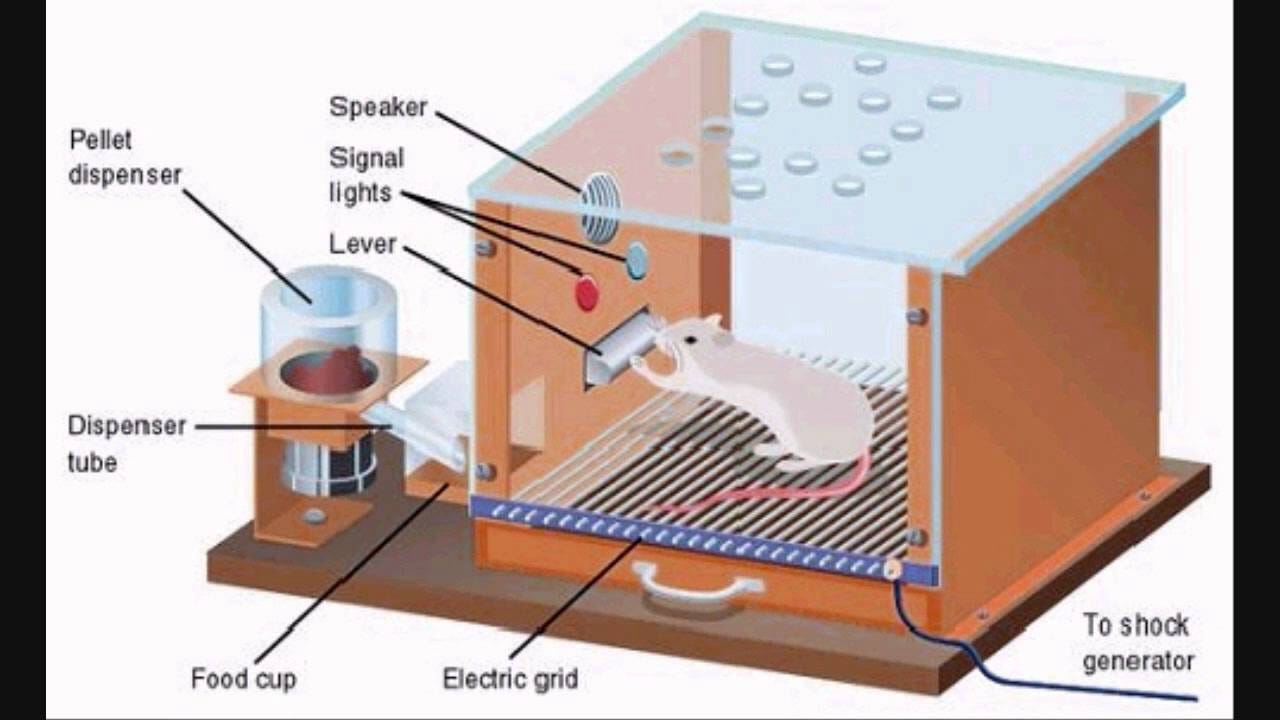
Skinner box. Source: ThingLink
To create our first gamification set, we need to design at least three icons, because three is a required minimum for a sequence.
Step 1. Navigate to the Gravit Designer Libraries tab, place the cursor in the search field and type “award.” Hit Enter to start searching through the entire library.
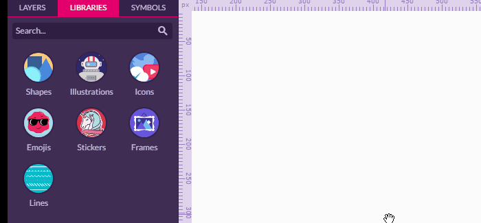
You can search through the library.
Step 2. Choose an icon from the collection. All of them are vectors, so you can easily customize fill, border, shape or add some effects, like drop shadows or texture.
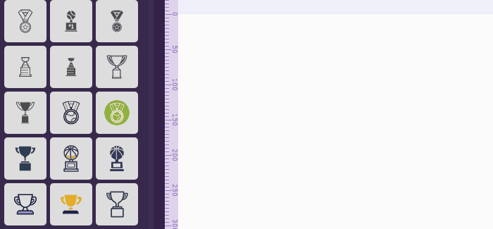
Drag and drop icon on the canvas and customize it
Step 3. Make two duplicates and adjust their fill color to create a set of three sets of awards: Gold, silver and bronze.
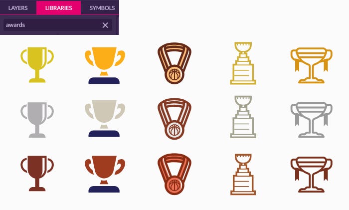
You can develop your sets of awards. All colors are easy to customize.
Badges are another popular category, that can be used for gamification.
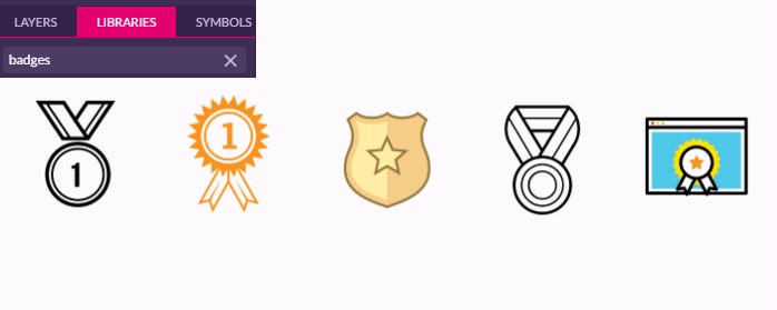
Different types of badges available for you in Gravit Designer.
As you can see, designing your own gamification assets with Gravit is a no-brainer, so why not start now? Get a your copy of Gravit Designer now!
Icons are a simple and effective way to draw users to the content of your website or mobile app.

You may or may not need them to boost traffic in your website. But you need to use them in order to increase accessibility of your content. Also, do not rely on color only when designing warning and error messages, since one of twelve people has color blindness.

Red Medium notification without an icon, unfortunately.
Be smart, secure your messages with icons to provide all necessary context for the user:
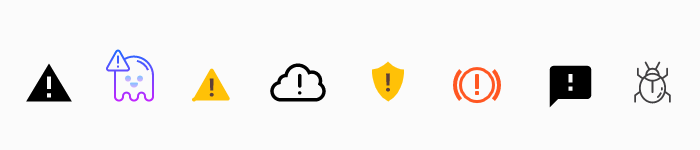
Some of the error, warning and fail icons in Gravit Designer.
Never forget that a successful icon is built on widespread recognition and a concrete, consistent message. With that in mind, you can’t go wrong.
Thanks for reading this article to the end. Be sure to subscribe to the Gravit Designer Medium blog to receive more useful articles.
AI-driven updates, curated by humans and hand-edited for the Prototypr community


