Build Design Systems With Penpot Components
Jul 21, 2:15 AM
Penpot's new component system for building scalable design systems, emphasizing designer-developer collaboration.
smashingmagazine.com

medium bookmark / Raindrop.io |
Co-founder of Scrimba — a tool for creating interactive coding screencasts: https://scrimba.com.
Nov 30
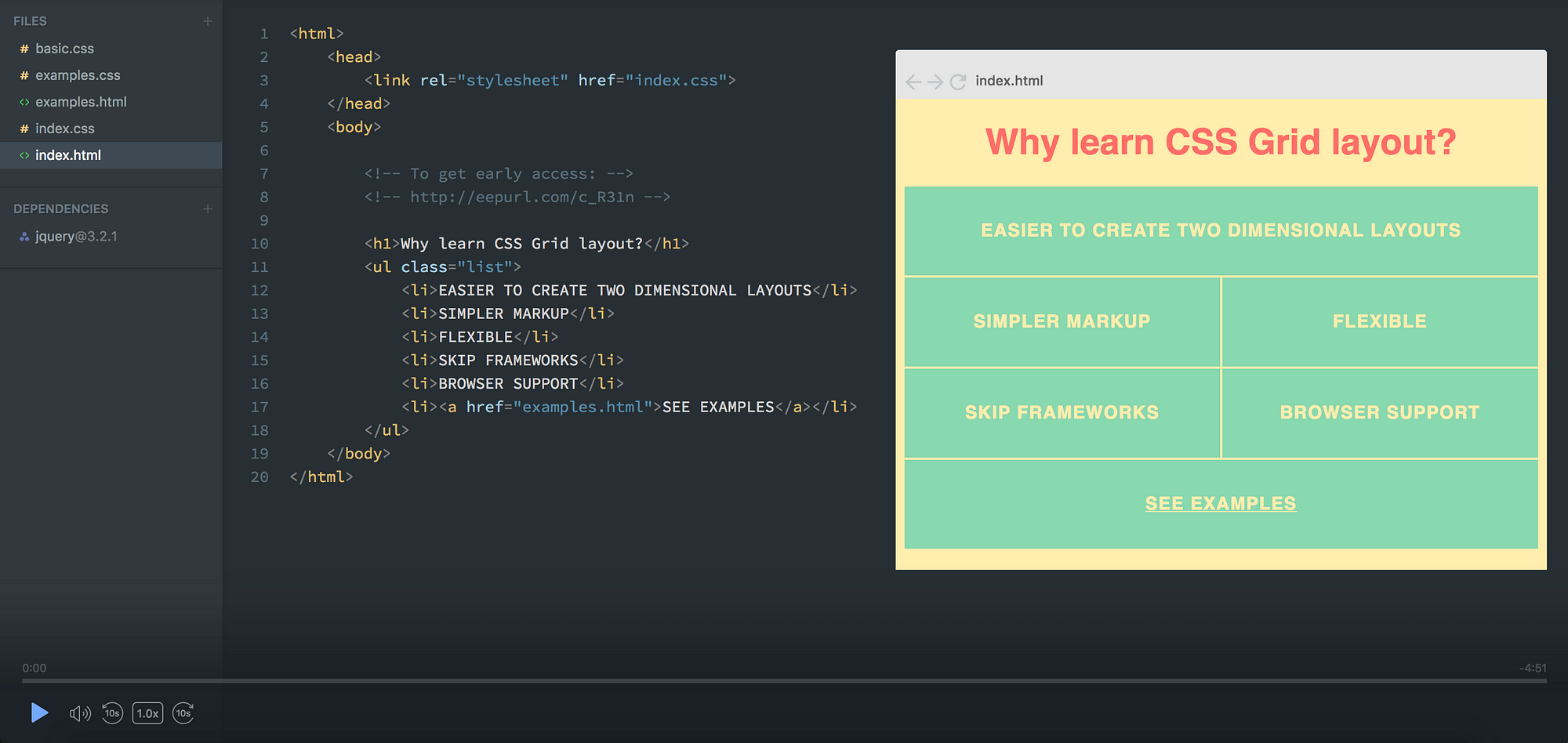
The CSS Grid module is a fantastic tool for creating mockups of websites. It allows you to experiment with the layout faster than any other system I’ve tried.
In this article I’ll teach you how.
I’ll also be launching a free CSS Grid course in mid December. If you want early access, leave your email here, and I’ll send it to you as soon as it’s ready.
You can also check out a preview screencast of the course here.
We’re going to start out with a very basic grid which mimics a classic website:
I’ve styled our example a little bit, but that has nothing to do with CSS Grid, so I’m leaving that out.
First, I’ll explain the HTML and CSS we need to get this working, which I’ve broken down to four parts. Once you’ve understood those, we’ll move on to the layout experimentations.
If you’re completely new to CSS Grid, you might want to skim through my 5 minute introduction article on the subject.
The first thing we need is a little bit of HTML. A container (the element we’ll turn into a grid) and the items (header, menu, content, footer).
<div class="container">
  <div class="header">HEADER</div>
  <div class="menu">MENU</div>
  <div class="content">CONTENT</div>
  <div class="footer">FOOTER</div>
</div>
Then we need to setup our grid, and specify how many rows and columns we need. Here’s the first CSS for doing that:
.container {
    display: grid;
    grid-template-columns: repeat(12, 1fr);
    grid-template-rows: 50px 350px 50px;
    grid-gap: 5px;
}
I’m going to add more later, but I first want you to understand this.
Here’s what the above code says: create a grid with twelve columns, each being one fraction unit wide (1/12 of the total width). Create three rows, where the first will be 50px tall, the second 350px and the third one 50px. Finally, add a gap between the items in the grid.
The feature which will allow us to experiment with layout super easily is called template areas.
To add it to the grid we’ll simply give the container a grid-template-areas property. The syntax might be a bit weird, as it’s unlike any other CSS syntax out there. Here it is:
.container {
    display: grid;
    grid-gap: 5px;
    grid-template-columns: repeat(12, 1fr);
    grid-template-rows: 50px 350px 50px;
    grid-template-areas:
        "h h h h h h h h h h h h h"
        "m m c c c c c c c c c c c"
        "f f f f f f f f f f f f f";
}
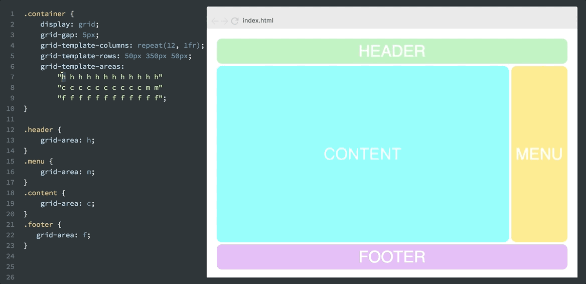
The logic behind the grid-template-areas property is that you create a visual representation of your grid in the code. As you can see, it has three rows and twelve columns, just like we’ve defined in grid-template-columns and grid-template-rows.
Each line represents a row and each of the characters (h, m, c, f) represent a grid cell.
Each of the four letters now form a rectangular grid-area.
As you might have guessed, I’ve chosen the characters h, m, c, f because our grid consist of header, menu, content and footer. I could have called them whatever I wanted, of course, but it makes sense to use the first character of the items they’re describing.
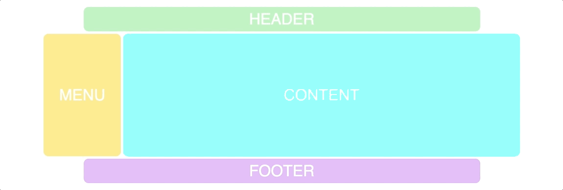
Now we need to connect these characters with our items in the grid. To do that we’ll use the grid-area property:
.header {
    grid-area: h;
}
.menu {
    grid-area: m;
}
.content {
    grid-area: c;
}
.footer {
   grid-area: f;
}
This results in the following layout:
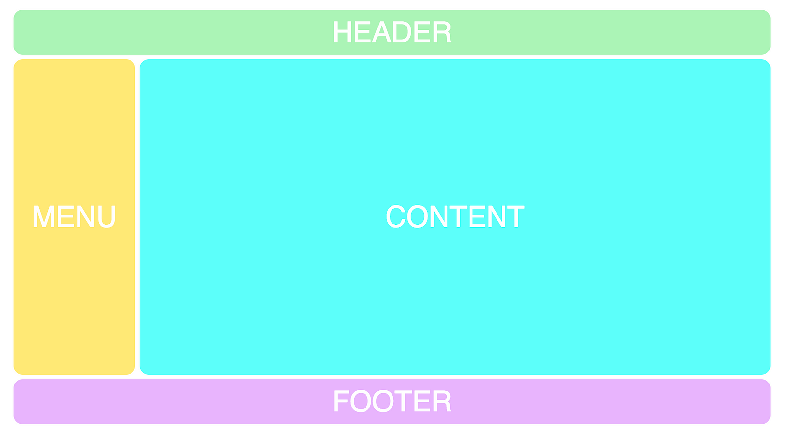
Now we’ve finally reached the beauty of this feature, as we can experiment with the layout super easily. It’s just a matter of changing the characters of the grid-template-areas property. Let’s for example move the menu over to the right hand side instead:
grid-template-areas:
        “h h h h h h h h h h h h”
        "c c c c c c c c c c m m”
        “f f f f f f f f f f f c”;
Which results in this layout:
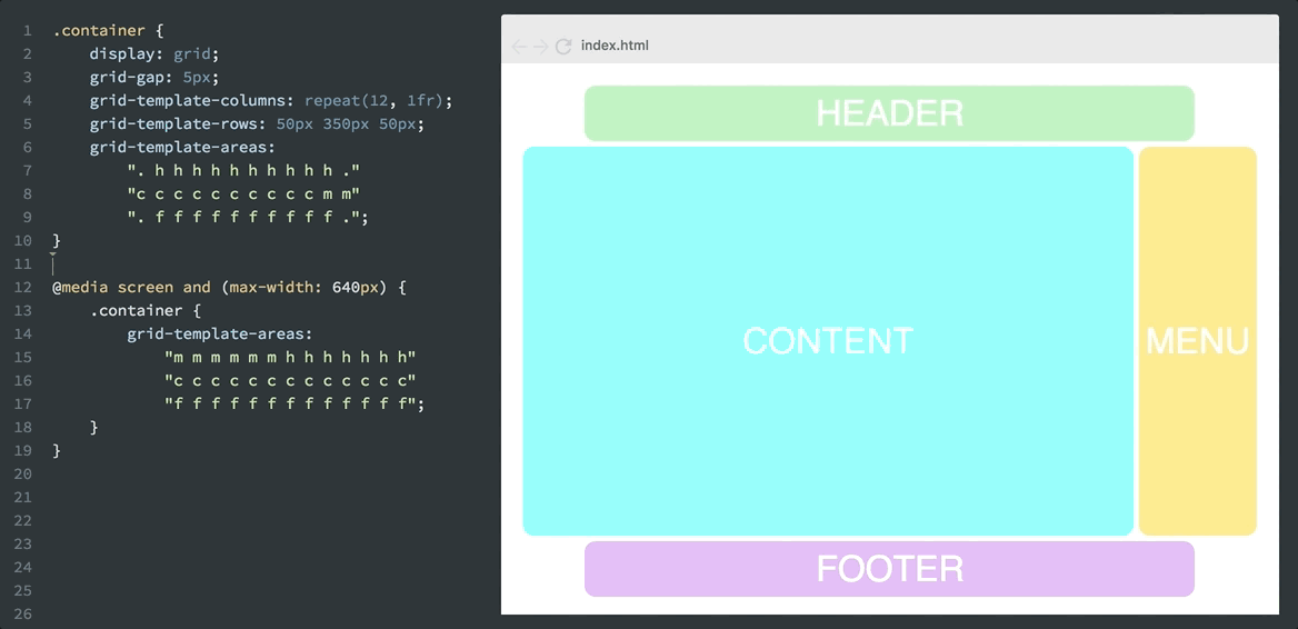
We can use dot’s to create blank grid cells.
grid-template-areas:
        “. h h h h h h h h h h .”
        "c c c c c c c c c c m m”
        “. f f f f f f f f f f .”;
Here’s a gif of how it plays out.
Now I’d recommend you to check out this screencast of my CSS Grid course, where you’ll be able to experiment with the code yourself.
Combining this with responsiveness is also a killer feature, as this simply wouldn’t have been possible to do with only HTML and CSS before. Let’s say you want the menu up besides the header when it’s being viewed on mobile. Then you can simply do like this:
@media screen and (max-width: 640px) {
    .container {
    grid-template-areas:
            "m m m m m m h h h h h h"
            "c c c c c c c c c c c c"
            "f f f f f f f f f f f f";
}
}
And that’ll result in the following:
Remember that all these changes are done with pure CSS, without touching the HTML. We can shuffle around however we want, regardless of how the div tags are laid out in the markup.
This is called source order independence, and it’s a huge step forward for CSS.
It allows the HTML to be what it was intended to be: markup for content. And not for styling, as that’s the job of CSS.
If you’re interested in learning more about CSS Grid, just leave your email here, and I’ll give you early access to my free CSS Grid course once it’s ready.
Click the image below to see a preview of the course.
Thanks for reading! If you have any feedback or questions, please leave a comment below. Alternatively, reach out to me via Twitter 🙂
AI-driven updates, curated by humans and hand-edited for the Prototypr community


