Build Design Systems With Penpot Components
Jul 21, 2:15 AM
Penpot's new component system for building scalable design systems, emphasizing designer-developer collaboration.
smashingmagazine.com

medium bookmark / Raindrop.io |
Cofounder of @clearleft, author of the @WebTypography book, designer of digital things. Please patronise responsibly.
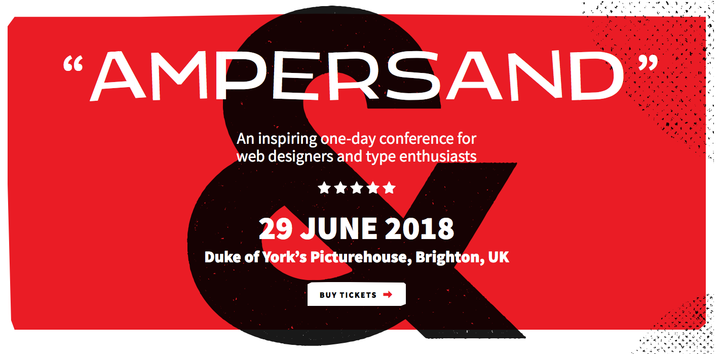
Variable fonts in action on the Ampersand website
A variable font is a single font file which behaves like multiple styles. (I wrote more about them here in an extract from my Web Typography book). There are plenty of sites out there demoing the possibilities of variable fonts and the font variation technology within, but for the new Ampersand conference website I wanted to show variable fonts being using in a real, production context. It might well be the first commercial site ever to do so.
Two months ago browser support for variable fonts was only 7%, but as of this morning support was at over 60%. This means font variations is a usable technology right now. But not all support is equal, as you’ll see.
Variable font capable software is already more pervasive than you might think. For example, the latest versions of Photoshop and Illustrator support them, and if you’re using macOS 10.13+ or iOS 11+ the system font San Francisco uses font variations extensively. That said, the availability of variable fonts for use is extremely limited. At the time of writing there are not really any commercial variable webfonts available, but there is a growing number of free and experimental variable webfonts, as showcased in the Axis Praxis playground.
From this limited palette of fonts, we (by which I mean Clearleft designer James Gilyead) chose Mutator Sans for the display text, and Source Sans for the body text in a Saul Bass-inspired design. Both fonts enabled us to make use of their variable weight axis. Fonts chosen now came the tricky, multi-step business of implementing variable fonts into the website. I’ll take you through how we (by which I mean Clearleft developer Mark Perkins) did it, using simplified code snippets.
Getting your variable fonts working in a basic fashion is fairly straight forward. At the time of writing Safari has the most complete support. If you’re following along with these steps, that’s what you’ll need to start off with.
We downloaded the Source Sans variable font from its home on Github and used @font-face with a format of truetype-variations to link it up to the stylesheet:
@font-face {
  font-family: 'SourceSans';
  src: url('source-sans-variable.ttf') format('truetype-variations');
}
We could then set the variable Source Sans font as the main typeface for the page in the usual way:
html {
  font-family: 'SourceSans', sans-serif;
}The variable font implementation in CSS is designed to use existing properties for certain pre-defined variation axes. We’re using three weights within the body text: regular, semibold and black. We set the bold fonts using font-weight in the usual way:
.hero { font-weight: 900; }
.blurb { font-weight: 600; }
With variable fonts, your weight doesn’t have to be limited to intervals of 100. It can be any integer in the range 1–999. For the main heading, set in Mutator Sans, we used subtle differences in weight for each letter to give a more hand-drawn feel to the design:
b:nth-child(1) { font-weight: 300; }
b:nth-child(2) { font-weight: 250; }
b:nth-child(3) { font-weight: 275; }The code outlined above is enough to get variable fonts working in Safari exactly as we’d want. It shows the correct way to do things (and the way things will be able to be done in the future).
Chrome 62+, Firefox 57+ and Edge 17+ all support variable fonts (Firefox only on a Mac and if you set the correct flags). However none of the code above works.
For a start, none of these browsers recognise format('truetype-variations') so they ignore the font altogether. This means we needed to add another property to the @font-face rule. It links to the same font file but with a regular format:
@font-face {
  font-family: 'SourceSans';
  src: url('source-sans-variable.ttf') format('truetype-variations'),
       url('source-sans-variable.ttf') format('truetype');
}
As you’ll see later, this workaround introduces another problem, however for now it gets the variable font linked to in non-Safari browsers.
Next up is getting the font to be displayed in different weights. It turns out those browsers don’t yet support font-weight with variable fonts. So we resort to the font-variation-settings property with its four letter axis labels:
.hero {
    font-weight: 900;
    font-variation-settings: "wght" 900;
}
That introduces another issue. Because font-variation-settings is a ‘low-level’ property, it is affected by font-weight, resulting in the browser faux-bolding the already emboldened font. So we ditch the font-weight. For now.
.hero {
    font-variation-settings: "wght" 900;
}The Source Sans variable font is pretty big: the TrueType file is 491Kb. This is mostly because it has a huge character set: nearly 2000 glyphs including Greek, Cyrillic, alternate characters and symbols. Your first step in reducing file size is to create a subset of the font so that it no longer contains characters you won’t ever need.
We decided to be fairly conservative in what we kept in, so we subsetted to include Basic Latin, Latin–1 Supplement and Latin Extended-A character ranges; a total of around 400 characters covering most European languages. In Unicode terms these are U+0020–007F, U+00A0–00FF and U+0100–017F.
There are plenty of online tools for subsetting fonts, such as Fontsquirrel. However all tools that I have seen strip out the variation data. This means you’ll need to turn to a command line approach. We subsetted the font using the open source pyftsubset, a component of fonttools (see Michael Herold’s tutorial for more info). If Node is more your thing, you could instead use Glyphhanger.
Both Glyphhanger and fonttools (if you install Brotli compression) will output the subsetted file as a WOFF2. We don’t need a regular WOFF as well because all browsers which support variable fonts also support WOFF2.
Running the subsetting routine and conversion to WOFF2 gave us a pleasingly tiny 29Kb file. We updated the @font-face rule accordingly:
@font-face {
  font-family: 'SourceSans';
  src: url('source-sans-variable.woff2') format('woff2-variations'),
       url('source-sans-variable.woff2') format('woff2');
}
So that’s the job done for browsers which support variable fonts — hopefully the workarounds will soon no longer be required. But either way that’s only half the story.
Variable fonts do render on browsers which don’t support font variations, but you obviously have no control over which weight (or other axis instance) will be used.
To get around this, you need to serve non-variable (single-style) fonts to these browsers. The way this is supposed to work is as follows:
@font-face {
  font-family: 'SourceSans';
  src: url('source-sans-variable.woff2') format('woff2-variations'),
       url('source-sans-regular.woff2') format('woff2');
  font-weight: 400;
}

@font-face {
  font-family: 'SourceSans';
  src: url('source-sans-variable.woff2') format('woff2-variations'),
       url('source-sans-black.woff2') format('woff2');
  font-weight: 900;
}
The preceding code points to the single-style font files with an @font-face rule including the font’s weight, as you would normally. You can then repeat a reference to the variable font file in each rule. Browsers which support variable fonts will download the file marked as format('woff2-variations') (once only), and browsers which don’t will download the single-style fonts marked as format('woff2').
The three single-style text fonts come in at 47Kb, that’s 61% bigger than the single variable font.
But. I mentioned earlier, only Safari supports format('woff2-variations'), which rather messes things up if we want the other capable browsers to get their variable font. So we resorted to a different, rather more verbose tactic. Firstly we gave the variable font a different name to the single-style typeface, thus separating links to variable fonts from single-style fonts:
@font-face {
  font-family: 'SourceSansVariable';
  src: url('source-sans-variable.woff2') format('woff2-variations'),
       url('source-sans-variable.woff2') format('woff2');
}

@font-face {
  font-family: 'SourceSans';
  src: url('source-sans-black.woff2') format('woff2'),
       url('source-sans-black.woff') format('woff');
  font-weight: 900;
}

@font-face {
  font-family: 'SourceSans';
  src: url('source-sans-semibold.woff2') format('woff2'),
       url('source-sans-semibold.woff') format('woff');
  font-weight: 600;
}
We then needed to write an @supports rule to ensure the right fonts went to the right browsers:
html {
  font-family: 'SourceSans' sans-serif;
}

@supports (font-variation-settings: "wght" 400) {
  html {
    font-family: 'SourceSansVariable', sans-serif;
  }
}
In the above code, the single-style fonts are specified as standard, however if a browser supports variable fonts (it’s reasonable assumption that can be judged by support for font-variation-settings) then it gets the variable font instead.
This brings us back to our black weights. You may remember we replaced font-weight with font-variation-settings in order to make the weight selection work in non-Safari browsers. As it stands, that also stops the correct weight being rendered in browsers which don’t support variable fonts. So we needed to add font-weight back in by way of another @supports rule:
.hero {
  font-weight: 900;
}

@supports (font-variation-settings: "wght" 900;) {
  .hero {
    font-variation-settings: "wght" 900;
    font-weight: normal;
  }
}
One final thing. For a belt and braces approach, every time you use variable fonts you should explicitly set the font weight even when the weight you want is 400 or normal. With a variable font, one browser’s idea of the default weight may differ slightly from another. In our testing Firefox rendered default text significantly lighter than Safari and Chrome, until we did this:
html {
  font-family: 'SourceSans' sans-serif;
  font-weight: 400;
}

@supports (font-variation-settings: "wght" 400) {
  html {
    font-family: 'SourceSansVariable', sans-serif;
    font-variation-settings: "wght" 400;
  }
}
And that’s it. Do check out how it came together on the Ampersand website, and don’t forget Ampersand is a conference dedicated to typography on the web — if that’s your thing you might want to check it out. There will be plenty of discussion of variables fonts, and much more besides.
This was originally posted on my own site.
One clap, two clap, three clap, forty?
By clapping more or less, you can signal to us which stories really stand out.
Be the first to write a response…
prototypr.io
AI-driven updates, curated by humans and hand-edited for the Prototypr community


