UX Planet — Medium | Vitaly Dulenko 
Every system can’t work without errors. It can be user’s errors or system’s fails. In both cases, it’s very important to handle errors in a right way as they are crucial for a good user experience.
Here are 3 vital parts of every good error message:
- Clear text message.
- The right placement.
- The good visual design.
Clear text message
1. Error message should be clear
The error messages should clearly define what the problem was, why it happened, and what to do about it. Think of your error message as a conversation with your user — it should sound like they’ve been written for humans. Make sure your error message is polite, understandable, friendly and jargon-free.

2. Error message should be helpful
It’s not enough to write that something went wrong. Show the users the way how to fix it as soon and easy as possible.
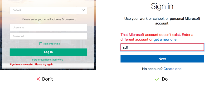
For example, Microsoft describes what’s wrong and provides a solution in the error message so you can immediately fix this issue.
3. Error message should be specific to the situation
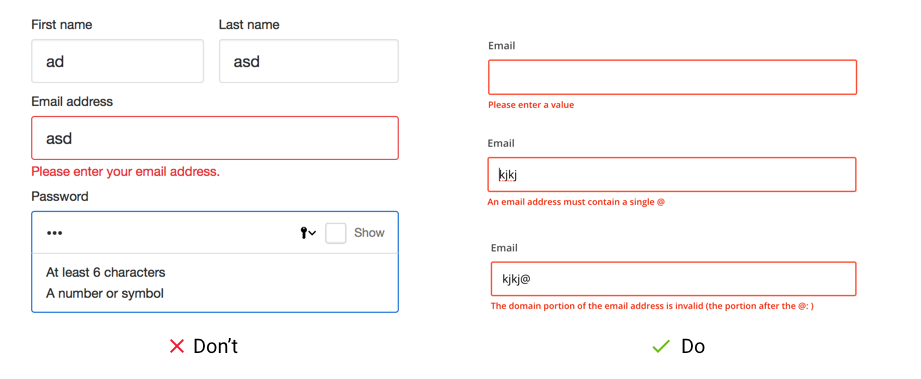
Very often websites use only one error message for all validation states. You left this email field blank — “Enter a valid email address”, you missed the “@” character — “Enter a valid email address”. The MailChimp does it in another way — they have 3 error messages for each state of email validation. The first one checks if the input field isn’t blank when submitting the form. The other two check if there is “@” and “.” characters. (However “Please enter a value” isn’t a great example of the error writing, it is unclear what kind of value you need to enter.) Show your users actual messages instead of general ones.
4. Error message should be polite
Don’t blame your users that they did something wrong even if they did. Be polite to your user, make them feel comfortable and convenient. It’s a great opportunity to use your brand voice and add personality into the errors.
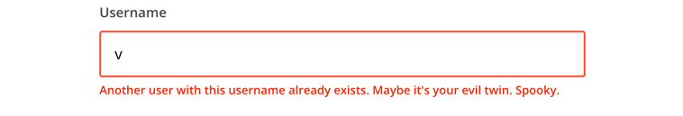
5. Use humor if it’s appropriate
Be careful using humor in your error message. First of all the error message should be informative and helpful. Then you can improve user experience adding some humor in your error message if it’s appropriate.
The right place for error messages
The good error message is that one you can see when needed. Avoid error summaries, place error messages next to the UI elements they are related to.

The right visual design for the error message
The error message should be clearly visible. Use contrast text and background colors so the user can easily notice and read the message.
As usual, the red color is used for error message text. In some cases, yellow or orange colors are used as some resources state that red color is too stressful for users. In both cases, be sure that the error text is legible, with noticeable contrast against its background color. Don’t forget to provide a related icon alongside the color to improve the accessibility for people with color-blindness.

Conclusion
Error messages are a great opportunity to improve user experience, share your brand voice and personality. Pay attention to all aspects of a good error message — the language, placement, and visual design to make it a really perfect.

How to Write a Perfect Error Message was originally published in UX Planet on Medium, where people are continuing the conversation by highlighting and responding to this story.