Build Design Systems With Penpot Components
Jul 21, 2:15 AM
Penpot's new component system for building scalable design systems, emphasizing designer-developer collaboration.
smashingmagazine.com

medium bookmark / Raindrop.io |
Over the past eight months, the Swarm team has been hard at work researching, prototyping, and building towards Swarm 5.0. On Tuesday, we launched. (Go download Swarm 5.0 now.) It was a big undertaking that involved a lot of people. Foursquare co-founder Dennis Crowley has already shared why we made me these changes, which means I can explain what, precisely, we were up to all this time.
As a product designer working on Swarm, some of the pieces I specifically worked on for 5.0 included simplifying the information architecture, updating our internal style guide, redesigning the home screen and the profile. More on all that below.
Our first priority was simplification. We knew that Swarm had a lot of the right pieces, but they may not have been organized in the most intuitive way. The plan was to make some changes, and then test them with real consumers in real time — and learn and build on this feedback.
One of the earliest, most immediate takeaways from user research was that we heard that Swarm’s visual language was younger than our core demo of urban explorers, age 25–45. So in addition to simplification, we knew we’d have to focus on how to make Swarm feel modern now.
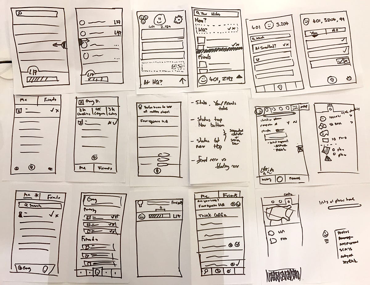
A few early sketch ideas
We went to work on churning out a number of different ideas, which came in the form of sketches, wireframes, and low-fidelity design iterations. We were constantly evaluating, whether it be by printing things out and hanging them up on a wall or building quick static prototypes.
After numerous iterations, it was time once again to share with people outside of the Foursquare walls. We conducted new rounds of user research, which let us know that participants liked that we’d removed a lot of the app’s complexity.
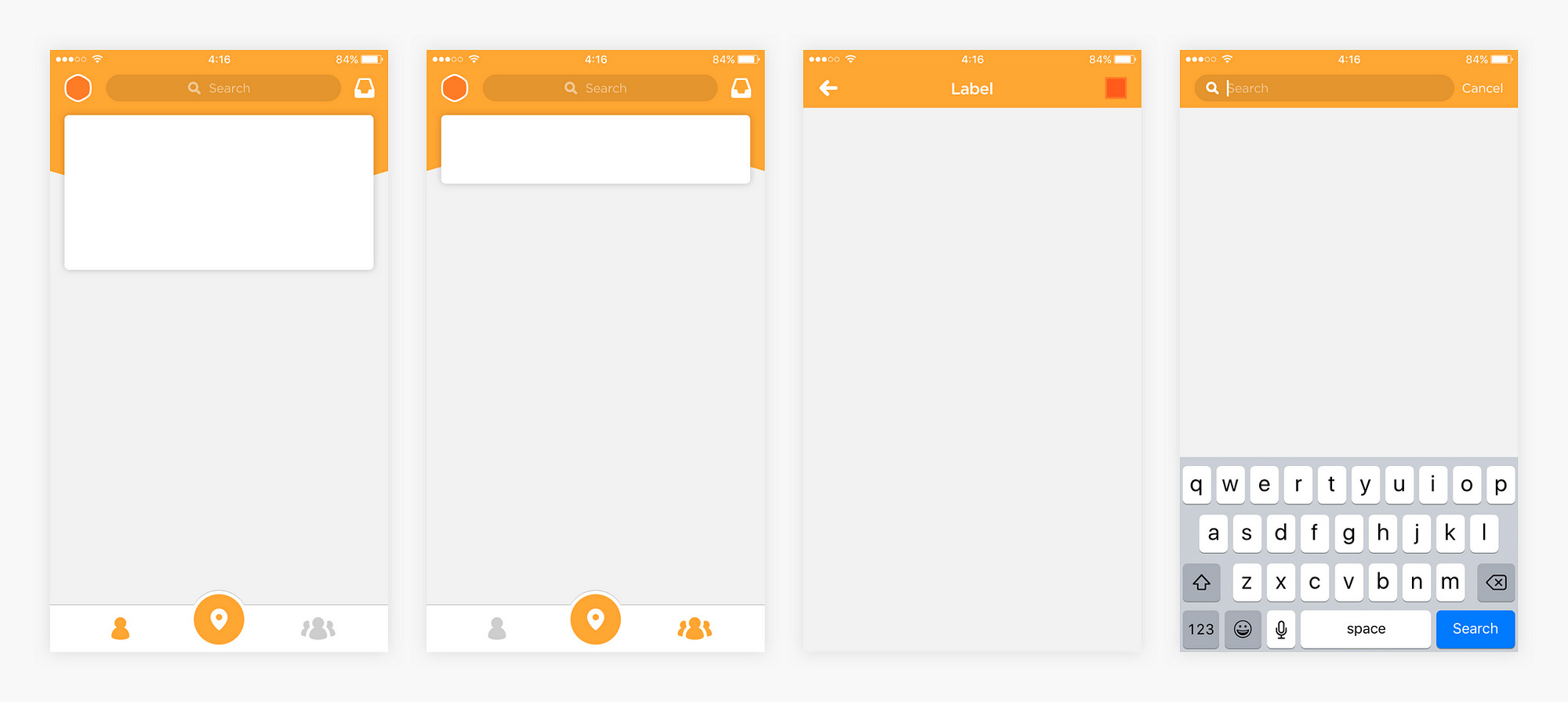
The final app chrome
These groups also loved the redesigned lifelog (see Dennis’s post for more on this topic), which we put front and center, and the universal search feature, now prominently located at the top of the screen. It was clear we were on the right track.
Swarm has always had a great visual design foundation and we didn’t want to lose that when thinking about 5.0 and beyond.
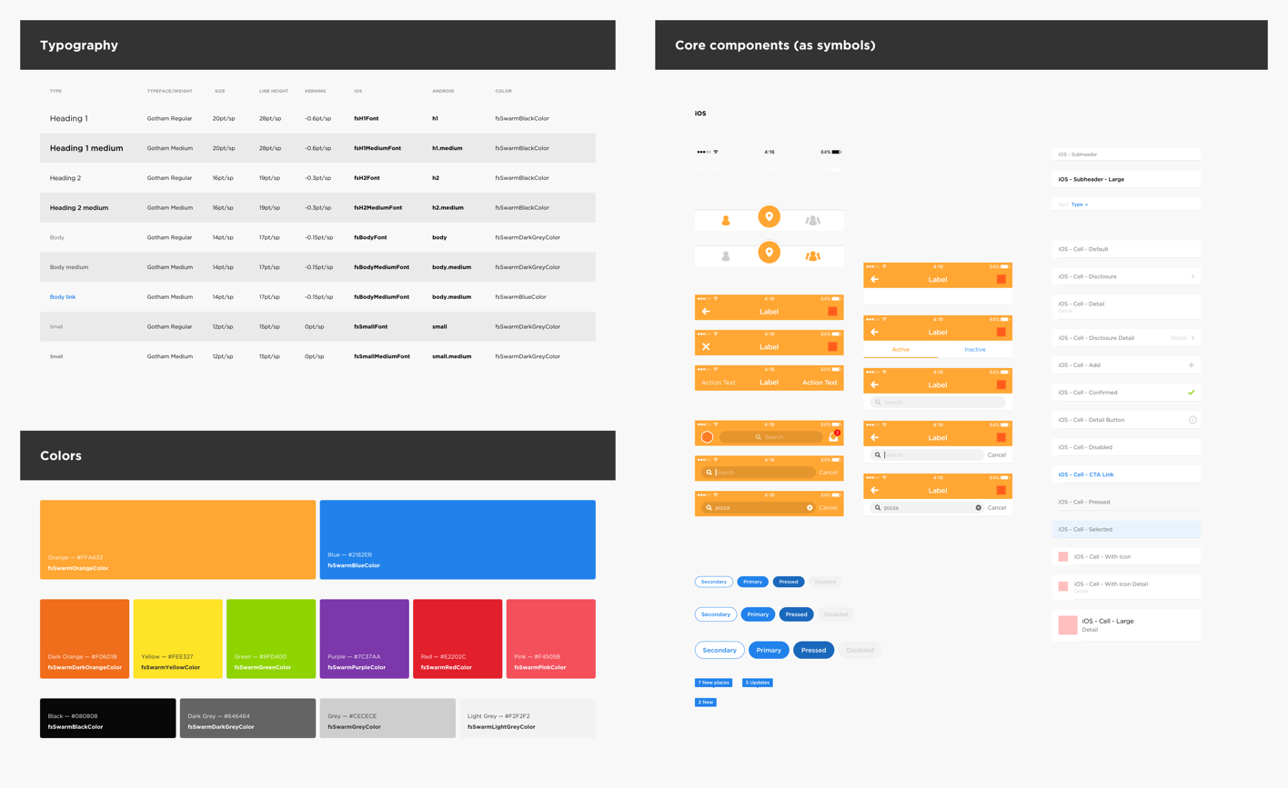
Typography, colors and Sketch symbols in our internal style guide
Instead, we decided to establish a robust style guide that helped us embrace the updated information architecture. It’s so important to keep the design team on the same page throughout the iteration process, so I created a living style guide which included styles and reusable components we could all share.

Icons in our internal style guide
This was a bit difficult to start, mainly because we didn’t exactly know what the entire visual direction for Swarm 5.0 would be, but I knew we wanted to simplify the language. We also knew that this style guide would evolve over time (which it has) as we continued building on features.
Once we had a few of the major pieces in place, things started to roll.
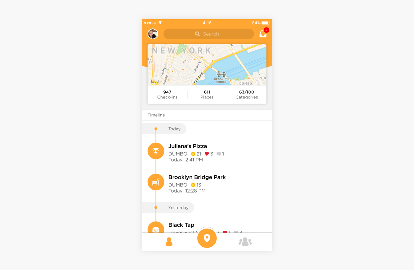
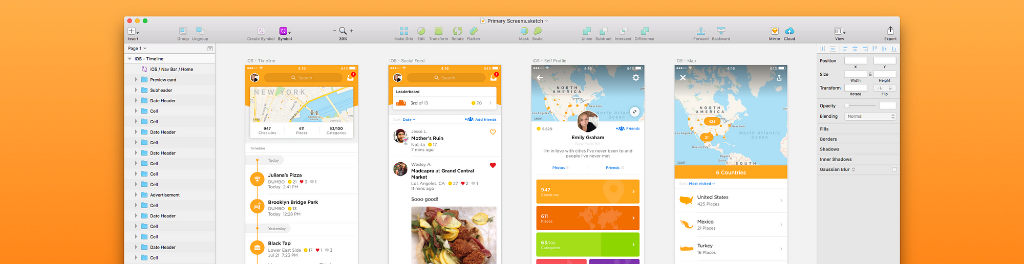
The redesigned home screen
As I mentioned, we knew we wanted to surface a user’s check-ins in a very prominent way to create a personal lifelog. We explored multiple iterations of the home screen. We developed design directions that ran the gamut from pretty safe to crazy. We wanted to consider the entire spectrum and exhaust all ideas.
We kept going back to the idea of a single line that connects all of a user’s check-ins, and so that’s what you see in the app now. Conceptually, we liked the idea that the vertical line easily illustrates the places you go. It ladders up to the Swarm 5.0 focus, which is on lifelogging and remembering everywhere you go.
Home page preview card and map
The map on the home screen was a given: we knew the map, which shows off a user’s every check-in, was always going to be prominent and interactive.
Once we decided to simplify Swarm’s visual language, we decided to make updating the existing dynamic feeds in Swarm our next priority. Since we were elevating check-in history to the home page of the app (instead of it being a subview on your own profile), check-in feed cells needed to closely match what your friends’ check-in cells looked like. Meaning, the home screen (Timeline tab) should feel very similar to the Friends tab since both highlight check-ins. This was difficult for a few reasons.

Check-in feed cell comparisons from the Timeline and Friends tabs
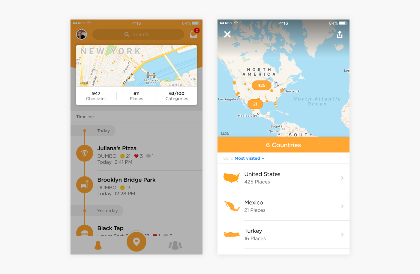
One phrase that was said quite often, was that a person’s profile should capture the lifelog from a 10,000-foot view.
In 5.0, the profile needed to highlight the statistics and elements that are most important. Again, the map is a top feature; it needed to be given ample space. We also knew (anecdotally) that people already loved to share their maps on Facebook and Twitter. We decided that showing a large native map with orange pins (dots) at the top of the profile was the most clear way to highlight the places you’ve been. We settled on a card-like layout for some of the stats we thought you should care about most.

A few different states a profile could be in
Another profile page challenge was determining which stats needed to be the most prominent. In the end, we agreed that Check-ins, Places, Categories (with its own architecture and design elements), Streaks, and Mayorships were the most compelling insights based on feedback from new and longstanding Swarm users.
Big releases don’t happen without a couple big takeaways. Here are mine:
Looking back on all the planning, prototyping, researching, designing, and building — launching Swarm 5.0 has been a huge feat. The engineering team rewrote many core views in Swarm and almost every screen was changed in some way. 20+ people were dedicated to working on the Swarm team over the past eight months, including Sam Brown and Jack Osborne specifically, who helped out on design work.
Soooo what are you waiting for!? Download Swarm 5.0 now. We hope you like it.
AI-driven updates, curated by humans and hand-edited for the Prototypr community


