Build Design Systems With Penpot Components
Jul 21, 2:15 AM
Penpot's new component system for building scalable design systems, emphasizing designer-developer collaboration.
smashingmagazine.com

medium bookmark / Raindrop.io |
The new version of HBO’s streaming service, HBO GO, has been live for a couple of months now in Europe. It was a 10-month long project and here is the story behind the redesign, highlighting couple of challenges we faced during each phase.
So, they already had a platform for streaming video, but what was the problem? The main business problem was that content discovery was almost non-existent. The full-screen highlighted section and the hard-to-find menu made it impossible to explore the site. On the other hand, promoting content for users was already possible in the old platform, but with the new one, HBO was aiming higher than that.
The new HBO GO’s aim is to engage users in a way that it couldn’t before: personalised recommendations, enhanced watchlist features, new discovery functions and a way better cross platform experience. The latter was crucial because HBO GO is available everywhere. Web, mobile, tablet, tv, smart tv, Xbox and PlayStation — phew that was a lot… gives the tagline “It’s HBO. Anywhere.” a new meaning, right?
Here at UXstudio, we always start our new projects with a kick-off including every decision maker and project member. After we have an idea about the project we arrange a persona workshop with the clients, because they know a lot about their users.
(Psst, you can download our persona workshop template here so you can amaze your colleagues on the next meeting.)
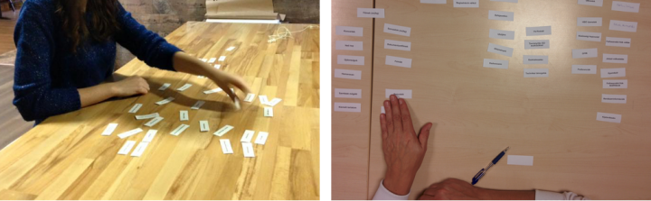
Before starting scribbling ideas on hundreds of post-it notes in a manical fashion, we came up with 3 distinct hypothetical personas. When these are ready, everybody writes down their ideas on individual post-it notes and then fill up the persona sheet together. Sometimes we have to merge or split personas: we ended up having four personas instead of our usual three.
Of course we validated these personas with user interviews — 81 of them. These included full user interviews, as well as mini interviews before every single usability test. We also spent a lot of time reading comments on forums and skimming through subreddits and blogs.
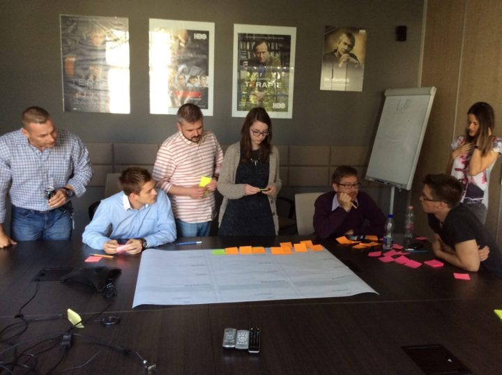
Persona workshop with executives and our UX team
Since HBO GO was an existing application, we had to test the current version on every platform. We also took a look at the competitors, for example Netflix, so we had a pretty good idea where to start.
On a global scale, we knew that the menu structure has to go. It was too complicated with unnecessary levels and too many submenus. The old menu version had three main submenus with even more tertiary levels. When testing the old version it became clear that users have a hard time finding what they are looking for.
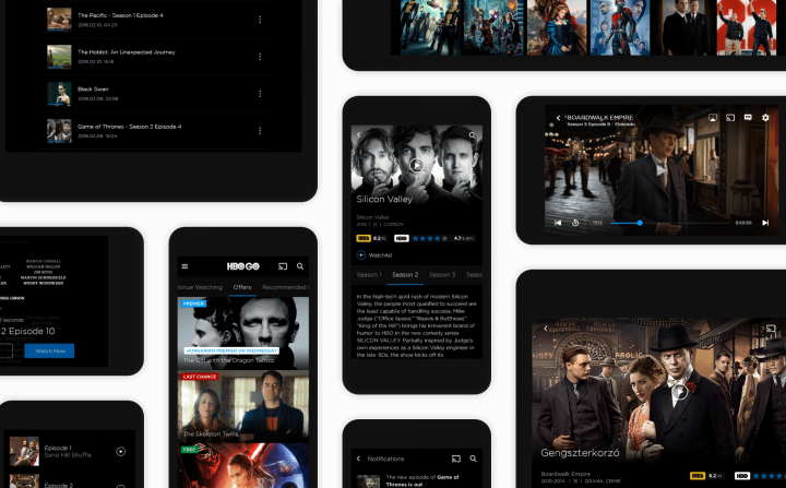
We took every element of the menu and printed them one by one. During the card sorting tests we asked users to group these items and also give them a name. After a couple of sessions it was obvious to group items in 6 main categories: Recommendations (Home), Movies, Series, Notifications, Settings and Help.
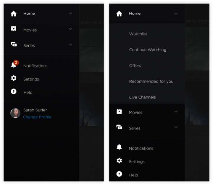
The result of the card sorting tests: restructured menu & navigation
Meanwhile we dived into the actual design process as well starting with mobile. We started our design process, as we always do at UXstudio, with paper sketches: exploring all possible solutions. After that, we built our first prototype and by the end of the week it was already tested with real users giving us even more feedback.
Our first idea is not the best one most of the time, am I right? I mean, even Tina Fey admitted that 30 Rock’s Pilot was far from perfect. Our very first prototype was also not the version I designed in the detailed UI phase later on.
Every week, we had 2 or more users coming into the office and testing these prototypes. We focused on usability issues, of course, but the mini interviews also helped us understand our users better. Sometimes it was really hard to let go of a version which was a favourite of mine, but UX design is not about the designer: it’s about the users.
If you want to read more about of UX design process, I highly recommend downloading our free ebook where you tell you all about it.
We could have made stunning series, season and episode pages for every single TV show there is on HBO GO. But users found it extremely painful to walk through dozens of screens just to play an episode. In the old application playing an episode took 6 taps to complete. The flow itself was not self-explanatory and users often got lost in the flow or couldn’t find the episode they were looking for. Since this is one of the main use cases of the application we wanted to make this user journey significantly shorter.
Since users are more likely to scroll than navigate to new pages, we created a layout for the series detail pages where users would find seasons and episodes right under each other. We also integrated a little help: the application remembers where the user left off, so instead of 6 steps users can now play an episode with a simple scroll and a tap.
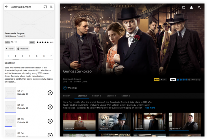
HBO GO series detail page for mobile (wireframe phase) and tablet (detailed UI phase)
Once we had the basic functionality of the mobile app, we could concentrate on the tablet and responsive web version. In the end we made 71 usabilty tests and iterated after every second or third one.
This HBO project, considering its length was not the series Firefly, it was more like Boardwalk Empire or True Blood. The HBO GO platform is so much more than just its player interface — even though this is the screen the users interact with the most. There were a lot of screens we couldn’t anticipate when starting the project (technical feedbacks, chromecast) because we were focusing on the main screens. Moreover, when designing for a big product like HBO GO we have to take into consideration that people are using it on every possible device.
We started the wireframing part with a cross-platform solution in mind. As we went more into the details we realized that Android users won’t like iOS-like interfaces and vica-versa. So we didn’t want users to feel strange while using HBO on a specific platform.
We decided to rely on platform specifications while not completely sacrificing the brand’s overall look and feel. We identified key elements that makes HBO HBO: The dark exclusive feeling, the typeface, the blue accent colour and big images and applied these to every platform. So the overall look and feel is the same for every application but the micro interactions vary across different operation systems.
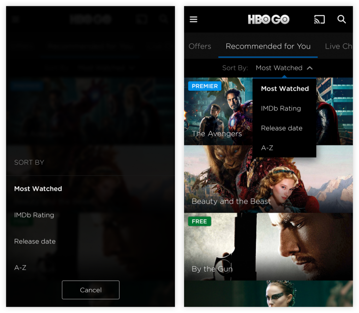
HBO GO sorting content micro interaction for iOS and Android
In this 10-month project we worked on the new version’s MVP. As to what we learned from it here are some snippets
You can check the final product by going to your region’s HBO GO and also try it out yourself. (Well… if you are in Europe — sorry other countries…)
If you want to read more case studies of projects done by our team I suggest you check out our UX blog, or the UX case studies section of our site.
Want to learn more about our UX design process? We have talked a lot about it on our blog, and we even wrote a Product Design Book about it!
AI-driven updates, curated by humans and hand-edited for the Prototypr community


