Build Design Systems With Penpot Components
Jul 21, 2:15 AM
Penpot's new component system for building scalable design systems, emphasizing designer-developer collaboration.
smashingmagazine.com

medium bookmark / Raindrop.io |

Girl sketching on iPad—illustration by Rob Levin
In the spirit of UX Teardowns, I’ll be looking at contemporary illustrators that catch my eye, and try to analyze what makes their work so compelling. Please note that all illustrations hereinafter, unless stated otherwise, are the express work of the artist I’m reviewing; I do not take any credit for their works! Also, I will try to be careful to post links back to the artist’s site — so if you click their image it will link through.
Focal point (often described as emphasis), is the element we intend the viewer to focus on, and thus, the element we are emphasizing. It’s our subject; the thing that’s intended to attract attention and draw in our potential viewer in her “noise-filled world”.
An element can be emphasized through many various techniques, but the devices commonly discussed are: contrast, isolation, placement, anomaly, and convergence.
Contrast itself can be achieved in many ways: contrasting shape, size, color, pattern, texture, style, etc. But, contrast is a way to achieve a strong focal point.

Andrea De Santis—Plenty of contrast to the neutral background is supplied via shape, color, and scale.

Justin Tran — The blue interior (with sprinkles of rosy pink to tie it all in) contrasts nicely with the rest of the face and is thus emphasized. Obviously, anomaly is at play there too.

Justin Tran — First glance you may think “ok, 3D’ish geometric shapes with nice colors and texture”, but, upon closer examination you’ll notice the paper airplanes have an interesting sort of S-Curve fold that catches your eye in terms of “shape contrast”. These contrasting shapes are repeated creating a nice motif.
Placing your subject against a single color or simplified background, will give the viewer no choice in the matter but to look at your focal point. If this is appropriate for your composition’s aesthetic, it can serve as quite an effective measure to prevent distraction ensuring sole focus on your subject.

Tang Yah Hoong—The sky is reduced to an elliptical shape that blends in to a white background thus isolating and emphasizing the pencil and explorer.
Where you place your element can help to make it stand out and achieve emphasis as well.
Centered
One obvious technique to get attention is to place the focal point dead center. Although this is often discouraged in favor of placement of focal point elements on to a sweet spot (think of tic tac toe lines over the entire composition—the convergence points of those lines are the sweet spots. See: rule of thirds), dead center still has its place. Especially if the rendering is as amazingly done as Chris Buzelli’s…
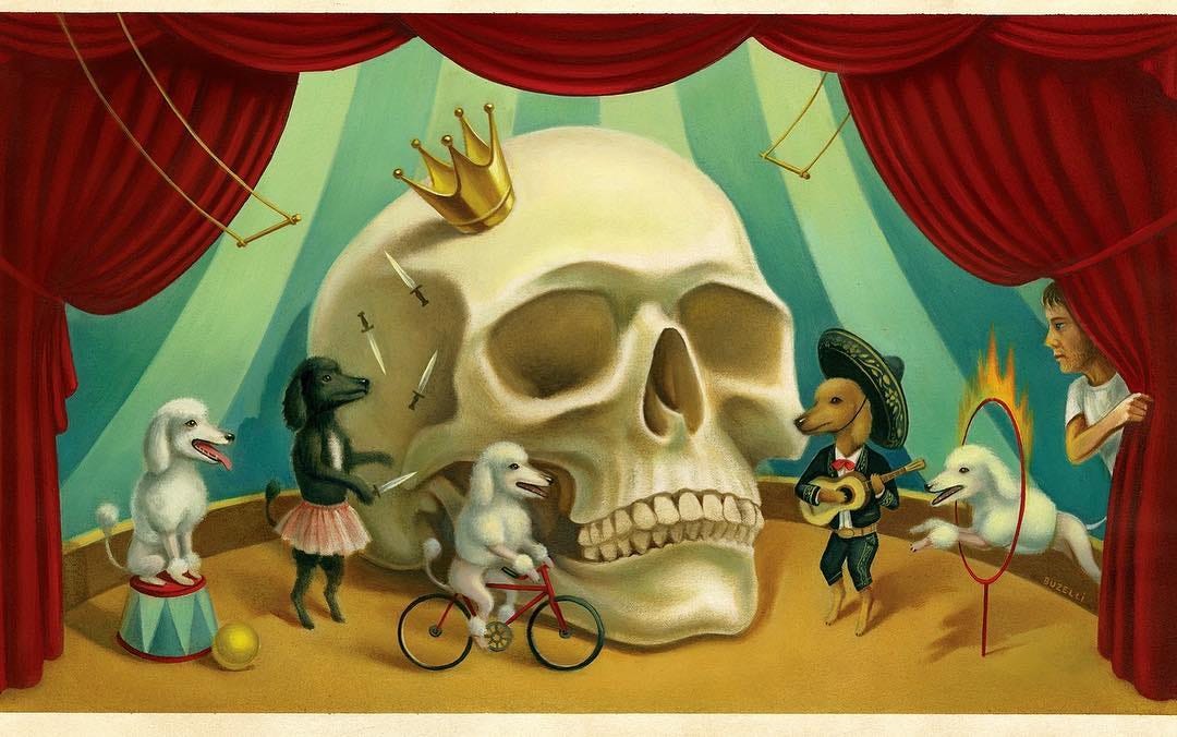
Chris Buzelli — Extremely strong rendering and execution is the focus. Focal point up front and center
And here a couple more from the same artist…
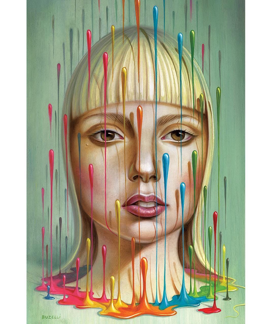
Chris Buzelli — the rendering is so beautiful, he’s able to place his subject in the center and fill the entire composition
Chris Buzelli — focus is dead center
Sweet Spot
As previously mentioned, the sweet spots created by the rule of thirds are a preferred place to put your element of emphasis. Moritz Adam is nice enough to have shared process shots on his Instagram showing his mindfulness of sweet spots early in the sketching phase (you’ll see what I meant earlier when I said it’s like “tic tac toe lines over the entire composition”):
Sweet spot placement is also shown nicely in the following illustrations by Meg Robichaud a.k.a megdraws:

Meg Robichaud—the focal point is placed on a rule of third sweet spot making it clear what she wants you to look at first

Meg Robichaud — While contrast may take your eye first to the, ahem, politician, you’ll undoubtedly also notice the reverse shadow. It falls roughly on a sweet spot, and also has some shock value going for it as well. Just in case your oblivious, the bright yellow flame has the visual weight to punctuate the concept further.
An anomaly is defined as:
Something that deviates from what is standard, normal, or expected. Something different, abnormal, peculiar
Obviously, conceptual illustration uses this device to pull you in, oftentimes with some sort of clever and unexpected twist. A contemporary illustrator that used this technique quite well is Andrea Ucini…
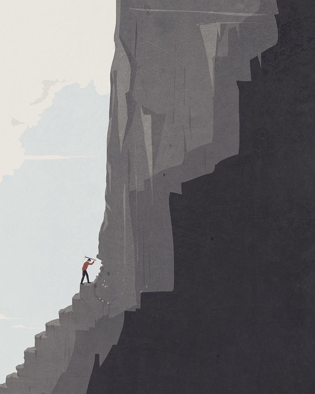
Andrea Ucini—epic and insurmountable task or challenge to overcome. Isolation is obviously at play as well.

Andrea Ucini—Roh oh! Suicide by credit card?
The Flyeschool site explains leading lines and convergence (and really does a nice overall explanation of the same topics we’re discussing on focal point and emphasis):
Leading Lines and Convergence — A line, arrow, or similar triangular or elongated element can indicate a direction and point towards something, leading the eye in that direction. When multiple elements converge toward a point (such as lines going back into perspective), they can create an even greater pull of attention in that direction.
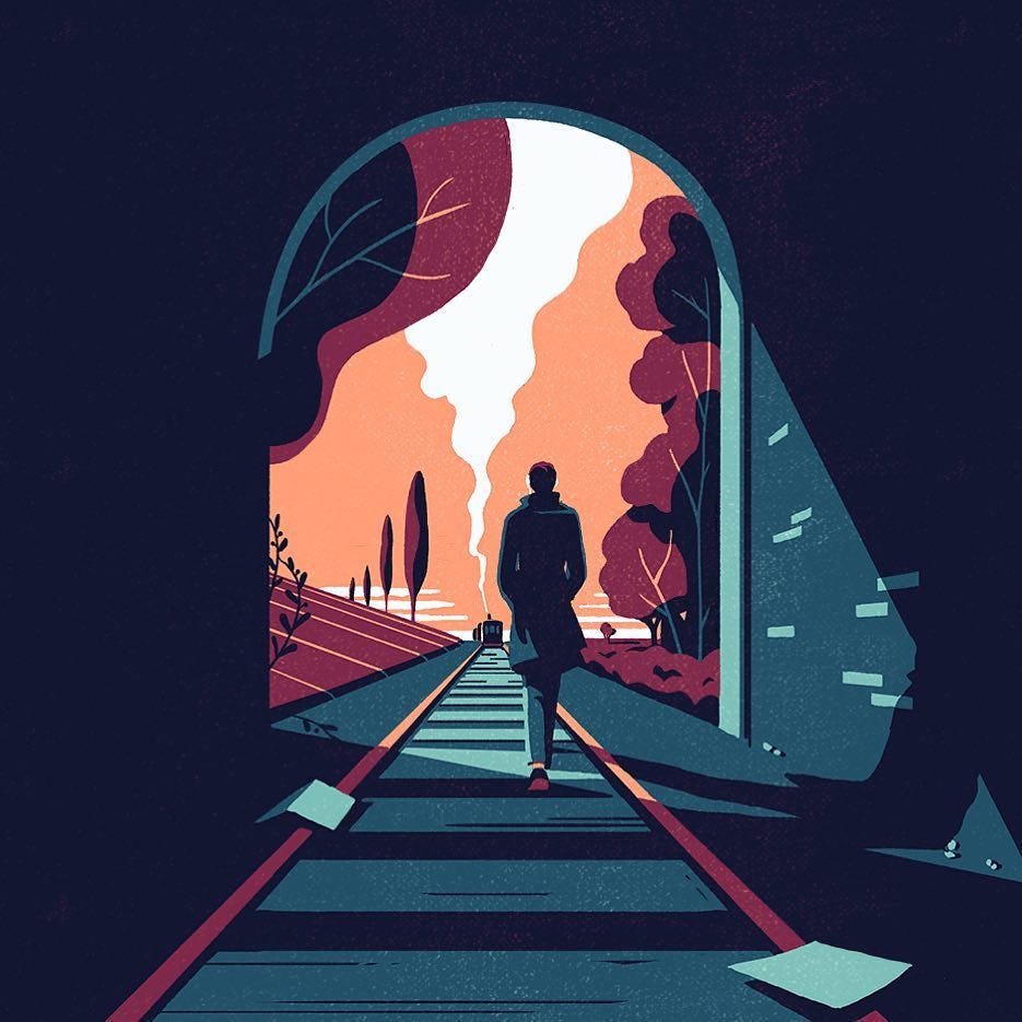
Tom Haugomat—perspective lines can work as leading lines as they do here. You likely first see the traveler, and then continue down the tracks and discover the train.
Emphasizing The Whole Composition
Sometimes you don’t want tight emphasis on one particular element, but, more want to feature the entire composition. The seminal textbook on design principles, Design Basics describes this:
A definite focal point is not a necessity in creating a successful design…an artist may wish to emphasize the entire surface of a composition over any individual elements.
Sometimes the focal point may be skillfully played down if the emphasis is on the overall aesthetic of the composition such as the above Tom Haugomat scenes. Abstract texture-rich paintings often employ this approach as well, and perhaps to a greater degree. Map, by Jasper Johns is a particularly good example of that.
Hopefully, seeing the above examples of timeless techniques for creating emphasis have inspired you to try some of these techniques in your own compositions. Whether you do paintings, web pages, digital art, or photography, you’ll undoubtedly want to focus on focal point ◕‿↼
Previous in series in series: Rhythm and Motif. Also, you may like one of my other illustration teardowns.
Rob Levin does technical things by day and illustration by night. You can view his work at https://www.instagram.com/roblevintennis and https://www.behance.net/roblevin
AI-driven updates, curated by humans and hand-edited for the Prototypr community


