Build Design Systems With Penpot Components
Jul 21, 2:15 AM
Penpot's new component system for building scalable design systems, emphasizing designer-developer collaboration.
smashingmagazine.com

uxdesign.cc – User Experience Design — Medium | Maia Herring 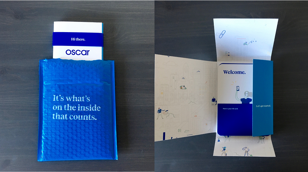
One of the great things about being a single, risk-averse freelancer over the age of 26 is that you have to buy health insurance on the Marketplace. It’s fantastic!
Around open enrollment season, I learned that Oscar Health would be expanding to Austin, beginning in 2018. I was thrilled to hear this news, as I had used Oscar for a brief time when I lived in New York. I couldn’t quite remember why I liked Oscar so much…it was something about the branding and their advertisements in NYC subway cars, I think. Anyway, I trusted my past judgment and made the decision to switch from my previous plan to an Oscar plan.
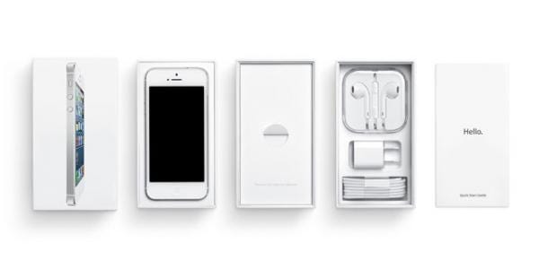
A couple of months later, I was reminded of why I preferred Oscar over other insurance companies, when I received my initiation paperwork in the mail. In fact, the materials didn’t look like paperwork at all. First of all, rather than being delivered in your standard white envelope, the materials came in a blue package. What a joy! When I opened the package, the contents resembled the booklets and instructions that come with Apple devices.
 You know what I’m talking about.
Health insurance is something that stresses me out to no end. I’ve definitely cried over the enrollment process and forced my loved ones (and some Marketplace call center employees) to sit through tearful phone calls with me as I tried to make sense of my policy options. This process can prompt all the logical questions, like “What is a deductible?,” “Do I have an in-network doctor?,” “Did I fully assess the risks of making a career change?,” and “Do I really need to live in a capitalist society?”
In the past year, I’ve enrolled in three different Marketplace plans: the first when I left my job in New York and moved to Pennsylvania to live with my parents for a few months, the second when I moved to Texas (goodbye, free health insurance from PA, I’m in a red state now), and the third when open enrollment for 2018 occurred. Even before that, I began receiving health insurance through my employer when I was 22. Needless to say, I am all too familiar with boring insurance materials. The big envelope and thick handbook typically go straight into my disorganized filing system, in case I need to reference them in the future. I certainly don’t review all the manuals, brochures, and flyers immediately after I receive them in the mail.
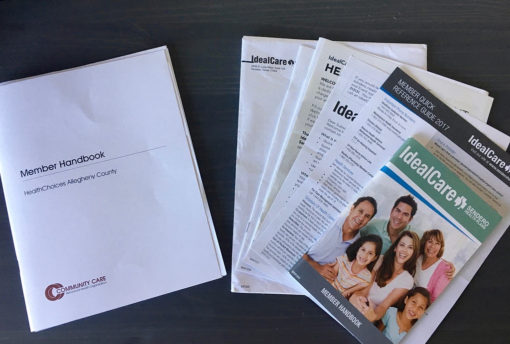 The handbooks of insurance plans past.
What I appreciate about Oscar is that the company uses conversational language to communicate information in digestible amounts, as opposed to presenting it in dense packets and handbooks. The package from Oscar greeted me with a simple “Hi there.” I then unfolded it to find information cards with cute, colorful illustrations and just the right amount of text. I also found a pack of bandages, stating “Let’s stick together,” and creating a pun about the adhesive quality of said bandages. Each bandage even has a funny or sassy saying on it, like “No pain, no gain,” and “This gets me out of work, right?”
Of course, we’re still talking about health insurance here, so the necessary privacy policies and legalese are in there too — in a booklet labeled “Here’s all the nitty gritty.”
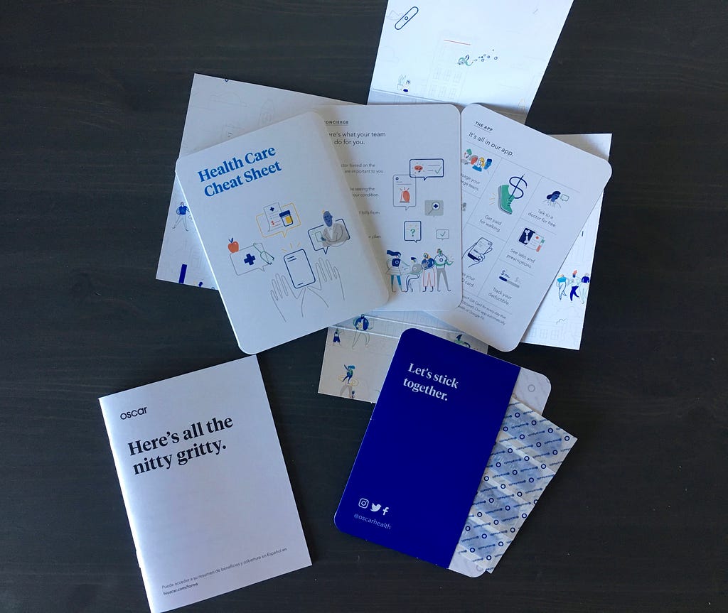 Oscar’s initiation materials.
Despite the seriousness of its industry, Oscar seems relatable — particularly for Millenials — and it offers some demystification in the insurance coverage process. It’s all in the branding, and Oscar’s branding reflects that the company is mindful of user preferences and acknowledges the often-unfavorable views of insurance companies. This awareness leads the company to take on a somewhat tongue-in-cheek tone in its communications, and I appreciate that level of humanity. It’s almost like Oscar is a friend of mine who possesses a quick wit and a good sense of humor.
So that’s all that Oscar had to do to win my loyalty and make a returning customer out of me. They created a delightful user experience through print — a medium that can be viewed as static and lacking multidimensional interaction, especially in comparison to digital.
I definitely didn’t read all the information from Oscar, but I actually looked at it and didn’t file it away immediately. And I was overjoyed to cut up my old insurance card.
Innovative UX Design in Printed Health Insurance Materials. Seriously. was originally published in UX Design Collective on Medium, where people are continuing the conversation by highlighting and responding to this story.
AI-driven updates, curated by humans and hand-edited for the Prototypr community


