Build Design Systems With Penpot Components
Jul 21, 2:15 AM
Penpot's new component system for building scalable design systems, emphasizing designer-developer collaboration.
smashingmagazine.com

UX Power Tools – Medium | Jon Moore
* But you probably shouldn’t. That’s foolish.
Designers spend a lot of time perfecting pixels. I like to call it nitpixeling. “Shift that over 2 pixels. Those reds don’t match. The line spacing should be a little looser. The border radius should be 3px not 5px.” (all real feedback I’ve delivered in the past week). Tools like InVision make this easy because you can just click around the UI and comment on any inconsistencies.
So why nitpixel at all?
Pixel-perfection isn’t an exercise of congratulatory self-indulgence, and it’s certainly not gonna earn you any extra Dribbble likes. It’s not for your design manager, client, or even that recruiter who you probably shouldn’t be showing those private screens to anyway.
Pixel-perfection is for developers. And let me tell you why.
Developers are inherently rule-driven, just like the machines they program. Tell a computer how to do something, and the computer will execute it. Send a developer a design spec with 23px padding, and you’re gonna get 23px padding. Developers can’t read minds, so you can’t expect them to know that you goofed and meant to say 24px. Which brings me to…
You’re responsible for seeing the design all the way through implementation. Sometimes QA will compare the spec to the production code, but they’re unlikely to have the same level of scrutiny you do. Frankly, I still find it hard to believe that they can’t tell the difference between 19px margins and 20px margins, but who am I to judge… ¯\_(ツ)_/¯
Ask any designer to see a website or app that they designed, and more often than not they’ll fake playing around with their phone, then lie and say something totally not believable like “oh, it looks like the server is down…I’ll uhh…send you a link…”
I think the only thing worse in the world than watching your design get butchered during development is when someone puts a box full of cereal dust back in the pantry.
Note from Jon: To be absolutely clear, poor implementation is rarely because developers are incapable of execution. Usually it’s just because a) they have bigger fish to fry, or b) they don’t have a design eye like you do.
This is where post-design redlines fit into the design process, but unfortunately, this is where most designers stop, leaving the implementation to look…well…the way it looks.
No bueno.
Don’t just get upset that the final product looks bad. Do something about it!
redline (noun)
1. a drawing or document that has been marked for correction or modification (source: Wikipedia)
2. the bane of my very existence (source: Me)
Remember during the design process how your team would sit and poke holes in your design during a review? UI redlining is basically the same thing, but done after your design is implemented. This is a developer’s first interpretation of your design, and it’s up to you to help them get it right.
 This is a real screenshot from one of my redline documents.
This isn’t easy for me, this isn’t easy for developers, and this isn’t easy for Lionel Richie either.
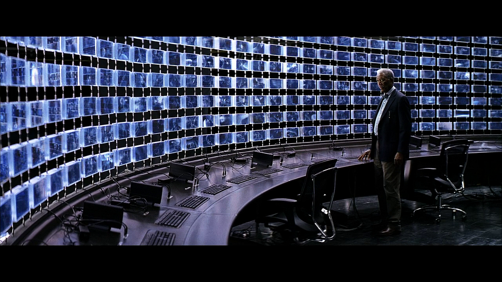 Pictured: Morgan Freeman’s monitor setup to redline an app.

The team at InVision has a new feature called Freehand.
Click here to try it out and follow along.
It’s essentially a lightweight, collaborative digital whiteboard. Here’s their launch video:
First off, I use a trackpad, and my Freehand drawings looked like they were done by a toddler. I wasn’t sold.
HOWEVER!
Your drawing experience is completely transformed when you hold down the alt/option key. It’s magical…watch:
It seemed a little gimmicky at first, but after using it for a while, I completely fell in love with it. I didn’t have to switch between tools.
It sounds trivial, but it was so nice just having one option for drawing. They perfectly mimicked writing on a real whiteboard by limiting users to a single tool with one color, yet still…somehow…made it better. Using a real whiteboard is depressing now because my shapes don’t snap in place. Sad.
Wireframing with Freehand is pretty cool, but for me, it’s become a brilliant tool for UI redlining. Again, I’m not redlining designs. I’m redlining the actual implementation. That’s an important distinction.
I can’t show you any of the client projects I’m working on at the moment, but here’s how Christian and I would use it to redline the UX Power Tools site (if it had any bugs…which I hope it doesn’t!).
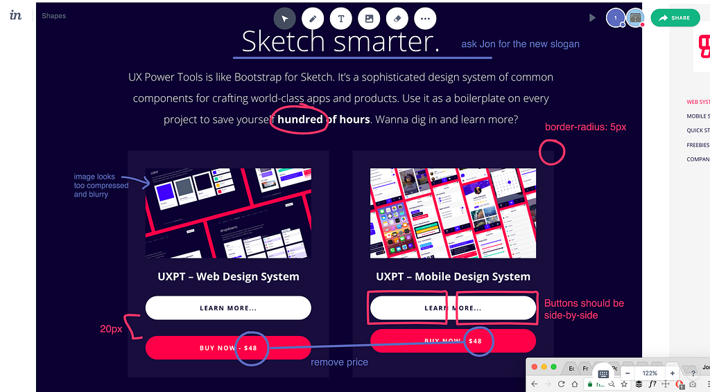
The reason I prefer this to other methods is because I can quickly take a browser screenshot and paste it directly onto my Freehand canvas, then draw or type directly onto the screen to show where problems exist.
It’s hard to describe, but using it just feels natural. It gave me the same type of feeling that the Medium interface did when I first used it. It works exactly how you expect it to work, and it stays out of your way.

I basically just work my way through each page of the live site or product, taking a screenshot, pasting into Freehand, and leaving comments along the way. I much prefer how I can see ALL of my comments at the same time, instead of them being hidden behind a number on InVision.
Things go a lot faster if you can get another set of eyes on the screens since you can both work at the same time. Christian and I hopped on a Slack call one evening while we were going over the site. Each new participant gets his or her own special color, so his comments are in blue:

It cannot be overstated: This redlining technique saves SO. MUCH. TIME.
If we were so lucky as to have our own web developer, then I would’ve just shared this Freehand document with her, and she could keep tabs on her progress right on the document itself.
There’s one huge, albeit hidden benefit of doing direct UI redlining in this way. Because you can draw directly onto the screens themselves, you are, in a way, helping your developer see what you see. You’re teaching them to scrutinize like you do, and over time, they will become a nitpixeler like you.
This is an important lesson.
If you just hand a developer a list of updates, the meaning behind why they’re making those changes will be lost because there’s a disconnect between the written feedback and the visual problem.
Let me show you what I mean. Here’s what I used to do:
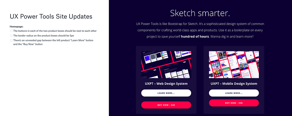
Chances are your eyes just bounced back and forth between the list of changes and the screen itself, pausing long enough to find what you assumed was the issue. It’s just…disjointed. When a developer actually goes to make the updates, they’re less likely to really SEE what was wrong. It’s like in history class when you read the words of an entire chapter without actually understanding a single word of what was said. And yes, that’s a painful reminder of my entire high school career.
Now compare that to this:
Since I’m drawing right onto the screen itself, there is a strong association between what is wrong and how that wrongness looks.
Make sense?
I’m still a diehard fan of physical whiteboards, so even though I don’t really use this to do much wireframing, that’s just one of many other ways you can use Freehand.
Here are some other ideas for how you can use it yourself:
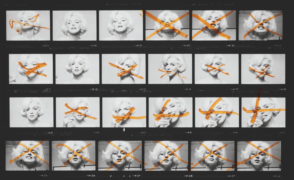 This is a sheet of image proofs that a photographer will assess when choosing which shots to retouch and/or print.
We can be serious all day with legitimate use cases, but let’s be real…there are some hilarious uses for Freehand as well:


UI redlining is an incredibly important part of the design process. QA should and will spend most of their effort on interaction and logic issues, so it’s up to us (the designers) to do proper Design QA. There’s no one more suited to dig deep into the pixels to make sure they shine.
My daytime agency is deep into the InVision ecosystem, and I’m thrilled with how well Freehand fits into our process. I’ve been searching for a solution to this redline problem for a while, and this is now our go-to.
When I’m not drawing all over the Internet, I’m working on Sketch design tools at UX Power Tools to make you a better, more efficient designer. You can learn more here:
Follow UX Power Tools on Twitter
Follow me on Twitter
InVision Freehand: A 21st Century Case for Digital Whiteboards was originally published in UX Power Tools on Medium, where people are continuing the conversation by highlighting and responding to this story.
AI-driven updates, curated by humans and hand-edited for the Prototypr community


