Build Design Systems With Penpot Components
Jul 21, 2:15 AM
Penpot's new component system for building scalable design systems, emphasizing designer-developer collaboration.
smashingmagazine.com

medium bookmark / Raindrop.io |
Apple has released the new iPhoneX (along with other updates) and everyone is talking about it! Apple’s “Meet the iPhone X” and “Introducing iPhone X” promotional videos received a combined 37 million views in one week and Twitter exploded with thousands of tweets. And what are they saying? Well, I’ll touch more on that later. Right now I’m going to share my own first impressions and initial thoughts on the new iPhoneX and what it’ll mean for all the iOS developers and designers out there.
Being an iOS developer myself, the new iPhone will certainly have an impact in the way we’ll design and build apps moving forward, whether we think it’s top notch or not!
So what changed in this new release? Well, in short. A lot! The first, and most obvious thing you’ll notice is that the home button is gone! The new iPhone breaks away with the common gestures to access the Home Screen, Multitasking and Control Centre. This to me is one of the biggest changes to the iPhone line up: a 10 year old gesture, “Press Home”, to take the user to the home page is now replaced with a swipe up from the bottom.
 <img class=”progressiveMedia-noscript js-progressiveMedia-inner” src=”https://cdn-images-1.medium.com/max/1600/1*CPHLnU239tdwZaxDrFoEEw.png”>
No touch! Only Swipe!
To keep things confusing for an old user, a swipe up from the bottom that stops mid-way now shows the multitasking screen, where you can scroll through the open apps. It looks easy to pick up, but it will sure take some time to stop double tapping the bottom of the screen and waiting for something to happen!
If that wasn’t confusing enough, there’s been another switch-a-roo. Control Centre and Notifications are both a swipe down from the top of the phone. The starting position of the swipe down now makes a difference! Centre means notifications, slightly to the right means Control Centre.
And to keep the chaos wave going, these changes are only for the iPhoneX. iPhone8 and below will still keep the same gestures we already know. To me this means that we lose a lot of UX consistency across the iPhone line. A user will eventually become used to these changes, but it feels sloppy to have different ways to access the same thing on the same version of iOS in different phones.
So, what else has changed? The phone screen now goes edge to edge and some system gestures have been switched around…oh, and you can pay with your face!
 <img class=”progressiveMedia-noscript js-progressiveMedia-inner” src=”https://cdn-images-1.medium.com/max/1600/1*aZY7cmjZHF7j4b3Wmdvdpw.png”>
I for one, welcome our new robot overlords.
If that isn’t one of the most cyberpunk things in a mainstream product then I don’t know what is… anyway, back to our scheduled program: UI and UX changes!
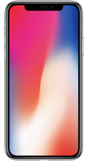
While the edge to edge screen is nothing new in the smartphone world, it is certainly a novelty for an iPhone. The extra real estate means that we have more vertical room to fit content. We also have a notch at the top and curved bezels in the corners of the screen which are bound to cause some issues when it comes to formatting.
 <img class=”progressiveMedia-noscript js-progressiveMedia-inner” src=”https://cdn-images-1.medium.com/max/1600/1*RNFpbUikrgz1PGD_l5k87Q.png”>
Look at those curves…
The impact of these changes on UI is heavy. Love or hate the notch and curved bezels, developers now have to be mindful of properly insetting content so it doesn’t clip when it reaches the corners.
And of course, Apple wants us to embrace the notch! On the updated design guidelines, Apple states: “Don’t mask or call special attention to key display features”. Which means for us developers that we should not try to hide the sensor notch nor the home screen indicator. But of course in true Apple fashion, they are the first to break their own rules!
 <img class=”progressiveMedia-noscript js-progressiveMedia-inner” src=”https://cdn-images-1.medium.com/max/1600/1*w-uRm92ED6CydWQDGOlv6w.png”>
What do we have here? iTunes App hiding the notch away!
And since we’re talking about the home screen indicator, this new addition also impacts apps that make use of landscape mode (most if not all of the apps). The indicator taking away vertical space paired with the new curves and notch mean that side margins on content need to be bigger. Personally, I think the iPhoneX on landscape mode is not that visually appealing.
Hey Apple, WHY???
Last thing of note, with more room to work with, the new iPhone can afford to have a bigger status bar. It remains the same size when a background task like location tracking or a call is happening. While it used to always be a layout breaker, now we don’t need to worry about it so much! (winning).
 <img class=”progressiveMedia-noscript js-progressiveMedia-inner” src=”https://cdn-images-1.medium.com/max/1600/1*SPQ37Mjjc3OwJlro_IyxeA.png”>
Status bar is now full size all the time!
There is a lot more in the guidelines to take into account which I highly recommend checking out. While you’re there, you can also check the updated design resources. The iPhoneX simulator is available with XCode 9, so try it out and see if your apps need any adjustment.
While the new iPhone looks very appealing with its new slick curves and the new screen looks top notch (pun intended), be aware of the impact these changes will have when designing an iPhone app.
Since I’m having a lot of laughs on Twitter with all of this, I wanted to share them with you! They were part of what motivated me to write this article, so here’s a small dump:
This piece was written by Luis Ramos, our Sydney based Senior Mobile Developer. If you like what you read, drop him some claps and follow him on Twitter! Here at Mentally Friendly we are a colourful bunch and we are currently hiring!
👏 We’re Mentally Friendly. We’re an agile digital product studio that strives to create meaningful and engaging experiences that solve real needs.
📩 If you’d like to create something amazing with us, get in touch- [email protected]
📱 To see more of what we do you can find us here:
Twitter: @MF_says
LinkedIn: https://www.linkedin.com/company-beta/1061792/
Instagram: @mentallyfriendly
AI-driven updates, curated by humans and hand-edited for the Prototypr community


