Build Design Systems With Penpot Components
Jul 21, 2:15 AM
Penpot's new component system for building scalable design systems, emphasizing designer-developer collaboration.
smashingmagazine.com

Design + Sketch App — Medium | Evon Tay
You’ve probably heard about how useful the Sketch libraries feature (available since v4.7) is. Many design teams, big and small, are currently using them to speed up their design iteration process. It is also part of the initial process of building up a “single source of truth” design system within your organisation.
Every team has their own preference of how they like to organise their style library, and in this post I’ll share how our design team does it.
Together with your team, decide on the list of initial building blocks you want to include in your Sketch library. We are following the rules of atomic design, because it just makes so much sense (thanks Brad Frost 👍). The general idea here is you’d want to create the smallest elements (atoms) first, then how you’d use these elements within something bigger (molecules) . And how these would be combined to form a larger group (organisms), and so on (templates).
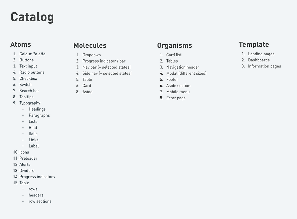 Our initial library wish list
Open a new Sketch file and save it as a library. Let’s create the colour palette first. Draw rectangles and fill them with your primary and secondary brand colours, the blacks and greys, the system validation colours etc. Remember to add the color codes for easy reference, this is a style guide after all!
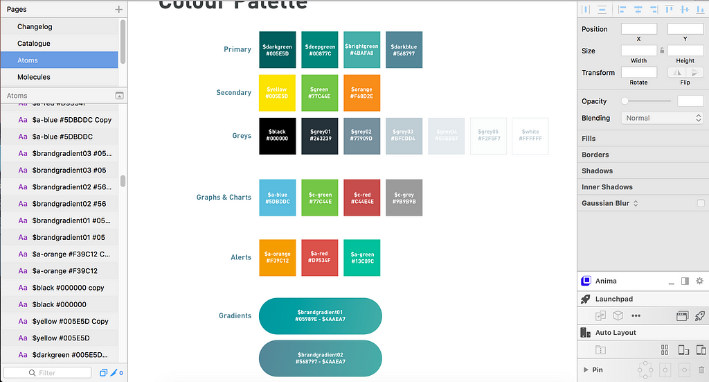 Colour Palette Swatches
💡Pro tip. To make this style guide more helpful for future designers using it, you might want to also include explanations and best practices on how to use each element.
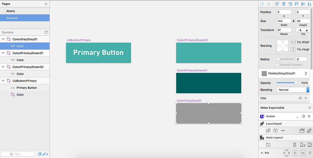
Select each rectangle fill and create a shared style for it on your right-side panel. You can name each colour semantically or by assigning each shade with a number, then categorise them with a slash “/”. For example, Palette/primary/darkblue. Having a shared styles library would be super useful to quickly change colours when you are creating other elements later on. This is how my shared style for colours look like. (Click on Shared Styles > Organize Shared Styles)
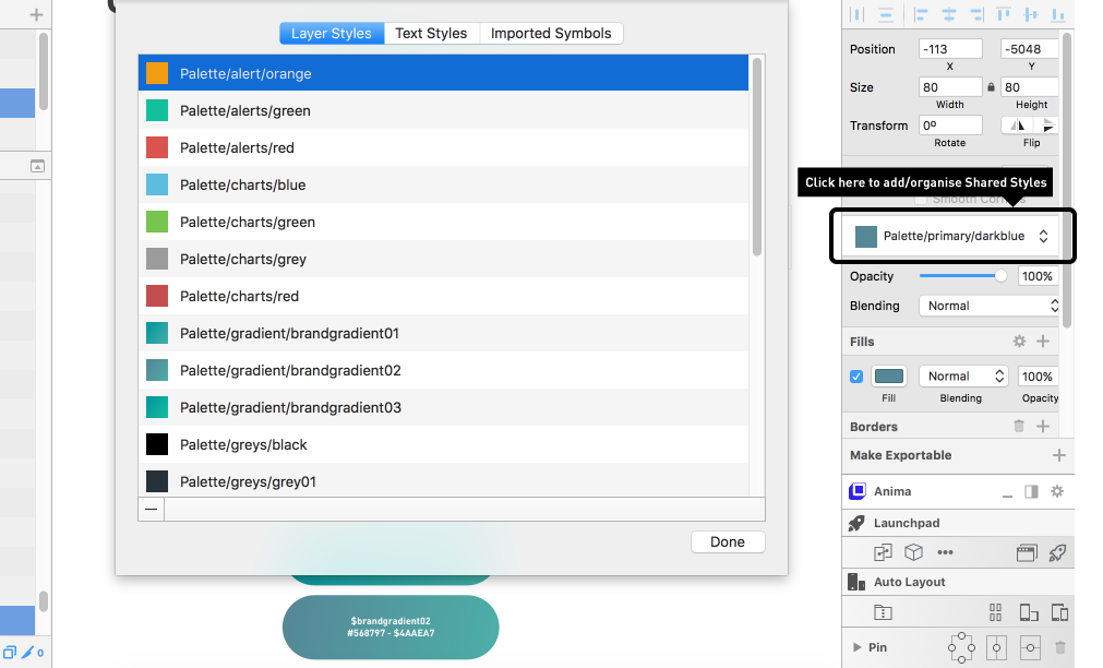 Shared Styles for my colour palette
Decide what is the next thing you want to use your colours in. For us, we decided to make buttons first. So I created a rectangle button with white text inside, and then I used shared style to fill my button colour. Select both the button background and text, and convert it into a symbol named “UI/Button/Primary”. At this point, let’s stick to the basic ol’ rectangle buttons first. If you want rounded corners, we will do that later!
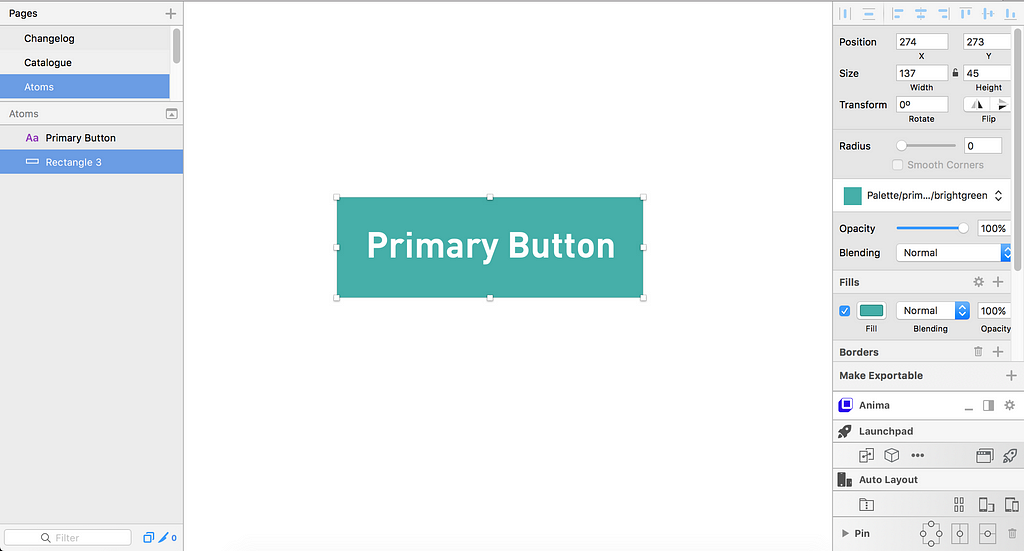 Making my first basic button
Now that your button is a symbol, double-click on it to go to the Symbols page in your Sketch file. Select the rectangle fill and convert it into a symbol named ‘Color/Green01’. By converting a layer in your button into a symbol, you are creating a variable that could be customised later on. Rename this symbol layer here into ‘Color’. This is for naming the label for the button color dropdown.
Let’s double-click on the colour layer now to go into the ‘Color/Green01’ symbol. Duplicate it and change it to another colour in your palette, rename the symbol according to the name you gave it earlier (i.e. ‘Color/Green02’ ). Do this for all the colours you want your buttons to be available in.
 Make Color into symbols
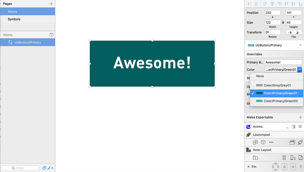
Now go back to your page and try to insert the button you have just created. Insert > Symbols > UI > Button/Primary
The button you have created is now customisable. On the right side panel, you can change the label text on this button, as well as the colour using the dropdown. Yay! 🙌
As mentioned earlier, if you want the option to change the shape of your button, like giving it rounded corners, double-click on the button to go back to the button symbol again. Draw a rectangle of the same width and height as your button (name this layer ‘Shape’) and add a border radius of 4px. Convert this layer into a mask, then convert this mask layer into a… you guessed it, symbol. Name the symbol ‘_resources/Shape/4px-radius’.
 Rename the rounded rectangle to ‘Shape’ then mask it, and convert to Symbol
And now delete your ‘Color’ layer from this button symbol. Yes, you read that right. Because we are going to nest the colour inside the Shapes symbol. Double-click on your Shapes Symbol to go to it. Insert your color symbol over it, and make sure the color symbol layer is named ‘Color’.
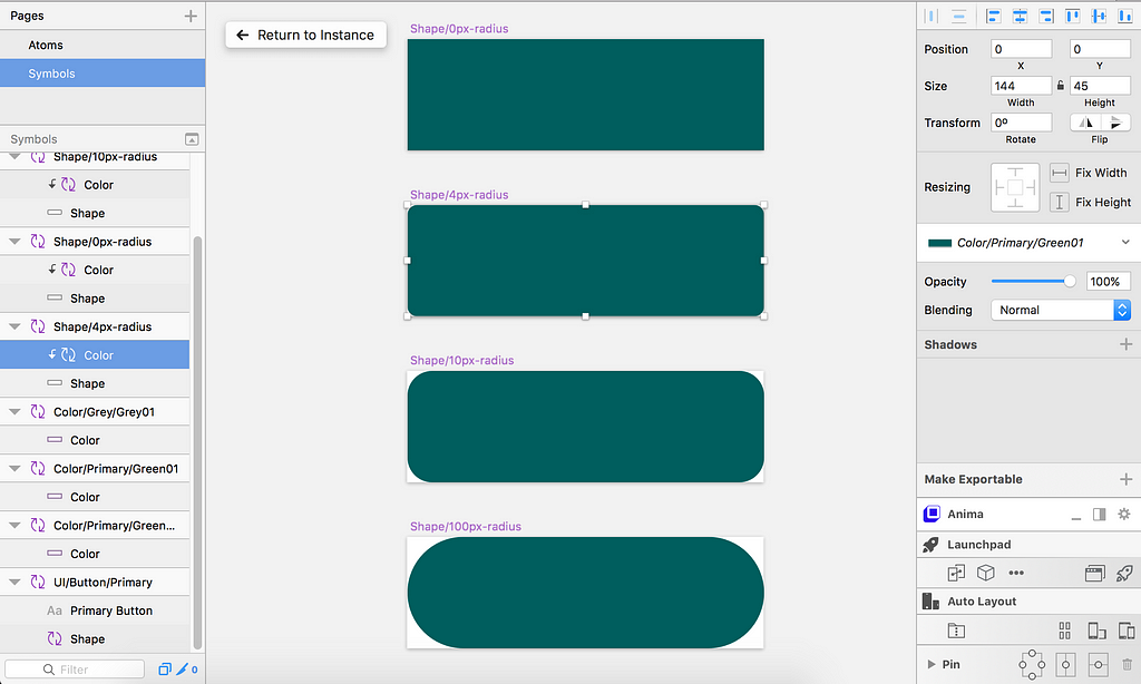
Like the Colors, you can duplicate the shape symbol to make other button shapes like 10px-radius, or rounded. Just remember to name the symbols accordingly.
Go back to your button on the style guide page again and test the shapes out. Nifty eh?
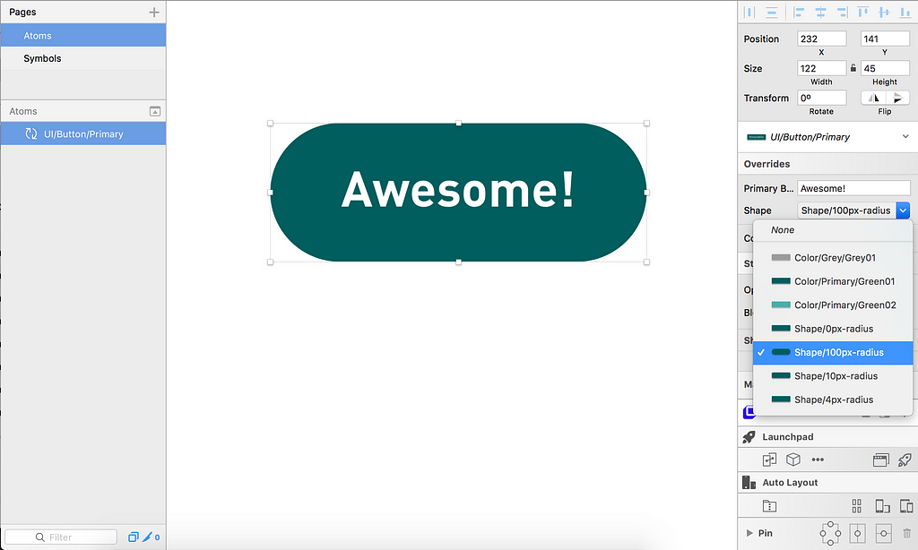
You can go on to expand on your button options, like having outlined option, buttons with icons. Or you can start adding your other elements in your style guide like typography, form inputs, tables etc.
The basic idea:
1) Create the component and make it into a symbol.
2) Decide which layers of the component you want to be customisable. and convert these layers into symbols.
3) Duplicate the symbols with their respective options.
Once you are happy with your first few sets of components, try it out with your team members. You may share your library sketch file in your common server or a file-sharing service like Dropbox. Make sure the file is shared at a place that can be synced whenever new changes are made to it.
To add your Sketch library to a separate Sketch file your team member is working on, go to Preferences…>Libraries, then click on the + to find the library file you have shared in the syncing folder.
Now you can start using elements from your shared library in this Sketch file. Just go to Insert and find the library and the symbol you need. Easy Peasy.
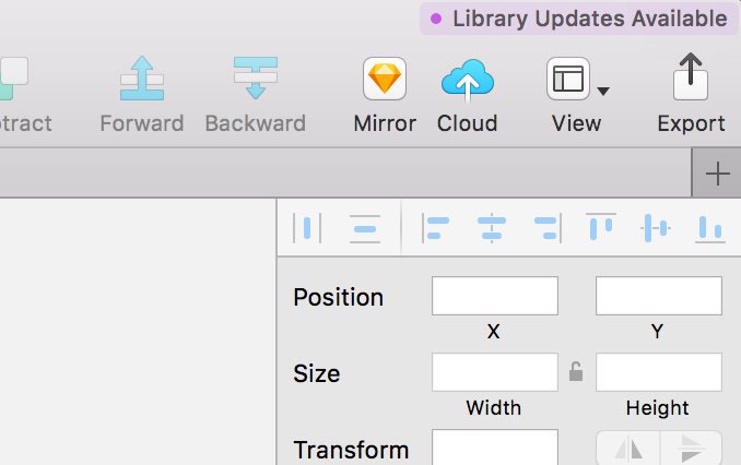
Whenever there is an update made to the library, all the files that are using this library would get a purple notification (on the upper-right corner). Clicking on it would inform you of the change, and showing the difference that would be made to your Sketch file if you decide to pull in the update.
The thing about a library is, it gets outdated very easily. Your team has to agree to maintain this library file regularly to ensure it stays useful. Discuss what needs to be updated, added or fixed. And before each ‘release’, test to make sure it doesn’t break any existing components. Otherwise things could get real messy. 😱
In our team, we have a separate page in the Sketch library file called ‘Changelog’ where we document all the updates in the file. It’s kind of like a product release note, so that we could keep track of whom updated what in the file.
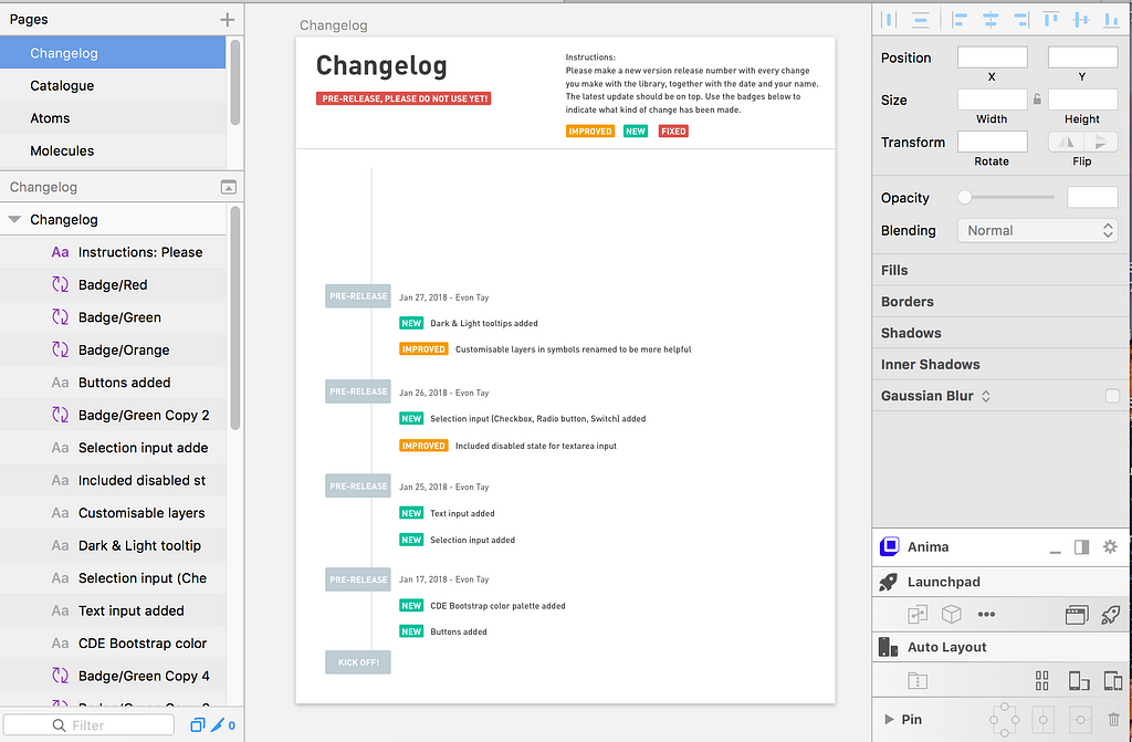 Keep a changelog inside your Sketch library file
We are also toying with the idea of using version control tools like Abstract, Kactus, or Folio for Mac to rid ourselves of this manual task.
That’s all, folks. Hope this information is enough for you to start building your own Sketch library. If you have any questions or comments, feel free to reach out!
This post was greatly inspired by this Youtube video by Pablo Stanley (Seriously, he explains it so much better than me.)
Do you have any tips on how your design team manages and maintain your Sketch libraries? Please let me know in the comments below.👇
Let’s start a Sketch Library! was originally published in Design + Sketch on Medium, where people are continuing the conversation by highlighting and responding to this story.
AI-driven updates, curated by humans and hand-edited for the Prototypr community


