Build Design Systems With Penpot Components
Jul 21, 2:15 AM
Penpot's new component system for building scalable design systems, emphasizing designer-developer collaboration.
smashingmagazine.com

Design + Sketch App — Medium | Mark Grambau
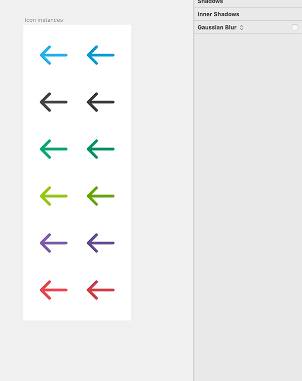
As a Product Designer & Illustrator at Circle, it’s my job to manage and grow our custom icon set. I’ve built each icon according to the system Steve Stone outlined in Icon Sets with color override in Sketch.
We have symbols for all of our official brand colors, and a color instance is nested and masked within each icon symbol. When a designer places an icon on an artboard, they can recolor it with a simple override, replacing the default hue with any other in our brand palette.
 A small sample of our icon and brand color symbols
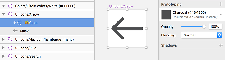 Each icon symbol features a color symbol instance masked into the icon’s vector shape
It’s great …with one caveat.
Sometimes, a designer needs to venture outside the brand palette. With no eyedropper or color picker available, they inevitably detach the icon from its symbol and just color it directly. This litters up the file and negates the benefits of symbols.
I’ve recently discovered a workaround: a way to turn symbol overrides into an RGB color picker. It’s an absurd Rube Goldberg machine, but it gets the job done. I thought my colleagues would mock me for such profound over-engineering, but to my surprise, they’ve embraced it and encouraged me to share it.
My solution relies on how RGB colors are composed. If you’re an RGB and hex color pro, skip ahead. Otherwise, here’s a quick primer:
RGB is an additive color model. When you add its three primaries — red, green, and blue — you get white, while the absence of color results in black. Every RGB color’s unique mix of red, green, and blue channels can be written as a six character hex code.
A hex code is actually a series of three pairs, representing the intensity of red, green, and blue, respectively. Each pair has 256 possible levels of intensity, from zero to 255. Those levels are then represented as hexadecimal, a system built around blocks of sixteen.
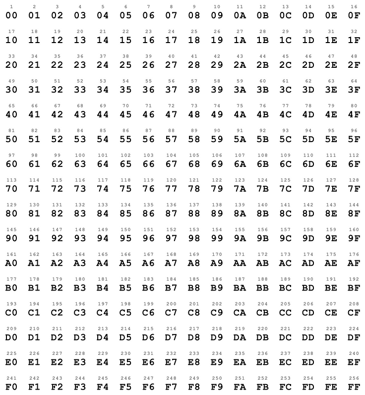 Counting in hexadecimal. Easy as 00, 01, 02!
Pure, full intensity red is written as #FF0000 because the first pair (the red channel) is maxed out, while green and blue are both zero. By that same logic, #00FF00 is pure green, and #0000FF is pure blue.
 Every pure red, green, and blue color.
#FFFFFF is pure white because every channel is at its max, while #000000 is pure black because every channel is at zero.
Steve Stone’s icon coloring method exists in the first place because Sketch doesn’t let you override a color fill within a symbol, but it does let you swap out one nested symbol for another of the same size. It dodges Sketch’s limitation by making symbols for all the colors we think we’ll ever need. A box of crayons.
But what if we made symbols for each part of a color instead? If we broke an RGB recipe into its red, green, and blue components, could we put it back together?
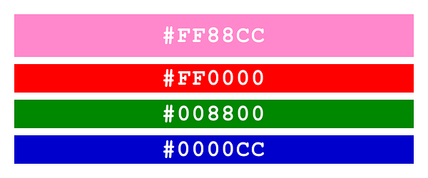
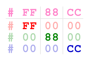
Let’s take the color #FF88CC, a nice rich pink. Its red value (FF) is all maxed out, its green (88) is mid-range, and its blue (CC) is near the top.
Now we’ll create three shapes, each representing a single channel. Our rectangles are colored #FF0000, #008800, and #0000CC.
Now to put them back together. We can’t just stack the layers and get #FF88CC; we need a blend mode to mix them properly. Lighten does the trick! Here’s how it works, according to the Photoshop user guide:
[Lighten] looks at the color information in each channel and selects the base or blend color — whichever is lighter — as the result color. Pixels darker than the blend color are replaced, and pixels lighter than the blend color do not change.
Like goblin-made silver, lighten only takes on that which makes it stronger. It considers all the stacked layers and picks only the highest value in each color channel. In our case, FF, 88, and CC are all higher than 00. These high values win and overwrite the zeroes, resulting in #FF88CC! Crucially, this still works once the layers are converted to symbols. More on that in a bit…
One last thing: We don’t know what will live below these layers out in the wild. If, for example, they were placed on top of #FFFFFF, you’d just see white because the FF pairs would cancel everything else out. To avoid this issue, we need a layer of opaque #000000 below to act as a barrier.
So now that we can recreate a color from symbols representing its red, green, and blue channels, we just need enough symbols to represent every possible color!
Every… possible… color…

I created 256 red symbols, covering every value from #000000 to #FF0000, then did the same for green and blue. All the red symbols are the same size in order to be swappable. The greens are another size, and the blue another yet. These 768 symbols live in a dedicated library called RGB Swatch Library to keep them from bogging down our main brand library.
Finally, I added a symbol, Colors/DIY swatch/Hex code, to our brand library. It has a black background fill and an instance of each channel’s AA symbol to serve as defaults. These three instances are set to Lighten.
This DIY swatch is the same size as our brand color symbols, so it’s available as an override everywhere they’re used.
Now when we need to recolor a symbol outside our brand palette, we just choose the DIY swatch and spell the hex code with overrides.
Oh, and just for shits and giggles, I also created a swatch set for choosing a color by its numeric RGB values, as opposed to hexadecimal. After all, once you’ve made 768 color symbols, what’s another 768?
They’re just duplicates of the hex symbols, resized to unique dimensions and renamed 0–255 instead of 00–FF. The #FF88CC we made before? Now it’s 255,137,205. Fun!
Want to use this absurd coloring method in your workflow? Don’t worry, you don’t have to make 1536 color symbols. You can borrow mine. I’m a design masochist, not a design sadist. Here’s what to do:
Curious about how I made all those swatches? Thankfully, it wasn’t entirely manual. Here’s how I went about it:
A million thanks to Steve Stone for his icon coloring method, Paul Demers for Batch Create Symbols, and Rodrigo Soares for Rename It.
A version of this article also appears on my website.
Mark & the Terrible, Horrible, No Good, Very Bad Way to Override a Sketch Symbol with any RGB Color was originally published in Design + Sketch on Medium, where people are continuing the conversation by highlighting and responding to this story.
AI-driven updates, curated by humans and hand-edited for the Prototypr community


