Build Design Systems With Penpot Components
Jul 21, 2:15 AM
Penpot's new component system for building scalable design systems, emphasizing designer-developer collaboration.
smashingmagazine.com

Design + Sketch App — Medium | Bunin Dmitriy
I would like to present you Plaster a mobile design system made to simplify working with Material guidelines by implementing fundamental principles and Sketch app best practices into nested symbols, granting the user with a fast and reliable component-based design approach.
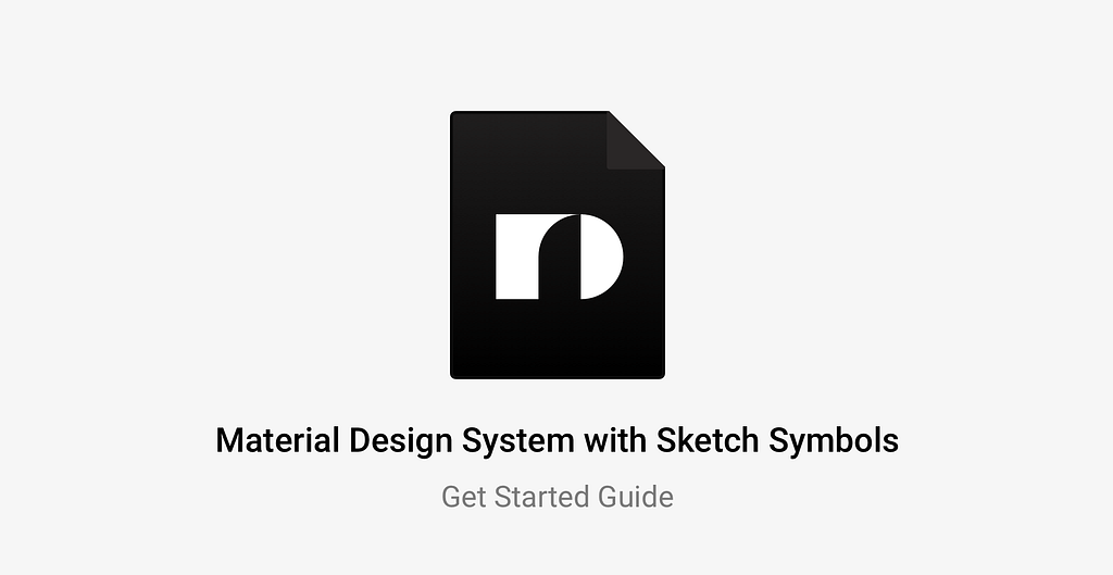
Plaster – Mobile Design System for Sketch app
Why the world needs another Sketch design system?
Mostly because I find the classic Material look been outdated, and after conducting a small research, I was convinced of this. Most of the people (*Designers) would find it worn-out or “too shady” to just blindly use it in their products, since it could lead to a non unique app UI that can get easily lost among all other applications that are already on the market.
But the whole Material.io design system is beautiful. It’s not only visuals, it’s certain design decisions and human-driven patterns working with displayed components. The foundations of all, is a solid structure, primary consisting of component-based design approach, gold 8-point grid, clean typography, and existing metrics on user mobile experience.
That’s why I believe it possible to implement these universal ingredients into a single UI library that will grant it’s master with huge advantages towards customization of mobile app design by utilizing the power of symbols, eg.
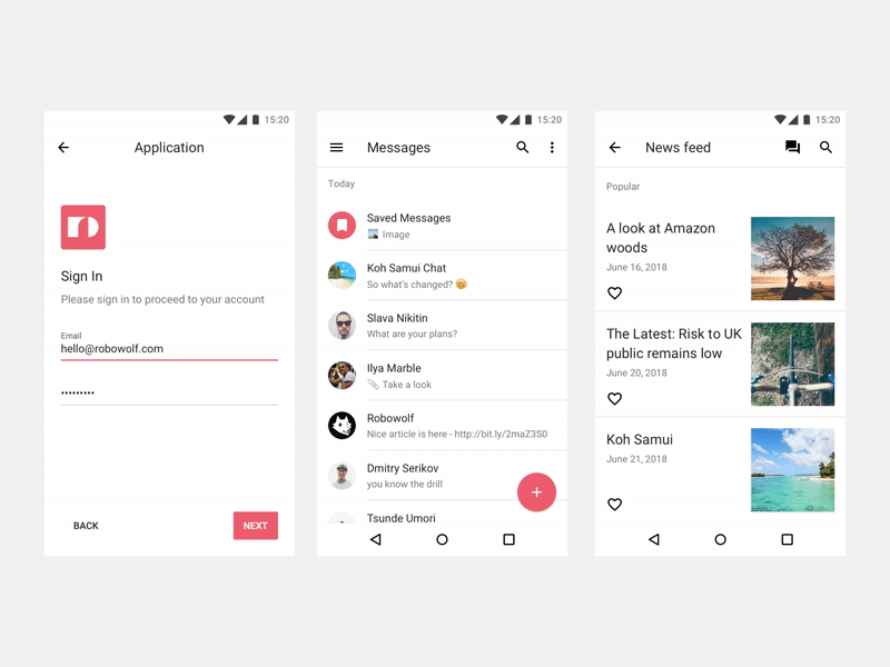
Plaster is a Mobile-first Toolkit designed to help validate and generate ideas faster using bulletproof guidelines packed into Sketch ecosystem. The master file is divided into 5 separate pages, each having its own purpose and lots of pre-designed contents to make a perfect playground.


All pages combined into a powerful tool to cover most use-cases when designing mobile applications, by giving anyone familiar with Sketch the ability to create UI kits and design systems based on it.
To setup Plaster and have your own unique version of the Material design, it only requires to overwrite the default layer and text properties.
Yeah, It’s that easy. ☝️
To do so, go to the Get Started page, select layers and styles you want to adjust, change them and apply. The rest will be done with the help of Shared Styles magic that will sync all existing symbols with new selected styles, including text symbols.
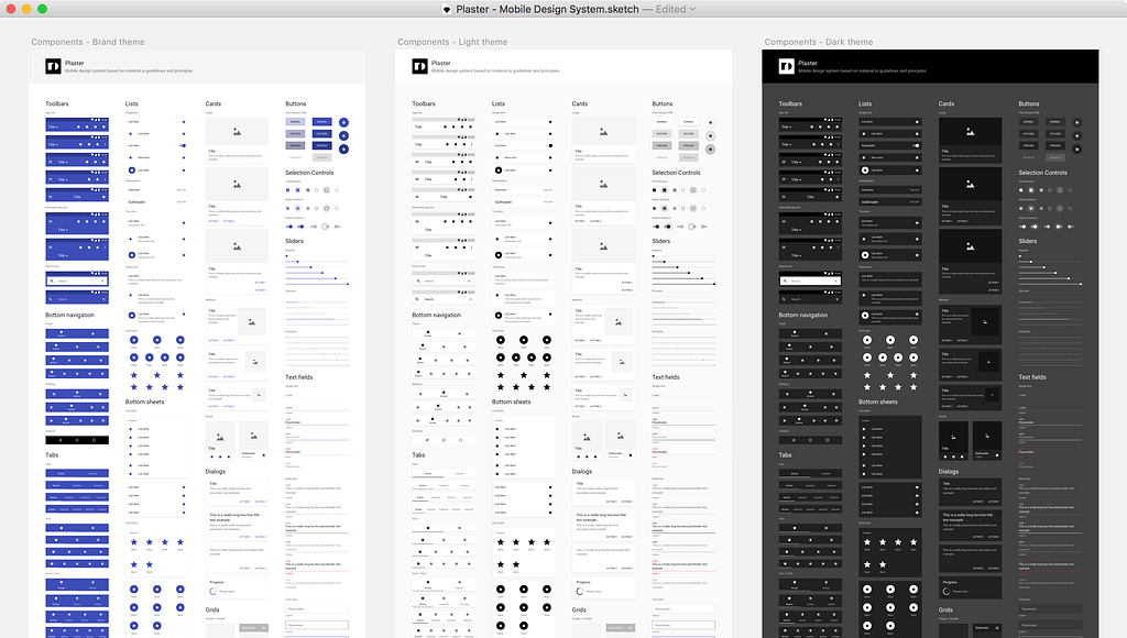
Having under your guidance such a control panel allows to easily create new themes and styles within a few clicks, through quick access to each visual parameter of the system, including global Color Schemes, Elevation, Ink Opacity, Overlays and Typography styles.
The concept of Plaster aims to bring wide-ranging benefits in both short and long-term run, by dividing the UI into compact building blocks that are easy to adapt, scale and reuse for both Android and iOS platforms.
Components — are crucial, using them you can quickly design many screens within a single iteration by just placing them in a right place on the artboard. But, what more important is the fact that you can update them with new details when it’s time to come for a new feature, and spread the changes through your app seamlessly with no additional efforts.
To explain the workflow with symbols, here is a short video of me using Plaster components to build a user profile screen.
Note: All of the Plaster components have the same unified material structure that shares identical override properties with all system components without exception, making it very easy to understanding and work with the overrides panel.
Here is a closer look at the typical List component structure.
 Tip: You can lock individual symbols to hide from appearing in the overrides panel.
In this example, all 4 symbols are nested into a single component, representing visual properties that are possible to adjust or swap, such as shape, color or shadow (Material) text (List item), separators (Divider), and icon (R Icon).
Note: you can add Plaster as a library 📚 to have all components always ready to be used through all of your documents, at any time of the day, using both Symbol menu or a cool Sketch Runner plugin.
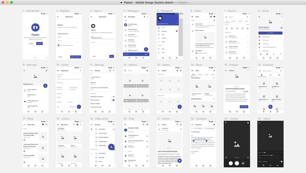
To show you in a more detailed way how components are used, I have prepared a Demo file with a simple UI screen, feel free download it and see them in action to get a feel of the system capabilities.
Plaster is a tool made to test and solve product goals in the shortest possible time. Once settled down you’ll save yourself a lot of hours on every next mobile design project thanks to the diversity of the use cases.
Do more in less time, build bold and beautiful applications. 👊
Visit the Plaster Design System Website to get the full version of the product, or download the Demo file and explore it more closely.
How to get the latest version?
We send email notifications via Gumroad and tweet when the new version is released so be sure to follow us, and if you already bought Plaster just go to the Product page and download the newest version.
Does this mean that Frames will no longer be updated?
Absolutely not. Both systems will be updated separately, our goal is to create best possible UI libraries for Sketch app and we do not intend to stop innovating our products.
Want to suggest a feature or a component?
Great! Feel free to reach us and discuss it via [email protected].
What differs your product from other UI kits?
Plaster is built into a system through constant improvements and is based on the existing mobile design patterns, granting the user with an ability to control and scale mobile design systems for mid/large clients in a fast and confident way.
Material Design System with Sketch Symbols was originally published in Design + Sketch on Medium, where people are continuing the conversation by highlighting and responding to this story.
AI-driven updates, curated by humans and hand-edited for the Prototypr community


