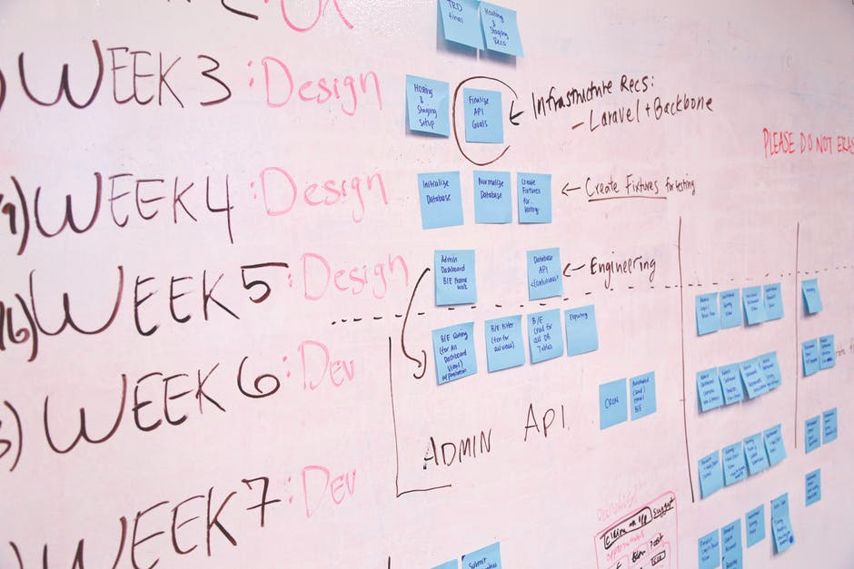
Build Design Systems With Penpot Components
Jul 21, 2:15 AM
Penpot's new component system for building scalable design systems, emphasizing designer-developer collaboration.
smashingmagazine.com

UX Planet — Medium | CanvasFlip
We’re living in the age of mobile apps. As per Statista, as of March 2017, Apple and Google app stores together had over 5 million apps. Gartner predicts mobile app downloads to generate an income of $77 billion in 2017. However, a report by Localytics highlights some troubling statistics about app engagement. The report found that-
While there are many contributory factors behind the abandonment of a mobile app like usefulness of the app, features, onboarding, engagement etc., but studies suggests that failure to create a winning first impression and user experiences are a major reason behind failure of apps. Design is one of the major element of impressing first time users and providing great experience.
Embrace Minimalist Design. Why? We’ll come to it later but before let’s understand how mobile is different from desktop or a laptop from a design point of view-
Now, let’s come to why a minimalist UI works better for mobile. Nick Babich, in his article ‘The Art of Minimalism in Mobile App UI Design’ writes-
“Minimalism is a perfect marriage of form and function. It’s greatest strength is clarity of form — clean lines, generous whitespace, and minimal graphical elements brings simplicity to even the most confounding subject matter. That is, of course, if it’s used effectively.”
A minimalist UI design for mobile app does wonders to user experience because-
When ‘less is more’ you need to plan each element-color, contrast, space, typography etc., well. Every element needs to be well thought. Do you need it? Can your design live without it? Think on both sides and then go ahead. Think with the end result- engaging your user, helping them achieve their goal easily and quickly- in mind.
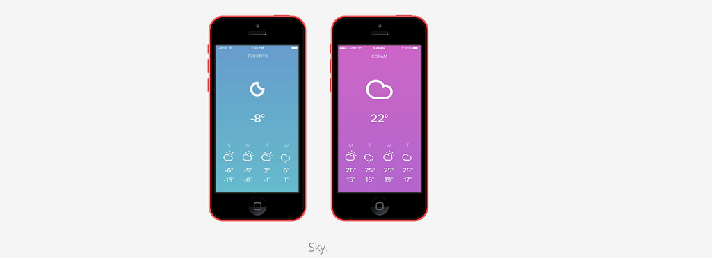
In minimalist mobile app designs, colors assume great significance. Color is a great way to convey vitality, communicate, give feedback and help people visualize data. Choosing right color palette is essential, however, it is important to keep it to minimum. You can pick any color you prefer but use colors that are great contrast to each other like grey and white, yellow and black, blue and white etc. Use color tools to test your colors. You can start with using:
How to make the most of typography in minimalist mobile app design? The answer lies in understanding typeface and how people read on small screens. There are many considerations in deciding typography for a mobile app are like font type, font size, space and line length.
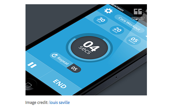
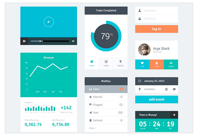
Using several different typefaces can make your app seem fragmented and sloppy. So use one typeface with minimum font variants and sizes. If done properly, typography can be the design like in this app-
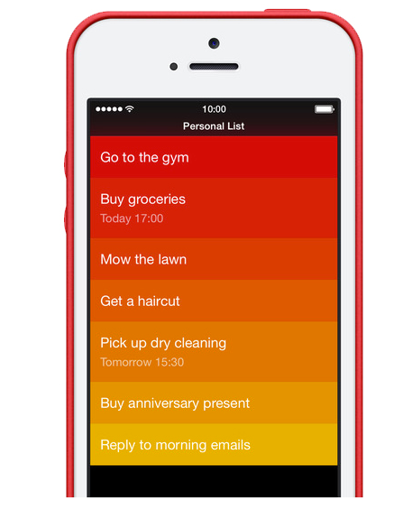
It is a cornerstone of any good design. It has many benefits when done right. It make you design look neat, fresh and soothing. Also it inherently attracts user’s attention to important elements in the screen. In our previous post- White space in UI design, we have discussed some of the best practices in using white space. Here are some tips to keep in mind while using white space for your app:
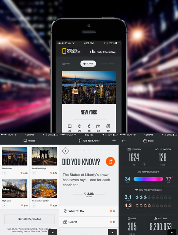
Use images only when it is necessary and serves a specific purpose. You can use a image to convey a message better or if it helps you replace texts in your screen.
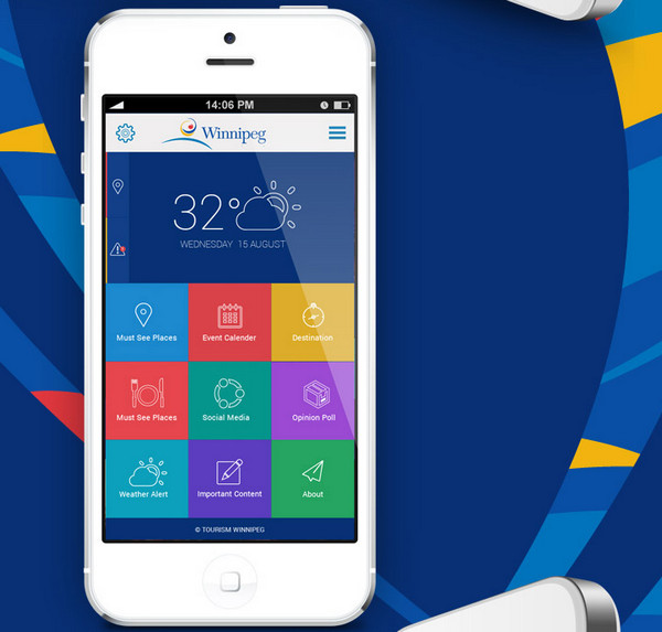
Use icons strategically to not only replace content but also for navigation to other screens and highlight active/inactive state. Stroke and filled icons are very popular on mobile with stroke icon representing inactive state and filled icons the active state. Whichever icons you choose, always ensure-
As Antoine de Saint-Exupéry famously said: “Perfection is achieved when there is nothing left to take away.” Minimalist design works best on that philosophy. However, our goal should be creating more than a minimalist mobile app design but to create seamless user interaction and memorable user experiences. That’s what will help the app become a success. Begin with the end goal in mind and with some efforts you will get your app design right!
We would like to know your thoughts on designing mobile apps. Have you tried minimalist design yet? Share your thoughts/experiences with us in the comments section. If you liked the post then please share it with your friends and followers on social media.
 Try CanvasFlip for FREE — Go to https://canvasflip.com
Minimal UI for maximum impact was originally published in UX Planet on Medium, where people are continuing the conversation by highlighting and responding to this story.
AI-driven updates, curated by humans and hand-edited for the Prototypr community


