Build Design Systems With Penpot Components
Penpot's new component system for building scalable design systems, emphasizing designer-developer collaboration.

medium bookmark / Raindrop.io |

Established in 1995, eBay used to be, back in the day, the ultimate auction site to buy weird shit from weird people (myself included). Today, it’s an all-encompassing e-commerce platform that enables consumer-to-consumer and business-to-consumer sales and works more like a general shopping site where you can buy things directly from companies and resellers without the cheap thrill of bidding on weird shit from weird people. You can still do that, sure, but it’s not the essence of the site anymore. We last talked about eBay in 2012 when they redesigned their logo and, other than helping my dad sell a watch on there and buying a pair of running shoes last week, I hadn’t thought much about it. Recently, eBay has started rolling out a new identity designed by New York, NY-based Form&.
 A quick reminder of what the eBay logo looks like in full color.
For more than 25 years, ebay has defined a new era of commerce through the art of connection—placing people at the heart of the experience. We partnered with ebay’s leadership to define a new language for those experiences, highlighting ebay’s diversity, depth, and dedication to people. The result was a revolutionary brand system that is redefining a new era of connection.
Overview of the new identity.
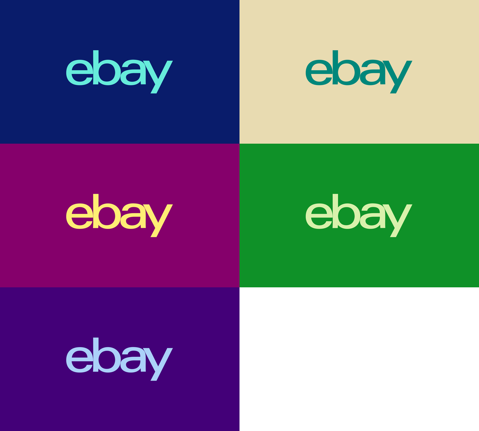
We released the ebay logo from its four color treatment, designing a system where the logo could become a symbol of ebay’s diversity.
 Single-color logo in multiple colors.
I was not a fan, at all, of the logo redesign from 2012. Not because I loved the old logo but because the new one was so stale yet trying to hold on to the quirkiness of the original with the multi-colored wordmark. Now that the wordmark is used in a single color, it has at least doubled down on its stale-ness. It still doesn’t inspire me to go on the site and buy something but it doesn’t confuse me as to whether I should be feel happy or dead inside when I see it, as the old logo did. Now it looks like a dead-pan wordmark operating within the not-trying-too-hard aesthetic and, while I still don’t like it, it functions a lot better. I don’t know if it’s just the presentation files or if they actually modified the wordmark to leave a sliver of space between the letters — instead of touching as the old logo did — but it’s driving me a little crazy that it looks like a mistake. I’m cool with the letters not touching anymore but if they were separated 1 or 2 pixels more it would make a huge difference.
The new color palette is fine, if a little on the dull side. But I appreciate it’s not screaming-vibrant colors.
The ebay grid system was designed to feel like an opened package or a shelf of goods—working seamlessly across experiences and mediums.

 Grid.
Grid.
The new grid approach is also fine, if a little on the dull side too. But the few applications shown are crisply executed and it’s hard to argue with an approach of simplicity and clarity.
Modern, inviting, and optimistic—Market Sans perfect for sharing ebay’s next chapter with the world.
Custom type family, Market Sans, in partnership with Swiss Typefaces. More images of the type here.
The new type family is also also fine, if a little on the dull side too. (Yes, I realize I’m writing the same sentence over and over.) It’s really getting harder and harder to distinguish between all these custom sans serifs. Other than a tightly-looped “e”, that sort of echoes the “e” in the logo, the visual relationship between the logo and the custom type is tenuous; if you look at the ad image towards the bottom, it’s like the type wants to look like the logo — in weight and structure — but it’s more of a subtle, jarring crash. If the type were more condensed or used in bolder weights when paired with the logo, there might be a more pleasant hierarchy to the layouts. Still, as a stand-alone typeface, I would probably buy it if it were retail.
To represent the diversity of experiences and moments on ebay, we designed a vibrant and expressive color system to elevate ebay experiences.
 Photo style.
 Various applications.
 Website.
 Some printed materials.
 Ad.
Ad.
“Fill Your Cart With Color” spot.
I know so far I haven’t sounded too effusive and perhaps there is a hint of sarcasm in what I’ve written but I will be the first to admit that everything presented looks good. It’s professional, it’s slick, it’s properly thought out, and it’s well executed. It’s also a lot better than the old type and color circus that visiting eBay was. Side note: you can still see the old four-color logo on the main website but everything around it uses Market Sans and is more gridded and contained so it’s definitely an improvement. Back to the point I was trying to make: Yes, everything is nice and pretty and it reflects the straight-up e-commerce nature of eBay but there is nothing really distinctive or memorable about it, especially when other e-commerce sites like Jet or Etsy fight for the same kind of attention and provide more personality. So, overall, I do like and appreciate the new direction — which, gives eBay a more mature, less frenetic personality — but I feel like there is no personal connection made as there is a certain sterility to it. Maybe I do like that old, weird eBay logo more than I would care to admit.
Thanks to Oleksandr Pazhyn for the tip.
AI-driven updates, curated by humans and hand-edited for the Prototypr community