Build Design Systems With Penpot Components
Jul 21, 2:15 AM
Penpot's new component system for building scalable design systems, emphasizing designer-developer collaboration.
smashingmagazine.com

Facebook Design — Medium | Charlie Deets 
Thoughts on how WhatsApp and Facebook design at scale
I’ve been a product designer at Facebook close to four years. I’ve worked on a variety of teams such as Groups, Sharing, and Privacy. At this time last year, I got an exciting opportunity to begin work on WhatsApp.
Going in, I knew designing for WhatsApp was going to be a significantly different experience than designing for Facebook. It’s been more eye-opening than I expected and taught me to approach problems and my work from different angles than I’d previously considered.
I’ve learned a lot over the past year and want to share what I’ve observed designing for WhatsApp and Facebook.
WhatsApp designs and builds its product with specific principles in mind. These principles are at the core of the decision-making process. Here are some examples of these shared values:
Whereas Facebook uses a high level mission to drive company decisions, WhatsApp uses these principles to focus product conversations so the majority of the design thinking goes into the minutiae of the execution.
Usually every Facebook designer I tell this to recoils. They say things like: I would hate that! Who decides the product direction? Does it feel like you aren’t in control? Can you introduce new ideas?
WhatsApp’s decision-making is significantly more top-down than Facebook when it comes to roadmapping. I personally find it brings me more focus to the work I’m doing. I influence the product through my designs, which makes sense to me…I’m a designer.
That being said, there’s still plenty of space to propose ideas and state my thoughts on roadmap decisions, but I usually don’t need to. The items chosen for the roadmap also adhere to the shared principles.
The main learning I discovered is that if your team can find strong design principles to agree on, it will make your team more efficient. The more values you agree on, the more efficient you’ll become and the less communication will be necessary in order to achieve your goals together.
When building a product, having a clear problem to solve for people is half the battle. Having a framework on how to judge the proposed solutions helps make the rest of the process more efficient.
 Status tab on Android
When working on Facebook, sometimes a designer is tasked with introducing a new feature. This can be challenging because Facebook already has many useful features. Change within the platform is not always easy on the people using the product, but our intent when introducing new features is always to improve the experience for people using the product and give people tools they find useful. One technique we use is alerting people to the new features they might find value in.
WhatsApp approaches this problem in a different pragmatic way. We try to design and build features which are obviously useful. If the feature needs explanation, it’s not ready.
We tend not to alert people to the new features in product. We assume that if we build features that are obviously useful, people will find them and engagement will naturally follow.
One could argue that is a naive mentality to have at our scale. On the other hand, I believe this methodology comes through in the product decisions and resonates with people using WhatsApp.
For me, the learning here has been that there’s not a single design formula for growing your product. You can help the user to try new things (NUXs, popovers, etc), but you can also passively encourage the user (discovery, word of mouth, etc). Finding ways to respect a person’s intent in these product decisions is beneficial and creates a respectful product experience.
 Text Status
One thing I really miss about working on Facebook’s product is fully benefiting from how amazing the design tools have become. Facebook has a team that is focused solely on creating great tools to make designers’ jobs easier and more efficient.
I use Origami pretty much daily for my prototyping and love it, but many other tools that helped me at Facebook are less relevant to the work I do now since WhatsApp doesn’t have a formalized interface kit or use the Facebook Graph API.
Maintaining an interface kit for WhatsApp would probably be more work than it’s worth for our small team. We rely heavily on platform native design patterns, so there’s less need for custom standard components. We have shared Sketch documents that act as templates for commonly used patterns, but it’s all very raw compared to the highly structured Facebook and Instagram systems.
One thing that caught me by surprise in my work at WhatsApp is that I often have to design iconography, illustrations and export assets by hand. I’ve had no trouble developing my UX skills working on Facebook surfaces, but I hadn’t been challenged many times with my visual design skills because of the talented illustrators and great tools we have for shared iconography. I’ve never considered myself a visual designer, but on a small team you gotta do everything well — and that includes fine visual design details.
The learning here is that tools help you do your job more easily, but I encourage you to take a step back every once and while and make sure you can do the work without the help of the tools. At the very least, it helps you keep perspective on how useful the tools are.
 Photo filters
Some of the product problems I’ve encountered at WhatsApp have been like nothing I’ve ever dealt with before. For example, end-to-end encryption has many challenging side effects. Messages are stored on the user’s own device and WhatsApp doesn’t store users’ messages once they’ve been delivered.
This causes behaviors in the user interface that might not make sense for people who don’t understand the underlying technology. For example, when you log into WhatsApp on a new device, you don’t immediately have all of your old messages. That’s because they’re still on your old device — there isn’t a copy on the server.
At Facebook, real identity ends up being a fundamental building block of designs. At WhatsApp, we don’t require people to have a profile picture. We don’t require people to use their name! Identity is something I took for granted in my designs at Facebook, but certain problems become a lot more amorphous when you can’t rely on the benefits of identity.
Another interesting example is taking literacy for granted. People can send voice memos, photos and videos to each other on WhatsApp communicating without text. One interesting challenge I had was designing the interface for people logging in to WhatsApp. People needed to know they successfully connected their contacts to WhatsApp and where to begin their conversations, but the design had to work well even for those who might not read the text.
 Chat Search on iOS
At Facebook, you start with a problem. Then you propose a solution to that problem. If that gets the team excited, you test it in research. If it tests well, you start to build it and you take it out for a small test to see if it solves the problem. If it solves the problem well, you build it out to have a rich feature set and release to a wider audience. The process is iterative and it has a lot of checks and balances naturally built in. It’s a mature process and it works well.
At WhatsApp, you start with a problem. You work on a spectrum of solutions. You start to whittle it down to the solutions that seem to solve it best and adhere to the principles of the app. You grind on the best solution until you think nothing is wrong with it. Then you keep grinding on the solution until nothing is actually wrong with it. Developers build the solution and you roll it out to everyone in an app update. The process is also iterative to some degree, but mainly in the design portion. There is additional pressure on design to get it right out the gate.
Facebook has the value of “Move Fast.” Getting a project going at Facebook can be extremely fast, but the full process of rolling out a product can actually take quite a bit of time. If WhatsApp had a similar motto, it would be “Move Slow and Deliberate.” We take a lot more time up front in the design phase, mainly because we’re more adverse to pivoting in the development phase. When we hand off the design to engineers, we really try to deliver as much of a finished spec and mocks as possible. The advantage of this is it causes less churn in engineering, which engineers appreciate. The potential downside is that engineers can feel less involved in the process of designing the product and might feel more isolated from the product decisions.
There are advantages and disadvantages to both of these methods of working, but the real learning for me is that both methods work. Neither one is particularly faster than the other, it’s more a matter of working style preference. The Facebook style allows for more overlap between the roles and the WhatsApp style has a workflow with more focused roles.
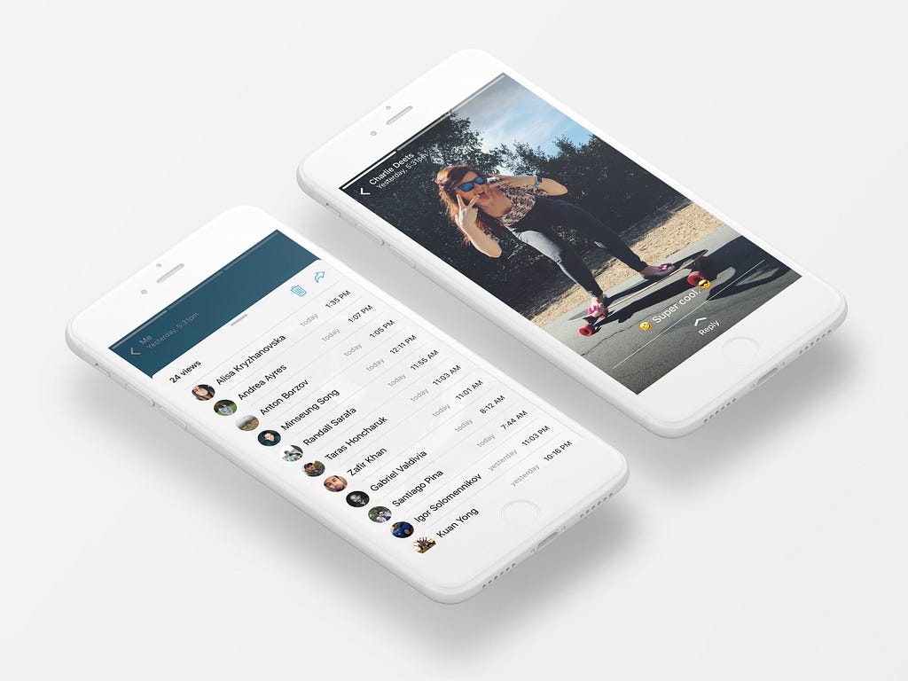 Status views and Status update on iOS
I hope some of these thoughts help you think of new ways to work or come up with additional ways to bring value to your team. I feel excited and encouraged to see first hand that different working styles can be used to create great products at scale. It’s just a matter of what works for the people who are doing the work. I believe finding that way of working is very important.
I also wrote this in the hopes of raising awareness of WhatsApp Design. We are a growing team and looking for more people to help out. If these values or ways of working sound interesting to you, you should check out our open positions, especially our Product Designer role.
WhatsApp Careers – Product Designer
One Year Designing at WhatsApp was originally published in Facebook Design on Medium, where people are continuing the conversation by highlighting and responding to this story.
AI-driven updates, curated by humans and hand-edited for the Prototypr community


