Build Design Systems With Penpot Components
Jul 21, 2:15 AM
Penpot's new component system for building scalable design systems, emphasizing designer-developer collaboration.
smashingmagazine.com

uxdesign.cc – User Experience Design — Medium | Alice Emma Walker 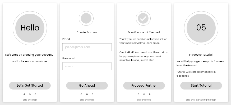
Companies tend to spend months (if not years) creating an interactive user experience that works. Designers tend to spend weeks and days finalizing the colour pallet, typeface, and design structure an app. Without having a proper user onboarding process there are high chances that these efforts may go unnoticed!
The user onboarding process is a quick interactive tutorial of how the core features of your app works. It really is that simple, but can be often overlooked and prevents new users from abandoning your app due to confusion.
A successful user onboarding process might help you increase the user engagement of your application and thereby help you increase the conversion rate.
There are many user onboarding methods like landing pages, email campaigns, push notifications and others. We will discuss a quick ‘first launch’ app tutorial that would be triggered the first time someone opens our app.
I have divided the app onboarding process into eight different points. There is no perfect strategy that may fit all projects, we can at-least discuss a few important ones that might help you optimize the onboarding process.
Every application has a definite targeted user base. Make sure you are speaking directly to the people you want to use your app and tailor the content accordingly.
I categorize end users into three broad categories, they are:
a. Non-technical:
They are real end users with limited technical capabilities. The content in the onboarding process should help them get the app basics. Make sure you provide content with tone and language that they can understand. They may not understand, push notifications, screen swipes, or drop-down menus.
For instance, if you app is about personal expense management, the onboarding content should help them get the basics like how to document a purchase, view the weekly/monthly/yearly expenses, and how to create bill payment reminders.
If you really get the basics right, they tend to engage with the app and accept it much more quickly. They start using it with confidence and eventually explore new options/features that weren’t in the onboarding tutorial.
b. Technical users:
The users in this category are technology geeks. They are completely immersed and comfortable with technical stuff. These users are familiar with most common UI and app interactions, and you can assume they don’t need the absolute basics about how to use their phones.
For instance, if you are creating a fitness app, you may jump to how to add body measurements, weight, and track the daily/weekly progress reports. If your UI intuitive, the user should already understand how to toggle between pages and navigate the basics.
c. Business/Enterprise users:
These users know their domain very well. They are familiar with both the basics and internal parts of an application, or they are capable of finding the required information though common interactions.
You may need to highlight the real core purpose of your app and showcase how they can improve their efficiency or productivity by using your app.
For instance, if you are creating a project management app, you may think of serving how your app will help them maximize their productivity, and then give them a quick app interactive tutorial.
Uniformity is key. The application design, content, and tone should be uniform across the board.
What you are saying on your website should reflect on your app. The content you show in onboarding process should match your app. Kind of a no-brainer, but you may have tweaked a few features since creating the tutorial so make sure all the icons, typography, and pages are the same!
The onboarding process design should match your actual app. The design, color, and typography should be similar. Don’t try to make it bright colours, or more fancy than the app’s current brand asssets. Your onboarding content is your user’s first interaction with your app, don’t confuse them!
The uniformity is also commonly referred to as visual consistency. It means the element on the design should be consistent across the app. This has to do with the user psychology and user experience. A visually consistent design will also help in user retention and engagement later on in your user journey.
If I need to cite an example here, I would use calm.com, a meditation app. They are offering almost the same functionality on their web application as well as their mobile applications.
They use the same color, typography, design pattern, information architecture, and action item placement. If a user is familiar with the web application, they will find it very easy to use their mobile application.
Creating predictable design and content may sound very simple, but it requires a lot of end user understanding.
Understanding the end user in the first place makes your UI and content design process really easy. You get to know your deliverables before you start sketching or writing anything.
The onboarding content should be goal specific to your targeted users. Make it a four to five screens long with user interactions. Let users see the feedback after each action they perform.
 Source: Usertesting.com
Illustrations helps you simplify the things. Having a combination of illustration and interactive content you can deliver a predictable onboarding experience.
By predictable I mean the onboarding process should have a goal. Walk them through a key user journey, an important feature, or complete the first level of your game.
Don’t overload your onboarding screens. You may want to keep a lower overall number of screens and limit the action elements on each screen.
If you have defined your targeted user base and have a simple goal for the tutorial, 4–5 onboarding screens should be more than enough.
We all relate to the fact that a product manual with over 50 pages never gets read. You definitely don’t want to overload your user with information so your tutorial never gets finished.
Each of your onboarding screens can be a combination of illustration, text, and an action elements. Having too many action elements on your screen may confuse your end users.
If there are complicated features or actions you want to illustrate in your onboarding, consider a screen/module specific, single time, or on-demand tutorial.
This may mean that some of your onboarding happens later down the line when the user is exploring more complex functionality. That’s ok! It will help from overloading the user when they are first starting with your app.
So far we discussed the ways you can optimize the onboarding process; help them get started with very basic tutorial.
Let’s now address the issue if your users have installed the app, they have been through the onboarding process, and they don’t seem to use your application regularly or at all. How could we address the situation and increase engagement?
You may send an email or series of emails based on the user behaviour. Four key points:
a. Explain how easy it is to get started
It might be the most basic and fundamental action to take. After the onboarding process, the majority of apps ask users to signup for an account and you get their email address.
Send them an email explaining how easy it is to use the application. You can cite some success stories or testimonial to make your points legit.
It is a good practice to use the same language and tone with your emails that you send. Help you maintain the uniformity across the app.
b. The next steps for the user
Chances are the user has seen the onboarding tutorial and has signed up for an account, but you don’t see much activity from them after using the basic functionality you explained on the tutorials.
These users are confused or bored. You know your app the best, so they’re not bored, right? Approach these users the next time they open your app with a tutorial for more complex features.
Having in-app analytics may help you track what’s working and what’s not.
c. Help user reach to the point where they understand the entire app
No matter how hard you try to explain your app with onboarding content and interactions, there might be a group of users that find it hard to get the app.
To address the issue, you may want bring those users to your central web resource where you have explained your app with a visual guide.
Also, it would be great to have video tutorials for your app. You may consider sending an email that contains the link for both the visual step-by-step tutorial on how to use your app, and the video guide. Let those user decide what to choose.
d. Offer one-on-one conversation to resolve the issues they are finding
When you have a very limited user base, you may want to hit your first 100 active user mark and stay super engaged with your early users.
For all those first 100 activations, you may send them an email offering one-on-one conversation about how to use the app and how to get most out of it. This might be the most attention they will ever get from you, as you are just getting started.
This may help you create a very responsive reputation within those 100 users and give your word of mouth publicity a positive edge.
Like emails, push notifications can be a good way to bring/improve engagement to your application.
Push notifications are one of the most direct ways you can reach your end user in almost real-time without caring about the opening rate, unlike emails.
Push notifications get directly onto the front page of the end user’s personal mobile device. They tend to receive your notification as long as they have internet connectivity (if you want to send personalized messages from your server). In app notifications still work without internet.
There are three ways you can approach push notification in your application that ultimately help you increase the productivity:
a. Remind user to complete the onboarding tutorial:
There are chances that a user may have downloaded and installed the app but never opened it.
Without opening your app and getting the most fundamental onboarding tutorial, there is much less of a chance that a user would use your app.
You may consider sending such users a gentle reminder on certain intervals about completing the onboarding tutorial. This may result into improved app usage and engagement in the long run.
b. Greet with insightful information about app:
The second case is, the user might have opened the app and gone though the onboarding tutorials, but they are not returning to your application for some reason.
Based on your application’s nature, you can send a casual push notification to such users about how your application can help them achieve x goal with ease.
For instance, if your app is about meditation and you don’t see user coming back to the app, offer a casual notification about how the app can help user lower the anxiety or stress in a 2 minute mindful session! There are strong chances a user may invest his/her 2 minutes into your app.
c. Make them subscribe to push notifications:
In case the user has disabled the push notifications, you can make them aware and motivate them to re-subscribe to the notifications.
For instance, you have a food delivery app. The user has disabled the push notification feature for your app. When the user orders a food from your application, you may ask them would they want to receive the notifications about delivery status?
It might be the situation where you (being the app owner) wants to send the notification for better engagement and the app user wants to receive updates in the form of a notification. It’s the best time to get those users back!
To cite an example, Netflix sends optimized and tailored push notifications about the movies or tv series based on your viewing history to boost engagement.
 Image credit: kissmetrics
No one strategy is fail proof. We all tend to make mistakes, learn from the mistakes, and quickly resolve them.
We may make some mistakes on the onboarding design. All the decisions we make until we have the real user data will be a hypothesis. We can try designing the best UI, content, and interaction based on best of our knowledge, targeted users psychology, and experience.
Rolling out the design and starting to get the actual users feedback and analytics is the first step you should focus on to optimize the onboarding process.
Based on the analytics, you can decide what needs to change, what design change, instruction, and content change would help you optimize the process.
But implementing those changes all at once and replacing the old design might be huge risk. And this is where the A/B tests comes into the place.
You keep the old design process while you introduce the new design. Out of your 100 visitors let the 70% users see the old design while the other 30% will interact with your new onboarding process design.
Measure the results, see how the new design is helping your user in onboarding process, how the new design helps you improve the engagement of your app, and how it helps you retain those first time visitors using your app.
A good and usable design can always be achieved via design iterations. No design can be a good UX optimized design in the first iteration, it will always take time.
The reason I put the point at last because, you being the UX designer, have already conducted extensive user research (hopefully)! You may have also built a prototype and tested it several times before finalizing the onboarding design process.
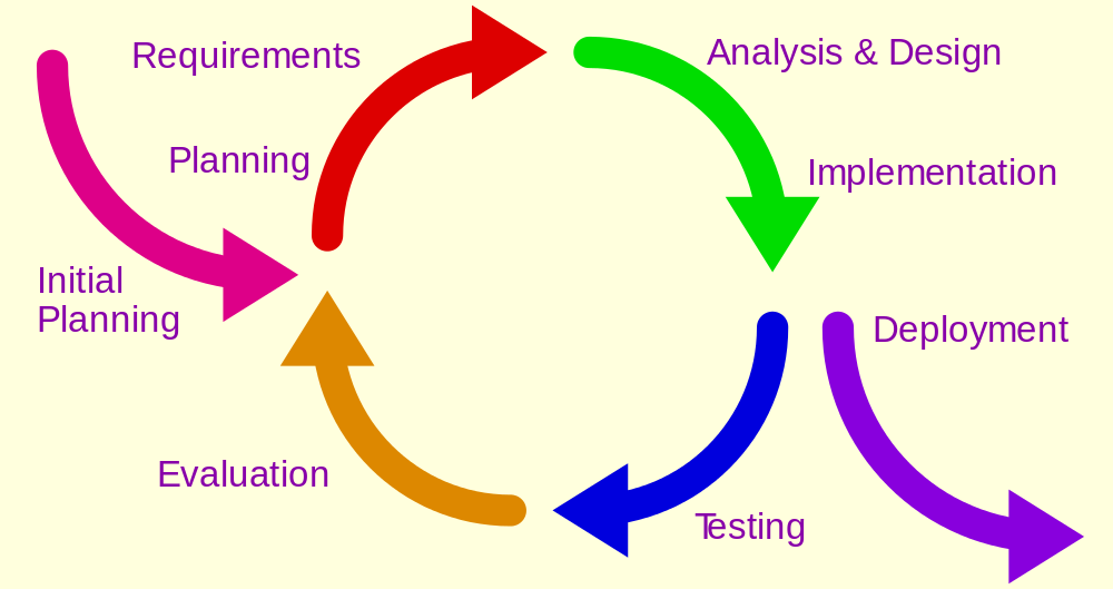 Image source: interaction-design.org
You may plan to improve your design for usability and better experience after you have the real usage data from the analytics.
Utilize the actual usage data into your next design iteration. Address the friction users are facing both on your onboarding tutorials and the actual app design.
Prepare the prototype based on those inputs. Test the prototype and deploy the new design iteration with the A/B test format we discussed previously.
Let the user use your app and keep your eyes on the A/B test results. If you see promising results, start migrating to your new design.
User onboarding is as simple as walking though the most fundamental features that are required to get going with your app. Having a clear understanding of what your app does and how it will be helpful to your user will lead to the most engagement and application opening rate. Good luck!
Optimized User Onboarding Strategies was originally published in UX Design Collective on Medium, where people are continuing the conversation by highlighting and responding to this story.
AI-driven updates, curated by humans and hand-edited for the Prototypr community


