Build Design Systems With Penpot Components
Penpot's new component system for building scalable design systems, emphasizing designer-developer collaboration.
medium bookmark / Raindrop.io |
Motion tells a story, adds delight, and shows a level of technical sophistication that tells the user, “These guys know what they’re doing.”
And this is all well and good, but at its core motion should teach the user how to interact with the product—demonstrating affordances, architecture, and task-flow with as little mental baggage as possible.
When the user must transfer attention from one element to another, motion should guide their eyes towards next steps. No transition in nature is instant, and nothing in your UI should be either. Whether leaving, arriving, opening, or closing—the change should include a fluid hand-off of attention.

Credit: Redshift Digital
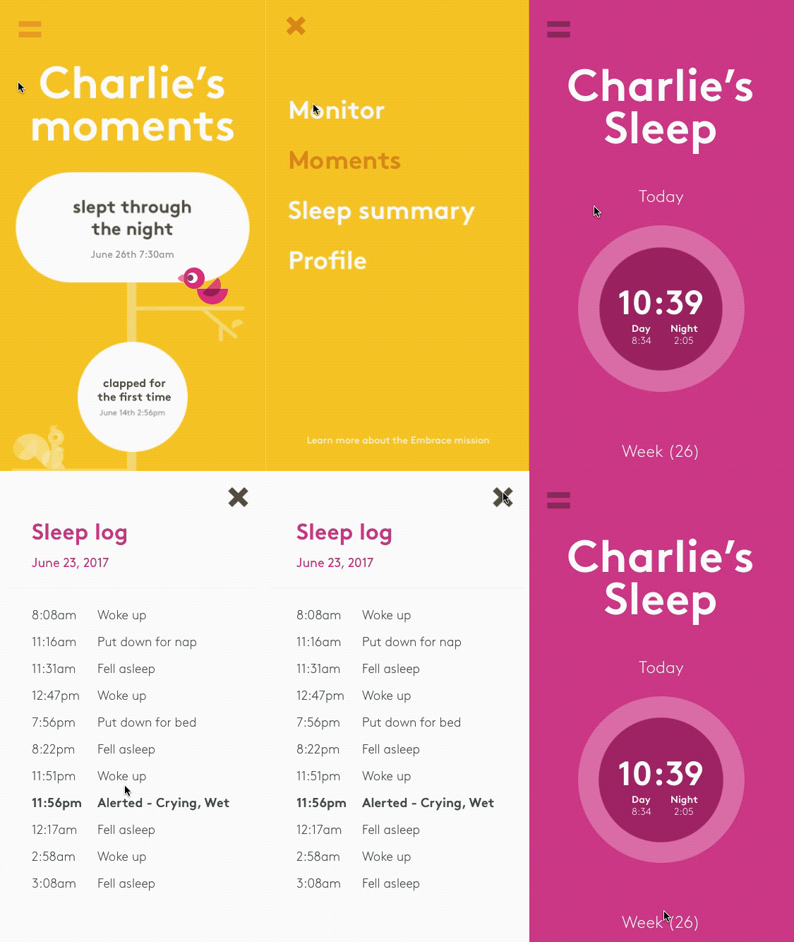
For the childcare startup Embrace, we created a playful experience with bouncey, rounded transitions. On the left, the screens communicate through an animated aperture around the interactive element, visually reinforcing that hub of control. On the right, we couple the user’s scroll with an expansion and illustration of content, drawing their eyes to one thing at a time.
Evolution coached our vision to be drawn to moving objects, meaning that any on-screen movement will command user-attention. This power should drive the interface’s ongoing conversation with the user, giving them advice about what they’ve done, what they’re about to do, and what they should focus on.

Credit: Redshift Digital
In the example above, we took a lengthy set of forms from Western Union and divided them into subsections. When completed, these subsections roll-up into a checked-off completed state. This light motion breaks up the monotony of the forms, satisfies a sense of completion, and nudges them forward into the rest of the process.
Sometimes the user just needs to wait, and there’s no way around it. At these times, it’s important to remind people they’re not forgotten, that things are still working as planned, and we’ll have them on their way shortly.

Credit: Redshift Digital
Again returning to Western Union’s monstrous form… we have here a user whose completed one section and must prepare for the next. A splash of color fills the page, capturing attention and notifying them of important information. With the length and complexity of these particular forms, we really wanted to stress these checkpoints as an opportunity to confirm what the user’s done and help them gather necessary documents to move ahead.

Credit: John Schlemmer
There’s a term in neurology called “proprioception,” which describes the closest thing we have to a Sixth Sense: the brain’s perception of our body in space. This is what grants you the ability to scratch an itch on your face without poking yourself in the eye. It’s also what allows your fingers to know, instantly and without forethought, that swiping your trackpad will cause this page to move.
The flexibility of our proprioception is what separates us from other animals—it allows us to use tools. When the hunter’s spear becomes “like an extension of their body,” it’s because repeated practice forced our brain to create a sense of self around the physical object. When a teenager learns how to parallel park, it’s because the car’s exterior becomes, according to their brain, the outer part of the body.
To guide proprioception in the digital world, our tools must do everything they can to appear and behave like physical extensions of self. The more that on-screen things behave like things in the tangible world, the more ease and control we feel in those digital environments.
In order to “fool” the brain in this way, let’s take a look at Google’s Material Design guidelines, which state that motion must be:

Credit: Google Design
Here the screen registers your finger’s point-of-contact and gives visual feedback. The micro-interaction lends the illusion of tangibility in the digital space.

Credit: John Schlemmer
When Disney laid out it’s 12 Basic Principles of Animation, they were trying to create a style that translated the laws of physics into a sort of charmed, cartoonish reality. Likewise, UI elements like to squash, stretch, and bounce across the screen, enticing the user to play with them.
Credit: Redshift Digital
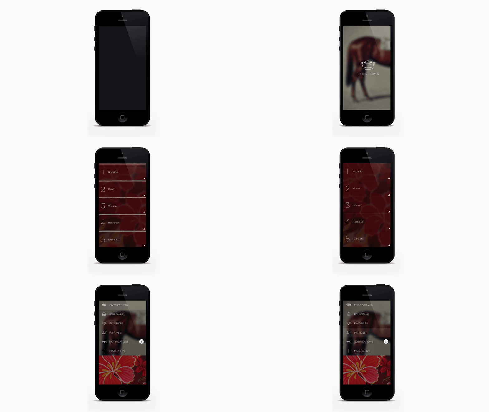
Within our app Five, we created an entirely swipe-based interface. To highlight this photo- and gesture-driven approach, we mimicked the glossy translucency of window panes. Each Five is it’s own “pane” which slides across the screen horizontally. A swipe up reveals the “shudders” (The content) within the pane, while a downward swipe pulls the primary navigation from the top. All motions on-screen support this metaphor of tangible tiles, encouraging the user to interact with them.

Credit: Unknown
Awareness means knowing the context in which the user is seeing motion. In the above example, a pause/play icon fluctuates in accordance with loading time. The motion reinforces what the application is trying to do. It gives visual feedback that the interface is “working” to load the video, and the user must be patient.

Credit: Unknown
Like anything in design, motion should have a reason. Motion without intent is like speaking without thought. Useless at best, annoying at worst. In the example above you can see, without any explicit description, that the user typed in the wrong password. It is motion with a purpose, elegant in it’s clarity.
Credit: Unknown
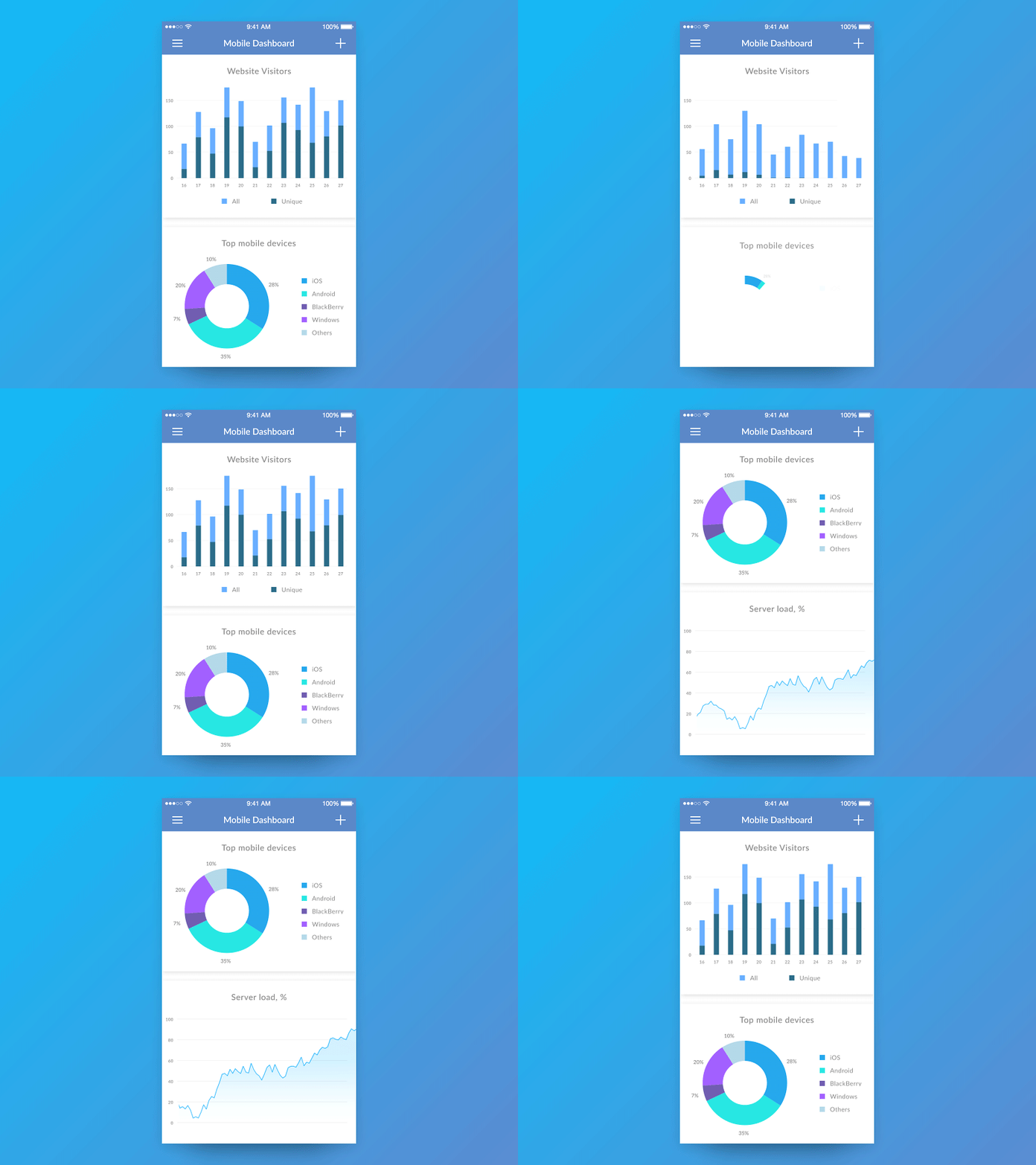
These animated charts are nice, even calming, to watch. But like a friend whose always late, their laid-back charisma wears thin when you actually have stuff to do. “Pity the User!” as Vonnegut might say.
Western Union agents often need to keep track of complex ownership structures with many layers of companies within companies within companies. We used motion to reinforce this layering. As you dig deeper into the ownership tree, the outer layers get pushed to the left, mimicking the breadcrumbs within the header. And for each successive layer, a new pie chart constructs itself to reinforce the notion that we’re looking at a different piece of the ownership pie.

Credit: Redshift Digital
Animation gives life. Vitality. Vigor. But that shouldn’t permit recklessness. Interfaces are tools, after all. So motion in an interface should be intentional, aware, responsive, crisp, and clear. It needs to know it’s role: when to excite and when to hold back. Like an eager assistant, the difference between too much and just enough is the difference between bothering the user and charming them.
For more fantastic guides on motion in UX, may we recommend:
Be the first to write a response…
prototypr.io
AI-driven updates, curated by humans and hand-edited for the Prototypr community