Build Design Systems With Penpot Components
Jul 21, 2:15 AM
Penpot's new component system for building scalable design systems, emphasizing designer-developer collaboration.
smashingmagazine.com

medium bookmark / Raindrop.io |
Check out the comprehensive research findings at : http://ssdesigninteractive.com/dialpad_research/
Download the iOS app here:
https://itunes.apple.com/us/app/dial-pad-ux/id1288812537
Let’s look at this timeline below:
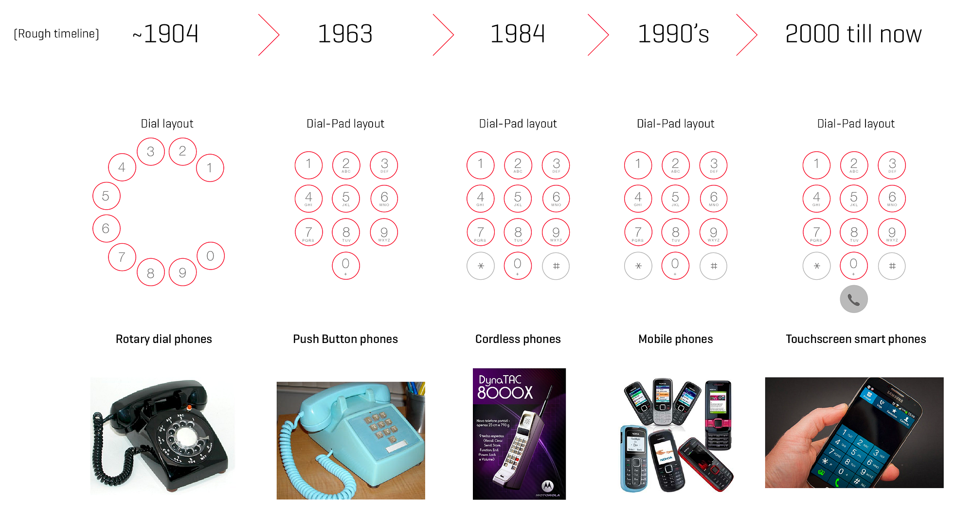
There is something important about the image above. Despite significant transformation in the ergonomics and the modality of the phones physical form factor, the dial-pad design seems to have remained unchanged since 1963.
So, looking at the image, one may question — Why did the Push Button phones changed the dial button positions from a circular arrangement to a different layout? (Even when the form factor had not changed significantly)
The answer can be found in the short introduction below.
On 18th Nov 1963, Bell System introduced the touch tone phone to the world. The touch tone pad replaced the old rotary dial.
This touchtone dial-pad was not only different from its predecessor, but was also completely opposite of a very similar and popular layout of the calculators.

Credit: http://www.vcalc.net/Keyboard.htm
You can find a complete history and the science behind this decision on 99percentvisible, but for the purpose of this post, what is important to note is that when Bell System asked the Texas Instruments and Sharp about why the calculator layout was designed the way it was, they said they did not conduct any research to define the calculator layout. They simply took the cue from the mechanical calculators (like the one shown below). These calculators had numbers 0-to-9 arranged from bottom to top.
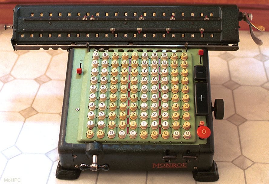
Credit: http://www.hpmuseum.org/ffmotor.htm
So Bell System decided to conduct their own research, and after testing many different layouts, decided to choose the one that we all use now.

Credit: https://archive.org/stream/bstj39-4-995#page/n3/mode/2up
This is an example of a great human factors study. But the study was done for physical push button dial pads.
Somehow we kept following the same layout when we moved from these fixed phone lines to cordless phones to push button mobile phones and now even on touchscreen based smartphones.
Until the phone screen sizes were small, people were able to handle dialing the numbers holding the phone with single hand. But now the phone sizes are getting bigger and bigger and this dial-pad layout is starting to fail.
Steve Hoober has done studies on how we hold the phone. He suggests that most of us hold the phone from the bottom such that the base of our thumb is at the bottom right of the screen (considering 90% of population is right handed).
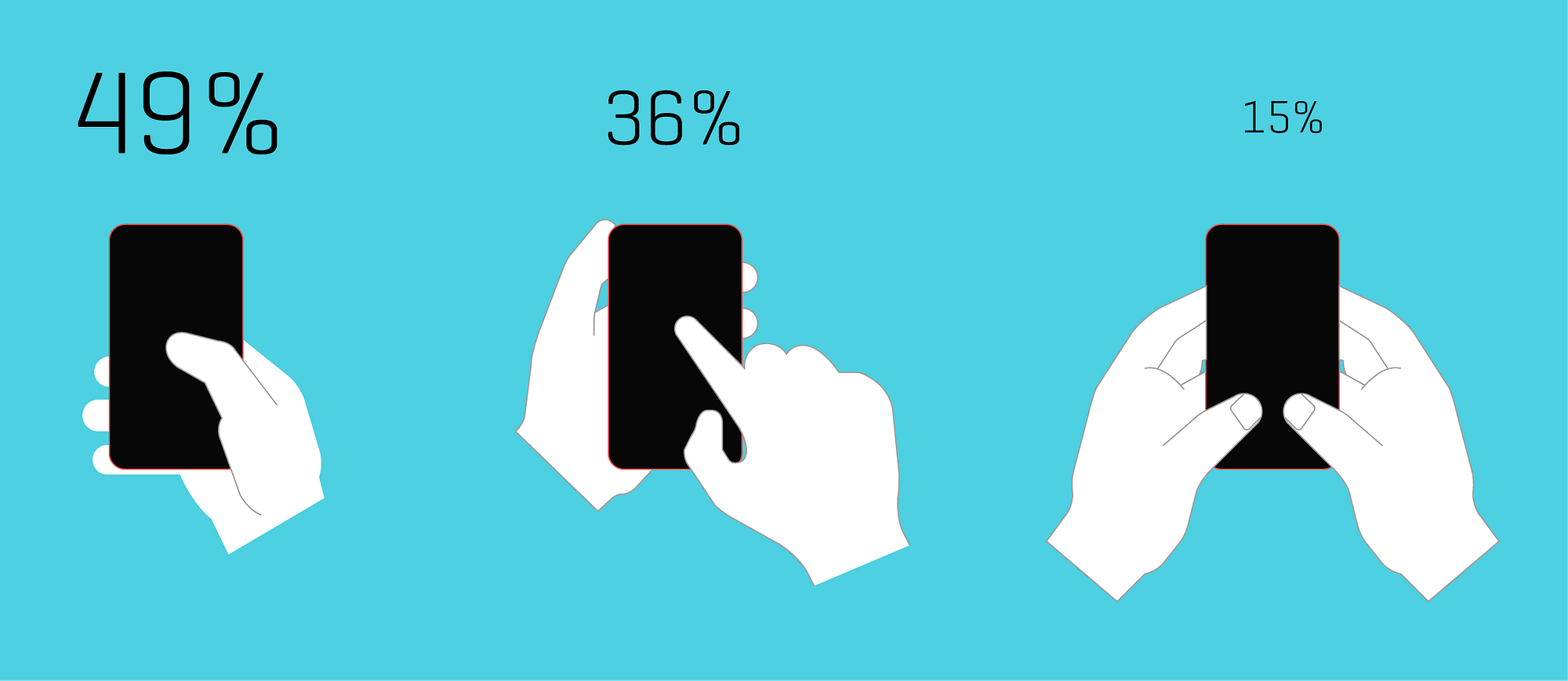
Based on study conducted by Steve Hoober.
This indicates that most likely the phone dialing will be done by the thumb in majority of the cases. So before we get into the dial-pad re-design exercise, let us also look at the thumb reach for different phone screen sizes.
Again, you will find a lot of research about “Thumb Zone”. I will not talk much about it but just try to summarise it in this one image (below).
Interestingly (and not surprisingly), the most efficient part of the screen is within the arc of the thumb and significantly on the lower half for most large smartphones.
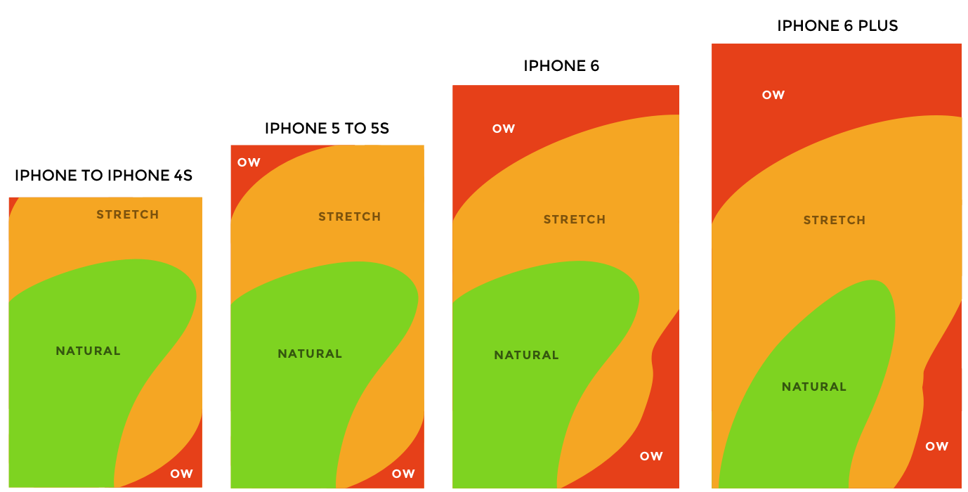
Source: http://scotthurff.com/posts/how-to-design-for-thumbs-in-the-era-of-huge-screens
The primary focus of this study is to find a better dial-pad layout for the touch screen smartphones.
The hypothesis is that there might be a possibility to better re-arrange the number keys on the dial-pad to achieve higher efficiency. At the same time, it seeks answer to, whether the dial-pad we currently use is the best we can design? or there are possibilities we haven’t explored yet.
Like those calculator companies, we are continuing to borrow from the legacy and apply the old designs in the new context.
Below, I have tried to re-create the Bell System experiment but this time for the smartphones.
To replicate the Bell Systems research in the current context, I designed a few alternative dial-pad layouts for smartphones (shown below).
These are the 6 layouts for the study (5 new and one existing layout):

These new designs try to overcome the problem of the thumb reach by bringing all the frequently used buttons as closer to the “natural zone” as possible.
Some of the proposed new designs also challenge the existing mental model of the user and boldly attempts to re-position the keys in new configurations.
This study is an attempt to crowdsource and gather as much empirical data as possible, so that a strong case can be formed for a new and unique dial-pad layout suitable for the touchscreen smartphones.
By conducting the study, I want to evaluate how these different dial-pads perform and also allow everyone to experience what these new dial-pad layouts feel like.
The study is an ongoing exercise, so there are findings from whatever data I have collected so far, but there is a need for larger dataset to be available to make this study even more powerful.
To facilitate everyone to participate and contribute to the study, I have created an iOS app (I know, Android users, I will come out with one for you soon, but right now my skills are limited and I am not a programmer, just a humble UX designer who could pull together this iOS app. I am currently trying to figure out my way with Android coding too 😀 ).
The app is
available on iTunes app store and I am looking for users who would like to test these different dial-pad layouts and submit their feedback for analysis.
So feel free to download the app and give it a try. You can also use comments on Medium to post your feedback on using the app and different dial-pad designs.
I have created a research study website where you can view the results in detail.
Show your support
Clapping shows how much you appreciated Sajid Saiyed’s story.
Be the first to write a response…
prototypr.io
AI-driven updates, curated by humans and hand-edited for the Prototypr community


