Build Design Systems With Penpot Components
Jul 21, 2:15 AM
Penpot's new component system for building scalable design systems, emphasizing designer-developer collaboration.
smashingmagazine.com

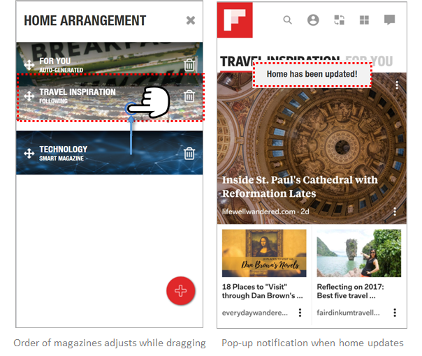
UX Planet — Medium | Vichita Jienjitlert 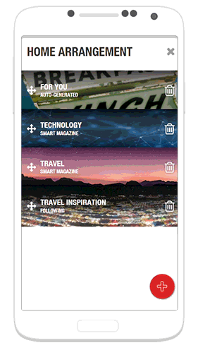 Prototype demonstrating the redesigned arrangement feature.
Last year in February, Flipboard has released a major redesign aimed towards personalization — What’s your passion?. This new Smart Magazine feature gives users more specific control over the topics they read.
However, without careful use, this new feature may create a new hassle — a cluttered home screen with a lack of organization.
Now that I can create my own magazines, is there a way for me to organize them on a rack?
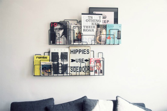 Magazines ordered horizontally on a rack. Credit: StyleToday
In this project, I propose a solution to take the personalization and customization a step further.
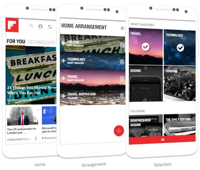 Screens from the final version of the redesign.
My Role: Product Designer.
Duration: Jan 2018 | Individual Design Challenge
Tools & Methods: Hand sketching, Usability Testing, Photoshop, Axure
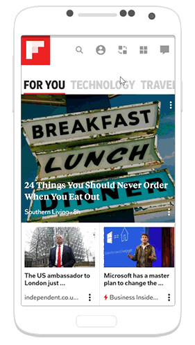
Taking a closer look at the current app, I identified the issues that prevents users from having a fully personalized home screen.
Issue 1: While the app allows you to add or remove magazines from the home screen, there is no way to arrange the order of the magazines to be shown. The order is based on when the magazine is added.
Issue 2: Following and Smart Magazines are kept separately. There is also no way to access the Following from the profile page, making it difficult to find.
Issue 3: For You feed is fixed as the first magazine, with no option to be removed from home. Hence, the AI generated personalized content would always be prioritized over the user’s own customized magazines.
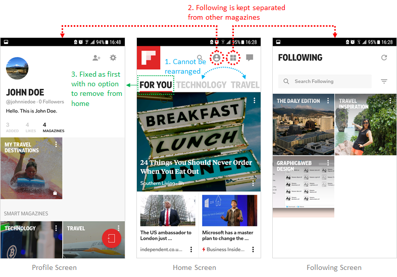 Screenshots demonstrating issues with the current design.
To frame my ideation, I defined 3 main tasks that the solution needs to support:
After sketching out a few ideas, I narrowed them down to the 2 with the biggest potential.
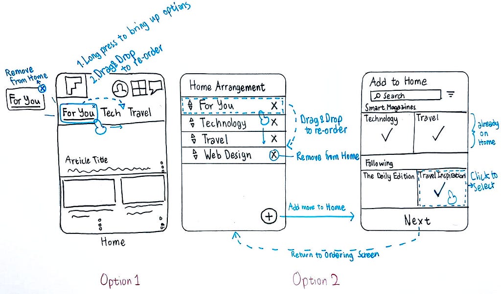 Sketches for potential solutions
Option 1: Re-ordering directly on the Home screen
This is a convenient solution that does not require any additional screens. However, the feature is not easily discover-able and horizontal drag & drop may be very difficult to use if there are many magazines on Home.
Option 2: Having a new Arrangement screen
This option allows users to see a comprehensive list of magazines currently shown on Home, giving the big picture. The vertical list allows more flexibility and ease of use in moving the magazines around.
I decided to go with the second option due to it better discover-ability and availability of vertical space to accommodate more magazines.
 Screens from the first version of the prototype.
I selected Axure as my prototyping tool because it allows me to simulate a drag & drop interaction — an essential part of my design. After finishing the prototype, I tested it out with my friends and colleagues using this script:
You want to re-orgranize the magazines on your home screen.
1. Open the re-arrangement screen.
2. Add a new magazine called “Travel Inspirations” from your list of Following.
3. Remove “Travel” from the list.
4. Move “Travel Inspirations” to the first magazine.
5. Return to the home screen.
Here are some of the issues and feedback I got from 4 user testing sessions:
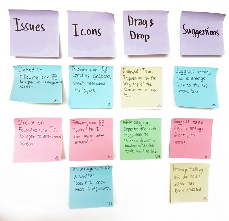 Results from 4 user testing sessions.
From the test results and feedback, I made some revisions to the design.
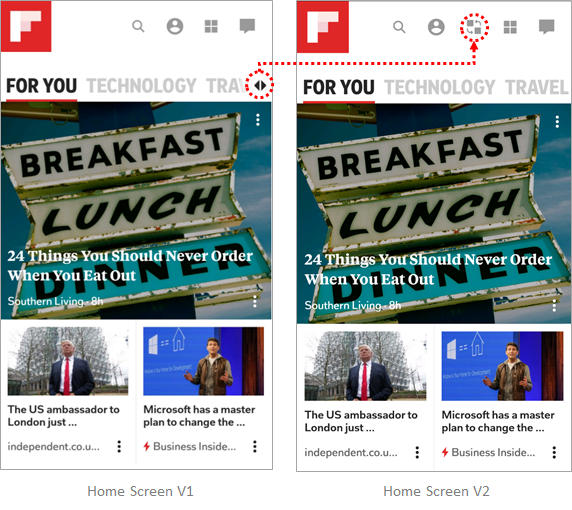
See the revised prototype in action below! Here are some of the feedback I got after testing this version out with my peers:
 Adding a new magazine to HomeRemoving & ordering the magazines.
“The design is very straight-forward, it works just as I expected it to.”
“I like how the magazine became colored when I selected it.”
“The re-arrange icon is a lot clearer. Looks like I can scramble it around.”
“I like how the other magazines moves up and down when I drag.”
“Deleting is easy, I can just click on the trash can.”
“The update notification is a nice touch.”
This has been a very difficult project to start off with, since the app itself is already very well designed. I had ideas in my head which I initially had no idea how to prototype. This project has forced me to step out of my comfort zone — and the new skills I’ve learned is definitely rewarding. Here are some final thoughts I’d like to share:
If you like this article, please feel free to *clap clap*.
Thank you all my fellow cohorts for helping me test the app and providing wonderful suggestions.
Please feel free to reach out to me if you want to learn more about this project.
Currently searching for a full-time job starting July 2018.
Find me on LinkedIn, or stop by my Portfolio to see my other works!
Redesigning Flipboard — creating a personalized magazine rack was originally published in UX Planet on Medium, where people are continuing the conversation by highlighting and responding to this story.
AI-driven updates, curated by humans and hand-edited for the Prototypr community


