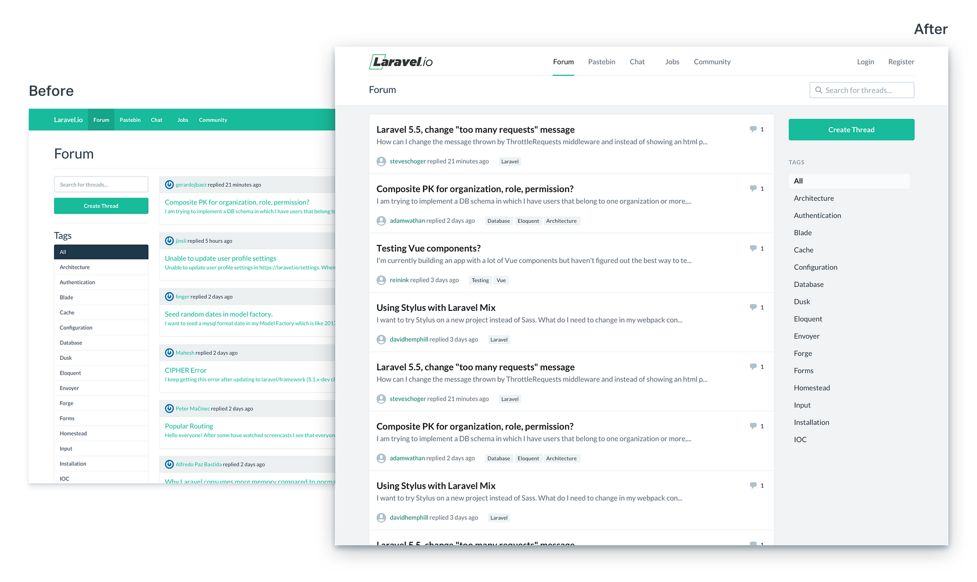
When you’re including a link in a block of otherwise non-link text, it’s important to make sure that the link stands out and looks clickable, and Bootstrap optimizes for that case by making links colored by default.
In this case though, just about everything in the thread list is a link and using a treatment designed to make links “pop” in paragraph text is really overbearing.
A common approach you’ll notice on sites that are almost entirely links is to just use a bolder version of the normal body text color, like YouTube does for example:

<img class=”progressiveMedia-noscript js-progressiveMedia-inner” src=”https://cdn-images-1.medium.com/max/1600/0*7CQ5QQENRRRliyFN.png”>
Let’s give that a try in our thread list, making thread titles a bold dark grey, and the preview text a lighter grey at the regular font weight:

<img class=”progressiveMedia-noscript js-progressiveMedia-inner” src=”https://cdn-images-1.medium.com/max/1600/1*zRikVbrNIn2ufk40u_WnVg.png”>
Tip: On link heavy sites, don’t try to make every link “pop” with a bright color.
Putting important content first
Right now, the top of each thread card has a grey header with meta data such as the last person to reply and the relevant tags for that post.
Being the first piece of content you see in each card is making the header area compete for attention with the thread title, and also makes the thread list a bit harder to scan.
Let’s try moving that header area to the bottom of each card to try and emphasize the thread titles a bit more:

<img class=”progressiveMedia-noscript js-progressiveMedia-inner” src=”https://cdn-images-1.medium.com/max/1600/1*PkP1HR6LRJc2GNpx9mC7lg.png”>
De-emphasizing secondary content
This is an improvement for sure, but the grey background in the footer is still grabbing a lot of attention and hurting the scanability of the list.
The only thing the grey background is doing for us is helping to separate the meta data area from the thread title and preview.
Let’s try dropping the background and seeing if we can achieve that separation another way:

<img class=”progressiveMedia-noscript js-progressiveMedia-inner” src=”https://cdn-images-1.medium.com/max/1600/1*QdaK26l7wWhYJ8EP36K31A.png”>
Dropping the background is definitely an improvement overall, but without that background color change the “replied x minutes ago” text is definitely competing with the thread preview now.
Let’s drop the font size on the meta data by a few pixels and use a slightly lighter color and see if that helps:

<img class=”progressiveMedia-noscript js-progressiveMedia-inner” src=”https://cdn-images-1.medium.com/max/1600/1*JK3a9DrGp7RaW1SpJL8QtQ.png”>
This feels like an improvement, but the green username links are getting a little hard to read.
A quick contrast check confirms that the light green on white doesn’t pass the WCAG 2.0 accessibility guidelines, so let’s use a darker green instead:

<img class=”progressiveMedia-noscript js-progressiveMedia-inner” src=”https://cdn-images-1.medium.com/max/1600/1*UH_YfXHFhceA93vgzzl8hw.png”>
That looks a lot better, and I think we could even get away with less white-space between the thread preview and meta data area now:

<img class=”progressiveMedia-noscript js-progressiveMedia-inner” src=”https://cdn-images-1.medium.com/max/1600/1*Vs2kvHU9KdcNVv0mlY5H0g.png”>
This lets us cram just a little bit more information onto the screen, and given that the audience for the site is developers, the extra density will probably be appreciated.
Repositioning the tags to reduce distraction
Right now the dark topic tags in the bottom right corner of each card pull your eye away from the thread title a bit; they make your eyes jump from corner to corner as you scan down the thread list.

<img class=”progressiveMedia-noscript js-progressiveMedia-inner” src=”https://cdn-images-1.medium.com/max/1600/1*DM2J14KuhPqzVN7gGvtf8g.png”>
One change we can make to help this is to move the tags closer to the left side of the card:

<img class=”progressiveMedia-noscript js-progressiveMedia-inner” src=”https://cdn-images-1.medium.com/max/1600/1*z5NpcAG0mFSoVy6ofZYztA.png”>
By putting the tags closer to the thread title, they have to compete for attention more directly. Since the title has more emphasis, it wins out and makes the tags a little less distracting.
Inverting the tag colors
If we wanted to de-emphasize the tags even more, we could also switch the dark background for a light one:

<img class=”progressiveMedia-noscript js-progressiveMedia-inner” src=”https://cdn-images-1.medium.com/max/1600/1*LFLZhiybo66VX3TvzztSLg.png”>
Clearer comments
Let’s also de-emphasize the comment count a bit by removing the dark background, and while we’re at it, add an icon to make it a little more clear what the number means:

<img class=”progressiveMedia-noscript js-progressiveMedia-inner” src=”https://cdn-images-1.medium.com/max/1600/1*P1HbIsKG2wUiFYbr0bBlWw.png”>
A more subtle default avatar
Finally, let’s replace the default Gravatar image with something more subtle; there’s no point in calling attention to the profile photo of a user who’s never uploaded one.
The one we’re using here is from Zondicons:

<img class=”progressiveMedia-noscript js-progressiveMedia-inner” src=”https://cdn-images-1.medium.com/max/1600/1*pKqInMt7ZoNkGiKjfPcgwg.png”>
Collapsing borders
Let’s look at the new card design with the rest of the page: