Build Design Systems With Penpot Components
Jul 21, 2:15 AM
Penpot's new component system for building scalable design systems, emphasizing designer-developer collaboration.
smashingmagazine.com

medium bookmark / Raindrop.io |

As a regular Berlin tram passenger (M10!) and in a lover of the public transport of Berlin in general, I loved reading Redesigning the Berlin Tram Digital Dashboards by @nandorocker. Indeed, the displays lack structure (as well as a quality design).
The trams using those displays actually won several design prizes themselfs. Their design is uniquely Berlin, and suit the personality of the city well — and as such they deserve a beautiful display.

Original BVG design (redone in Sketch.app)
Besides the alignment and visual issues, the flow and connection of elements is quite chaotic. The blue line visualizes the planned route of the tram, the pink line the connection between the “Stop” sign and the upcoming stop it’s connected to.
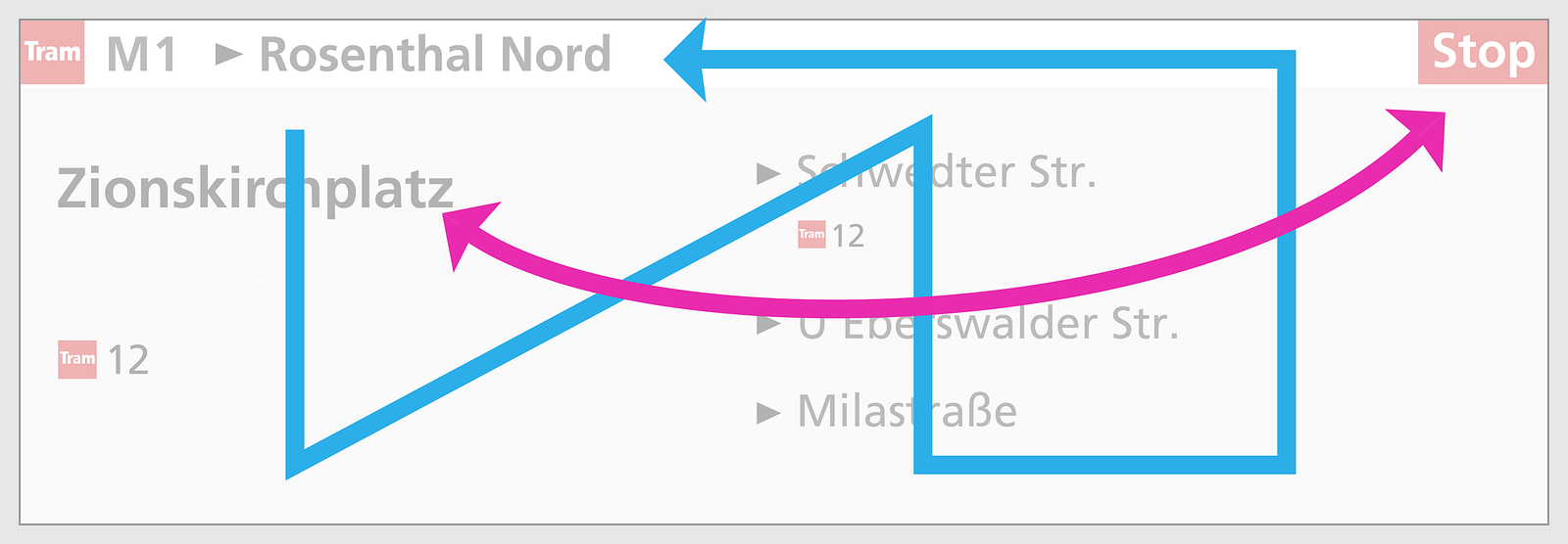
The flow in the original BVG design
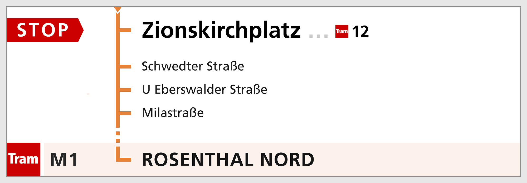
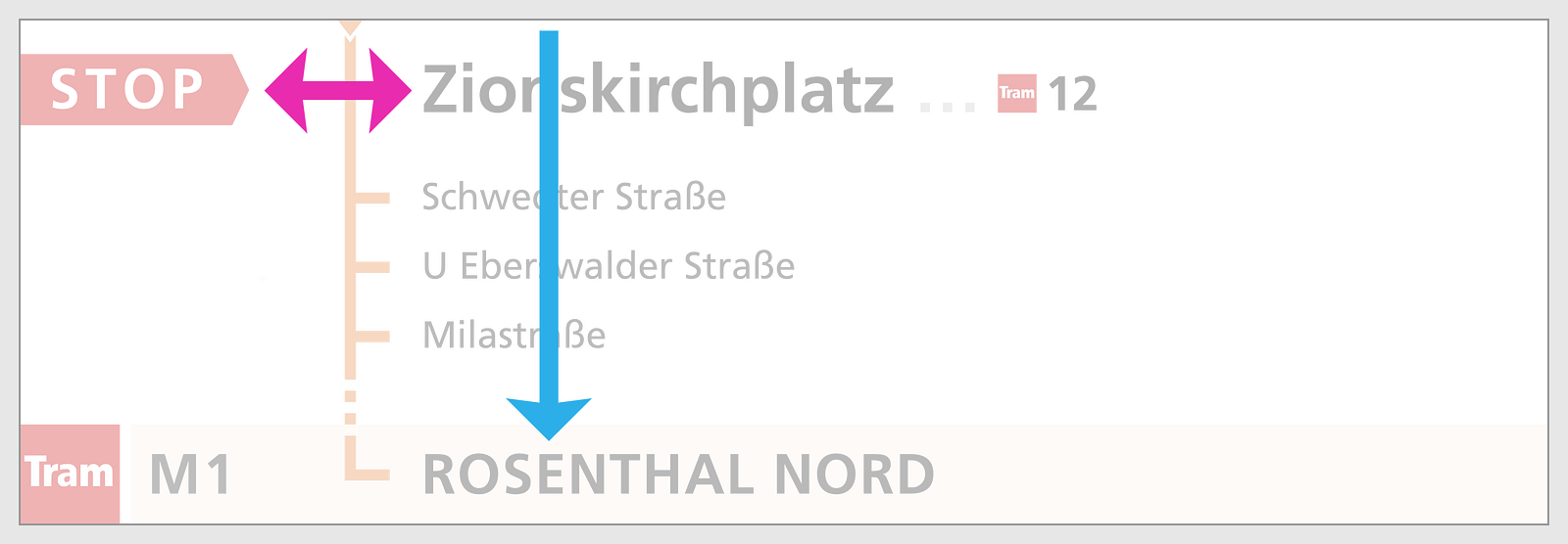
@nandorocker’s redesign looks way more beautifully structured:

The tram route has been optimised, but the connection between the “Stop” label and the upcoming stop can be improved:

I personally don’t like the difference between the tram and MetroTram. Both use the same trains. They feel the same. They mostly differ in their importance, their timetables and availability of 24 h service. This also applies for busses vs. the MetroBus. Instead of a logo per type (tram or bus or subway), the MetroTram and MetroBus logos almost look the same.

Which logo marks a tram, which a bus?
Only the red Tram and the purple Bus logo should be used in my opinion. The line number can be prefixed with “M”. Therefore I’m using the Tram logo in my designs and would also love to see it used everywhere. It seems this also has been recognized by BVG because the orange icons have been slowly replaced by the red and purple icons.
Now back to the display redesign.
Two major changes:
Final-design-current-2.png (or something like this)
While I was designing this, I realized that it’s really based on logic, and could have been the logical result if one had thought about it for a bit. So I might not be the only one. BVG is tesing a surprisingly similar design in the pre-production batch of the upcoming IK subway train series right now. The design still looks like a draft (as well as the whole train in comparison to the amazing Flexity tram design):

New display system in the IK series (“Icke”) of the Berlin U-Bahn.
One interesting point: They turned the screen into vertical mode which seems to allow more space. In addition people can get much closer as it’s hanging on eye level, which is important if you have bad eye sight. But still there are some confusing details:

Then again, what is a transfer station? The map above ignores busses and trams. The display in the trams lists other trams and busses available for transfer.
So, is this still article still relevant? Maybe you also get motivated to improve this. Still I see issues. It looks overloaded as soon as transfer information is added, but at the same time there’s more useful information that could be included the same time. And wouldn’t it be nice to have a wonderful transition between the stops?
I’d love to see your ideas in a follow up!
AI-driven updates, curated by humans and hand-edited for the Prototypr community


