Build Design Systems With Penpot Components
Jul 21, 2:15 AM
Penpot's new component system for building scalable design systems, emphasizing designer-developer collaboration.
smashingmagazine.com

medium bookmark / Raindrop.io |
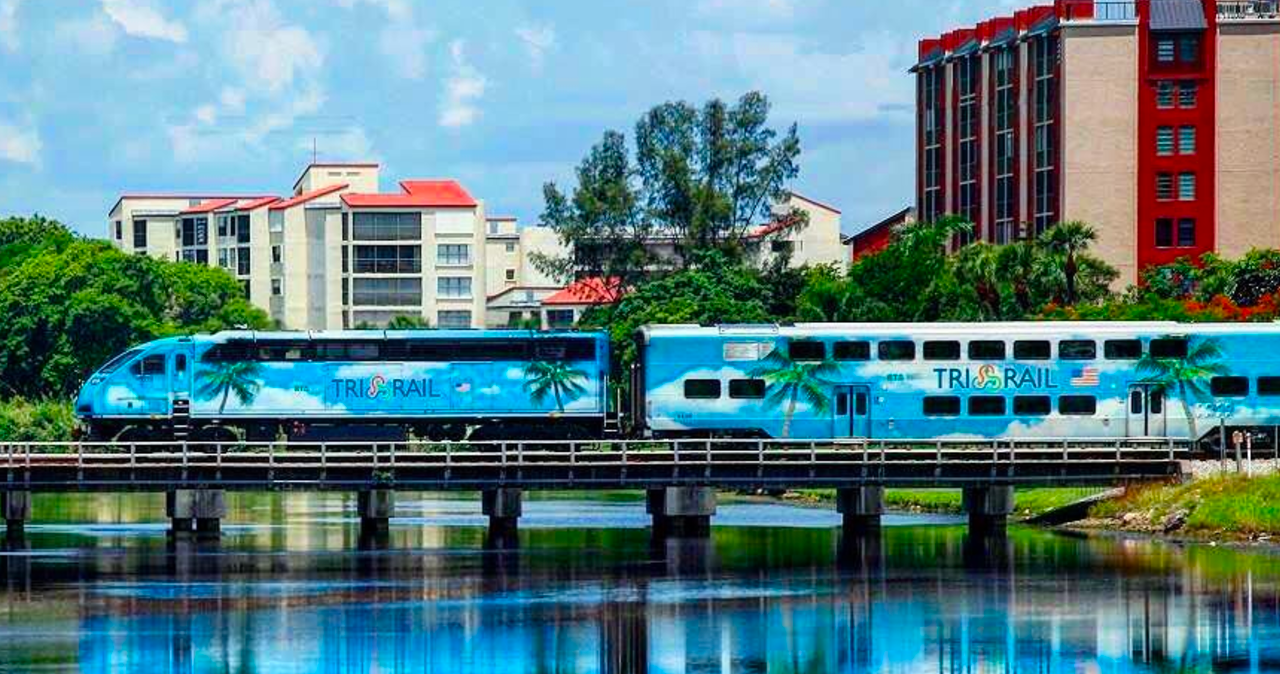
Photo by @trirail
Even in my initial research, it was clear that a holistic approach was needed to understand the user experience: it went way beyond the Tri-Rail web presence. For instance, while standing on the platform one morning, I observed rain drenching the only available bench, installed just inches from roof cover. That evening, I watched people frantically running up and down stairs when they realized the train track had been switched-you might think this was displayed somewhere. Nope. There are no monitors offering information, so riders depend on word of mouth and the occasional announcement. For deaf or headphone-wearing riders, this system offers a pretty small chance of success. Ok, fine, it was me listening to music and running last minute to switch tracks-but I wasn’t alone!
A reenactment of me running for the last southbound Train (minus headphones, plus some killer abs)
When I talked to commuters, they were happy to answer my questions, but they also hoped I could give them information in return. One rider really just wanted to know where they could see their transaction history. They weren’t sure why their fare was already out, but couldn’t figure out how to check! It shouldn’t surprise anyone reading at this point when I tell you, ahem, there is no place to check your transaction history. You just have to trust Tri-Rail. Insert some intense side-eye here*
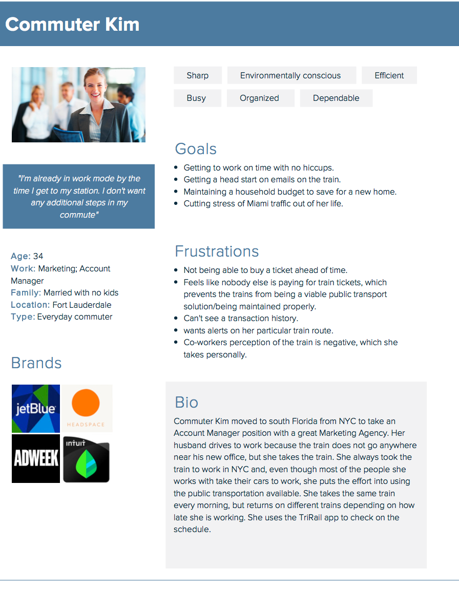
Clearly, a lot of factors were making an otherwise comfortable, convenient and economical commute very frustrating for riders. By creating a user persona (named Commuter Kim. Zero regrets) and following her through her morning train journey, I was able to pinpoint the moments of frustration shared among users and design user-focused solutions for my prototype. Some of you may be thinking ‘Damn, Commuter Kim is super moody in the morning.’ But, the user persona is an amalgamation of all of the riders I observed, surveyed, and interviewed. In other words, we are all Commuter Kim.
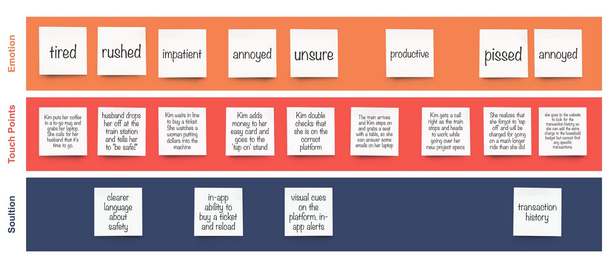
Commuter Kim’s user journey
After analyzing the the data, It was clear that solving a few specific pain points would greatly improve the user experience for current commuters and make the train a more viable option for residents and visitors who currently avoid the train.
VISUAL APPEAL: First and foremost, the Tri-Rail has an image problem. There are no images on their website or app that give a new rider assurance that their journey will be a comfortable and safe one. As a UX designer, my main goal is to make the app more functional, but the information I gathered tells me that the perception that the train is dirty, unsafe and unreliable. In this case, adding clear images of stations of the train interior could add value and ease to the site and app. Use of bright colors, clean lines and images of the interior of the train and stations would help dissipate fears.
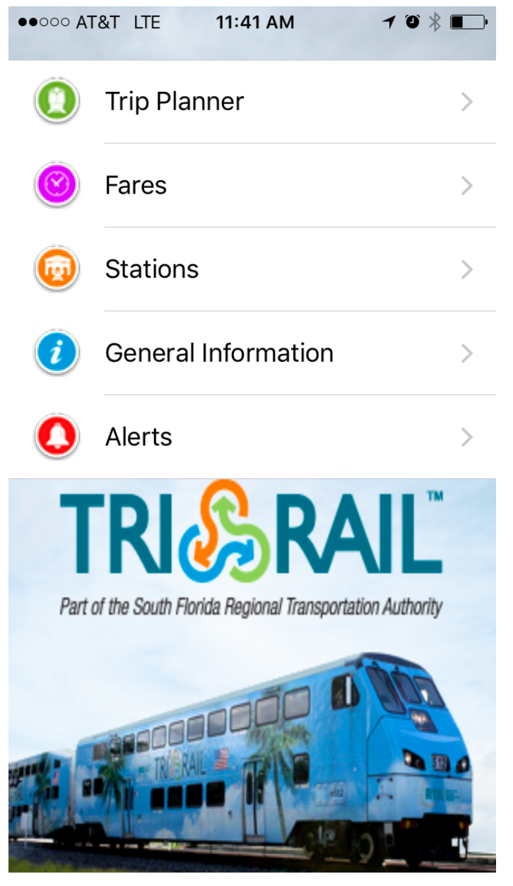
The landing page of the Tri-Rail current app
INFORMATION ARCHITECTURE: The current online presence somehow gives the impression of information overload, while not actually providing much information. On the mobile app landing page, the information is organized in a utilitarian and unattractive way. According to my research, the lack of information available made people legitimately scared to ride the train, so this was a priority in the redesign. Information should, of course, be readily available and organized intuitively. Curating the information to display what’s needed, while editing out what is not will lead to a cleaner, more delightful design.
USER NEEDS The app should cater to the user. Visitors and first time users need an introduction to the system, whereas commuters would find shortcuts and realtime alerts useful. The current app includes an alerts button on it’s landing page, should the user ever have the urge to see alerts for all of Tri-Rail. Not likely. Riders should be able to find the closest station to them for example, or save favorite routes for easy access. Some attention should also be paid to creating a contextually personalized voice and tone that is cohesive with the design and consistent throughout.

Current Tri-Rail ticketing system
TICKETING SYSTEM The current ticketing system for Tri-Rail is nothing short of absurd. You have two basic choices: purchase a paper ticket or reload an existing easy card. When you purchase an easy card, you tap-on and tap-off at the stations, so that you are charged for the zones you traveled. There are no winners here. Most people are not paying. On the rare occasion that a ticketing agent walks through the train car to check tickets, many people say they’ve lost their paper ticket. Public transportation will not succeed or improve in south Florida if nobody is investing in it. There is an associated fine, but people take their chances. On the other hand, those that presumably buy the tickets most often, the easy card holders, are charged for going the entire train route if they forget to ‘tap off,’ a habit that is neither natural or convenient. It’s frustrating for these users to feel like they are the only ones paying, then be charged extra, then not have access to the transaction to see what they were charged.
All these insights led me to a redesign that takes into account the needs of the user, the goals of the stakeholders and the possibilities of technology. To improve the User Experience of Tri-Rail and make the train a viable option, a ticketing system must be installed. The Miami MetroRail uses an in-app ticketing system right now, so there is a precedent to go this direction. This solution would help prevent people from using riding the train for free.
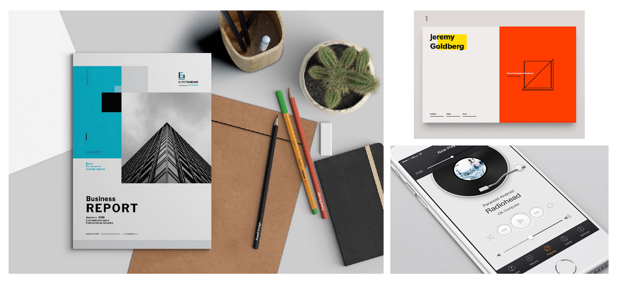
MOOD BE LIKE: I struggled with the mood board as I looked for something that would present the idea of clean and sleek without being too Tesla-ish or make me feel like I was selling stainless steel appliances. When I leaned a little preppier, my mood board took a turn toward a J.crew ad. Thanks to a suggestion by Jonathan Thomason, who is doing really cool design and brand development, I took a look at business reports and catalogs for some inpiration. It was there I found the perfect balance of clean pops of color, industrial cool, and minimalist restraint.
source links: left, top right, bottom right
STYLE TILE: After the mood was established, I put together a ‘style tile’ that included the fonts and colors I planned to use, some sourced inspiration, words, and elements that communicated the essence of the visual brand I was building. The Tri-Rail logo and brand includes blue, green, and orange. I decided to include orange, but brightened it up a bit. The ticket design by Kendrick Kidd inspired me to include an analog ticket. The nostalgic feel of perforated edges juxtaposed with the new technology gave the design a little touch of fun, without delving into cutesy territory. I played with the text as a design element, and you will see the Ostrich Sans numbers here become the zones for the fare calculator in the hi fidelity prototype.

STYLE TILE | source link: ticket
The amount of information that had to be organized within the app redesign had me really questioning my life choices at some moments. ‘Maybe the current Tri-Rail app wasn’t so bad afterall’ I thought as I fell asleep on my prototypes. Thankfully, I am a big believer in failing fast and moving on! As Thomas Edison once said, “I have not failed. I’ve just found 10,000 ways that won’t work.”
a small collection of the many iterations that were thrown out and/or slept on.
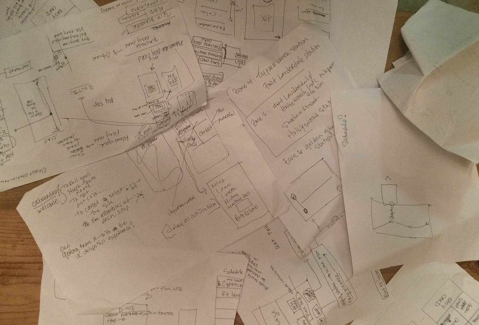
With hella gusto, I threw out paper and lo-fi wireframes and started over. I pivoted from ideas I had in the beginning, such as a quick touch radial app menu seen on my style tile, when the idea didn’t work in testing. By the end of the wireframing stage, my sketch files had names like: Redesign.of.re.redesignTR.again.finalone.omg.
one of many lo-fi wireframe
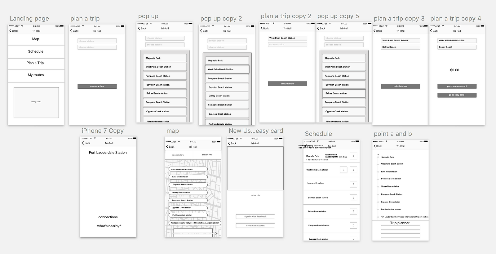
On the plus side, by the time I created a hi-fidelity prototype, many of the challenges I faced with the information architecture and flow of the app had finally been solved. Though it’s not perfect (it’s not supposed to be), both the functionality and design received positive feedback from users!
in-app ticketing! so convenient!
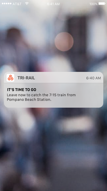

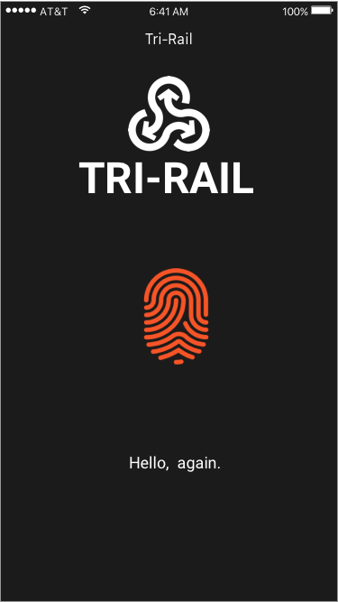
The screens are based on a user flow of an existing user who commutes regularly. Even before the app is opened, the user is notified that they should leave in order to make it to the train.The app takes advantage of the touch ID to offer advanced security and save the user from having to enter a user name and password. I used language that was simple and polite, rather than casual, because I wanted to elevate the experience: I imagined the voice of a personal assistant.
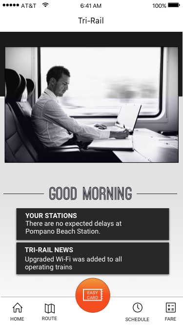
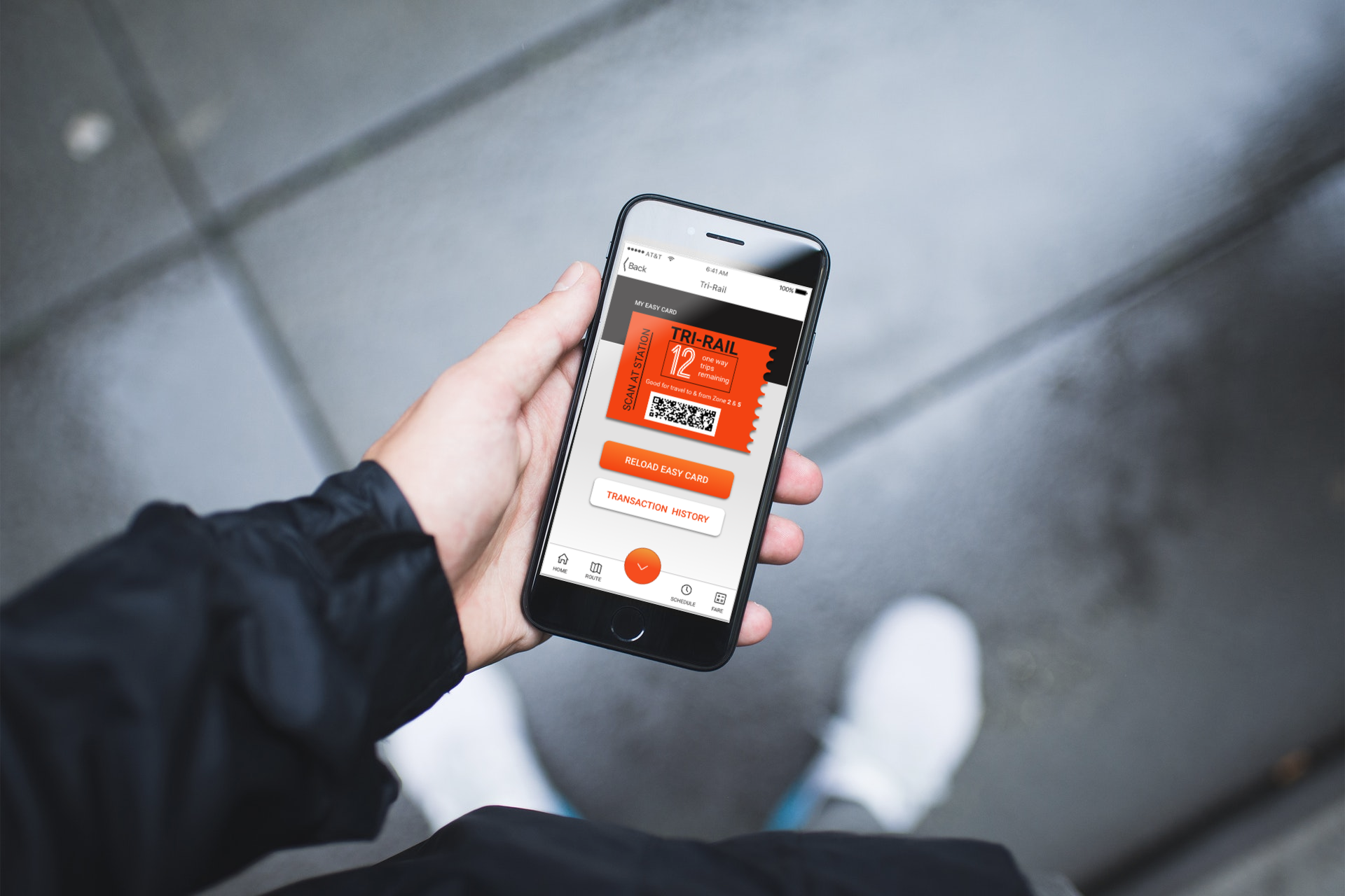
The easy card is accessible through the big, orange button. When the button is pressed, the easy card page pops up with all the information about the users current card. Because the app would be scanned at the station, this page is very easy to access. I hesitated with keeping the name ‘easy card,’ which doesn’t make total sense in this format, but kept it for consistencies sake. Of course, I added an easily accessible transaction history. I imitated the design element of the ticket on this page by including a torn paper feel.


Easy card and transaction history
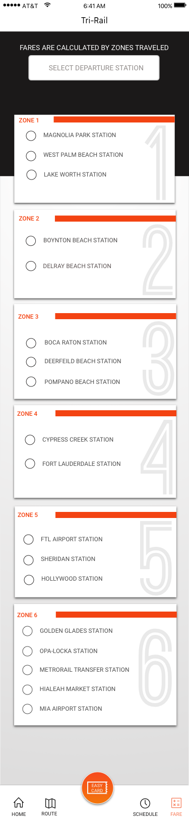
Finally, I wanted to show one of the pages from the scrollable fare calculator. The Tri-Rail pricing system is structured so that a rider pays according to how many zones they cross. Not all the zones have the same number of stops, so it’s the cause of a lot of confusion for ticket buyers. I decided to break up the zones using card elements and stamp each card with the zone number. The user would scroll and pick the departure and destination stations, which would then give them the total cost.
Scrolling interactive fare calculator
I hope you enjoyed this redesign. I may have led the project, but I leaned on countless strangers to take surveys, colleagues to answer interview questions, designers to inspire me, and many more. I would also really like to give a shout out to dry shampoo and vanilla lattes, without which, I never would have finished.
Please let me know what you think in the comments!
AI-driven updates, curated by humans and hand-edited for the Prototypr community


