Build Design Systems With Penpot Components
Jul 21, 2:15 AM
Penpot's new component system for building scalable design systems, emphasizing designer-developer collaboration.
smashingmagazine.com

medium bookmark / Raindrop.io |

Product Designer in Singapore
As a fresh graduate trained in designing tangible objects, I’m excited to translate the skills I’ve learnt into the digital space. I gave myself a challenge to redesign an app along the design thinking process within 20 pomodoros (slightly over 8 working hours).
My friend recently shared with me a design exercise given to interview candidates at a reputable startup. Here it is:
Design how someone chooses the best dates for a trip.
Being an avid traveller with a tally of 18 countries, and recently finding myself booking countless of vacations (it’s grad trip season), I found that flights have always been the key determinant of travel dates because of its volatile pricing, which can have a large impact on the budget.
A known way to find the cheapest fares is to use flight aggregators. They work by searching hundreds of booking engines, airline sites, and travel agencies, and present the results all in one page. The app of choice that 60 million people (including me) use is Skyscanner, because it consistently finds the cheapest prices with an easy to use interface.
I interviewed 5 Skyscanner users and observed as they walked through their usual flight booking experience, with extra emphasis on understanding how they ultimately settle on travel dates.

One particular pain point stood out above all else — users search multiple times to hunt for the cheapest combination of travel dates.
Infinite loop of toggling between dates
Travelers are frustrated that this search process has to be repeated for each additional day they are flexible to fly, and become impatient when each search can take up to 20 seconds.
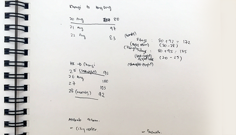
Additionally, users need to make mental notes and calculations of the many searched dates and prices. For some users, they transcribe and compile those figures on notebooks or Excel sheets for easier comparison.
This problem is critical to solve because finding the cheapest fares, even across dates is essential to a successful Skyscanner experience.
Travelers expected Skyscanner to not only compare the cheapest flights, but also the cheapest date combinations.
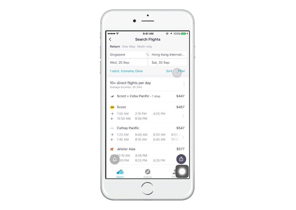
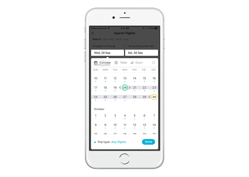
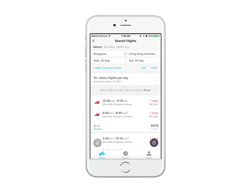
Skyscanner aims to help users select dates through these three existing interfaces.
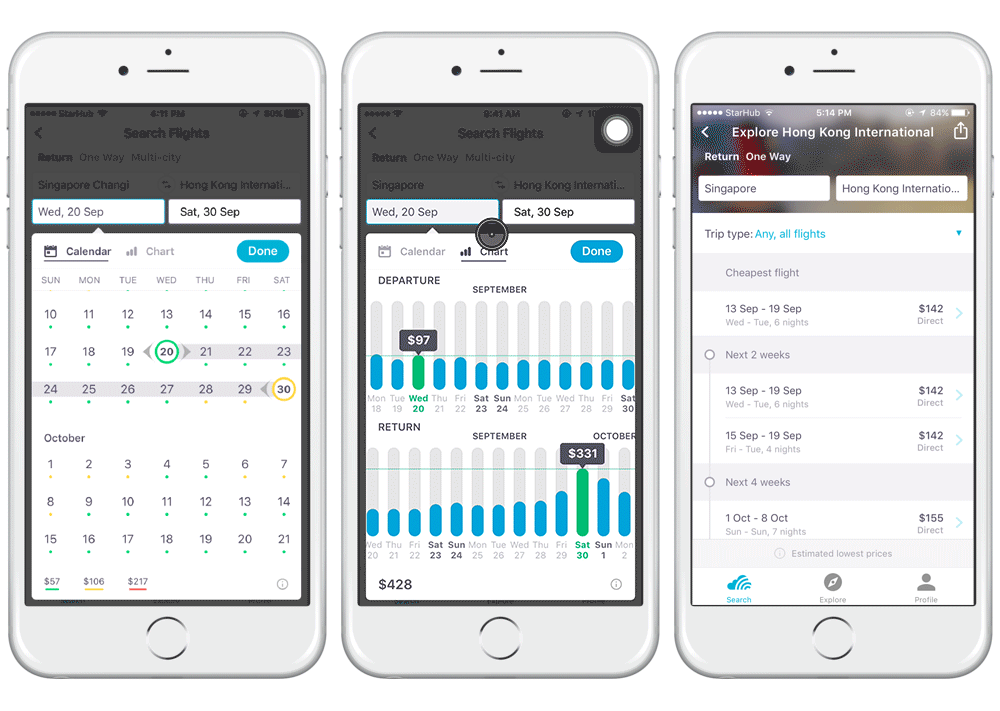
L: Coloured Dots | M: Chart | R: Anytime Search
With all three interfaces, users are wary about the cheapest fares suggested because it often comes with undesirable timing (early morning or late night) or lengthy layovers.
Another thing I found out is that travelers fall somewhere along the following spectrum:

Skyscanner caters to Fixed travelers with a seamless booking experience and to Flexible travelers with Chart and Anytime Search.
However, the pain point of toggling between dates still happens today because of an in-between category of users — the semi-flexible travelers.
These are the people who have a general idea of their travel dates and duration, but are flexible a few days before or after. It is this group of travelers that are toggling between date combinations.
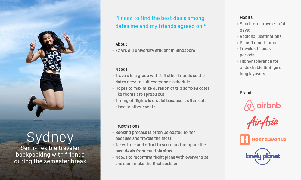
Persona of a semi-flexible traveler
I interviewed more semi-flexible travelers to uncover what their concept of a perfect search is and how today’s experience pales in comparison.
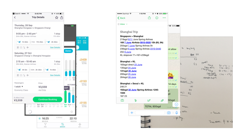
L: Multiple screenshots sent to friends | R: Flight details transcribed to a notepad
Choosing the best dates can be a stressful situation, especially if choosing for others as well. Emotions are tense because any cost savings or loss is multiplied by the number of people involved and these bookings are often non-refundable and non-changeable.
Picking the most optimal flight days come with huge monetary savings, especially for short-notice journeys as there is much more variance in price between days. A poor booking experience causes mistakes, but a great booking experience brings cost savings and peace of mind.
How might we help semi-flexible travelers choose the best combination of dates that fits their constraints?
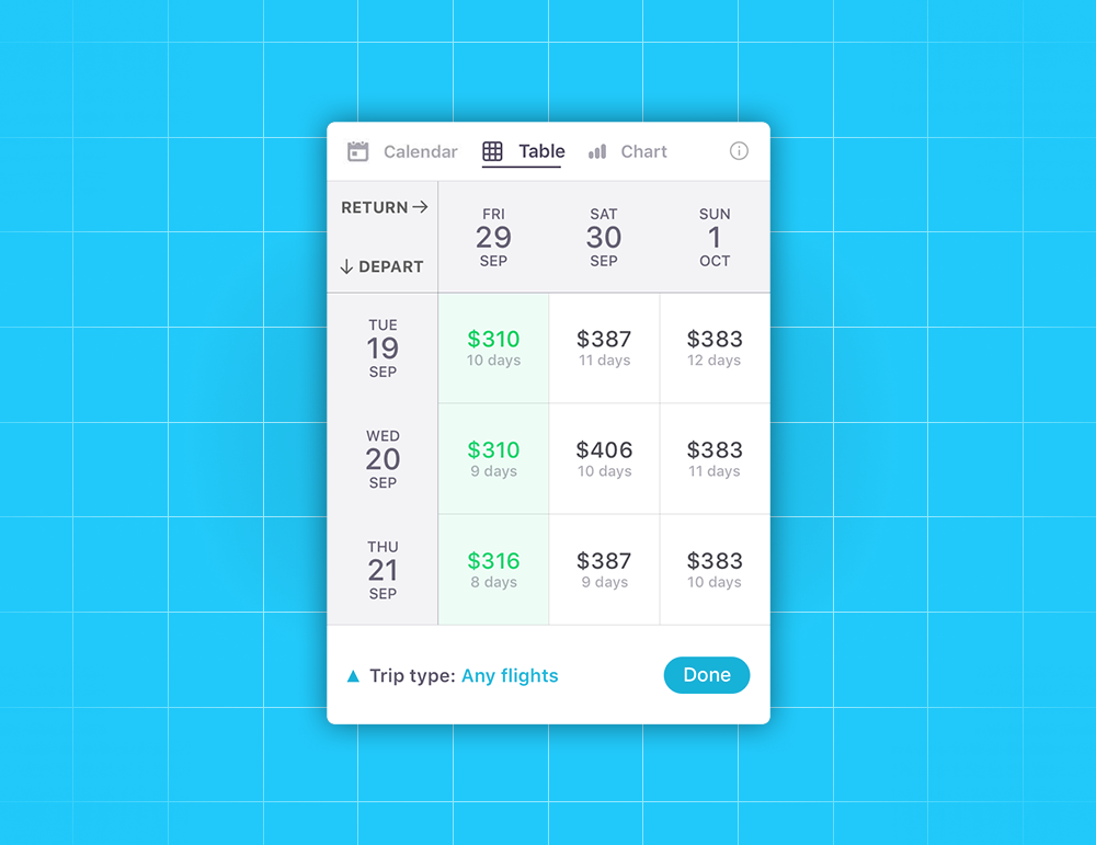
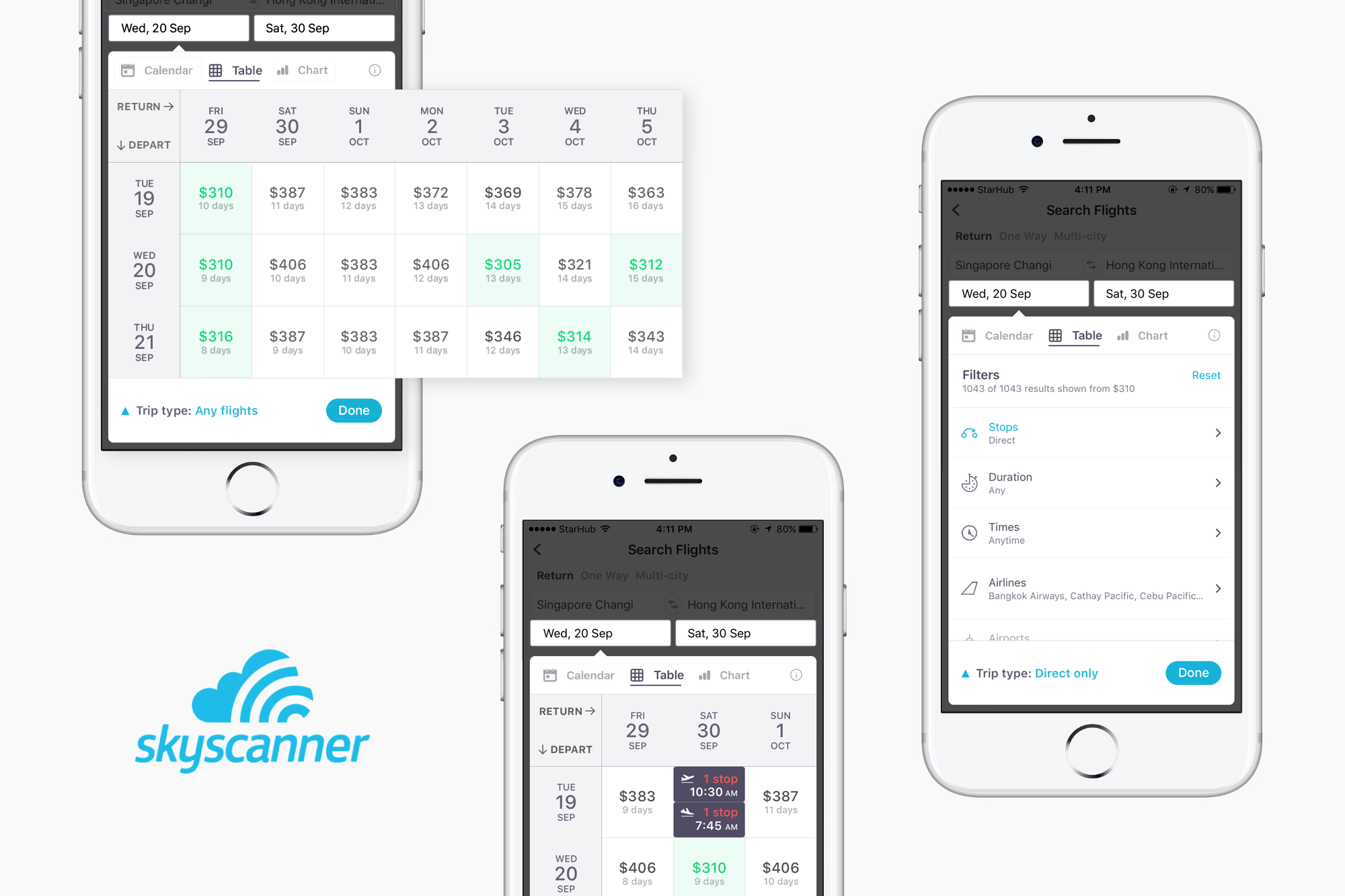
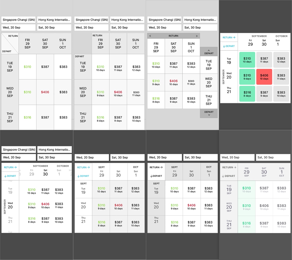
A new experience for travelers to not only compare the best flights, but also the best date combination all in one table. It is designed for travelers with semi-flexible trip dates by a few days before or after and was born out of the understanding that each traveler has their own budget, time and comfort constraints. Use Table to find the best travel dates.
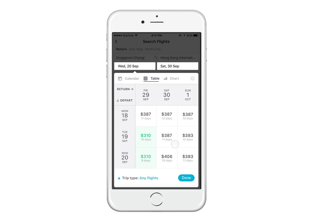
Upon entering Table, the user is presented with a grid of departure dates, return dates, and their corresponding total prices with the cheapest dates highlighted in green.
Upon clicking a Table cell, additional flight details like layover and departure timing is presented. The user can easily compare prices and flight information across dates.
Optionally, users can tailor their flight with Skyscanner’s powerful filtering options and remove deal-breakers.
Based on the insights gathered, the key design explorations are:
With each iteration, I conducted user testing with 3–5 semi-flexible travelers.
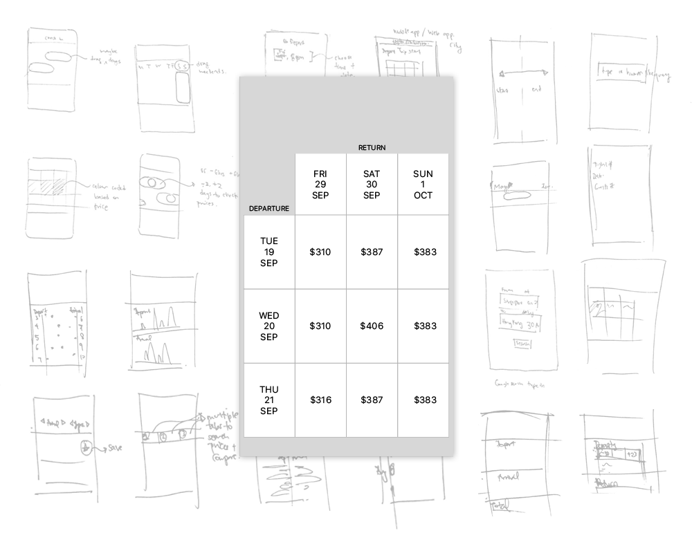
Sketches of ways to compare flights with clarity
This table format offered the clearest comparison of total price among different date combinations. Moreover, seasoned travelers are accustomed to this interface as some airline websites (FinnAir) already utilise the same format.
However, there are some concerns that will form the basis for further exploration.
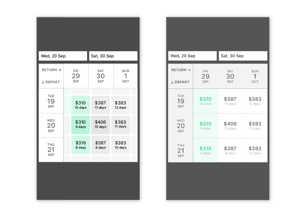
A key challenge was finding ways of representing the huge amounts of data in a clear manner that would not overwhelm users. Starting with just the essential information, the priority of data which users needed to know at this point is: Axis Meaning > Date > Total price > Relative price.
Explorations of ways to represent data clearly and clutter-free
I managed to minimise cognitive overload and reduce visual clutter by chunking information into equal spaces, relying on visual cues from spreadsheet software (Keynote and Excel) and creating visual hierarchy through typography.
I initially explored scrolling along the two axis with arrow buttons and sliders. After testing with users, I found out that users already assumed that they could navigate by scrolling the dates, rendering those visual cues unnecessary.
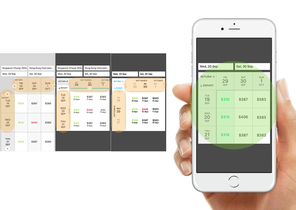
Improving reachability when navigating the table
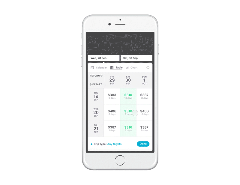
It was then I realised that the scrolling area (highlighted orange) was a stretch for the thumb, especially for right handed users on larger phones. I increased reachability by expanding the scrolling area (highlighted green) to also allow users to scroll anywhere on the table.
Explorations of navigating the table
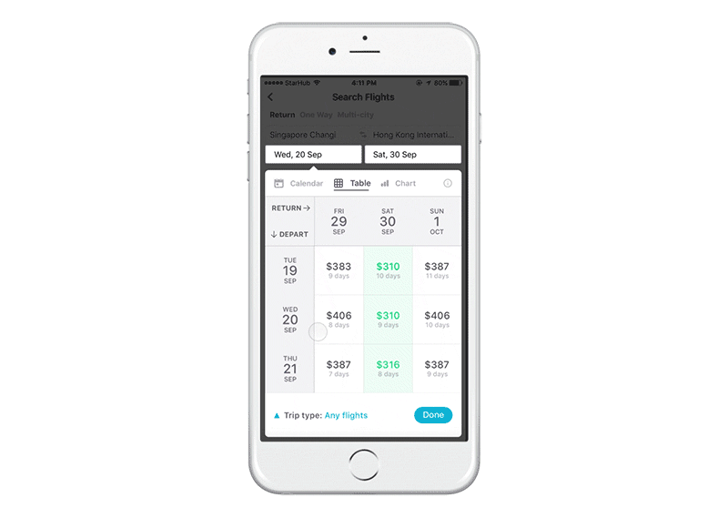
I encountered two distinct paths that caused lots of internal debate. The design on the left could hint and guide users to dates beyond the table, while the design on the right could only compare the dates within the table.
When faced with this difficult design decision, I looked back at the main goal, which is to design for semi-flexible travelers to narrow down their choices and ultimately choose the best combination of dates within their time constraints, and not to encourage further exploration of more dates. Hence, the design on the right was chosen.
It was also at this juncture that I realised how easy it is to lose track of the trip duration when scrolling between dates, thus requiring the display of number of trip days to serve as a landmark for scrolling.
Cost may not always be the definitive factor in choosing dates. Different travelers have different constraints (dates, duration, comfort level) and expect to be able to tailor a flight that works for them. But before users can know what to filter for, they need to know more information about the flights.
Based on research, the 2 deal breakers for cheap flights are 1) lengthy layovers and 2) bad timing. Starting with just these two information, I needed to strike a balance between level of detail, limited screen real estate and clarity.
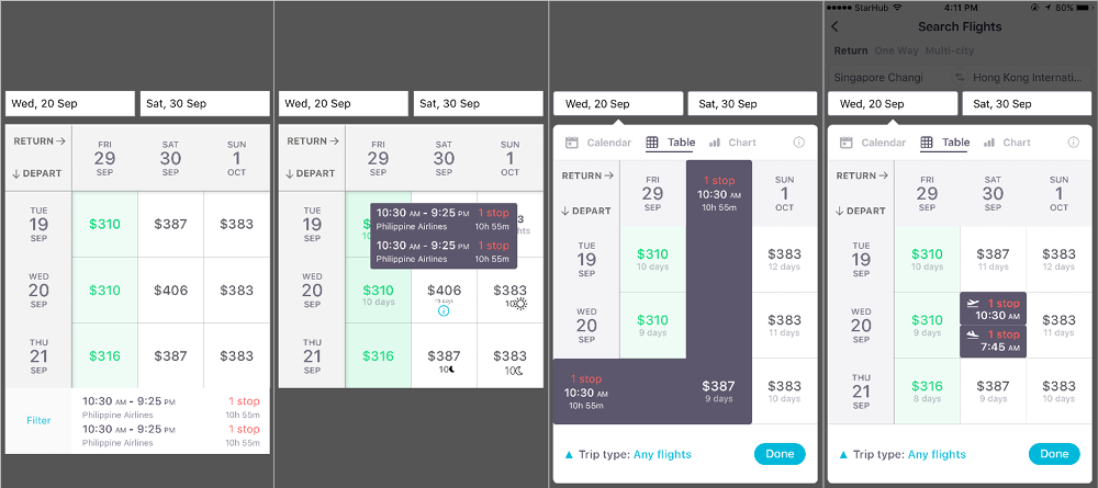
Iterations of ways to show more flight info
The solution was to hide the flight information underneath the price tile, which is easily accessed and toggled with a tap. To tailor the perfect flight, I relied on Skyscanner’s existing powerful filtering capabilities.
The most straightforward solution is to include Table as an opt-in feature, which can be accessed among Calendar and Chart as that is where users are selecting dates.
Julie Zhuo wrote about how common it is to design how a new feature will work, but the hard part is to design the beginning of how people will discover that feature for the first time.
The easy way to introduce Table is to launch a pop-up announcement or educate during onboarding tutorial. However, it is hard for users to understand the value of Table those times. Taking the easy way out also risks causing confusion among other types of Skyscanner users (fixed travelers and flexible travelers).
Instead, a more meaningful introduction is to target semi-flexible travelers when they are toggling between dates on the results page. It is much easier for them to understand the value proposition of Table when they are experiencing the pain point.
After 5 years of experience in Industrial Design, I want to transition into the digital world. I figured that the best way for me to learn is to just throw myself with both feet into a project.
Some powerful things I learnt:
Thank you Alvin Juano, John Teo, Sheng Juen, Jia Qi, Ying Ling & Hsiao Fong for this wouldn’t happen without you guys ❤
Feel free to drop some feedback below. I’m always open to meeting passionate and curious creatives, please get in touch with me at [email protected].
I’m currently seeking for a great company
in Singapore to join as a product designer.
AI-driven updates, curated by humans and hand-edited for the Prototypr community


