Build Design Systems With Penpot Components
Jul 21, 2:15 AM
Penpot's new component system for building scalable design systems, emphasizing designer-developer collaboration.
smashingmagazine.com

Design + Sketch App — Medium | Kevin Lanceplaine
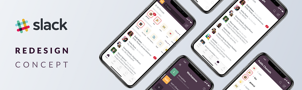
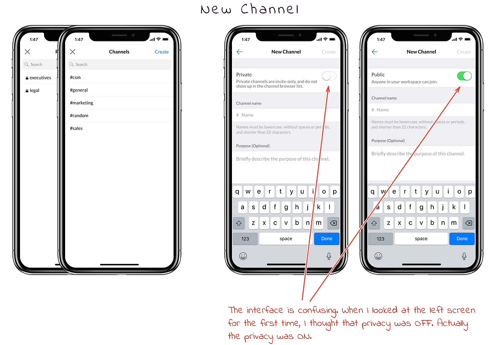
Like most people in the tech industry, I have used Slack in my work on many occasions. But while I always thought that the UX was intuitive on desktop, I felt the iPhone version could be improved. I decided to analyze in detail what could be revised and to propose a redesign concept.
Once I understood the issues I wanted to fix on the Slack UX, I started to do low-fidelity mockups.
 Some of my early drawings
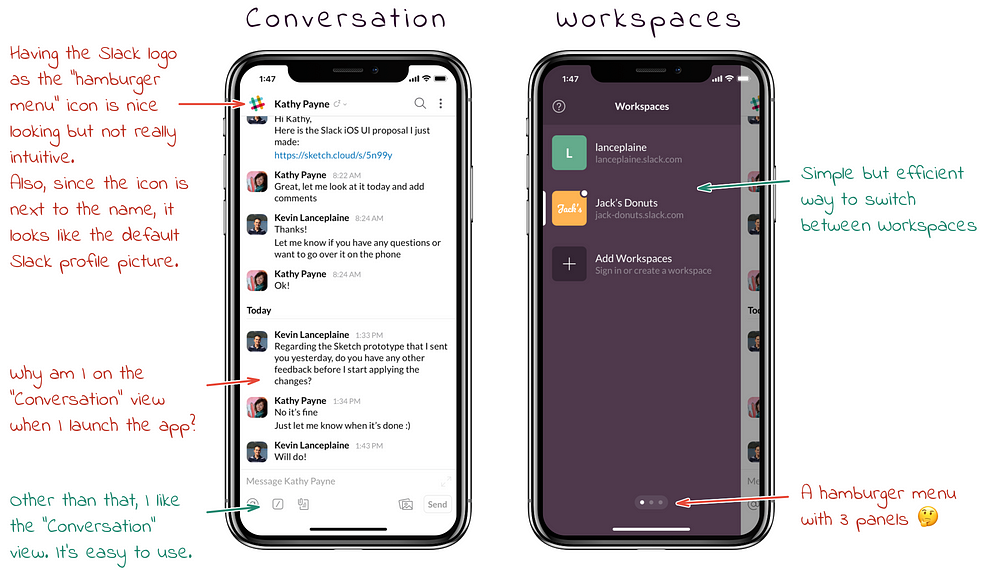
Once the low-fidelity mockups were finished, I started working with Sketch. But before I even started sketching the redesign concept, I wanted to reproduce the current Slack iPhone UI. It allowed me to better understand the design of their iOS application and ensure that my proposal would respect Slack’s design.
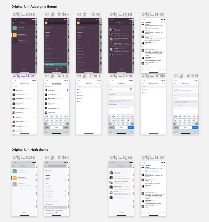 I did the original UI for both the “Aubergine” theme and the “Hoth” theme
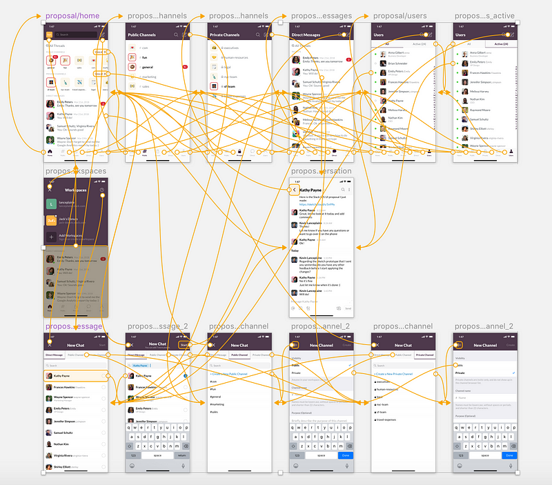
Once the original UI was reproduced in Sketch, I started my redesign concept. I made sure to use the prototyping feature of Sketch 49 as you can see below. You can also download the file and try it for yourself.
I used GitHub (with Git LFS) in order to manage the different iterations of the project.
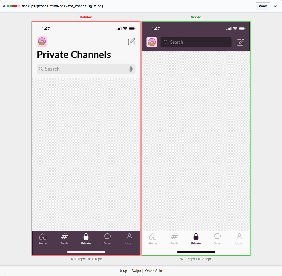 GitHub allows me to easily see the changes for each commit I made
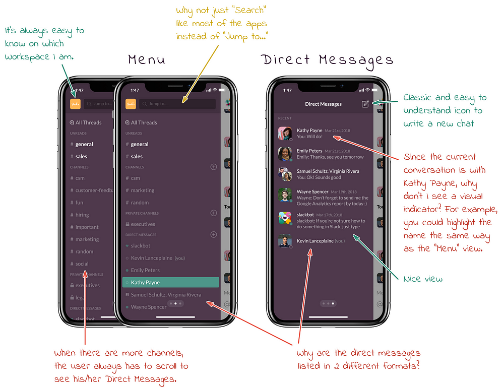
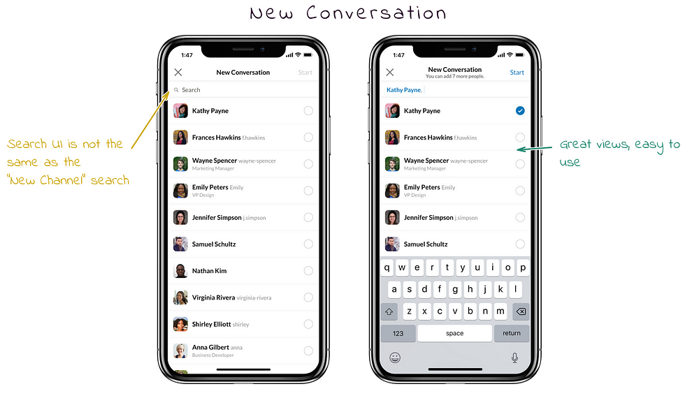
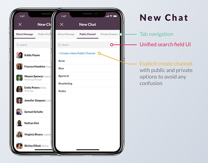
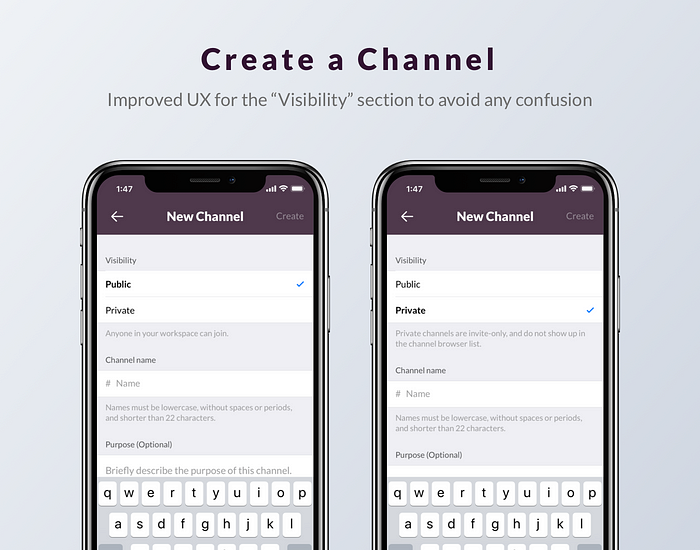
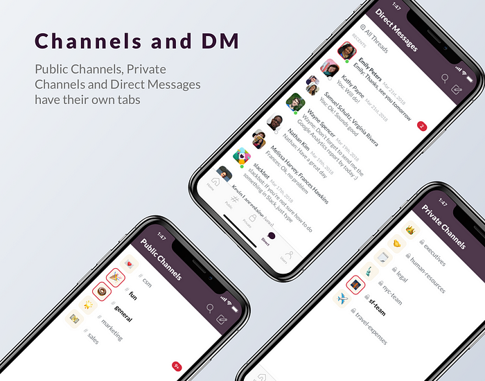
You’ll find the most important screens below along with some explanations:


You can download the Sketch file on sketchappsources.com.
It contains:

Feel free to comment below if you have any feedback!
Thanks for reading 😊
Slack iPhone Redesign Concept was originally published in Design + Sketch on Medium, where people are continuing the conversation by highlighting and responding to this story.
AI-driven updates, curated by humans and hand-edited for the Prototypr community


