


Build Design Systems With Penpot Components
Jul 21, 2:15 AM
Penpot's new component system for building scalable design systems, emphasizing designer-developer collaboration.
smashingmagazine.com

uxdesign.cc – User Experience Design — Medium | Flavio Lamenza
We are User Experience Designers and our core objective is to create delightful and seamless experiences for the user. Let’s be clear here, if you do any of the following below I suggest a new term: “A**hole Design”.
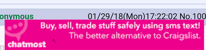
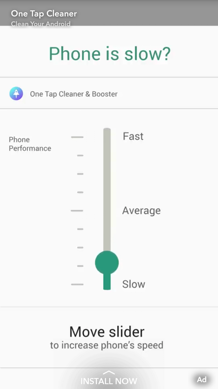 Ad in Snapchat for Android 😬
This app was downloaded on April 2nd.
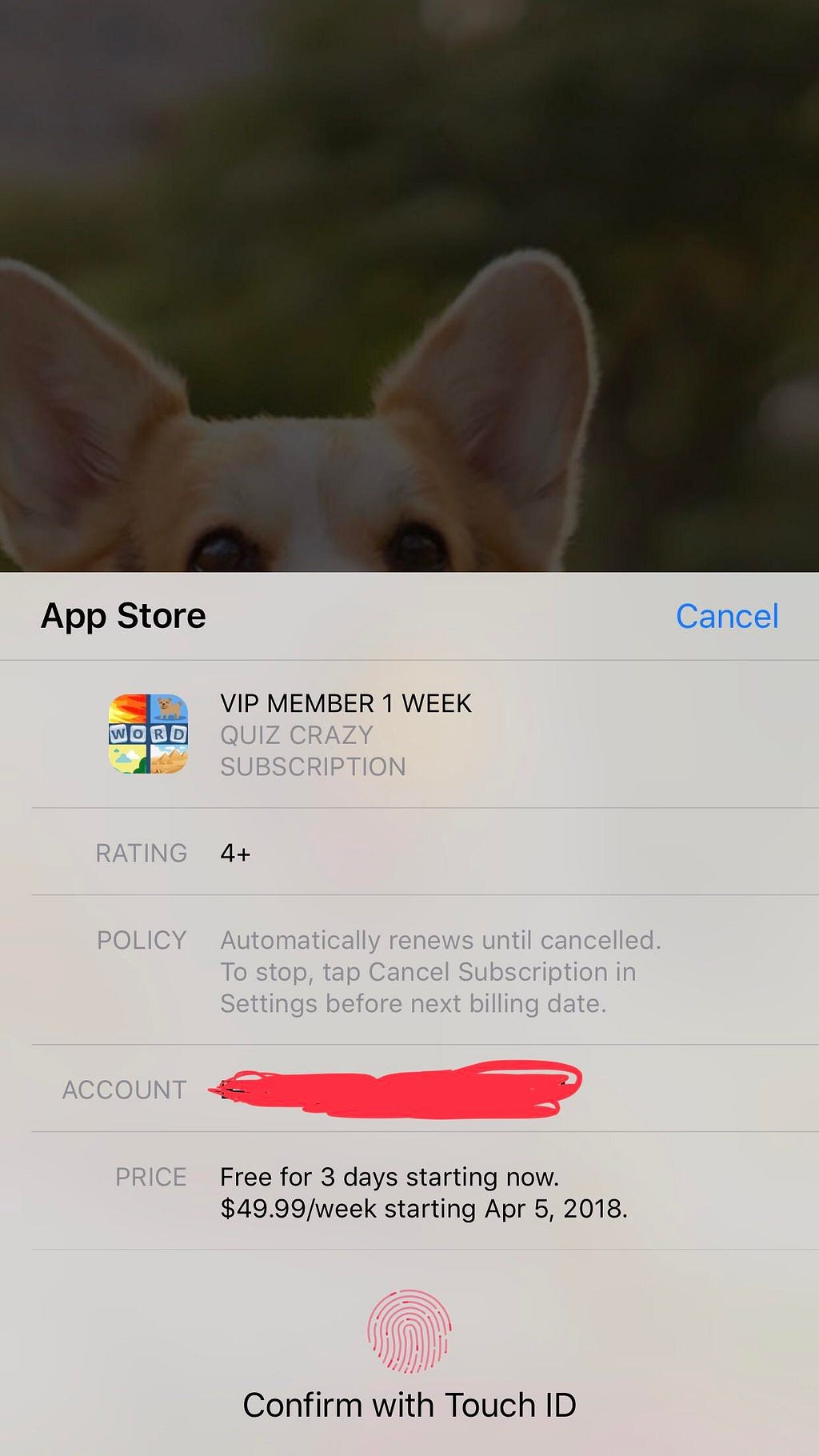 “Free for 3 days starting now. $49.99/week starting Apr 5, 2018”
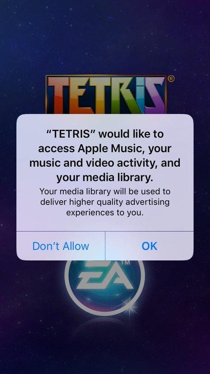
Have you heard about “Variable Rewards”? One example is the little red alert to tell the user there is something new to have a look. That’s a technique Facebook, Instagram and Candy Crush mastered. The term became famous after the book “Hooked“, from Nir Eyal, mentioned it as the most important “trick” to hook the users. Nir Eyal’s words below:
What distinguishes the Hook Model from a plain vanilla feedback loop is the Hook’s ability to create a craving.
This print screen was taken a week after downloading the app “Restaurant 2”.
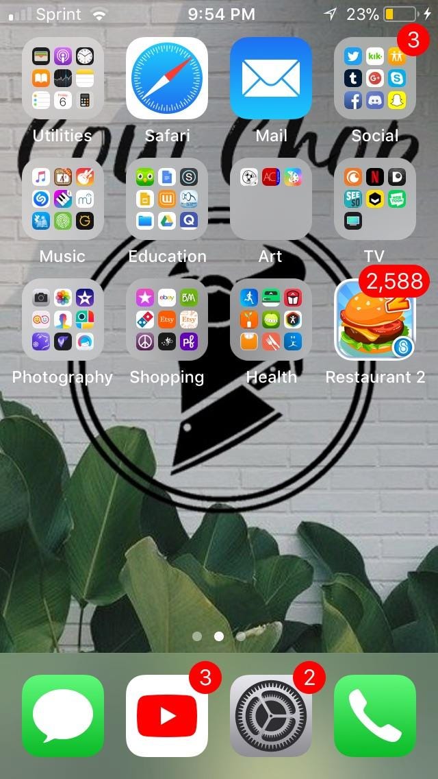 2.588!
And this other app below pretends to have a notification on the image of the icon itself.
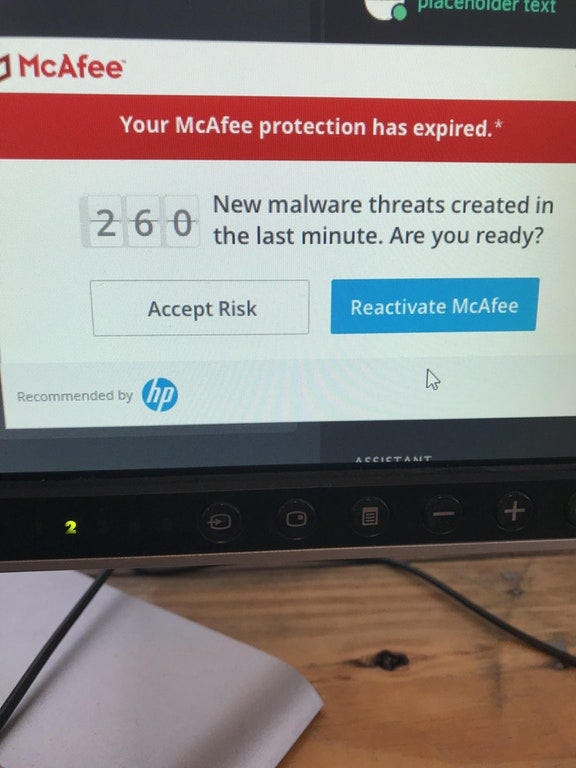
New malwares created in the last minute by…
This add in a mobile app makes you think there is a dust particle on you screen, making you tap on it.
This ad in Snapchat makes you think there is a strand of hair on your screen, making you tap on it.
 (not my hair, for sure!)
While uninstalling IObit you get a confusing message with a prominent CTA to continue (and not uninstall it):

At this moment I can see the stakeholder clapping and the UX designer’s reaction like:

Ok… good luck.
What about, “Enter your e-mail below and we will remove you from the list…” Okay…😖
12 seconds of slow pain…
By the way if you shop for wraps in Waitrose or Pret, you’ve seen some packaging like the one below 😲
And here is the king of deception. The way the ham was inside this sandwich.
 I had to laugh 😂😂😂
 Do you want my National Insurance Number as well?
These examples are only the tip of the iceberg. You’ve seen them and even more in many different ways. They are everywhere nowadays. Also, have you ever tried to opt-out a marketing e-mail? It feels like this:

And this is not a new thing, below is an example of 1861. It’s called Wizard Oil and was created by John Austen Hamlin.
 With ingredients like ammonia and chloroform, Wizard Oil did more harm than good.
This “wizard” made big profits until the government prohibited the oil in 1906 (almost 50 years operating with a fake product).
All of this is not bad user experience design, not psychology, not “dark patterns”. This is being dishonest, deceitful, corrupt, and unethical.
Thank you for your time reading. Clapping is caring. Press the 👏 to share this article with others.
Stop calling these Dark Design Patterns or Dark UX. These are simply Asshole designs. was originally published in UX Collective on Medium, where people are continuing the conversation by highlighting and responding to this story.
AI-driven updates, curated by humans and hand-edited for the Prototypr community


