Build Design Systems With Penpot Components
Jul 21, 2:15 AM
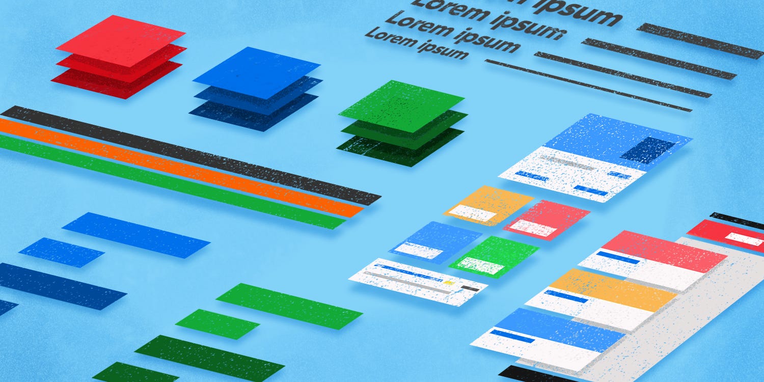
Penpot's new component system for building scalable design systems, emphasizing designer-developer collaboration.
smashingmagazine.com

medium bookmark / Raindrop.io |
As we developed our web and mobile platforms over the years, our design patterns collected technical debt. Instead of using a common design standard, each engineering team was using its own, leading to numerous inconsistencies across our platforms. This was both confusing for our brand and, from an engineering perspective, cumbersome to maintain.
In an effort to create a more consistent brand identity across our platforms and simplify maintenance, our engineering and design teams worked together to create a living style guide. A living style guide consists of well-documented design patterns that cover a broad range of use cases. A design pattern could be as simple as color schemes and typography or as complex as navigation strategies. To achieve this, we followed atomic design principles, where design patterns are developed as building blocks that can be used to create other design patterns.
Consider a simple button. It is composed of simpler design patterns such as color, typography, and shape. A button could then be used in more complex design patterns, such as button groups or forms.
Prior to working with a style guide, to make a button, we would first create a drawable to define the background and shape.
Because a button can take on various states, such as focused, pressed, and disabled, we would also need to create three additional drawables to account for each of these states. To display the appropriate drawable for a specific state, we need to define a state selector.
So far, that’s a total of five files for a single button in a specific shape, size, and color scheme — and keep in mind, we haven’t even thought about the text selectors yet. Our new style guide, at minimum, contains 15 different types of buttons of varying colors and sizes. Not only is the thought of creating more than 80 files cumbersome, it also hints at a system that is prone to significant human error and will grow increasingly difficult to maintain.

We can solve this using style guide-driven development (SGDD). SGDD is the process of creating a living style guide that, in addition to creating well documented design patterns, allows us to:
SGDD, a growing practice for web development, is well supported by tools such as StorybookJS. Although no such tools exist for native mobile, we can still leverage SGDD principles.
In order to introduce new design patterns, we created a new Android library, which we dubbed the Pattern Library. We were inspired by Google’s Material Design, introduced in 2015, which provides UX guidelines for Android apps. However, not all material components are well supported in the Android Support Library, such as bottom navigation view.
The Pattern Library, which contains all of our design patterns, consists of two modules:
This architecture provides the following benefits:
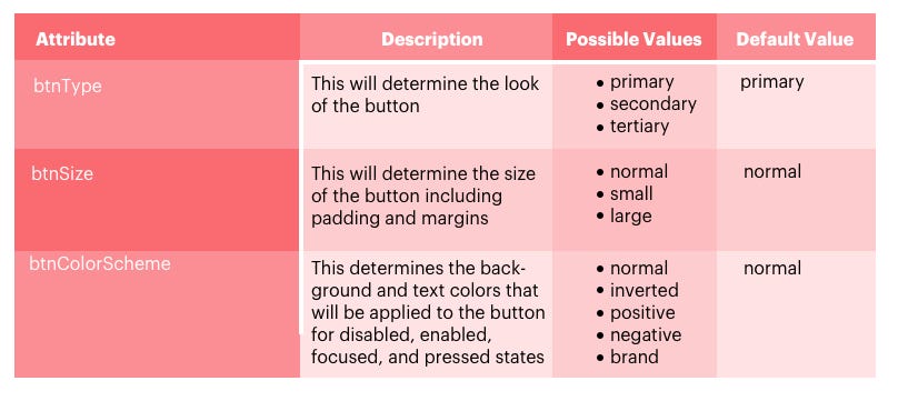
Our Android Pattern Library gives us a way to work on design patterns in an isolated environment. However, we still need to determine a way to create flexible and maintainable design patterns within the library. Let’s take another look at our buttons example. Our style guide provides very specific guidelines for how our buttons should look and feel. Therefore, we created a custom view that extends the Button class. Doing so allows us to abide by our own brand guidelines, which contains the following attributes:
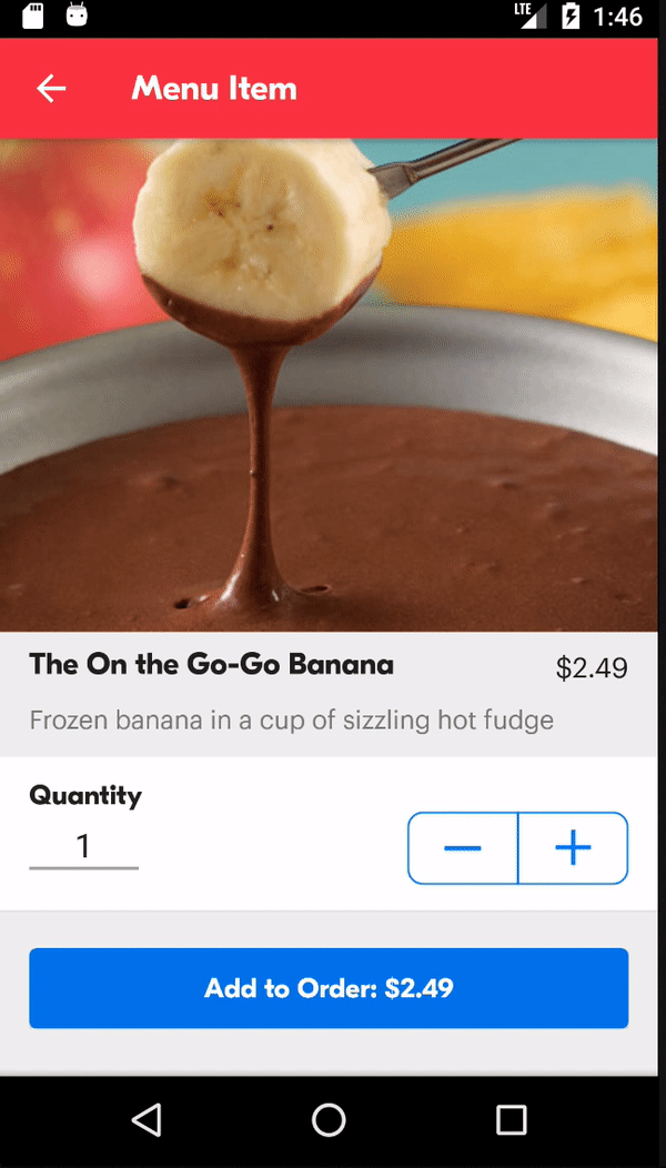
Here is an example of how we create the Add to Order button:
This snippet is all that is necessary to create the Add to Order button.
The custom view uses these attributes to programmatically generate the drawables for each state of the button, create a state selector with the drawables, and assign the state selector to the button. In this scenario, we are using our normal color scheme, which includes our standard interactive color. As shown below, this color scheme also specifies which color we should use for the focused and pressed states.
We use these values and other specified attributes to create the button in an appropriate size and programmatically create the state selectors for the background and text.
Now, we’ve accounted for all of the button variations defined in our style guide. But what happens if we need to update a design pattern — say, by adding a new color scheme? Ordinarily, we would need to update the pattern library before working on feature development. To avoid this potential bottleneck, we allow some flexibility within our design patterns from a development perspective. For example, if we need to create a button with a custom color scheme that is not yet in the pattern library, we can provide our own default, focused, and pressed state colors, as shown below.

This practice helps us future-proof the design patterns, so we don’t need to immediately update the pattern library or the version used each time there is an update to the style guide. Most importantly, this flexibility covers all possible variations of buttons in our style guide and provides room for potential changes or updates — all in a single class.
In order to make the Pattern Library a success, we had to take time to understand our existing challenges. One of the challenges we faced prior to using SGDD was miscommunication with design. As engineers, we do not always use the same terminology as designers do, and vice versa. We wanted to abide by Material Design guidelines so our apps behave and feel like an Android app while maintaining our brand identity. To do this, we would set aside time for visual QA with the design team to refine our UI.
Ultimately, the engineering and design teams came together to create a unified language. A unified language helped us stick to specific naming conventions for our design patterns across Android, iOS, and web. Our naming standard for the button group design pattern is a great example. The term button group is common to Android and web, but is more commonly known as a segmented control in iOS. Another example of unified language is seen in our typography naming standards, where a term such as heading 1 encapsulates which font type, text size, and line spacing should be used on each platform. Unified language mitigates confusion among the design and engineering teams.
Style guide-driven development offers many tangible benefits to each team that adopts it. It’s helped our engineering teams speed up development time, decrease ambiguity around our design patterns, and improve communication with our design team. The Android Pattern Library is currently integrated into the Grubhub, Seamless, and Eat24 Android apps.
AI-driven updates, curated by humans and hand-edited for the Prototypr community


