Build Design Systems With Penpot Components
Jul 21, 2:15 AM
Penpot's new component system for building scalable design systems, emphasizing designer-developer collaboration.
smashingmagazine.com

Design + Sketch App — Medium | Duy Luong 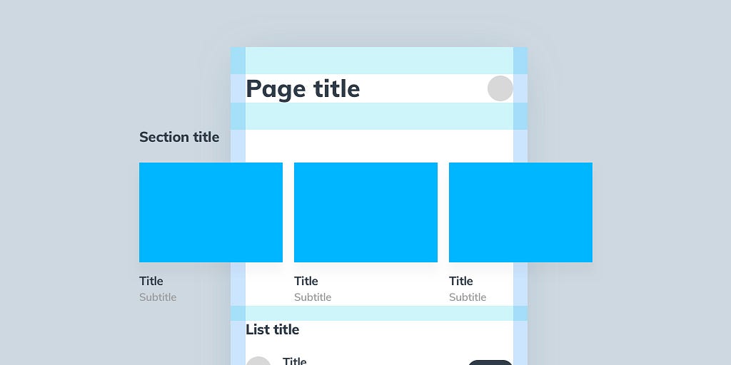
Sketch is quite most famous in Design tool field at the current time. I always believe one of the reason is Sketch has a large plugin library — community. Today, I want to introduce 2 plugins: Paddy and RenameIt that will help cut of amount of time doing replicated actions and streamline your Mobile Design workflow. Especially, if you’re building a Design System, I think you will find it’s quite useful.
I write this article based on my experience so I’m really open to discussion, so we can enhance the design workflow. I also tried Auto-Layout before but looks like we’re not belong together.
Because of GIF’s limitation. Sorry for the speed of GIF images in this post! You can check out my original article here to view the full/slow speed videos.
Let’s move on the main subject. What’s the current problem? Do you see the below design workflow familiar?
When tackling UI Designing, you have to care about content, how it looks on variant of screen size. Each time we update content, we have to re-layout everything again . You can see it normal, doesn’t it the designing job? But if you have hundred of components need to be update, then you will see the pain here.
There’re many way to resolve this problem, you can use many plugins to organize the layers. But it’s still not automatic, or at least not in the convenient way like in this article. We will go through from building basic components to an entire page, like Atomic Design Method.
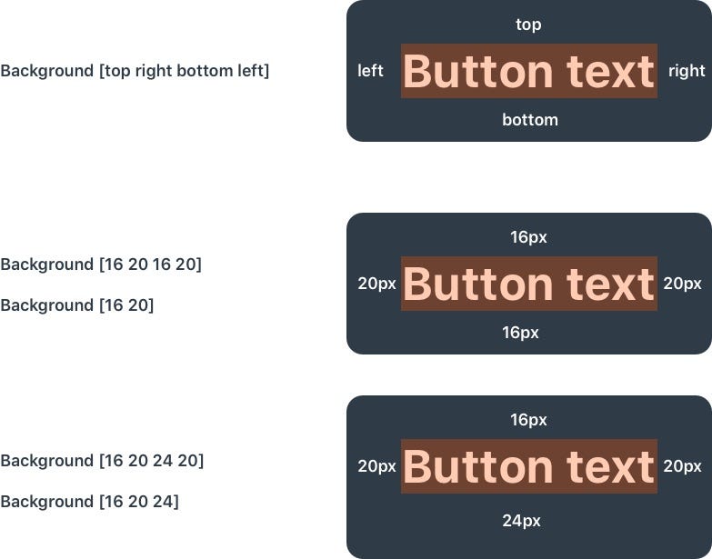
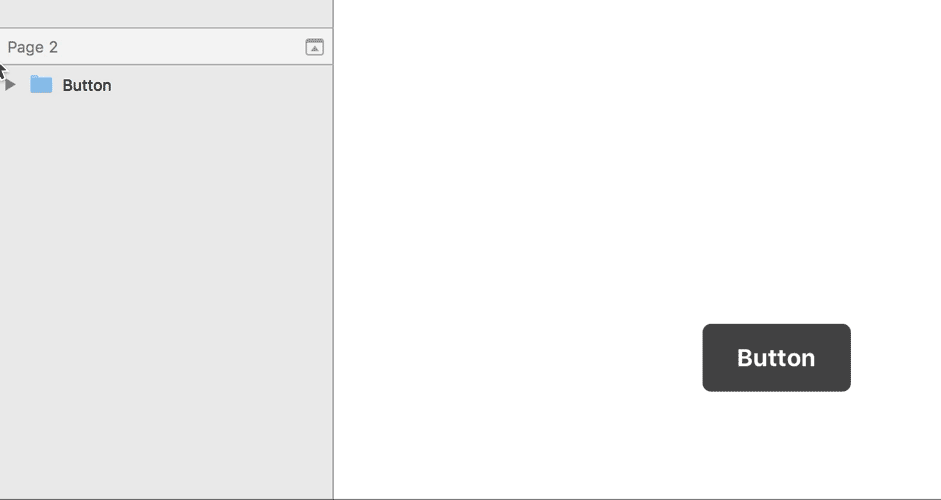
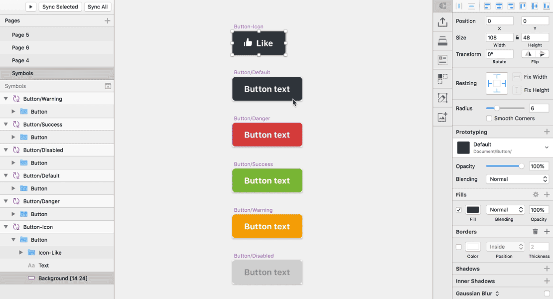
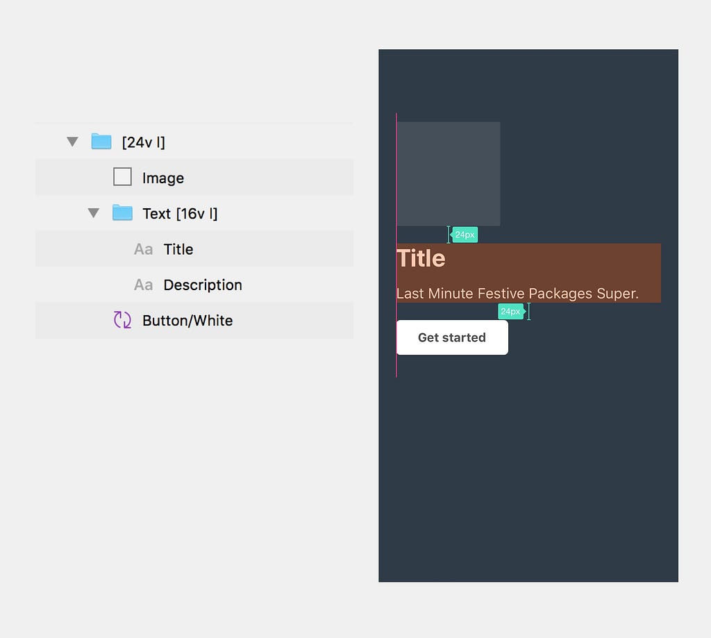
I think it’s one of the most popular component so we will try it first. If you used Dynamic Button before, you will be familiar with it quickly. This is the structure of a button: Background, Text. We will add [topPadding rightPadding bottomPadding leftPadding] into Background layer name. Then it will automatically update your background base on text length. If top padding and bottom padding are the same, left padding, right padding are the same, you can use shorthand like CSS shorthand:
It would be more useful if we create Button symbol, like this:

Apply this mechanism, we can create a Button with icon two:

I believe that you’re are familiar with: button-default, button-danger, button-warning, … This is where Rename it plugin will be the perfect combination with Paddy. I went to the situation that create a lot of symbols of button, then did some experiments, then I found that I need to decrease button size. Now we just select all Button background > Fine and Replace Layer Name > Resize to fit content. Bum! everything is neat again.
Now, we will build a popular components, a horizontal item:

Before going down, I want to introduce Paddy’s Auto Align feature. This feature helps we align everything and update whenever each layer changes size. For more detail, please check the whole cheat sheet below:
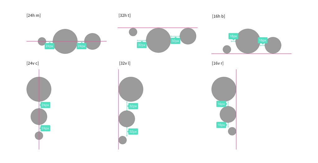 Paddy Auto Align Cheet Sheet
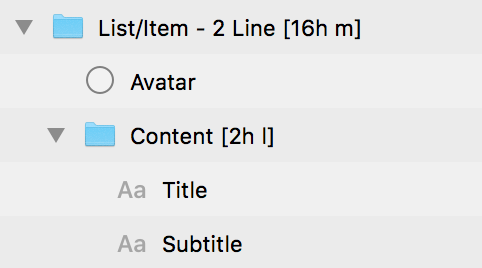
By using atomic methodology, we divide the component into: Avatar and Info. Info includes Title and Subtitle:
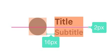
Thanks to Auto Align feature of Paddy, I can horizontally center Avatar and Info. The spacing between Avatar and Info is 16px, so the group should has name “[16h m]”. The space between Title and Subtitle is 2px, and two items are align left, so we add “[2v l]” to Info group. Finally, the group structure should be like this:
Now we build a more complex components width nested component, a List section:
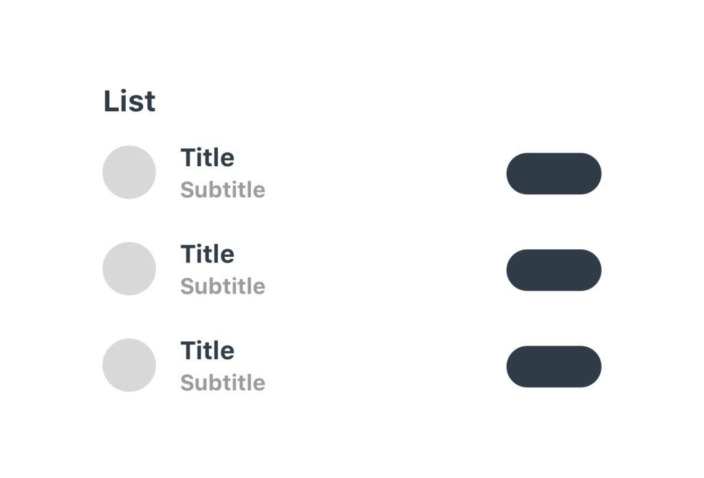
Follow the break-down-anything spirit, we break this into smaller components:

Now, we will see what happen when I add a new Item:
The new item will be align into the group like the items. Super convenient!
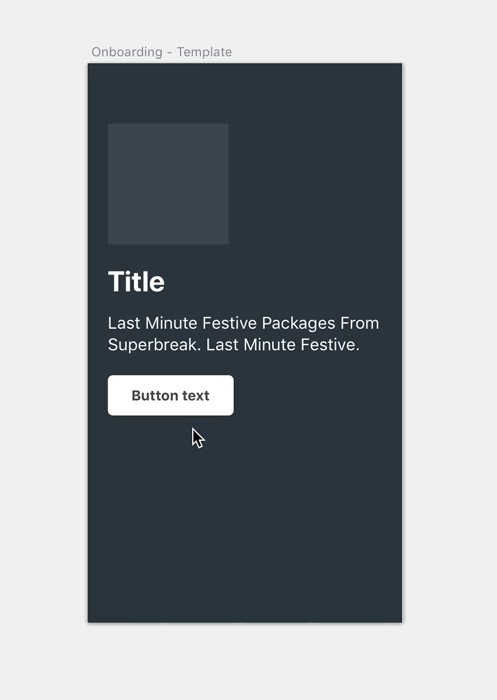
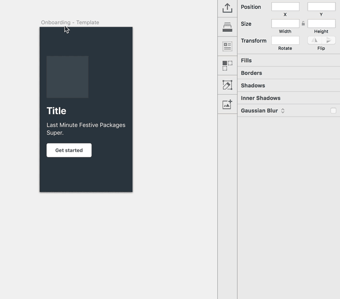
Now we know how build some components, we’re ready to build a complete page. We will build 2 pages: On boarding screen and Home screen:
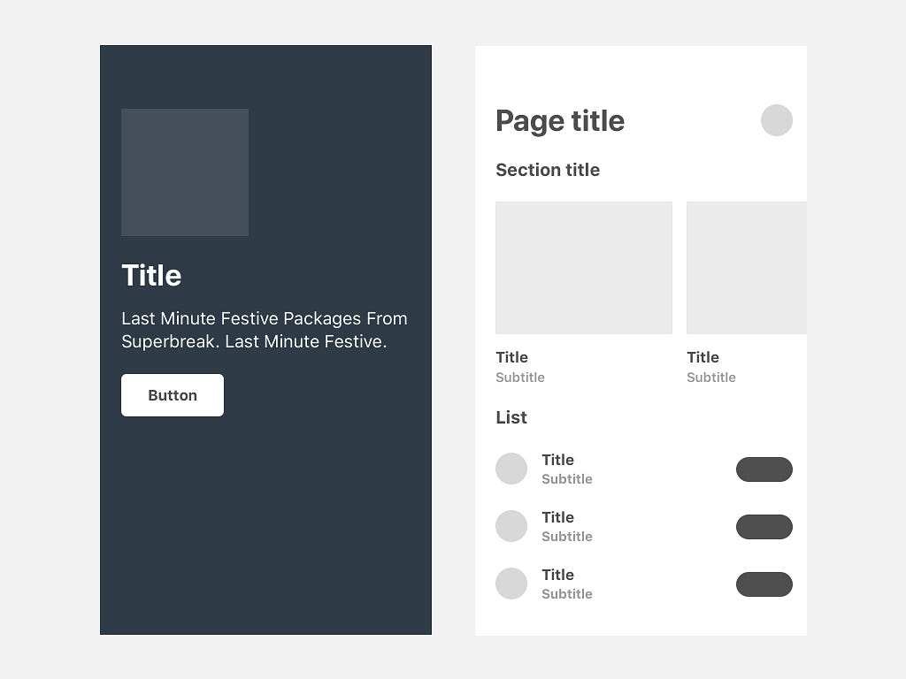
Now, we will test this screen in various screen sizes:
We divide screen into 3 main sections:
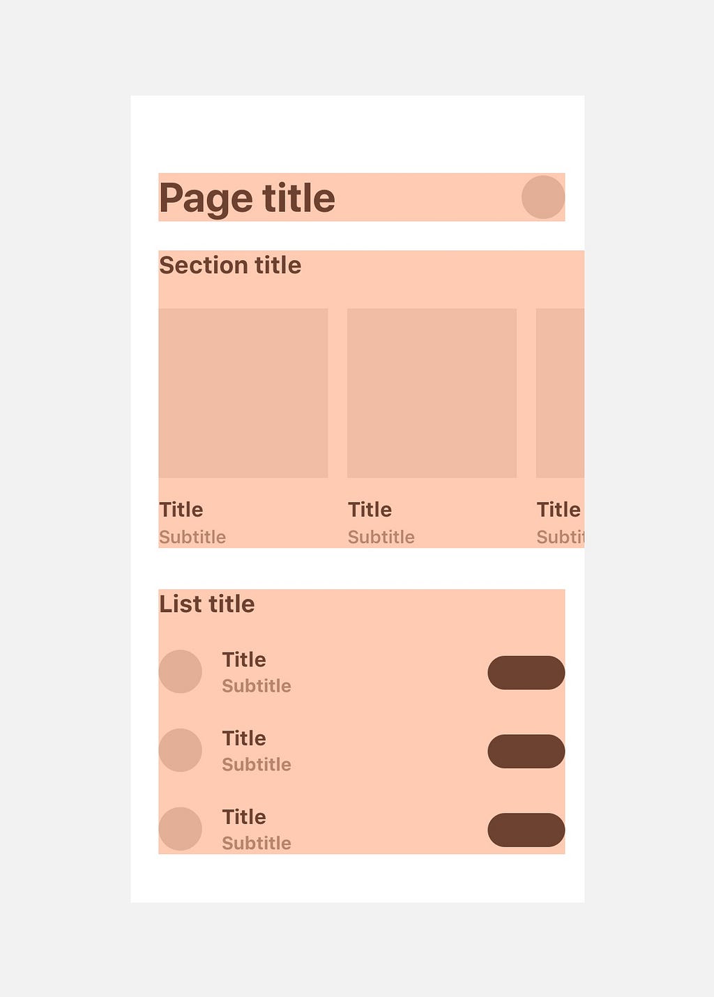
We will add more detail to see how each components is constructed:
The Page title and Avatar are vertical align center.
Horizontal section
Vertical section
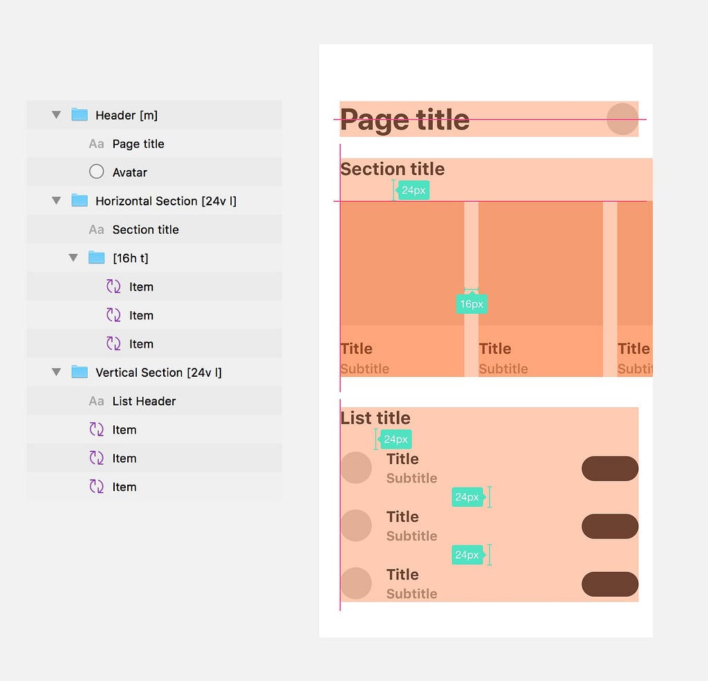
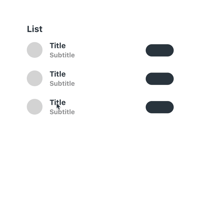
Finally, we have a page that automatically arrange and align your components in your way. Now we will mess the list up a little bit:

😎 Bum! Everything is neat again!
Now I can test everything in a fast way. So I can focus on building experience rather than pushing every pixels. Beside that, it also maintains the precision of a component and consistency between them.
Divide your page into smallest pieces like in this book Atomic.
Auto size background by add [top right bottom left] size to background layer name.
Align everything in a group by adding those string to parent group name:
Space everything in a group by adding those strings to parent group name:
I was inspired by this genius article I applied this similar mechanism to my workflow and figure out some good practices as I mentioned above.
Smarter Tables with Sketch + Paddy
Thanks for reading! Happy Sketching!
This articles is posted originally on my website here. Want to know more? I’m Duy Luong, product designer and front-end developer. Check out my portfolio here!
Supercharge mobile design workflow in Sketch was originally published in Design + Sketch on Medium, where people are continuing the conversation by highlighting and responding to this story.
AI-driven updates, curated by humans and hand-edited for the Prototypr community


