Build Design Systems With Penpot Components
Jul 21, 2:15 AM
Penpot's new component system for building scalable design systems, emphasizing designer-developer collaboration.
smashingmagazine.com

medium bookmark / Raindrop.io |

Design is important. Like…really important. Like “make or break your entire business” important.
[Even if you’re not a designer yourself, the more you understand about how design collaborates with other teams or team members, the better.]
But it’s not the only part of the equation. Oh no, there’s so much more that goes into building a successful product, and pretty pixels only make up a small part of it. Designers should selflessly serve everyone in the business. After all, it’s not about winning design awards. It’s about shipping product, satisfying customers, and continuing to innovate.
Raise your hand if you’ve ever designed something that some other department absolutely ruined with feedback, and you thought to yourself, “ugh you just don’t understand design and aren’t thinking outside of the box!!!”

Placard text: “The Mona Lisa” by Leonardo da Vinci is admittedly kind of a boring painting of some random white lady, but we thought the frame was kinda cool so we put it behind this bomb-proof glass. Medium: Drywall paint over stretched newspaper.
Same here, sister. Same here.
I presented a design last week that I was super excited about. Here’s a list of things I was excited about, and how the client reacted:
You know what their only feedback was? The only thing they really cared about? I used incorrect terminology in a couple places.
That’s like going to visit the Mona Lisa and critiquing the wall plate.

These groups either need to buy-in to fund your vision, or they need to buy-in to truly sell and market it. Great design can sell itself if you get the right people behind it (and…you know…they are actually selling it while you sit on your iPhone and play Mario Run).
Let me make one thing abundantly clear: Marketing IS NOT just Facebook and Twitter. Here’s a brain dump of things people in marketing care about to one varying degree or another:
That’s only what comes up in one breath. People in marketing handle SO MUCH STUFF. I’m not telling you this to diminish other departments. I just know that sometimes “marketing” is highly misunderstood to only involve hashtags and Instagram pics.
See all of those deliverables above? By my completely non-scientific estimation, your designs will make it into at least 87% of those deliverables. From direct screenshots to artistic blockframes and illustrations, the product you design will be represented in marketing materials far and wide.

37% of all slides in Canopy’s sales deck feature screenshots of the product. Design by Trevor Nielsen.
Make every design count. Every pixel. Every word. Every avatar. Every story you tell. Polish it until it shines, then apply an industrial buffer with a clear coat lacquer and massage it until you can see your idyllic cul-de-sac childhood reflected back at you.
If you misspell a word in a mockup, marketing will put that on the website and it will stay there for the world to see for eight months until some overly-ambitious user points out how you wrote “UPLOAF” instead of “UPLOAD”.
Embarrassing, unless you’re designing a bread app, which I highly doubt. 🍞
Use realistic data, proofread, double-check your alignments, and be consistent. It makes for a much more intelligible and sellable product.
Friends will tell you that I’m a bit of an old man when it comes to storytelling. I dig deep into the backstory before I even touch the main storyline, and cover every subplot in excruciating detail. It’s a blessing and a curse. My grandchildren will love me.

Me, as a grandpa. Most likely. Illustration by James Olstein.
Salespeople are storytellers…
…and they tell great stories! In fact, people PAY THEM when they tell great stories. They’re the ones knocking on doors and bringing in new business to help you keep bread on the table 🍞 (How’s that for a callback? Uploaf!!!).
When I design a product flow, I always tell a story. Interaction flows can get pretty complicated, and a story helps drive understanding.
There are lots of little techniques that you can use to tell a consistent and compelling story. Here are a few tips:

Here’s a great example where realistic medical terminology is used throughout the mockup. Compared to other mockups with lorem ipsum, this one tells a much more realistic and compelling story. Design by Yolqin Alimov.
Few people know the product as well as you do (since you designed it), so it’s your responsibility to empower others with the means to accurately present, explain, and sell the product without you holding their hand.
Salespeople can do amazing things with just one screen mockup (I’ve watched it happen…it’s incredible), so light some candles, pour a glass of wine, and start telling stories.
People in executive suite — the CEO, CMO, COO, CIO, CTO, CXO, C3PO — have a lot of eyes on them:
Understand that your humble mobile app design will probably be used to please and dazzle these audiences.
When you’re designing, little tricks can help drive the product vision. In the screenshot below, I added the “Integrations” option to the user profile dropdown of a concept I presented to a client. That tiny idea sparked a 15-minute conversation about additional revenue opportunities, positively impacted the product roadmap, and opened the doors to previously unexplored business partnerships.

To people on the leadership team, your designs aren’t just pretty pictures. They’re evidence of a business plan, roadmap, and innovative team. Be confident in your work, and design to a caliber your CEO would want to brag about.
Okay so we’ve gotten buy-in from the higher-ups and now the real panic…uh…excitement sets in. We are ready to bring in the teams who will help us get this thing built:
Some of you may be designing solo and/or not have product managers, but someone will be playing these roles whether it’s you, your startup’s CEO, or your cat. And we know how judgmental cats can be.
If you’re ever working with other designers, it is so important that you keep your file clean and organized. You should be doing this anyway for your own sanity, but especially if you’re working with other designers. No one likes sifting through “Group 65” and finding your misspelled text or detached symbols. Do yourself and everyone else a favor and keep a clean kitchen. You’ll love yourself, and your team will, too. Everyone wins.

Design Cleanliness + Design Scalability + Design Consistency = Design Team Efficiency
Einstein has E=MC² and Pythagoras has a²+b²=c², so maybe I’ll get this etched into an Egyptian pyramid or something when I’m dead and gone.
Not as much of a ring to it, though. Working on that.
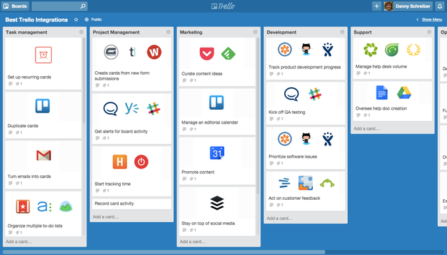
I swear, I dream in Trello cards. I have a board that helps me get dressed in the morning. And one for planning breakfast.
As much as they can really drive us crazy, product managers are the ones who make us designers look good. I can’t tell you how many times I’ve been in a review with my PM before a client presentation, only to realize that I’ve forgotten an important use case.
With product managers, you’re not designing for them so much as you’re designing with them. PMs are a direct line to your users, so keep them close. They’re the keepers of all product requirements, each of which is deeply rooted in user research.
My product managers (Lacey, Anna, Katie, and Kristin) are my best friends. Here’s how we work together:

A design without a developer is like a Christopher Nolan film without a theater.
What good is your design if no one ever uses it? Designing for practice is all well and good, but at some point, you’re gonna want to get the thing built. That’s what pays the bills, right?
Here are some things to keep in mind while you design:
Spacing: Everything is designed on an 8px spacing grid. Paddings and margins should always be multiples of eight: 8, 16, 24, 32, 40, 48, …
Typography: Everything is designed using a text style from my Sketch stylesheet. These make for great CSS classes. Grey text is never hex grey — it’s always the base black with a transparency applied so it’s tinted toward the color it’s over.
Icons: Every icon comes from the same set. “Here’s an icon font. Use this instead of pulling individual SVGs from Zeplin or InVision.” 🙌🏽
This kind of guidance will set your developers up for success, and I promise you that they’ll do a kickass job. Tools like Zeplin have helped us translate design specs to developers faster than ever, and teaching your developers to fish will ensure that extra layer of polish.
Be a selfless and charitable designer. Your influence goes up, down, far, and wide. Make others look good, and you’ll all look good together.
At this point, you probably think your designs are ready to see the light of day. But even in this agile, continual release world, you still need checks and balances to make sure the work is high quality.
Again, some of you may be solo as a designer or may not have product managers, but someone will be playing these roles.
You know that User Manual you get with your shiny new 8K TV? The one you either a) Throw away immediately or b) Use to kill a spider on the wall? (don’t worry there’s a PDF version somewhere online you can reference)
Well, guess what? That complicated new app you designed has a user manual, too!
Individuals responsible for owning product documentation do everything from writing and answering FAQs, to producing how-to videos. Your grimy designer fingerprints will be everywhere in these documentation materials, so be consistent and thorough.
While it’s not a huge deal if things like website marketing images aren’t perfect, documentation has a higher bar. It’s literally how your users learn your product. You wouldn’t want your math professor using a book that’s mostly correct, right? Neither would your users.
A product experience extends far beyond the product itself, so put the same effort into perfecting screenshots for documentation as you do animating that menu button. If users can’t figure out how to use the button in the first place, it doesn’t really matter what that animation looks like anyway 🙃

The Slack Help Center is brimming with helpful screenshots and it looks just like the product. Way to go, Slack!
If you’re not working at a huge, global software company, you probably won’t really have to worry about this (although, you’re always just one surprise client away from having to worry about it). But it’s worth understanding so you can at least be empathetic toward their worries and needs.
As a designer, you’re responsible for crafting a product that will shine on any continent. Here are some things to consider:
Language: How will those inline titles look with long German words? Did you pick a typeface that supports Polish ogoneks (dziękuję!)? Does your typeface support multiple currency symbols ($/¥/₱/£/€)?

What I can only assume is a login page in Russian, by Anna Bakurova
Page Load: This falls more into the hands of the devs who are optimizing the product, but it’s still a form of internationalizing a product. How will your product load over a 3G connection? How about slower than that? India and China are massive user bases and have dreadfully slow connection speeds. Keep that in mind.

The scale shows average Mbps. Red = really slow.
Screen Size: How’s that full-width UI look on a 1024×768 monitor? “But no one uses those anymore!” Unfortunately, MacBooks haven’t quite hit global mainstream affordability yet.
My absolute favorite responsive GIF, by Gal Shir.
Here is how a typical conversation goes once my design hits testing:
“Uh, hey Jon, I was testing your age dropdown and it got crashed when it got to 1,020”
“Um, well it’s an age dropdown so you probably just need to test into the 90’s”
“So like, 99?”
“Sure, Greg. 99”
Or
“Hey Jon, you didn’t specify the RGB value of this link color”
“Yeah that’s because it’s just the same link color we have set in the main.css”
“But what is the actual RGB value? I need to verify that it’s correct.”
“I’m looking at it on your screen right now and I can tell you it’s right.”
“But I’d like to know what the right RGB is so I can close this defect.”
“Well, you don’t need to worry about it. It’s a global style and it won’t ever be off.”
[blank stare]
Admittedly, QA was the biggest shock for me when I started my design career. I really struggled with conversations like these — often, my ignorance to the role came off as arrogance.
But QA does exactly what it’s acronym symbolizes and if you have any chance at your design reaching your high standards as a designer, QA is the group that will make it happen.
Most of what QA needs is covered in the previous two groups. What’s more important is to help get your testers aware of your design intent earlier on so you get better defects and solutions.
A tactic I’ve used is something I’ll call Design Audit Defense™. This is where you review your designs in-person with QA closer to the concept phase and well before implementation to reduce the amount of time spent later on communicating and logging defects:
Your role as a designer is not to keep defects to a minimum, but to help QA log better defects.
Designers are (understandably) trained to think of the user when designing product. And those of you that are tasked with hiring or overseeing designers will assess a designer based on their design skills. However, these nine internal teams will have to sponsor, review, and implement, before it ever goes to market. Hopefully I’ve shed light on tactics to facilitate these internal processes in a way that results in a higher quality product, and a happier product team.
If you enjoyed this article, I’d be forever grateful if you shared or subscribed to our newsletter below.
AI-driven updates, curated by humans and hand-edited for the Prototypr community


