Build Design Systems With Penpot Components
Jul 21, 2:15 AM
Penpot's new component system for building scalable design systems, emphasizing designer-developer collaboration.
smashingmagazine.com

uxdesign.cc – User Experience Design — Medium | Caitria O’Neill
Brilliant, dense, and aggravatingly always right —the flesh interface can fuck up even the simplest interaction.
 Hasty, undisciplined, and emotional — everybody’s barreling down the shortest path to fulfilling their goals.
Humans form a bumbling half of human-computer interaction.
It is tempting to think of your product as a chunk of code that either runs or is broken. It’s tempting to reduce it to a set of interactions that you ‘test’ between the person and the computer.
Does the code work? Does a prototypical ‘user’ understand this text?
Reality is unfortunately more complex than just checking these boxes and achieving instant boosts in user productivity.
In reality you must test how your product embeds into a user’s workflow, and in reality you must sell how it changes their life.
The flesh interface is stubborn: If your app’s flow clashes with offline human workflows, people will often return to their old process. If new information conflicts with previous knowledge, people will rely on on previous knowledge.
This article explores the downfall of designing ‘organization-first’ or ‘tech-first’ and provides tips for designing ‘flesh interface first’.
 People are like water — they’ll skip and flow around any complexities or uphill tasks.
I learned my inaugural (and hardest) lessons in flesh interface design when working on software for disaster areas.
After my home was hit by a tornado in 2011, I got involved in local resource and volunteer management, then designed software to simplify the interaction. I flew the prototype software to disaster areas to see where the software broke or…conflicted with human workflows.
Ooooh boy.
To be frank, yeah, I was launching home-cooked prototypes in disaster zones — chaos was somewhat pre-ordained. But I had underestimated the creativity of the flesh interface to find holes in our software workflow. The initial field tests were a roller coaster.
Taste the panic: Volunteer sites didn’t have data connectivity, a tandem paper system was rapidly developed. Rural farmers in Alabama don’t have email addresses, but our system required them for account creation. Families share phone numbers. Local leaders were overloaded by the administrative requirements of the software, but a ‘self service model’ led to fraud.
It is shocking and disheartening as a young software designer to watch someone throw up their hands and go back to a paper system. The experience is a hell of a lesson, of course, but painful.
The first time I saw someone give up on my software workflow, I irrationally wanted to bargain with the tired volunteer coordinator.
I hunted for words to explain that their investment would pay off in efficiency and data later on. I said something about losing FEMA money due to bad records. Womp womp womp.
It took looking into the exhausted coordinator’s face — stubble, gray circles under the eyes — to realize that this man did not give a partial shit about any of that.
He was just doing his job, and trying to achieve his goals.
The volunteer coordinator’s job is to send as many excited people as possible to dig out collapsed homes, before excitement dries up and the news cycle moves on. Their ‘goal’ is not to track email addresses. It makes sense that when the software got in the way of that goal, the coordinator just dropped it.
I’ll admit, I moped a bit. I had a sad coffee at a Waffle House in rural Alabama.
It was on a plane ride home that I realized my mistake. It wasn’t that this man didn’t want or need the tools I had designed — it was just that the way the system was designed. I had optimized for organizational goals and made it harder on the flesh interface.
Worse, I had added hoops to jump through and frustrating data fields for organizational purposes, without explaining why to the organizer.
No wonder the overwhelmed coordinator jumped ship.
Luckily, humility is a muscle designers and researchers build over time. First drafts of ideas are rarely fully formed or correct.
Ultimately the success of the software came from changing our workflow to more closely match the needs and expectations of volunteer coordinators on the ground, not training them to adopt our workflow in their time of crisis.
Now when I perform product research or design, I dedicate time specifically to mapping out the existing workflows and task requirements with users. If you’re asking the wrong questions, your app could pass every usability test you create with flying colors…only to fail in real-world use.

The flesh is lazy. The flesh is weak. The flesh makes dumb, emotional decisions and often refuses to consider logic/facts/precedent in the heat of the moment.
Don’t be offended, but I’m talking about designers as well here. Humans are, in general, messy, aggravating, and barreling towards their goals on the shortest apparent path.
The trick of excellent design is to take a step backwards in the midst of the chaos to look at not just the process, but the people who perform it.
The first and best strategy for workflow design is to involve your prospective user throughout the entire process.
It isn’t too late to get started — there is a type of research or design you could be doing to involve your users at every stage of product developement: Research the issue and their existing solution together. Check concepts before investing. Test usability in the field. Survey on task completion and satisfaction after launch.
The following tips can help you check in with your user and incorporate their feedback throughout the design process.

Some of the most useful product advances in the past decade have been simple, human-focused updates to popular apps. Google Maps now allows you to search for a gas station along the route. Spotify allows you to switch music between devices seamlessly.
These updates are not examples of software design changing the way people behave, but rather, allowing people to behave the way they would have with an analog.

Physical context shapes not only creates the individual’s need for a specific interaction, it also determines the way that interaction should be designed. For example, a driving app should prioritize voice interactions over physical input.
Where is your user? What else are they doing or juggling at the time? Are they completing any physical actions? Interacting with others? Are they using other software or apps?

Carefully study your product’s use case to determine whether there are interactions that should have offline alternatives, or produce offline artifacts.
When I was working on disaster relief, entire recovering communities would be left without internet and data for days. We would post news and resource bulletins online for volunteers to print and distribute in dead-zones, adding a physical step to our process to side-step a technical challenge.

Often forms or workflows require fields that will be needed later on, but that don’t make sense to the individual filling out the form. If these requirements are not explained, you risk the user skipping them.
“But I don’t want to add a phone number!” — User We Can’t Contact Now
Similarly, interactions that require physical proximity, like bluetooth or firmware setup steps, require the user to understand how their physical proximity relates to the the process.
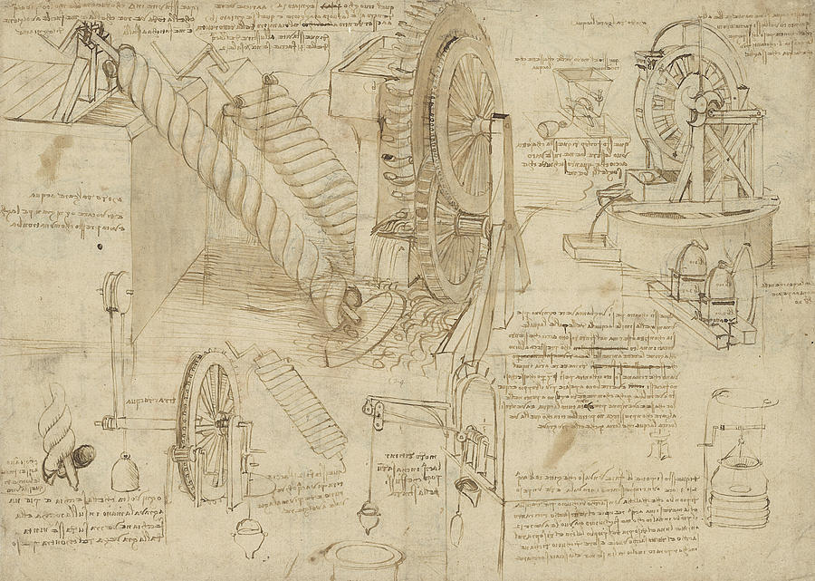 Note the water-friendly design of this Da Vinci water wheel: the water’s goal is to flow downhill. The wheel merely coopts the water’s movement momentarily, then allows it to achieve its goal. If the wheel interrupted the water’s movement too much, the water would flow around the wheel to achieve its goal.
People are like water. They flow over and around any confusing or uncessary interactions that don’t match their ideal path. They have the collective power to carve stone over time — they sure as hell have the power to change your app workflow.
You might be designing technology, but it is vital to start and end with human goals and direction. Root your design in human workflows, test your product in human environments, judge your success by real-world goal achievement.
The flesh interface after all is brilliant, dense, aggravating — and always right.
The Damnable Flesh Interface: designing around human workflows was originally published in UX Collective on Medium, where people are continuing the conversation by highlighting and responding to this story.
AI-driven updates, curated by humans and hand-edited for the Prototypr community


