Build Design Systems With Penpot Components
Jul 21, 2:15 AM
Penpot's new component system for building scalable design systems, emphasizing designer-developer collaboration.
smashingmagazine.com

medium bookmark / Raindrop.io |
The Digital Color Meter is a cute and useful app for macOS that is installed by default. It’s probably the easiest way to copy a color value from any onscreen pixel. It helps designers, photographers, engineers, … and despite it being helpful on a day to day basis, I realized that this app can go unnoticed because people don’t understand how to use it or where to find it (inside the applications > Utilities folder). This can change after a quick explanation of how to use this app and that is what brought me here.
I always saw room for improvements in this app because I like its concept and of course because I use it very often. With this in mind and after some research, I tried to redesign this app. The goal was to create a better experience for the users by adding new features and making some small tweaks.
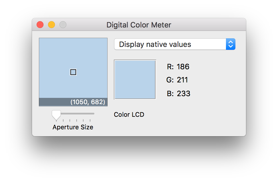
This is what the current app looks like
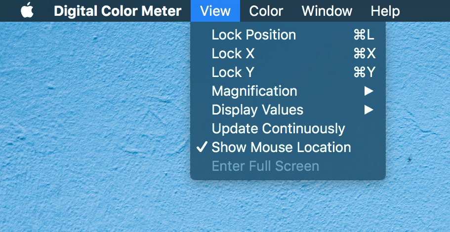
View Menu
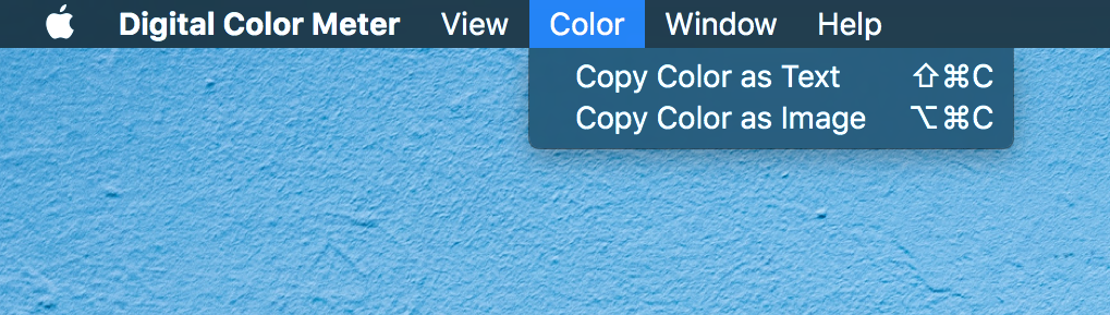
Color Menu
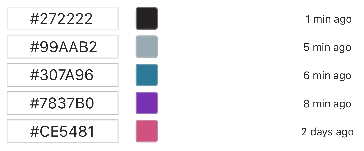
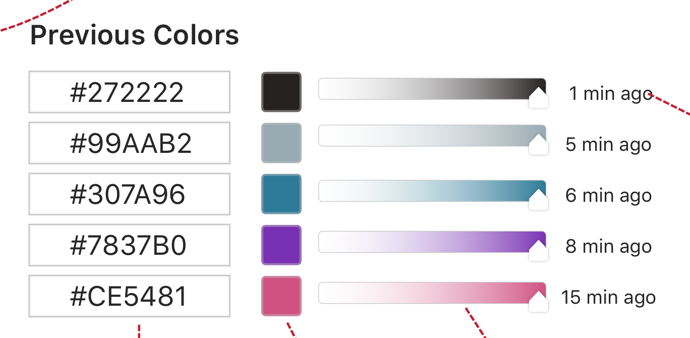
It would be very helpful if the app saved the last 5 colors you picked (and even across sessions). In this redesign, you don’t lose track of the colors right way and you can come back later to copy the value once again.
Mockup for this new feature
In the current Digital Color Meter, users can change the RGB color display format between hexadecimal, percentage and the raw RGB values. I propose that this selection be moved down to the main UI with a few more options (HSB and CMYK). The default should be the RGB hexadecimal, but automatically saved between sessions.
A dropdown was the solution I used to solve this problem which gives the user a way to easily change how the color results are displayed.
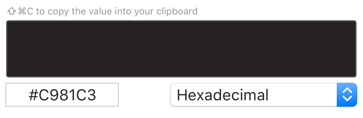
New tip and dropdown for display values on the interface
I saw a lot of comments in forums (or tweets) from people asking for help on how to copy the color values. And even from my experience, this is a problem and that’s why I decided to add a visible tip on the interface explaining the user how to copy. While the shortcut is currently hidden up in the menu, most users will not spend time exploring it. They will probably end up installing another tool to solve the same problem.
The first thing I did when I started to use this app was try to resize the window because I felt like I needed more space and I wasn’t in control of the application. A resizable window lets the user figure out where in the screen they are currently zooming at.
I find it useful to have a Copy as HTML for developers, web designers, UI/UX designers … I imagine this accessible through the main menu, in the “Go Section”, like the others copy types, but also having its own shortcut (e.g. Ctrl + Cmd + C).
An output example of “Copy as HTML” would be color=”#307A96″.
I saw an opportunity to remove this from the main menu because with a resizable window the position indicator won’t bother you.
I will be totally honest — I removed this feature because I don’t understand how to use it. I tried to make sense of it, searched around and still have not yet figured out what it does.
I am looking for someone to explain it to me.
From the main menu I also removed the Display Values selector because now you can change it directly in the interface, yay 🙌
In the middle of this process I also considered adding a hue slider in order to let the user make some quick experiences with the last 5 colors they picked. But at the same time, I see this app as a simple screen color picker so I had mixed feelings about this. I even thought having a toggle to enable this feature on the main menu. However, this goes beyond the purpose of this app and I ended up removing it from my proposal.
Feature mockup
This story is published in Noteworthy, where 10,000+ readers come every day to learn about the people & ideas shaping the products we love.
Follow our publication to see more product & design stories featured by the Journal team.
AI-driven updates, curated by humans and hand-edited for the Prototypr community


